
import matplotlib.pyplot as plt
#2d그래프 담당이 pyplot
#결과는 그래프 들 일거임 그때, 새창을 띄워서 결과값을 볼건지, 아니면 하단에 낼건지 정하는게 inline(하단에 내기)

get_ipython().run_line_magic('matplotlib', 'inline')
#그래프 출력이 Jupyter Notebook 셀 내에서 자동으로 처리되어 바로 볼 수 있게 됨

plt.figure(figsize=(10,6))
#그래프 사이즈, (figsize=(가로,세로))
plt.plot([0,1,2,3,4,5,6,7,8,9],[1,1,2,3,4,2,3,5,-1,3])
#plt.plot([x값],[y값])
plt.show()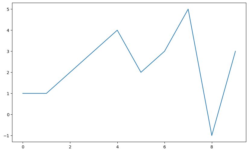

def drawGraph():
    plt.figure(figsize=(10,6))
    plt.plot(t, np.sin(t), label='sin')
    plt.plot(t, np.cos(t), label='cos')
    plt.grid() #그래프에 격자 라인을 추가합니다.
    plt.legend() #그래프에 범례(legend)를 추가합니다. 'sin'과 'cos' 라벨이 표시됩니다.
    plt.xlabel('time')
    plt.ylabel('amplitude')
    plt.title('example of sinewave')
    plt.show()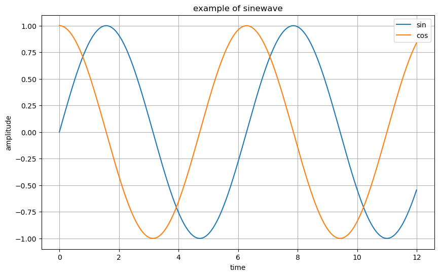
t = np.arange(0, 5, 0.5)

def drawGraph(t):
    plt.figure(figsize=(10,6))
    plt.plot(t,t, 'r--') #x축에 t 값을, y축에도 t 값을 가지는 선 그래프 #'r--'는 빨간색 점선 스타일을 나타냅니다. v v
    plt.plot(t,t**2,'bs') # x축에 t 값을, y축에 t의 제곱 값을 가지는 선 그래프를 그립니다. 'bs'는 파란색 사각형 마커 스타일을 나타냅니다.
    plt.plot(t,t**3,'g^') #x축에 t 값을, y축에 t의 세제곱 값을 가지는 선 그래프를 그립니다. 'g^'는 초록색 삼각형 마커 스타일을 나타냅니다.

    plt.show()

drawGraph(t)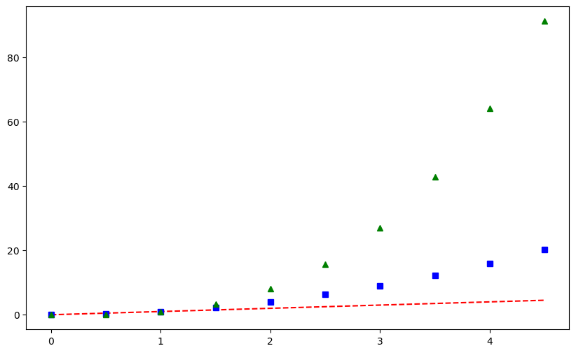
t=[0,1,2,3,4,5,6]
y=[1,4,5,8,9,5,3]

def drawGraph(t,y):
    plt.figure(figsize=(10,6))
    plt.plot(
        t,
        y,
        color = 'green',
        linestyle = 'dashed',
        marker = 'o',
        markerfacecolor = 'blue',
        markersize = 12
    )
    plt.xlim([-0.5,6.5])
    plt.ylim([0.5,9.5])
    plt.show()


drawGraph(t,y)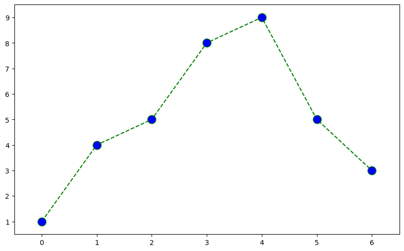
t=np.array([0,1,2,3,4,5,6,7,8,9]) #array는 배열을 나타내는 자료구조
y=np.array([9,8,7,9,8,3,2,4,3,4])


def drawGraph(t,y):
    plt.figure(figsize=(10,6))
    plt.scatter(t,y) #scatter는 점을 뿌리듯이 그림
    plt.show()

drawGraph(t,y)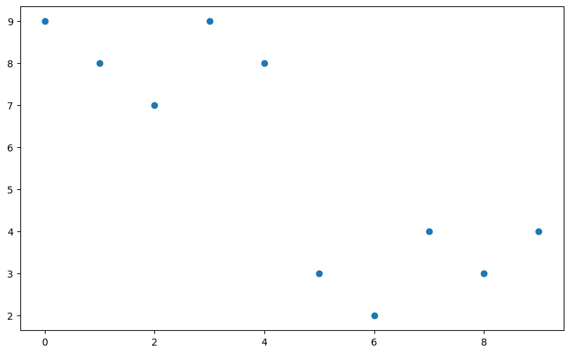
colormap = t # colormap 변수에 t 값을 할당합니다. 이는 t 값과 동일한 값을 가지는 색상 맵을 생성하기 위한 변수입니다.

def drawGraph():
    plt.figure(figsize=(10,6))
    plt.scatter(t,y, s=50, c=colormap, marker='>')
    plt.colorbar() # 색상 맵의 범례(colorbar)를 추가합니다. colormap에 할당된 값에 따라 색상이 표시됩니다.
    plt.show()

drawGraph()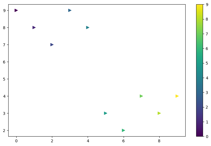
def drawGraph():
    data_result['총계'].sort_values().plot(
        kind='barh',
        grid=True,
        title='CCTV가 많은 자치구',
        figsize=(20,20)
    )
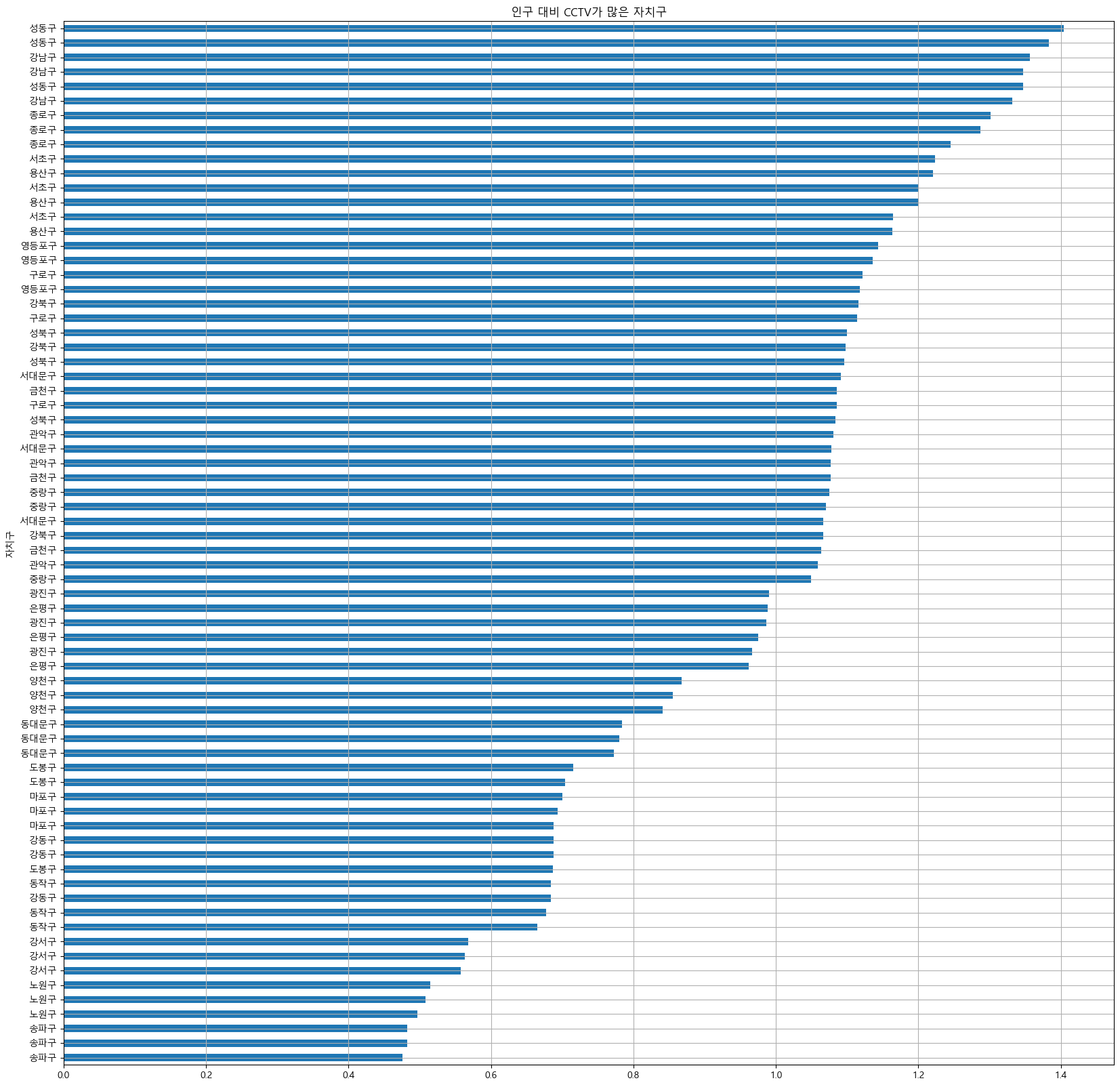
def cctvRate():
    data_result['cctv 비율'].sort_values().plot(
        kind='barh',
        grid=True,
        title='인구 대비 CCTV가 많은 자치구',
        figsize=(20,20)
    )
import matplotlib.pyplot as plt

def scatGraph():
    plt.figure(figsize=(20,20))
    plt.scatter(data_result['인구수'], data_result['총계'],s=50) # s=50은 점의 크기를 지정하는 매개변수로, 점의 크기를 50으로 설정합니다.
    plt.xlabel('인구수')
    plt.ylabel('cctv')
    plt.grid()
    plt.show()

scatGraph()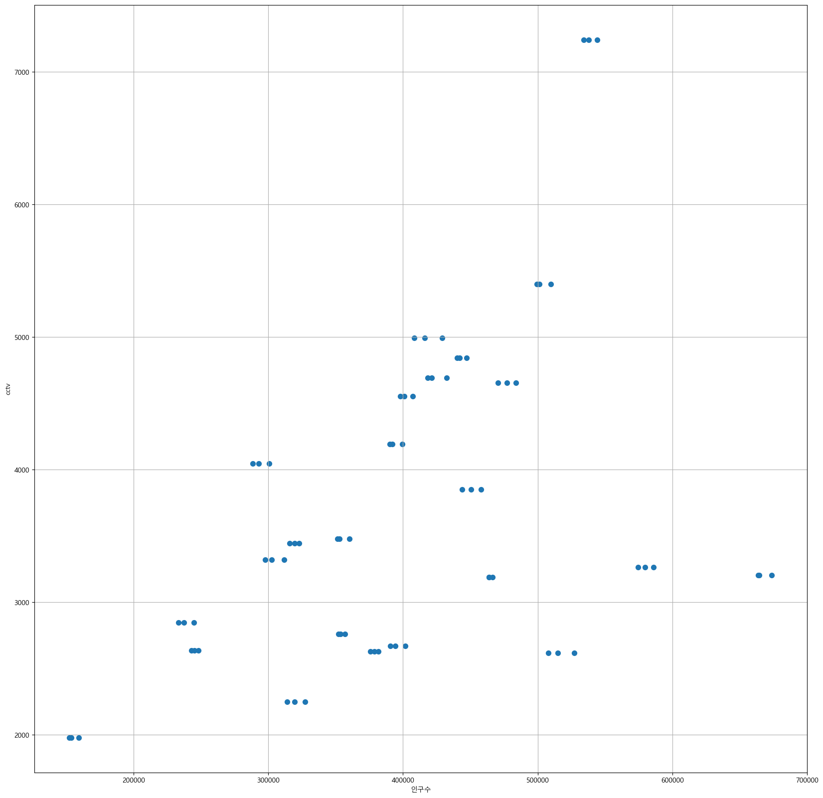
def lineGrap():
    plt.figure(figsize=(20,20))
    plt.scatter(
        data_result['인구수'],
        data_result['총계'],
        s=50
    )
    plt.plot(fx, f1(fx), ls='dashed', lw=3, color = 'g')
    plt.xlabel('인구수')
    plt.ylabel('cctv')
    plt.grid()
    plt.show()

lineGrap()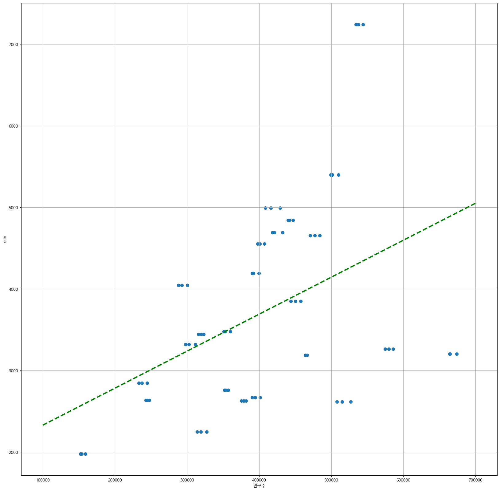
def colorGraph():
    plt.figure(figsize=(20,20))
    plt.scatter(data_result['인구수'], data_result['총계'], c= data_result['오차'], s=50,
                cmap=my_cmap)
    plt.plot(fx, f1(fx), ls='dashed', color='gray')

    for n in range(5):
        plt.text( #그래프 상에 텍스트를 표시하기 위해 사용되는 좌표와 텍스트 내용
            df_sort_f['인구수'][n]*1.02, #*1.02는 해당 값을 1.02배로 조정한 값을 의미합니다. 이 조정은 텍스트의 위치를 오른쪽으로 약간 이동시키기 위한 것
            df_sort_f['총계'][n]*0.98, # *0.98은 해당 값을 0.98배로 조정한 값을 의미합니다. 이 조정은 텍스트의 위치를 아래쪽으로 약간 이동시키기 위한 것
            df_sort_f.index[n],
            fontsize = 15
        )
        plt.text(
            df_sort_t['인구수'][n]*1.02,
            df_sort_t['총계'][n]*0.98,
            df_sort_t.index[n],
            fontsize = 15
        )
    plt.xlabel('인구수')
    plt.ylabel('cctv')
    plt.colorbar()
    plt.grid()
    plt.show()

colorGraph()
🎇다른데이터로도 나중에 해보자~!

수야는 코린이에서 더 나아갈거야