
본 포스팅은 elice의 2021 NIPA AI 온라인 교육을 듣고 개인 공부를 위해 정리한 것입니다.
5. Matplotlib 데이터 시각화
1) Matplotlib 그래프
데이터 시각화와 2D 그래프 플롯에 사용되는 파이썬 라이브러리
Matplotlib를 이용하여 아래와 같은 다양한 그래프를 그릴 수 있다.

import matplotlib.pyplot as plt
matplotlib.pyplot 모듈은 MATLAB과 비슷하게 명령어 스타일로 동작하는 함수의 모음입니다.
matplotlib.pyplot 모듈의 각각의 함수를 사용해서 간편하게 그래프를 만들고 변화를 줄 수 있습니다.
예를 들어, 그래프 영역을 만들고, 몇 개의 선을 표현하고, 레이블로 꾸미는 등의 일을 할 수 있습니다.
출처 : https://wikidocs.net/92071 [Matplotlib Tutorial - 파이썬으로 데이터 시각화하기]
Line plot
plt.subplots() : figure 및 axes 객체를 포함하는 튜플을 반환하는 함수
import matplotlib.pyplot as plt
import numpy as np
import pandas as pd

fig, ax = plt.subplots() # fig는 그림, ax는 그림에 그려질 그래프
x = np.arange(15)
y = x ** 2
ax.plot(
    x, y,
    linestyle=":",
    marker="*",
    color="#524FA1" # rgb 16진수
)

plt.shows() # 그래프 창 띄우기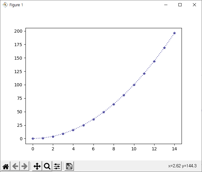
Line Style
| 기호 | 의미 |
|---|---|
| - | 실선 |
| -- | 대시 선 |
| -. | 대시 점 선 |
| : | 점선 |
import matplotlib.pyplot as plt
import numpy as np

x = np.arange(10) # 0~9
fig, ax = plt.subplots()

# ax.plot(x, y, linestyle)
ax.plot(x, x, linestyle="-") # solid
ax.plot(x, x+2, linestyle="--") # dashed
ax.plot(x, x+4, linestyle="-.") # dashdot
ax.plot(x, x+6, linestyle=":") # dotted

plt.show()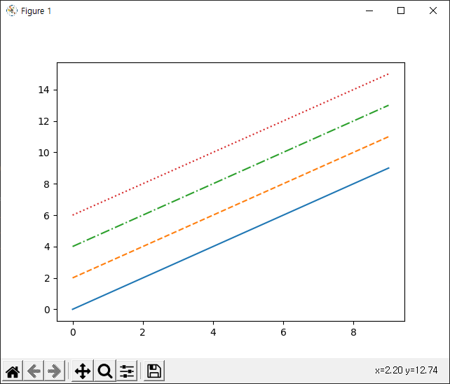
👉 참고로 그래프 선 색상은 여러 선을 구분하기 위해 디폴트로 설정된 색상이다.
color
import matplotlib.pyplot as plt
import numpy as np

x = np.arange(10)
fig, ax = plt.subplots()

# ax.plot(x, y, color)
ax.plot(x, x, color="r") # red
ax.plot(x, x+2, color="green")
ax.plot(x, x+4, color="0.8") # 0~1 사이의 gray scale을 의미 → gray
ax.plot(x, x+6, color="#524FA1")

plt.show()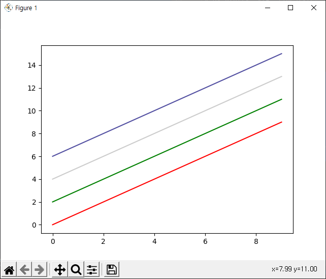
Marker
| 기호 | 의미 | 기호 | 의미 |
|---|---|---|---|
| . | 점 | , | 픽셀 |
| o | 원 | s | 사각형 |
| v, <, ^, > | 삼각형 | 1, 2, 3, 4 | 삼각선 |
| p | 오각형 | H, h | 육각형 |
import matplotlib.pyplot as plt
import numpy as np

x = np.arange(10)
fig, ax = plt.subplots()

# ax.plot(x, y, marker)
ax.plot(x, x, marker=".")
ax.plot(x, x+2, marker="o")
ax.plot(x, x+4, marker="v")
ax.plot(x, x+6, marker="s") # square
ax.plot(x, x+8, marker="*")

plt.show()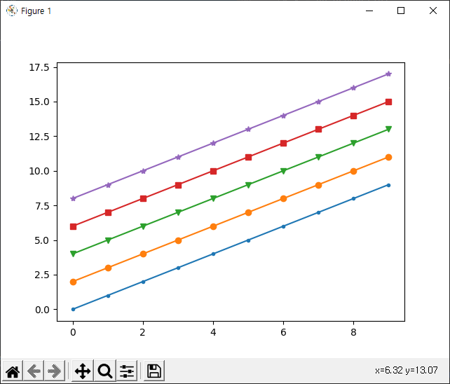
축 경계 조정하기
xlim(), ylim(), axis() 함수를 사용하여 그래프의 X, Y축이 표시되는 범위를 지정한다.
np.linspace(start, end, num): 숫자로 된 시퀀스를 생성하는 함수로 np.arange함수와 비슷하지만 NumPy array로 구성된 균등한 간격을 둔 시퀀스를 생성한다. start, stop은 배열의 시작점과 종점, start와 stop 사이를 나누는 갯수이다.
예를 들어np.linspace(0, 10, 5)는[ 0. 2.5 5. 7.5 10. ]를 반환한다.
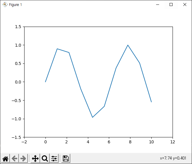
x = np.linspace(0, 10, 1000)
fig, ax = plt.subplots()
ax.plot(x, np.sin(x)) # sin그래프
ax.set_xlim(-2, 12) # x축 limit를 -2 ~ 12
ax.set_ylim(-1.5, 1.5) # y축 limit를 -1.5 ~ 1.5

plt.show()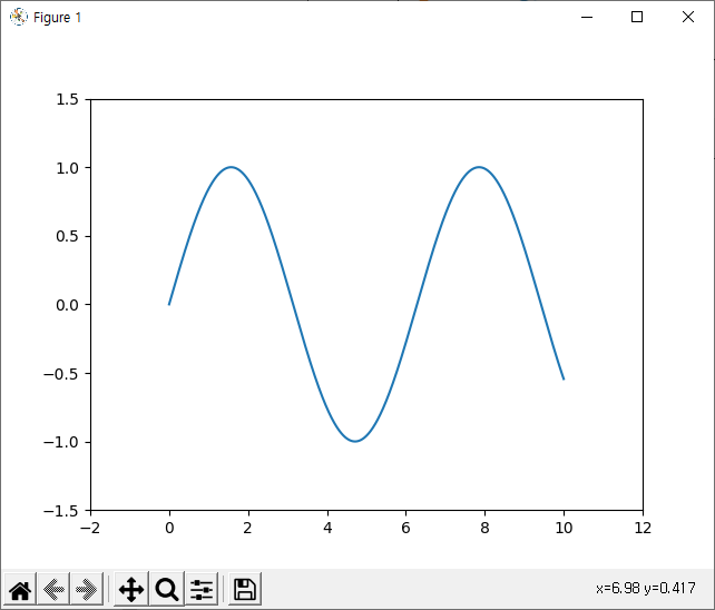
👉 sin 함수를 그릴 때 x = np.linspace(0, 10, num) 에서 num 값을 너무 작게 하면 x 값이 충분하지 않으므로 곡선이 아닌 꺾여진 형태의 그래프가 나온다.
👉if x = np.linspace(0,10,10)
범례(Legend)
그래프에 데이터의 종류를 표시하기 위한 텍스트
matplotlib.pyplot 모듈의 legend() 함수를 사용해서 그래프에 범례를 표시, loc 파라미터를 이용해서 범례가 표시될 위치를 결정한다.
.set_xlabel(), .set_xlabel() 는 축 레이블 설정
- loc 파라미터
| 문자형 | code | 문자형 | code |
|---|---|---|---|
| ‘best’ | 0 | ‘center left’ | 6 |
| ‘upper right’ | 1 | ‘center right’ | 7 |
| ‘upper left’ | 2 | ‘lower center’ | 8 |
| ‘lower left’ | 3 | ‘upper center’ | 9 |
| ‘lower right’ | 4 | ‘center’ | 10 |
| ‘right’ | 5 | - | - |
x = np.arange(10)
fig, ax = plt.subplots()

# ax.plot(x, y, label), ax.set_xlabel(), ax.legend()
ax.plot(x, x, label = "y=x")
ax.plot(x, x**2, label = "y=x^2")
ax.set_xlabel("x")
ax.set_ylabel("y")
ax.legend(loc = "upper right",
          shadow = True,
          fancybox = True,
          borderpad = 2)
          # shadow는 그림자, fancybox는 모서리 둥글게, borderpad는 범례를 그린 박스의 크기를 결정

plt.show()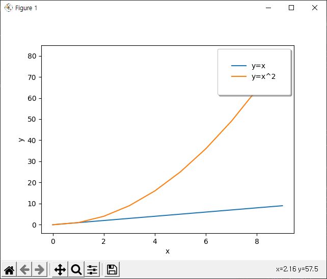
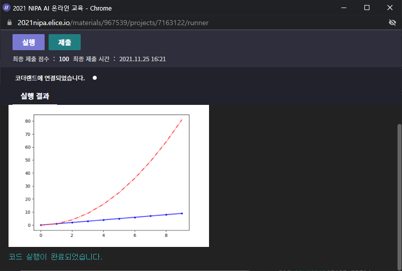
실습✍ 선 그래프
- 파란색 선 그래프의 linestyle을 실선으로, marker를 점으로 변경해보세요.
- 빨간색 선 그래프의 linestyle을 대시 점 선으로, marker를 픽셀로 변경해보세요.
- 주어진 그래프
from elice_utils import EliceUtils
import numpy as np
import pandas as pd
import matplotlib.pyplot as plt

elice_utils = EliceUtils()

#이미 입력되어 있는 코드의 다양한 속성값들을 변경해 봅시다.
x = np.arange(10)
fig, ax = plt.subplots()
ax.plot(
    x, x, label='y=x',
    linestyle=':',
    marker='o',
    color='blue'
)
ax.plot(
    x, x**2, label='y=x^2',
    linestyle='--',
    marker='^',
    color='red'
)

# elice에서 그래프를 확인
fig.savefig("plot.png")
elice_utils.send_image("plot.png")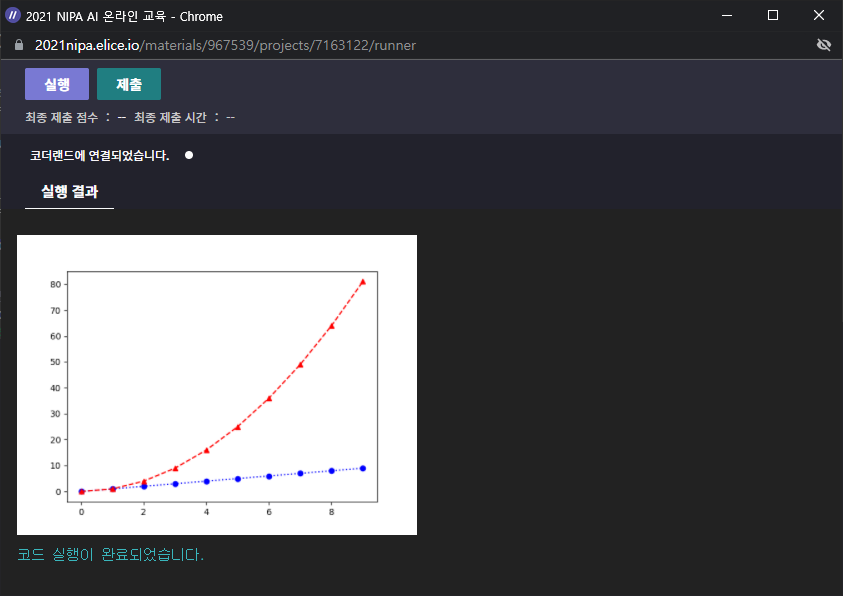
- 답안 작성하기
x = np.arange(10)
fig, ax = plt.subplots()
ax.plot(
    x, x, label='y=x',
    linestyle=':',
    marker='o',
    color='blue'
)
ax.plot(
    x, x**2, label='y=x^2',
    linestyle='--',
    marker='^',
    color='red'
)- 결과
💎 예시 코드에서 figure와 ax가 각각 1개인데, ax.plot 함수를 두 번 호출했다! 이렇게 하나의 ax에 여러 번 그래프를 그리면, 그래프를 겹쳐서 그릴 수 있다!!
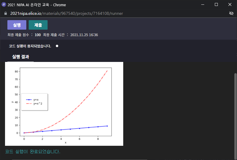
실습✍ 그래프 범례
위치 옵션 표를 참고하여 문자형이나 code를 통해 범례의 위치를 왼쪽 중간으로 변경해보세요.
- 주어진 그래프
from elice_utils import EliceUtils
import numpy as np
import pandas as pd
import matplotlib.pyplot as plt

elice_utils = EliceUtils()

x = np.arange(10)
fig, ax = plt.subplots()
ax.plot(
    x, x, label='y=x',
    linestyle='-',
    marker='.',
    color='blue'
)
ax.plot(
    x, x**2, label='y=x^2',
    linestyle='-.',
    marker=',',
    color='red'
)
ax.set_xlabel("x")
ax.set_ylabel("y")

#이미 입력되어 있는 코드의 다양한 속성값들을 변경해 봅시다.
ax.legend(
    loc='upper left',
    shadow=True,
    fancybox=True,
    borderpad=2
)

# elice에서 그래프를 확인
fig.savefig("plot.png")
elice_utils.send_image("plot.png")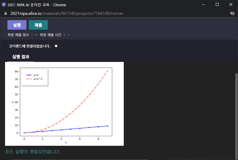
- 답안 작성하기
ax.legend(
    loc=6, # 6 대신 "center left" 도 가능하다.
    shadow=True,
    fancybox=True,
    borderpad=2
)- 결과
2) Bar & Histogram
Bar plot
import matplotlib.pyplot as plt
import numpy as np

x = np.arange(10)
fig, ax = plt.subplots(figsize=(12, 4)) # 가로 12, 세로 4로 figure size 설정
ax.bar(x, x*2) # ax.bar(x, y)

plt.show()
- 하나의 막대 안에 누적해서 그리기
ax.bar(x, y, bottom): bottom을 지정해서 해당 지점부터 다시 데이터를 쌓아 올린다.
np.random.rand(m, n) : 0부터 1사이의 균일분포에서 난수 matrix array(m, n) 생성, np.random.rand(3)이면 0부터 1사이에서 세 개의 값을 랜덤으로 뽑는 것
틱(Tick) : 그래프의 축에 간격을 구분하기 위해 표시하는 눈금, xticks, yticks
x = np.random.rand(3)
y = np.random.rand(3)
z = np.random.rand(3)

# print(x, y, z)
# [0.84867894 0.01934068 0.58794556] [0.57715812 0.23048354 0.86574296] [0.54681793 0.15794894 0.06525527]

data = [x, y, z]

#print(data)
#[array([0.84867894, 0.01934068, 0.58794556]), array([0.57715812, 0.23048354, 0.86574296]), array([0.54681793, 0.15794894, 0.06525527])]

fig, ax = plt.subplots()
x_ax = np.arange(3) # [0 1 2]

for i in x_ax:
    ax.bar(x_ax, data[i], bottom=np.sum(data[:i], axis=0))
    # x, y, z 값이 누적되게 쌓아올린다. axis = 0, 세로로 누적

ax.set_xticks(x_ax) #
ax.set_xticklabels(["A", "B", "C"])

plt.show()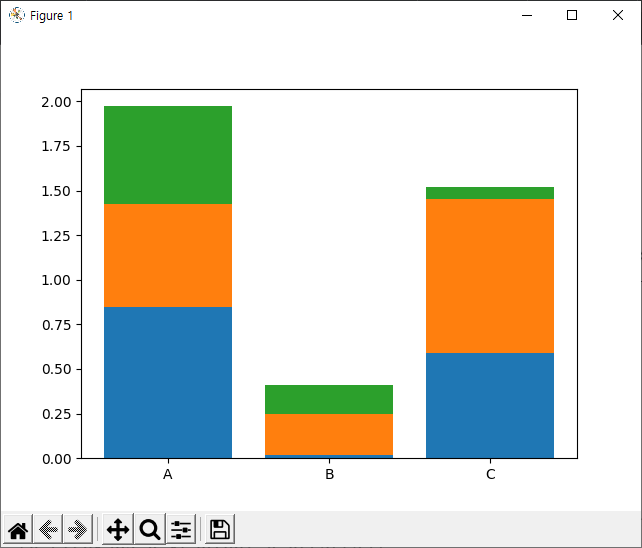
👉 파란색이 x, 주황색이 y, 초록색이 z
👉 그래프를 쌓아올릴 때는(누적) bottom을 지정한다는 것 꼭 기억하기
Histogram
히스토그램 = 도수분포표
가로축은 계급, 세로축은 도수(횟수나 개수 등)를 나타낸다.
hist() 함수의 bins 파라미터는 히스토그램의 가로축 구간의 개수를 지정, 막대 개수!
np.random.randn(m, n) : 가우시안 표준 정규 분포(평균 0, 표준편차 1)에서 난수 matrix array(m, n) 생성
import matplotlib.pyplot as plt
import numpy as np

fig, ax = plt.subplots()
data = np.random.randn(1000) # 1000 개의 데이터 랜덤하게 뽑음
ax.hist(data, bins = 50) # 막대가 50개 생성

plt.show()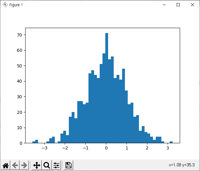
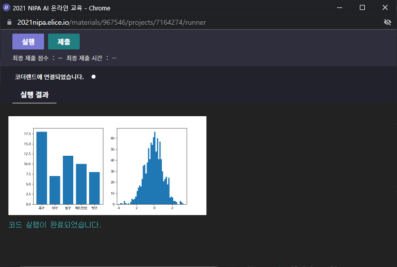
실습✍ 막대 그래프 & 히스토그램
- 막대 그래프의 데이터의 y축 값을 아래 표를 참고하여 변경하고 실행버튼을 눌러 그래프가 어떻게 변하는지 확인해보세요.
| 축구 | 야구 | 농구 | 배드민턴 | 탁구 |
|---|---|---|---|---|
| 13 | 10 | 17 | 8 | 7 |
- hist() 함수에서 bins 값을 200으로 변경하고 실행버튼을 눌러 그래프가 어떻게 변하는지 확인해보세요.
- 주어진 그래프
from elice_utils import EliceUtils
elice_utils = EliceUtils()
import numpy as np
import pandas as pd
import matplotlib.pyplot as plt
import matplotlib.font_manager as fm
fname='./NanumBarunGothic.ttf'
font = fm.FontProperties(fname = fname).get_name()
plt.rcParams["font.family"] = font

# Data set
x = np.array(["축구", "야구", "농구", "배드민턴", "탁구"])
y = np.array([18, 7, 12, 10, 8])
z = np.random.randn(1000)

fig, axes = plt.subplots(1, 2, figsize=(8, 4))

# Bar 그래프
axes[0].bar(x, y)
# 히스토그램
axes[1].hist(z, bins = 50)


# elice에서 그래프 확인하기
fig.savefig("plot.png")
elice_utils.send_image("plot.png")
- 답안 작성하기
# Data set
x = np.array(["축구", "야구", "농구", "배드민턴", "탁구"])
y = np.array([13, 10, 17, 8, 7])
z = np.random.randn(1000)

fig, axes = plt.subplots(1, 2, figsize=(8, 4))

# Bar 그래프
axes[0].bar(x, y)
# 히스토그램
axes[1].hist(z, bins = 200)
- 결과
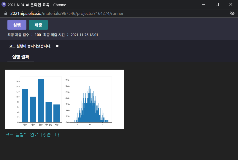
💎Tips!💎
fig, axes = plt.subplots(1, 2, figsize=(8, 4))는 하나의 도화지(figure)에 1*2의 모양으로 그래프를 그린다. 즉, 그래프를 2개 그리고, 가로로 배치한다는 의미!
위 코드에서 axes[0]은 막대 그래프를, axes[1]은 히스토그램을 가리킨다.- matplotlib 의 pyplot으로 그래프를 그릴 때, 기본 폰트는 한글을 지원 No🙅♀️
아래는 한글을 지원하는 나눔바른고딕 폰트로 바꾼 코드이다. 덕분에 막대 그래프에서 축구, 야구, 농구, 배드민턴, 탁구가 올바르게 출력되었다.
import matplotlib.font_manager as fm
fname='./NanumBarunGothic.ttf'
font = fm.FontProperties(fname = fname).get_name()
plt.rcParams["font.family"] = font
3) Matplotlib with Pandas
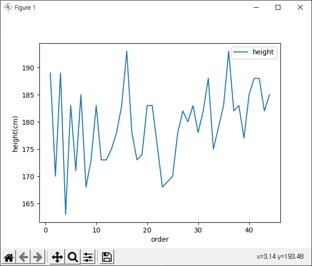
- President_heights.csv
https://github.com/jakevdp/PythonDataScienceHandbook/blob/master/notebooks/data/president_heights.csv 참고
import matplotlib.pyplot as plt
import pandas as pd

df = pd.read_csv("./president_heights.csv") # csv 파일 불러오기

fig, ax = plt.subplots()
ax.plot(df["order"], df["height(cm)"], label="height") # x: 임기 순서, y: 키
ax.set_xlabel("order")
ax.set_ylabel("height(cm)")

print(df)
plt.show()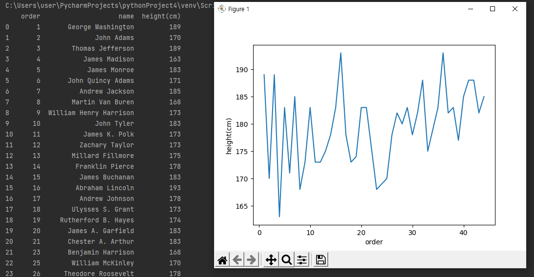
👉 Series 데이터를 x값 또는 y값으로 넣으면서 line graph를 그릴 수 있다.
👉 범례(legend) 추가 ax.legend()
이미 위 코드에 label = "height"로 들어가 있다. 이 범례를 나타내기 위해선 legend 함수를 적어줘야 한다.
- pokemon.csv
https://github.com/jakevdp/PythonDataScienceHandbook/blob/master/notebooks/data/president_heights.csv 참고
import matplotlib.pyplot as plt
import pandas as pd

df = pd.read_csv("./data/pokemon.csv")

# masking 연산
fire = df[(df["Type 1"]=="Fire") | ((df["Type 2"])=="Fire")] # 왜 뒤에꺼는 (( 괄호가 두개? 괄호 하나 빼도 상관 없음! (df["Type 2"]=="Fire")도 OK
water = df[(df["Type 1"]=="Water") | ((df["Type 2"])=="Water")]

fig, ax = plt.subplots()
ax.scatter(fire["Attack"], fire["Defense"], color="r", label="Fire", marker="*", s=50)
ax.scatter(water["Attack"], water["Defense"], color="b", label="Water", s=25) # s는 size! makrer의 크기를 뜻한다.
ax.set_xlabel("Attack")
ax.set_ylabel("Defense")
ax.legend(loc="upper right")

plt.show()
원본에는 color = "R"과 color = "B" 였는데 Error 발생..😢 소문자 "r", "b"로 바꾸니 해결되었다.
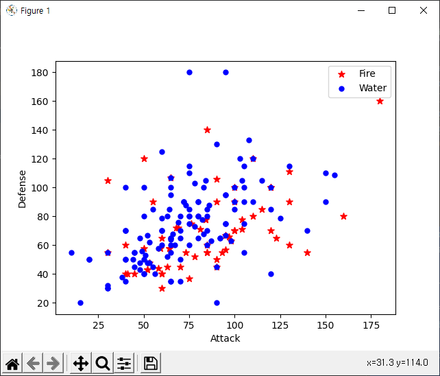
👉 Series 데이터를 x값 또는 y값으로 넣으면서 Scatter graph를 그릴 수 있다.
실습✍ Matplotlib with Pandas
- pokemon.csv 파일을 읽어와 df변수에 데이터프레임으로 저장해보세요.
- 공격 타입에 Fire 속성이 존재하는 데이터들만 추출하여 fire 변수에 저장해보세요.
- 공격 타입에 Water 속성이 존재하는 데이터들만 추출하여 water 변수에 저장해보세요.
- 아래 표를 참고하여 추출한 데이터를 하나의 산점도 그래프로 함께 그리는 코드를 완성해보세요.
| 속성 | fire | water |
|---|---|---|
| x축 | 공격능력치 | 공격능력치 |
| y축 | 방어능력치 | 방어능력치 |
| 색상 | 빨강 | 파랑 |
| 라벨 | Fire | Water |
| 마커 | * | . |
| 크기 | 50 | 25 |
from elice_utils import EliceUtils
import numpy as np
import pandas as pd
import matplotlib.pyplot as plt

elice_utils = EliceUtils()

# 아래 경로에서 csv파일을 읽어서 df 변수에 저장해보세요.
# 경로: "./data/pokemon.csv"
df = pd.read_csv("./data/pokemon.csv")

# 공격 타입 Type 1, Type 2 중에 Fire 속성이 존재하는 데이터들만 추출해보세요.
fire = df[(df["Type 1"]=="Fire") | (df["Type 2"]=="Fire")]
# 공격 타입 Type 1, Type 2 중에 Water 속성이 존재하는 데이터들만 추출해보세요.
water = df[(df["Type 1"]=="Water") | (df["Type 2"]=="Water")]

fig, ax = plt.subplots()
# 표를 참고하여 아래 코드를 완성해보세요.
ax.scatter(fire['Attack'], fire['Defense'],
    marker='*', color="Red", label="Fire", s=50)
ax.scatter(water['Attack'], water['Defense'],
    marker='.', color="Blue", label="Water", s=25)

ax.set_xlabel("Attack")
ax.set_ylabel("Defense")
ax.legend(loc="upper right")

# elice에서 그래프 확인하기
fig.savefig("plot.png")
elice_utils.send_image("plot.png")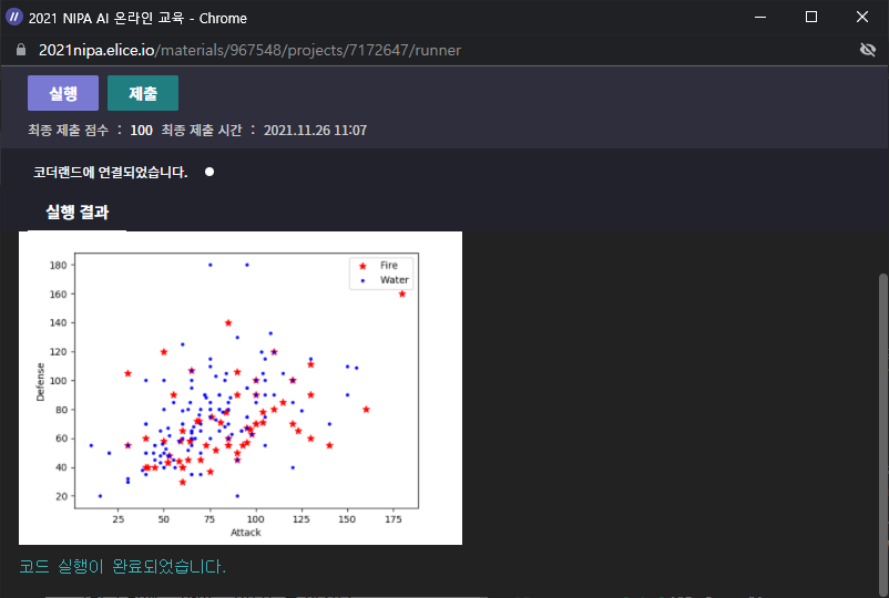
💎 조건은 중괄호 () !
🎈 아직 csv 데이터 불러오는걸 몰라서 그냥 github의 Raw data를 복사하여 가져와 파이참에 .csv 파일을 만들어 붙여넣었다. 아마 다른 방법이 있겠지?