iterrows()
pandas 데이터프레임은 대부분 2차원
이럴때 for문을 사용하면 n번째 지정을 반복하여 가독률 하락
pandas 데이터 프레임으로 반복문을 만들때 iterrows()옵션을 사용하면 편함
받을 때, 인덱스와 내용을 나누어 받는 것만 주의
import googlemaps

gmaps_key = 'AIzaSyA8jgzOnloWB4kiCjIRprlbYhslVD0T14c'
gmaps = googlemaps.Client(key=gmaps_key)

temp = gmaps.geocode('서울영등포경찰서', language='ko')

print(temp[0].get('geometry')['location']['lat'])
print(temp[0].get('geometry')['location']['lng'])
print(temp[0].get('formatted_address'))
37.5260441
126.9008091
대한민국 서울특별시 영등포구 국회대로 608
tmp = temp[0].get('formatted_address')
tmp.split()[2]

crime_station['구별']=np.nan
crime_station['lat']=np.nan
crime_station['lng']=np.nan
crime_station.head()

count = 0
for idx, rows in crime_station.iterrows():# 데이터프레임의 각 행에 대해 인덱스와 해당 행의 데이터를 순차적으로 가져올 수 있습니다.
    station_name = '서울'+ str(idx) + '경찰서'
    tmp = gmaps.geocode(station_name, language='ko')

    tmp_gu=tmp[0].get('formatted_address')

    lat = tmp[0].get('geometry')['location']['lat']
    lng = tmp[0].get('geometry')['location']['lng']

    crime_station.loc[idx, 'lat'] = lat # loc는 데이터프레임에서 특정 위치에 접근하고 값을 설정하는 데 사용되는 메서드
    crime_station.loc[idx, 'lng'] = lng
    crime_station.loc[idx, '구별'] = tmp_gu.split()[2]

    print(count)
    count += 1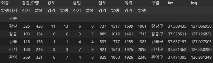
name = [
    crime_station.columns.get_level_values(0)[n]
    + crime_station.columns.get_level_values(1)[n]
    for n in range(0, len(crime_station.columns.get_level_values(0)))
]

crime_station.columns = name
crime_station.head()
저장방법
crime_station.to_csv('../data/02. crime_in_seoul_raw.csv', sep =',', encoding = 'utf-8')crime_anal_gu = pd.pivot_table(crime_station, index = '구별', aggfunc=np.sum)
del crime_anal_gu['lat']
del crime_anal_gu['lng']
crime_anal_gu.head()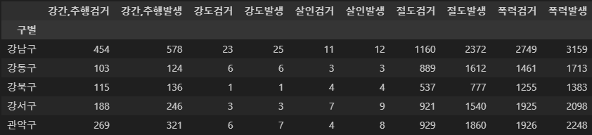
target = ['강간,추행검거율', '강도검거율', '살인 검거율', '절도검거율', '폭력검거율']
get = ['강간,추행검거', '강도검거', '살인검거', '절도검거', '폭력검거']
issue = ['강간,추행발생', '강도발생', '살인발생', '절도발생', '폭력발생']

crime_anal_gu[target] = crime_anal_gu[get].div(crime_anal_gu[issue].values) * 100

crime_anal_gu.head(5)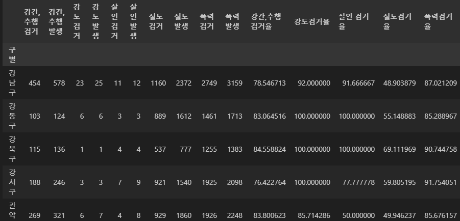
# 정규화, 리스케일링
crime = ['강간,추행발생', '강도발생', '살인발생', '절도발생', '폭력발생']
crime_anal_norm = crime_anal_gu[crime] / crime_anal_gu[crime].max()
crime_anal_norm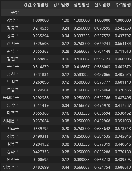
crime_percent = ['강간,추행검거율', '강도검거율', '살인 검거율', '절도검거율', '폭력검거율']
crime_anal_norm[crime_percent] = crime_anal_gu[crime_percent]
crime_anal_norm.head()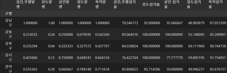
new_CCTV = resutl_CCTV[~resutl_CCTV.index.duplicated(keep='first')]#데이터 넣기 전에 중복 내용 삭제
crime_anal_norm = crime_anal_norm.loc[new_CCTV.index]
crime_anal_norm['인구수'] = new_CCTV['인구수']

crime = ['강간,추행발생', '강도발생', '살인발생', '절도발생', '폭력발생']
crime_anal_norm['5대 범죄 평균 발생 건수'] = np.mean(crime_anal_norm[crime], axis=1) # axis=1은 각 행(row)을 기준으로 평균을 계산하라는 의미입니다.
crime_anal_norm.head()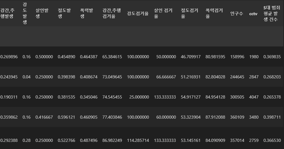
seaborn
import matplotlib.pyplot as plt
import seaborn as sns # seaborn은 matplotlib과 함께 실행된다

get_ipython().run_line_magic('matplotlib','inline') #Jupyter Notebook에서 matplotlib 그래프를 출력하기 위한 매직 명령어
선 그래프
x=np.linspace(0,14,100) #linspace는 주어진 범위를 지정한 개수로 나눈 값을 반환합니다. 이 경우 0부터 14까지의 범위를 100개로 나누어서 값을 생
y1=np.sin(x)
y2 = 2* np.sin(x+0.5)
y3 = 3* np.sin(x+1.0)
y4 = 4* np.sin(x+1.5)

plt.figure(figsize=(10,10))
plt.plot(x,y1,x,y2,x,y3,x,y4) # 주어진 x와 y 값을 연결하여 선 그래프
plt.show()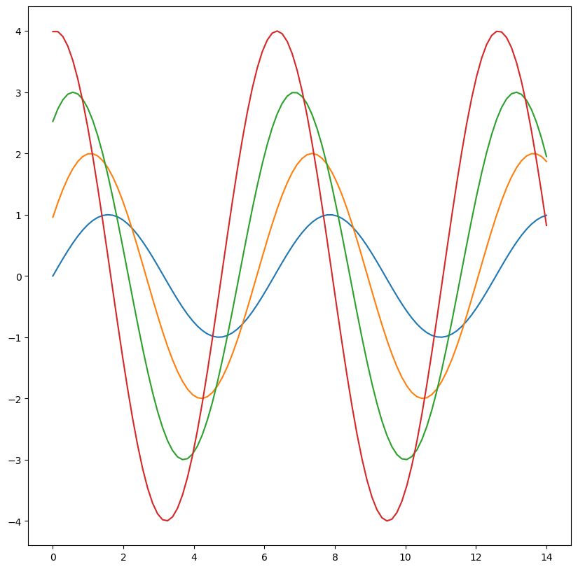
boxpolt
tips = sns.load_dataset('tips') # 실습용 데이터
tips.head(5)

#boxpolt
plt.figure(figsize=(5,5))
sns.boxplot(x=tips['total_bill'])
plt.show()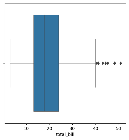
plt.figure(figsize=(6,6))
sns.boxplot(x='day', y ='total_bill', data = tips)
plt.show()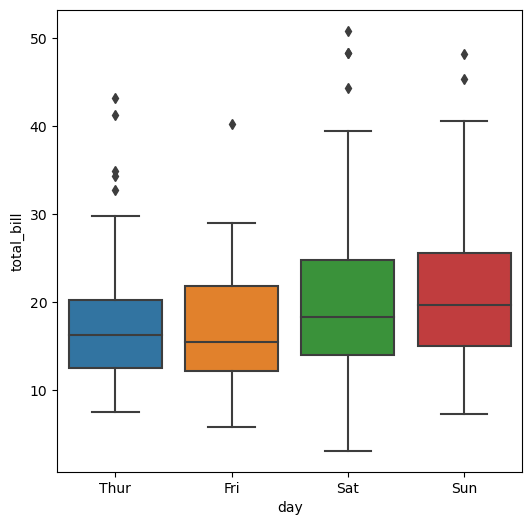
plt.figure(figsize=(6,6))
sns.boxplot(x='day', y='total_bill', hue='smoker', data=tips, palette='Set3') #hue = 구분지을 데이터
plt.show()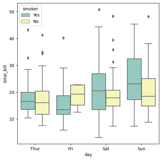
swarmplot
#swarmplot
plt.figure(figsize=(6,6))
sns.boxplot(x='day', y ='total_bill', data = tips)
sns.swarmplot(x='day', y = 'total_bill', data=tips, color='0.7')
plt.show()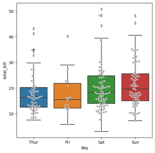
linerplot
#linerplot
sns.set_style('darkgrid')
sns.lmplot(x='total_bill', y='tip', data=tips, hue='smoker')
plt.show()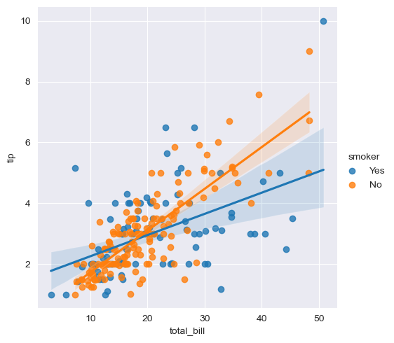
# 또다른 실습 data
flights = sns.load_dataset('flights')
flights.head()

flights=flights.pivot('month','year','passengers')
flights.head(5)
heatmap
plt.figure(figsize=(7,7))
sns.heatmap(flights, annot=True, fmt='d') #annot은 heatmap에 표시되는 각 셀에 숫자 값을 표시할지 여부를 나타내는 매개변수
#fmt은 annot이 True로 설정된 경우에 사용되는 숫자 형식을 지정하는 매개변수입니다. 기본값은 None이며, 일반적으로 숫자 형식 문자열을 지정하여 표시될 숫자의 형식을 지정합니다. 예를 들어 fmt='d'로 설정하면 정수로 표시되고, fmt='.2f'로 설정하면 소수점 이하 두 자리까지 표시
plt.show()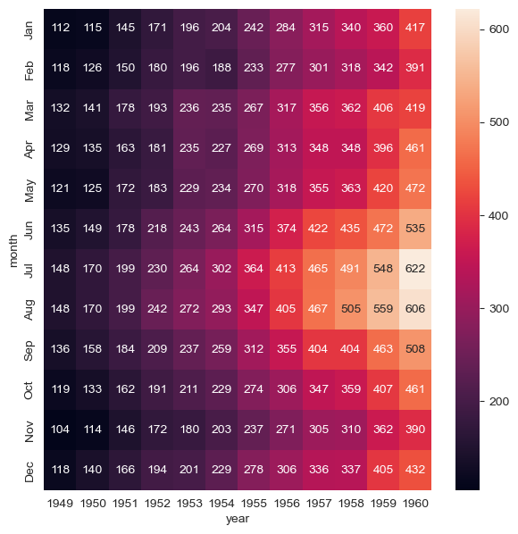
pairplot
#iris data
sns.set(style='ticks') # Seaborn 라이브러리의 스타일 설정 중 하나입니다. ticks 스타일은 그래프의 축에 눈금과 눈금 레이블을 표시하는 전형적인 스타일
#이 스타일을 설정함으로써 Seaborn이 그래프를 그릴 때 눈금과 눈금 레이블이 포함된 보다 깔끔하고 읽기 쉬운 형태로 그려집니다. 축 눈금을 표시함으로써 데이터의 분포와 패턴을 시각적으로 파악하기 쉬워집니다.
iris = sns.load_dataset('iris')
iris.head()

sns.pairplot(iris, hue='species')#다수의 컬럼 비교
plt.show()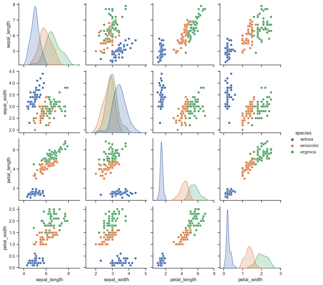
sns.pairplot(
    iris, x_vars=['sepal_width', 'sepal_length'], y_vars=['petal_width', 'petal_length']
)#d원하는 data만 pairplot

plt.show()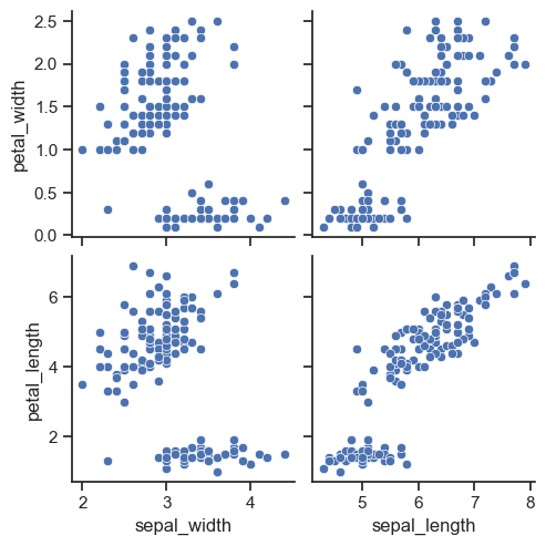
anscombe
#anscombe data
anscombe = sns.load_dataset('anscombe')
anscombe.head(5)
#특정 조건을 만족하는 데이터를 선택하기 위해 사용되는 메소드
다시 이어서..
crime_anal_norm['5대 범죄 평균 검거 건수'] = np.mean(crime_anal_norm[crime_percent], axis=1)
crime_anal_norm.head()
pairplot
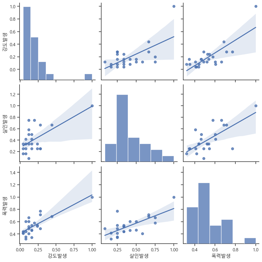
sns.pairplot(
    crime_anal_norm,
    vars=['강도발생', '살인발생', '폭력발생'], #vars는 pairplot 함수에서 그래프를 그릴 때 사용할 변수들을 지정하는 매개변수
    kind='reg', #kind는 그래프의 유형을 지정하는 매개변수 #reg'는 산점도 그래프에 선형 회귀선을 추가하여 그리라는 의미
    size=3
    )
def relation(x1,x2,y1,y2):
    sns.pairplot(
        crime_anal_norm, x_vars=[x1,x2], y_vars=[y1,y2], kind='reg', size=4
    )
    plt.show()

relation('인구수', 'cctv', '살인발생', '강도발생')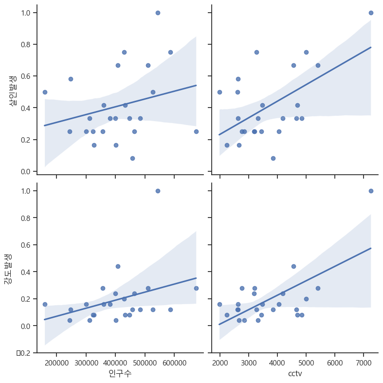
relation('인구수', 'cctv', '살인 검거율', '강도검거율')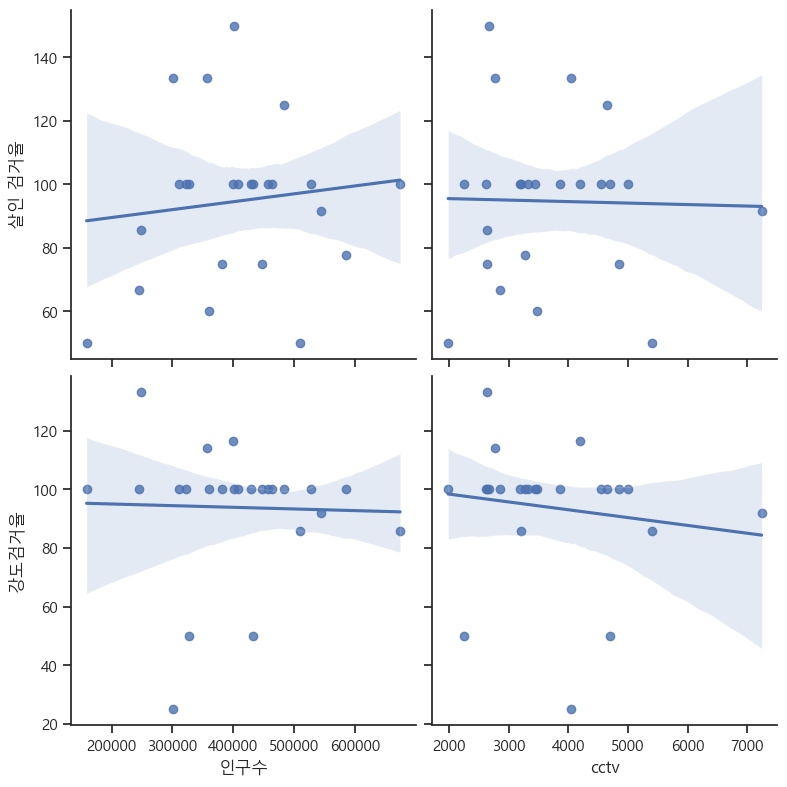

수야는 코린이에서 더 나아갈거야