이산형 데이터
- 정수 값으로 이루어진 데이터 (ex : 동전 던지기, ...)
- 이산형 변수는 가능한 값이 한정되어 있으며 정수 형태로 측정
- 공장에서 제품 불량률, 인구 통계학에서 가구 수 등과 같은 다양한 분야에서 사용됨
- 범주형 데이터와 유사한 면이 있으며 범주형 데이터와 함께 분석하면 더욱 의미 있는 결과를 도출 할 수 있음
lab07
데이터 : college_data.csv
import pandas as pd
import matplotlib.pyplot as plt

data=pd.read_csv('./data/college_data.csv')

# top10perc : 상위 10% 대학생 비율을 나타냄
# unique() : index를 제외한 value 값만 출력
print(data['top10perc'].unique())
print(type(data['top10perc'].unique()))
[23 16 22 60 38 17 37 30 21 44 9 83 19 14 24 25 20 46 12 36 42 15 50 53
18 34 39 28 26 11 67 45 76 5 48 10 87 71 49 32 40 8 47 29 75 27 13 35
1 31 6 55 33 3 58 70 68 56 78 77 41 4 90 43 51 89 7 57 95 52 96 2
65 85 86 62 54 66 79 74 80 81]
<class 'numpy.ndarray'>
막대그래프 시각화
#top10perc 막대 그래프 그리기
plt.figure(figsize=(10,6))
plt.bar(data['private'], data['top10perc'])
plt.title('Bar Chart of Top 10% Scores by Private/Public')
plt.xlabel('Private/Public')
plt.ylabel('Top 10% Scores')
plt.show()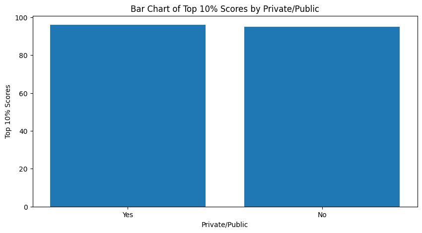
원형 그래프 시각화
# top10perc 원 그래프 그리기
plt.figure(figsize=(10,6))
data.groupby('private')['top10perc'].sum().plot(kind='pie', autopct='%1.1f%%')
plt.title('Pie Chart of Top 10% Scores by Private/Public')
plt.ylabel('')
plt.show()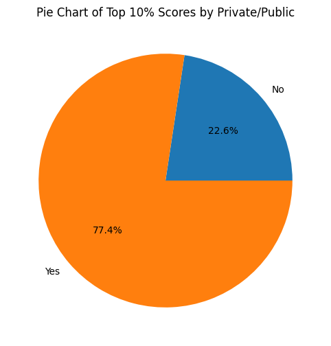
- 그래프 종류와 데이터에 따라 가독성이 높아짐
히스토그램 시각화
# top10perc 히스토그램 그리기
plt.figure(figsize=(10,6))
plt.hist(data['top10perc'], bins=20)
plt.title('Histogram of Top 10% Scores')
plt.xlabel('Top 10% Scores')
plt.ylabel('Frequency')
plt.show()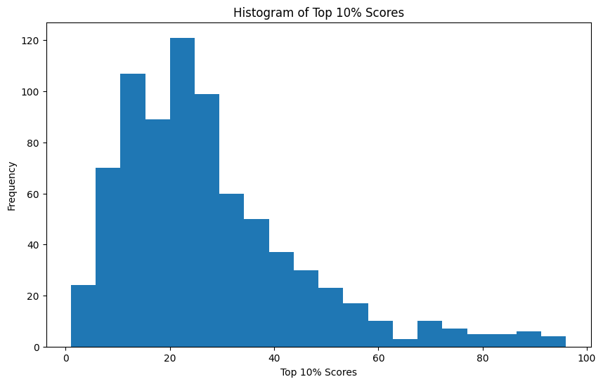
lab08
빈도수
- 각 값이 몇 번 나타나는지를 세는 것
- 이산형 데이터는 값이 유한하고 분리되어 있는 데이터이기 때문에 각 값이 나타난 빈도수를 통해 전체 데이터의 분포를 파악할 수 있음
import numpy as np
import matplotlib.pyplot as plt

# 데이터 생성
data=np.random.randint(1,7,size=100)

# 빈도수 계산
unique, counts=np.unique(data, return_counts=True)

# 막대 그래프 시각화
fig, ax= plt.subplots()
ax.bar(unique,counts)
ax.set_xlabel('Value')
ax.set_ylabel('Frequency')
ax.set_title('Frequency Distribution')
plt.show()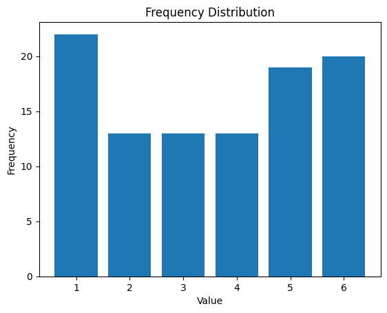
lab09
상대 빈도수
- 빈도수를 전체 데이터 수로 나눈 것, 상대빈도수는 각 값이 전체에서 차지하는 비율을 파악 할 수 있음
- 상대빈도수는 빈도수와 달리 전체 데이터 크기에 상관 없이 각 데이터 값의 비율을 비교 할 수 있으므로 데이터의 특성을 파악하는 데 유용함.
import numpy as np
import matplotlib.pyplot as plt

"""
계산 방법
각 숫자 빈도수 체크
예를 들어 5라는 숫자의 빈도수는 4번
4/11(데이터 총 수) = 0.363636
"""

# 예시 데이터 생성
data=np.array([1,2,2,3,3,4,4,5,5,5,5])

# 데이터에서 각 값의 빈도수 계산
value_counts=np.bincount(data)
print(value_counts)

print(len(data))
relative_frequencies=value_counts/len(data)
print(relative_frequencies)
[0 1 2 2 2 4]
11
[0. 0.09090909 0.18181818 0.18181818 0.18181818 0.36363636]
막대 그래프로 상대빈도수 시각화
# 막대 그래프로 상대빈도수 시각화
plt.bar(np.arange(len(value_counts)), relative_frequencies)
plt.xticks(np.arange(len(value_counts)), np.arange(len(value_counts)))
plt.xlabel('Value')
plt.ylabel('Relative Frequency')
plt.title('Relative Frequency Bar Chart')
plt.show()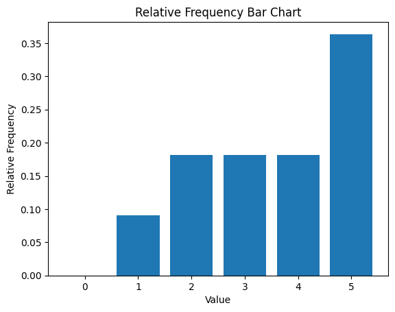
lab10
백분율
- 상대빈도수를 100으로 곱한 값
데이터 생성
import matplotlib.pyplot as plt

labels=['A','B','C','D','E']
percentages=[30,20,15,10,25]
원형 그래프 시각화
fig, ax = plt.subplots()
ax.pie(percentages, labels=labels, autopct='%1.1f%%')
ax.axis('equal')
ax.set_title('Percentages of Categories')
plt.show()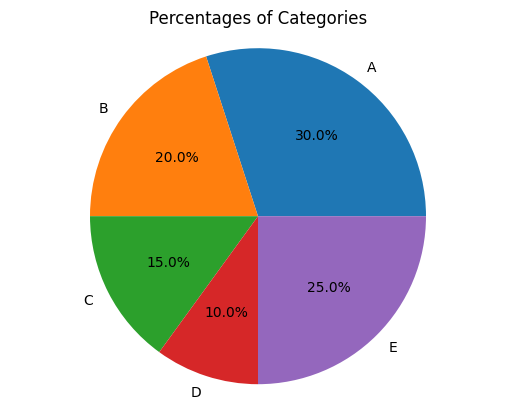
막대 그래프 시각화
fig, ax = plt.subplots()
ax.bar(labels, percentages)
ax.set_xlabel('Categories')
ax.set_ylabel('Percentages')
ax.set_title('Percentages of Categories')
plt.show()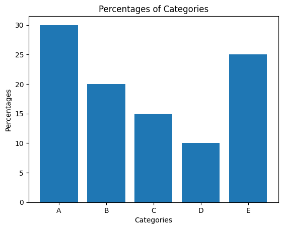
이산형 데이터 분석 시 고려해야 할 사항(빈도수, 비율 등)
막대 그래프
- 각 값의 빈도수를 막대로 표현
파이차트
- 각 값의 상대빈도수를 원형으로 나타내는 그래프, 전체에서 차지하는 비율을 파악
히스토그램
- 이산형 데이터의 분포를 파악할 때 사용하는 그래프 데이터를 구간으로 나눔
- 각 구간에 속한 값의 빈도수를 히스토그램 나타냄