범주형 데이터
- 명목형 데이터와 순서형 데이터로 나눌 수 있음
- 정량적인 측정이 불가하며 특정 카테고리에 속하는 경우가 많음
1. 명목형 데이터
- 순서와 관련 없이 서로 다른 카테고리에 속하는 데이터
- 성별, 혈액형, 종교 등이 대표적인 예시
- 범주형 데이터에서 가장 간단한 형태, 빈도수와 백분율로 요약 할 수 있음
2. 순서형 데이터
- 서로 다른 카테고리에 속하면서 일정한 순서나 계층 구조를 가지는 데이터
- 학생의학년, 만족도조사에서의 만족도 수준, 경력 등이 순서형 데이터의 대표적인 예시
- 각 카테고리의 순서나 계층구조를 고려하여 빈도수, 백분율, 중앙값, 사분위 수 등으로 요약 할 수 있음
lab11
성별에 따른 생존자 수
data : titanic_df
import pandas as pd
import seaborn as sns
import matplotlib.pyplot as plt

# 데이터 불러오기
titanic_df=pd.read_csv("./data/Titanic_data.csv")
# 성별에 따른 생존률 계산
survived_by_sex=titanic_df.groupby('Sex')['Survived'].mean()
print(survived_by_sex)출력
Sex
female    0.742038
male      0.188908
Name: Survived, dtype: float64
데이터 막대그래프 시각화
# 막대 그래프로 시각화
plt.figure(figsize=(6, 4))
sns.barplot(x=survived_by_sex.index, y=survived_by_sex.values)
plt.title('Survival Rate by Sex')
plt.xlabel('Sex')
plt.ylabel('Survival Rate')
plt.show()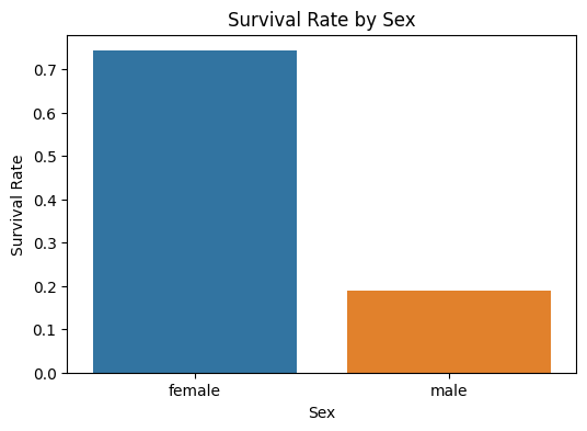
탑승 항구에 따른 탑승자 수 파악
# Embarked
survived_embarked = titanic_df.groupby('Embarked')['Survived'].sum()
dead_embarked = titanic_df.groupby('Embarked')['Survived'].count() - survived_embarked
print(survived_embarked,'\n',dead_embarked)
출력
Embarked
C     93
Q     30
S    217
Name: Survived, dtype: int64
Embarked
C     75
Q     47
S    427
Name: Survived, dtype: int64
막대 그래프 시각화
# 그래프 그리기
plt.figure(figsize=(10, 6))
plt.bar(survived_embarked.index, survived_embarked.values, color='g', alpha=0.5, label='Survived')
plt.bar(dead_embarked.index, dead_embarked.values, bottom=survived_embarked.values, color='r',
        alpha=0.5, label='Dead')
plt.title('Survivors by Embarked')
plt.xlabel('Embarked')
plt.ylabel('Number of passengers')
plt.legend()
plt.show()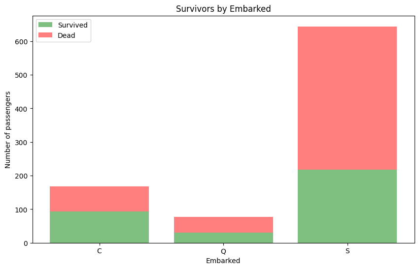
객실 등급에 따른 생존자 수
# 객실 등급에 따른 생존자 수
survived_class= titanic_df.groupby('Pclass')['Survived'].sum()
dead_class=titanic_df.groupby('Pclass')['Survived'].count()-survived_class
막대 그래프 시각화
# 그래프 그리기
plt.figure(figsize=(10, 6))
plt.bar(survived_class.index, survived_class.values, color='g', alpha=0.5, label='Survived')
plt.bar(dead_class.index, dead_class.values, bottom=survived_class.values, color='r', alpha=0.5, label='Dead')
plt.title('Survivors by Class')
범주형 데이터 분석 시 고려해야 할 사항
빈도수
- 각 항목이 나타난 횟수를 살핌
비율
- 각 항목의 빈도수를 전체 데이터 수로 나눈 값
카이제곱 검정
- 두 개 이상의 범주형 변수가 서로 관련이 있는지 검증하는 데 사용됨
ex) 성별과 직업 간의 관련이 있는지를 카이제곱 검정을 통해 검증할 수 있음
lab12
카이제곱 검정 해석에서 나온 용어
귀무가설
- 통계적 검정에서 기본적으로 세워지는 가설, 귀무가설으 검정대상이 되는 모집단의 특성에 대한 가설이며 일반적으로 무의미한 차이가 존재한다는 가정으로 설정
자유도
기댓값
- 특정한 조건에서 어떤 사건이 발생할 것으로 예상되는 평균적인 값
-카이제곱 검정에서 기댓값은 관측된 분할표에서 각 카테고리가 기대할 수 있는 빈도의 값을 의미함, 이 값은 특정한 가정에 따라 계산됨
카이제곱 검정 간단한 시각화
import numpy as np
from scipy.stats import chi2_contingency

# 예시 데이터 생성
observed_values=np.array([[10,20,30],[6,15,9]])

# 카이제곱 검정 수행
chi2,p_value,dof,expected_values=chi2_contingency(observed_values)

# 결과 출력
print(f'카이제곱 통계량:{chi2}')
print(f'p-value:{p_value}')
print(f'자유도:{dof}')
print(f'기대값:{expected_values}')
출력
카이제곱 통계량:3.3997252747252746
p-value:0.18270861966696167
자유도:2
기대값:[[10.66666667 23.33333333 26.        ]
 [ 5.33333333 11.66666667 13.        ]]
카이제곱 통계량
- 변수들 간읜 관계를 나타내는 수치임
- 일반적으로 이 값이 클수록 두 변수 간의 관련성이 강해짐. 하지만 이 값이 유의미한지는 p-value와 함께 고려해야함
p-value
- 변수들 간의 관계가 우연히 발생할 확률을 나타냄
- 이 값이 작을수록 두 변수 간의 관련성이 유의미하다고 판단함
- 일반적으로 0.05이하면 유의미한 관련성이 있다고 판단함. 하지만 이 기준은 연구의 목적, 데이터의 특성 등에 따라 다를 수 있음
자유도
- 검정에서 사용된 통계적 자유도의 수를 나타냄
- 이 경우에는 2개의 범주형 변수 중 하나의 변수가 3개의 범주를, 다른 하나의 변수가 2개의 범주를 가짐
- rxc 행렬의 경우 : (r-1) x (c-1) 로 계산됨
기대값
- 두 변수들 간의 관계가 없을 때 예상되는 빈도수를 나타내는 값
- 검정 통계량의 계산에 사용되며 검정의 유효성을 검증하는 데에도 사용됨
- 해당 결과에서는 첫 번째 변수의 두 범주에서 두 번째 변수의 각 범주에 대한 예상 빈도수가 나와있음
해당 결과 값에 대한 해석
- 해당 결과를 종합해보면 검정 결과가 유의미하지 않음
- 두 변수 간의 관련성이 우연히 발생한 것으로 보임
0522
lab01
범주형 데이터 분석 시 고려해야할 사항
분할표
- 각 카테고리 별로 데이터의 빈도수를 나타내는 표
- 행과 열로 구성되며 각 카테고리에 대한 빈도수가 셀에 나타남
예시

import seaborn as sns
import matplotlib.pyplot as plt

# 데이터 생성
data=[[5,10,15],[10,15,20]]

# seaborn을 이용한 히트맵 시각화
sns.heatmap(data,cmap='YlGnBu',annot=True,fmt='d',cbar=False)

plt.show()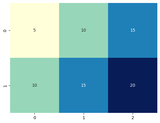
상관분석
- 범주형 변수 간의 상관관계를 파악하기 위해 사용
ex) 학생의 성적과 출석 여부 간의 관계를 파악을 위해 사용
로지스틱 회귀분석
- 범주형 종속변수와 연속형 또는 범주형 독립변수 간의 관계를 파악하기 위해 사용
ex) 고객의 구매 여부와 광고 비용 간의 관계를 파악하기 위해 사용
순서형 데이터
- 서로 다른 카테고리에 속하면서 일정한 순서나 계층 구조를 가지는 데이터
- 명목형 데이터와 달리 순서나 계층 구조가 있는 점에서 차이가 있음
- 서열변수로 취급되며 열변수는측정 가능한 순서나 계층구조가 있는 변수로, 순서나 계층구조를 고려하여 적절한 분석방법을 선택해야함
lab02
import pandas as pd
import matplotlib.pyplot as plt

# 데이터 불러오기
data=pd.read_csv('./data/college_data.csv')

data['admisson_level']=pd.qcut(data['top10perc'],q=4,labels=['very_low','low','high','very_high'])
출력
    private   apps  accept  enroll  top10perc  top25perc  f_undergrad  \
0       Yes   1660    1232     721         23         52         2885
1       Yes   2186    1924     512         16         29         2683
2       Yes   1428    1097     336         22         50         1036
3       Yes    417     349     137         60         89          510
4       Yes    193     146      55         16         44          249
..      ...    ...     ...     ...        ...        ...          ...
772      No   2197    1515     543          4         26         3089
773     Yes   1959    1805     695         24         47         2849
774     Yes   2097    1915     695         34         61         2793
775     Yes  10705    2453    1317         95         99         5217
776     Yes   2989    1855     691         28         63         2988

     p_undergrad  outstate  room_board  books  personal  phd  terminal  \
0            537      7440        3300    450      2200   70        78
1           1227     12280        6450    750      1500   29        30
2             99     11250        3750    400      1165   53        66
3             63     12960        5450    450       875   92        97
4            869      7560        4120    800      1500   76        72
..           ...       ...         ...    ...       ...  ...       ...
772         2029      6797        3900    500      1200   60        60
773         1107     11520        4960    600      1250   73        75
774          166      6900        4200    617       781   67        75
775           83     19840        6510    630      2115   96        96
776         1726      4990        3560    500      1250   75        75

     s_f_ratio  perc_alumni  expend  grad_rate admisson_level
0         18.1           12    7041         60            low
1         12.2           16   10527         56            low
2         12.9           30    8735         54            low
3          7.7           37   19016         59      very_high
4         11.9            2   10922         15            low
..         ...          ...     ...        ...            ...
772       21.0           14    4469         40       very_low
773       13.3           31    9189         83           high
774       14.4           20    8323         49           high
775        5.8           49   40386         99      very_high
776       18.1           28    4509         99           high

[777 rows x 19 columns]
qcut()
- 데이터를 일정 구간으로 나누는 함수
- 구간 수나 구간 범위를 지정하여 나눌 수 있음
# 그래프 그리기
plt.figure(figsize=(10, 6))
plt.bar(data['admisson_level'].value_counts().index, data['admisson_level'].value_counts().values)
plt.title('Number of Colleges by Admission Level')
plt.xlabel('Admission Level')
plt.ylabel('Number of Colleges')
plt.show()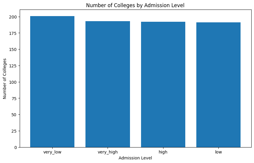
very_low
- 수준에 해당하는 학교의 수가 가장 많음
very_high
- 수준에 해당하는 학교의 수가 가장 적음