✏️ 반응형 애니메이션 모달 예제
html 구조
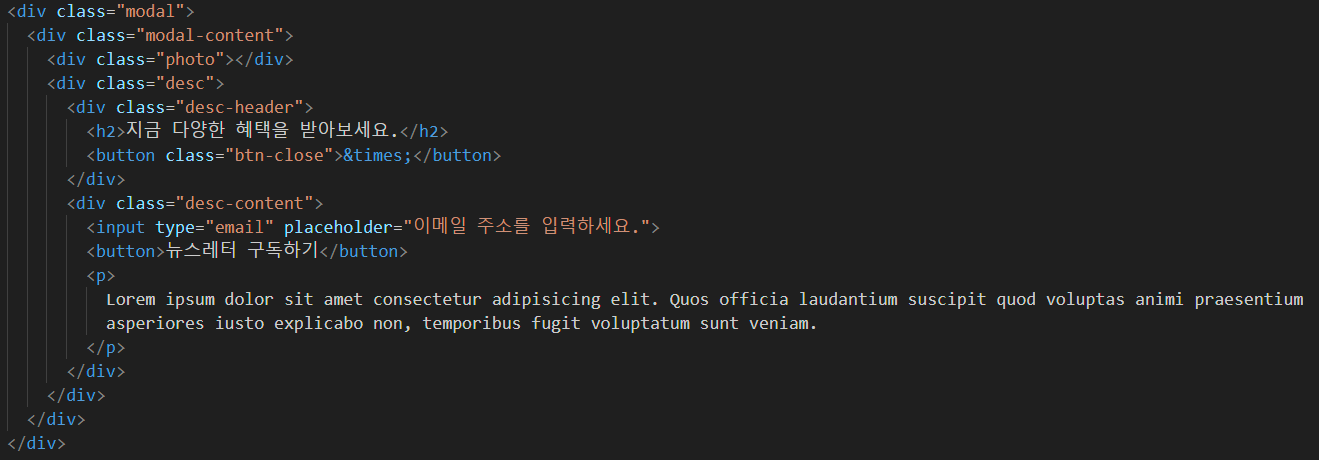
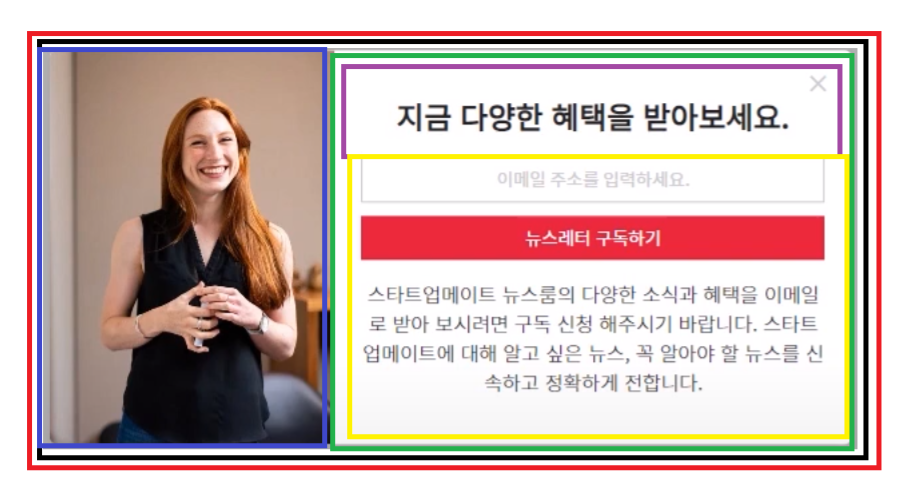
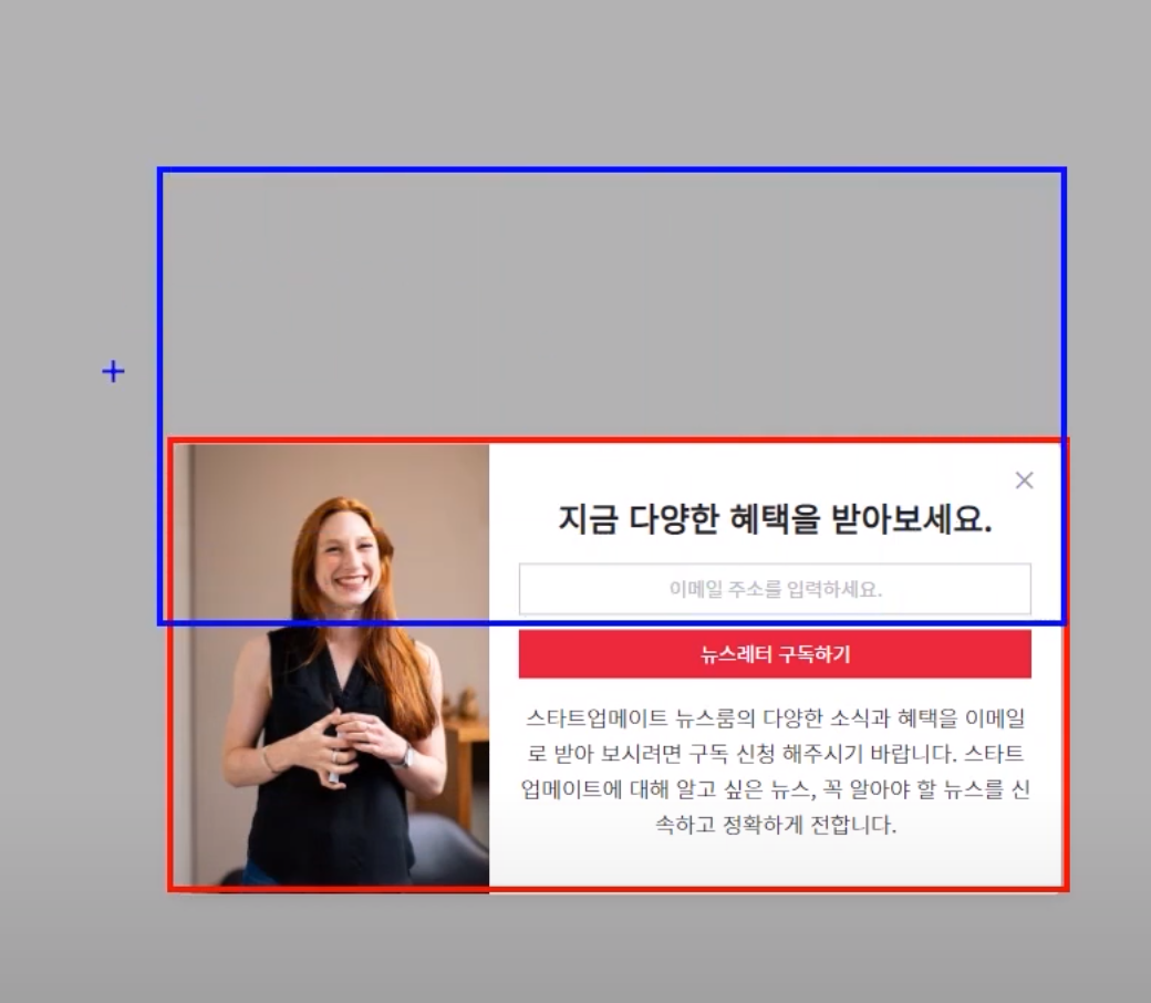
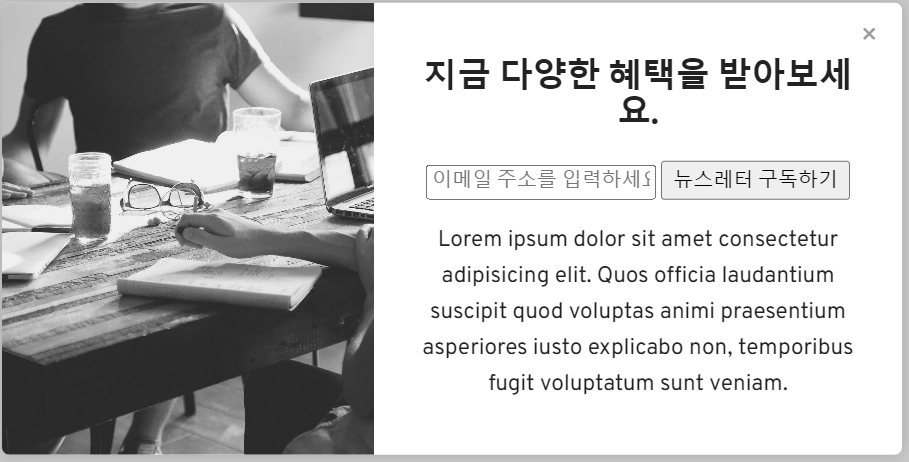
빨간색 테두리 부분(.modal)
검은색 테두리로 화면 가운데 정렬을 담당한다.
검은색 테두리 부분(.modal-content)
모달 전체 컨텐트들을 포함하는 div이다.
파란색 테두리 부분(.photo)
이미지 부분 div
초록색 테두리 부분(.desc)
오른쪽 컨텐츠를 포함하는 div
초록색 테두리 부분(.desc-header)
오른쪽 컨텐츠중 헤더부분을 포함하는 div, 닫기 포함
초록색 테두리 부분(.desc-content)
input, button, p태그를 포함하는 div
📝 CSS
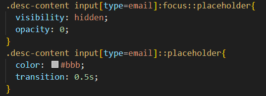
desc-content 클래스에서 하위 태그 중 input이고 type이 email인 것을 찾고 focus된다면 placeholder를 안보이게 한다.
여기서 placeholder사용할 때 더블클론을 사용해야 한다.
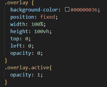
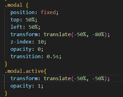
모달창은 처음에 안보여야 한다. 그래서 opacity를 0로 준다. 만약 modal창의 active된다면 opacity를 1로 준다. overlay도 마찬가지로 해준다.
우리는 이제 modal, overlay에 Jquery를 통해 active를 넣고 뺴고를 해주면 된다.
 파란색 테두리 위치에 있다가 active되면 중앙으로 이동하게 하면 된다.
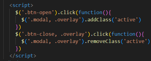
해당 스크립트로 모달창,overlay에 active클래스를 추가 삭제함으로서 모달을 키고끄고를 할 수 있다.
📝 CSS정리
전체 모든 font-family 지정하는 방법?🤔
body {
        font-family: 'Overpass', sans-serif;
        box-sizing: border-box;
      }
이렇게 하게되면 본문 텍스트는 변경되나 input이나, button태그 텍스트는 변경이 되지 않는다.
* {
        font-family: 'Overpass', sans-serif;
        box-sizing: border-box;
      }
이렇게 해주면 전체 다 적용된다.
modal은 항상 fixed를 해주어야 한다?🤔
.modal {
        position: fixed;
        top: 50%;
        left: 50%;
        transform: translate(-50%, -50%);
      }
absolute보단 fixed를 해주어야 한다. 고정되어야 하니까
position속성이 둘 다 있을 때에는 늦게 나온 것이 우선순위를 가진다🤔
.overlay가 .modal을 덮는다. 왜냐하면 overlay가 modal 뒤에 나오기 때문이다.
그래서 modal에 zindex를 넣어주어야 한다.
.modal {
        position: fixed;
        top: 50%;
        left: 50%;
        transform: translate(-50%, -50%);
        z-index: 10;
      }
position => absolute보다 relative가 우선한다. 같은 absolute or fixed일 때에는 늦게 나온 것이 우선한다.🤔
display:flex를 하면 자연스럽게 가로배치가 된다. 🤔
또한 modal-content를 1:2 비율로 나누고 싶다면 flex를 사용하면 된다.
.modal-content{
        width: 600px;
        background-color: #fff;
        border-radius: 5px;
        box-shadow: 0 0 10px rgba(0, 0, 0, 0.171);
        display: flex;
      }
.photo {
        flex: 2;
      }
      .desc {
        flex: 3;
      }
2:3비율로 한다.
border-radius를 했는데 이미지를 추가하니 border-radius한 게 사라진다. 🤔
.modal-content{
        width: 600px;
        background-color: #fff;
        border-radius: 5px;
        box-shadow: 0 0 10px rgba(0, 0, 0, 0.171);
        display: flex;
        overflow: hidden;
      }
overflow-hidden으로 넘친부분 자르면 된다.
btn-close의 position:absolute를 했는데 왜 정상적으로 작동할까? 🤔
.modal의 position이 fixed이므로 해당 modal 기준으로 좌표값을 얻는다.
button 태그와 input태그는 왜 한 라인에 있을까? 🤔
button과 input은 inline-block요소이기 때문이다. 한 줄로 나타내기 위해선 block으로 변경해주면 된다.
.desc-content input[type=email]{
        display: block;
        width: 100%;
      }
      .desc-content button{
        display: block;
        width: 100%;
      }
block요소는 자동으로 너비가 100%라고 했는데 input이랑 button은 왜 width 100%주는가? 🤔
input이랑 button은 예외적으로 추가해줘야 한다.
flex-direction은 기본값은 row다. 반응형 웹에서는 어떻게 해야할까?🤔
@media (max-width: 768px){
        .modal-content{
          flex-direction: column;
        }
      }
미디어쿼리를 사용해서 flex-direction을 column으로 변경한다.
반응형에서 이미지의 높이값이 제대로 나오지 않는다. height를 줘도 안되는 이유?🤔
.photo{
          height: 250px;
          /* flex-basis: 250px; */ => 이걸로 해야함
        }
photo는 flex로 자리를 잡아놨기 때문에 height로 조정하는 것이 아닌 flex로 조정해야한다.
flex: 1이란?🤔
flex-grow : 1, flex-shrink : 0, flex-basis: auto;
위에 3개를 하나의 단축 속성으로 가지고 있다.
그래서 photo를 flex :1을 하였고 flex-basis:0인 상태였기 때문에 flex-basis를 바꿔준다.
뉴스레터 구독하기 버튼을 누르면 모달창이 떠야하는데 opacity가 0인 overlay에 가려져서 클릭이 안된다. 해결하는 방법은?🤔
.overlay {
        background-color: #00000036;
        position: fixed;
        width: 100%;
        height: 100vh;
        top: 0;
        left: 0;
        opacity: 0;
        transition: 0.5s;
        pointer-events: none;
      }
pointer-events:none을 해준다. 마우스 이벤트를 안받겠다는 소리이다.
다른방법은 visibility를 사용하는 것이다.
.overlay {
        background-color: #00000036;
        position: fixed;
        width: 100%;
        height: 100vh;
        top: 0;
        left: 0;
        opacity: 0;
        transition: 0.5s;
        /* pointer-events: none; */
        visibility: hidden;
      }
      .overlay.active{
        /* pointer-events: all; */
        visibility: visible;
        opacity: 1;
      }
📝 전체코드
<!DOCTYPE html>
<html lang="ko">
<head>
<meta charset="UTF-8">
<meta name="viewport" content="width=device-width, initial-scale=1.0">
<title>이미지맵 만들기</title>
<script src="https://code.jquery.com/jquery-3.5.1.min.js"></script>
<style>
@import url('https://fonts.googleapis.com/css2?family=Overpass&family=Source+Code+Pro:wght@200;300;400;500&display=swap');
* {
font-family: 'Overpass', sans-serif;
box-sizing: border-box;
}
body{
font-weight: 300;
color: #222;
font-size: 15px;
line-height: 1.6em;
}
.modal {
position: fixed;
top: 50%;
left: 50%;
transform: translate(-50%, -50%) scale(0.5);
z-index: 10;
opacity: 0;
transition: 0.5s;
}
.modal.active{
transform: translate(-50%, -50%) scale(1);
opacity: 1;
}
.modal-content{
width: 600px;
background-color: #fff;
border-radius: 5px;
box-shadow: 0 0 10px rgba(0, 0, 0, 0.171);
display: flex;
overflow: hidden;
}
.modal-content > div{
padding: 20px;
}
.photo {
flex: 2;
background: url(images/background-location.jpg) no-repeat center center;
background-size: cover;
}
.desc {
flex: 3;
text-align: center;
}
.overlay {
background-color: #00000036;
position: fixed;
width: 100%;
height: 100vh;
top: 0;
left: 0;
opacity: 0;
transition: 0.5s;
/* pointer-events: none; */
visibility: hidden;
}
.overlay.active{
/* pointer-events: all; */
visibility: visible;
opacity: 1;
}
.btn-close{
position: absolute;
top: 10px;
right: 10px;
background-color: transparent;
border: none;
font-size: 18px;
color: #999;
cursor: pointer;
}
.btn-close:hover{
color:#000;
}
.desc-content input[type=email]:focus::placeholder{
visibility: hidden;
opacity: 0;
}
.desc-content input[type=email]::placeholder{
color: #bbb;
transition: 0.5s;
}
.desc-content input[type=email]{
display: block;
width: 100%;
text-align: center;
padding: 7px;
margin-bottom: 10px;
border: 1px solid #ccc;
outline: none;
}
.desc-content button{
display: block;
width: 100%;
border: none;
background-color: crimson;
color: #fff;
cursor: pointer;
padding :7px;
outline: none;
}
.desc-header{
font-size: 14px;
}
@media (max-width: 768px){
.modal-content{
flex-direction: column;
width: 100%;
}
.modal-content > div{
width: 350px;
}
.photo{
height: 250px;
/* flex-basis: 250px; */
}
}
</style>
</head>
<body>
<button class="btn-open">뉴스레터 구독하기</button>
<div class="modal">
<div class="modal-content">
<div class="photo"></div>
<div class="desc">
<div class="desc-header">
<h2>지금 다양한 혜택을 받아보세요.</h2>
<button class="btn-close">×</button>
</div>
<div class="desc-content">
<input type="email" placeholder="이메일 주소를 입력하세요.">
<button>뉴스레터 구독하기</button>
<p>
Lorem ipsum dolor sit amet consectetur adipisicing elit. Quos officia laudantium suscipit quod voluptas animi praesentium asperiores iusto explicabo non, temporibus fugit voluptatum sunt veniam.
</p>
</div>
</div>
</div>
</div>
<div class="overlay">
</div>
<script>
$('.btn-open').click(function(){
$('.modal, .overlay').addClass('active')
})
$('.btn-close, .overlay').click(function(){
$('.modal, .overlay').removeClass('active')
})
</script>
</body>
</html>