이번 포스팅에서는 초보자 기준으로 뷰티파이 사용법에 대해서 알아본다.
Vue.js에 유용하며 Nuxt.js에서는 기본으로 탑재 되어 있는 Vuetify(뷰티파이). 그중에서도 수많은 UI컴포넌트중 <v-btn> 하나만 잘써도 UI를 이쁘게 꾸밀 수 있다. 그 방법을 자세하게 알아보자.
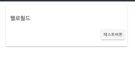
기본 사용은 <v-btn>텍스트</v-btn>의 형태로 아래와 같은 형태로 그려진다.
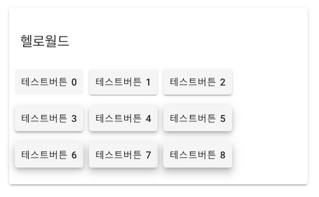
elevation프로퍼티를 통해서 그림자를 조절 할 수 있다. 기본값은 2이다.
<template>
  <v-row justify="center" align="center">
    <v-col cols="12" sm="8" md="6">
      <v-card class="py-4 justify-center">
        <v-card-title>헬로월드</v-card-title>
        <v-card-actions>
          <v-btn elevation="0">테스트버튼 0</v-btn>
          <v-btn elevation="1">테스트버튼 1</v-btn>
          <v-btn elevation="2">테스트버튼 2</v-btn>
        </v-card-actions>
        <v-card-actions>
          <v-btn elevation="3">테스트버튼 3</v-btn>
          <v-btn elevation="4">테스트버튼 4</v-btn>
          <v-btn elevation="5">테스트버튼 5</v-btn>
        </v-card-actions>
        <v-card-actions>
          <v-btn elevation="6">테스트버튼 6</v-btn>
          <v-btn elevation="7">테스트버튼 7</v-btn>
          <v-btn elevation="8">테스트버튼 8</v-btn>
        </v-card-actions>
      </v-card>
    </v-col>
  </v-row>
</template>
엘리베이션 값을 0~8까지 지정 해본 결과 (최대 24까지 가능)
그리고 컴포넌트 attribute로 tile, depressed, icon, outlined, plain, raised, rounded, fab, text 를 지정 할 수있다. 예제 코드는 아래와 같다.
<template>
  <v-row justify="center" align="center">
    <v-col cols="12" sm="8" md="6">
      <v-card class="py-4 justify-center">
        <v-card-title>헬로월드</v-card-title>
        <v-row align="center">
          <v-col cols="4" align="center">
            <v-btn tile>(tile)</v-btn>
          </v-col>
          <v-col cols="4" align="center">
            <v-btn depressed>(depressed)</v-btn>
          </v-col>
          <v-col cols="4" align="center">
            <v-btn icon>(icon)</v-btn>
          </v-col>
          <v-col cols="4" align="center">
            <v-btn outlined>(outlined)</v-btn>
          </v-col>
          <v-col cols="4" align="center">
            <v-btn plain>(plain)</v-btn>
          </v-col>
          <v-col cols="4" align="center">
            <v-btn raised>(raised)</v-btn>
          </v-col>
          <v-col cols="4" align="center">
            <v-btn rounded>(rounded)</v-btn>
          </v-col>
          <v-col cols="4" align="center">
            <v-btn fab>(fab)</v-btn>
          </v-col>
          <v-col cols="4" align="center">
            <v-btn text>(text)</v-btn>
          </v-col>
        </v-row>
      </v-card>
    </v-col>
  </v-row>
</template>
실행 결과 이다.
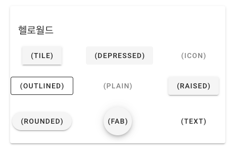
타일은 모서리가 꽉차고 디프레스는 눌려져 있고 아웃라인은 외곽선이 있고 라운디드는 둥글둥글 하다..
다른건 영어 단어 그대로 라서 직관적으로 이해가 될 수 있는데 raised는 뭘까? 버튼을 눌렀을때 그림자가 주위를 뚫고 올라 온다.
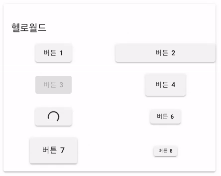
그리고 7가지 옵션 Attribute를 지정 가능하다.
block, disabled, large, loading, small, x-large, x-small
예제 코드는 아래와 같다.
<template>
  <v-row justify="center" align="center">
    <v-col cols="12" sm="8" md="6">
      <v-card class="py-4 justify-center">
        <v-card-title>헬로월드</v-card-title>
        <v-row align="center">
          <v-col cols="6" align="center">
            <v-btn>버튼 1</v-btn>
          </v-col>
          <v-col cols="6" align="center">
            <v-btn block>버튼 2</v-btn>
          </v-col>
          <v-col cols="6" align="center">
            <v-btn disabled>버튼 3</v-btn>
          </v-col>
          <v-col cols="6" align="center">
            <v-btn large>버튼 4</v-btn>
          </v-col>
          <v-col cols="6" align="center">
            <v-btn loading>버튼 5</v-btn>
          </v-col>
          <v-col cols="6" align="center">
            <v-btn small>버튼 6</v-btn>
          </v-col>
          <v-col cols="6" align="center">
            <v-btn x-large>버튼 7</v-btn>
          </v-col>
          <v-col cols="6" align="center">
            <v-btn x-small>버튼 8</v-btn>
          </v-col>
        </v-row>
      </v-card>
    </v-col>
  </v-row>
</template>
실행결과이다.
그리고 color attribute 가 지정 가능하며, 버튼 텍스트 대신에 머티리얼 디자인 아이콘을 사용 하는 것도 가능 하다. 물론 svg를 이용 한다면 더욱더 멋질 것이다.
<template>
  <v-row justify="center" align="center">
    <v-col cols="12" sm="8" md="6">
      <v-card class="py-4 justify-center">
        <v-card-title>헬로월드</v-card-title>
        <v-row align="center">
          <v-col cols="4" align="center">
            <v-btn color="pink">버튼 1</v-btn>
          </v-col>
          <v-col cols="4" align="center">
            <v-btn color="indigo">버튼 2</v-btn>
          </v-col>
          <v-col cols="4" align="center">
            <v-btn color="green">버튼 3</v-btn>
          </v-col>
          <v-col cols="4" align="center">
            <v-btn color="pink">
              <v-icon>mdi-star</v-icon>
            </v-btn>
          </v-col>

          <v-col cols="4" align="center">
            <v-btn color="indigo"> <v-icon>mdi-cached</v-icon></v-btn>
          </v-col>
          <v-col cols="4" align="center">
            <v-btn color="green"> <v-icon>mdi-thumb-up</v-icon></v-btn>
          </v-col>

          <v-col cols="4" align="center">
            <v-btn dark color="pink">
              <v-icon>mdi-star</v-icon>
            </v-btn>
          </v-col>
          <v-col cols="4" align="center">
            <v-btn dark color="indigo"> <v-icon>mdi-cached</v-icon></v-btn>
          </v-col>
          <v-col cols="4" align="center">
            <v-btn dark color="green"> <v-icon>mdi-thumb-up</v-icon></v-btn>
          </v-col>

          <v-col cols="4" align="center">
            <v-btn dark icon color="pink">
              <v-icon>mdi-star</v-icon>
            </v-btn>
          </v-col>
          <v-col cols="4" align="center">
            <v-btn dark icon color="indigo"> <v-icon>mdi-cached</v-icon></v-btn>
          </v-col>
          <v-col cols="4" align="center">
            <v-btn dark icon color="green">
              <v-icon>mdi-thumb-up</v-icon></v-btn
            >
          </v-col>
        </v-row>
      </v-card>
    </v-col>
  </v-row>
</template>
실행 결과
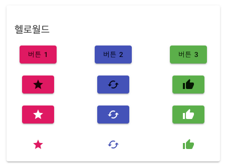
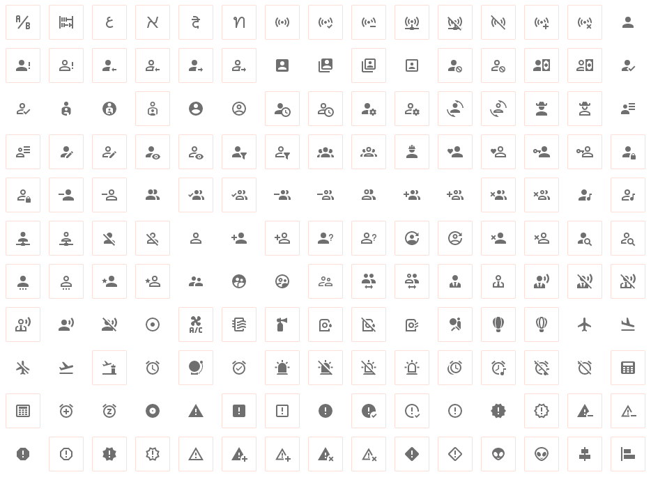
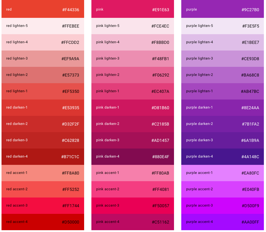
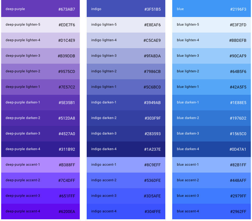
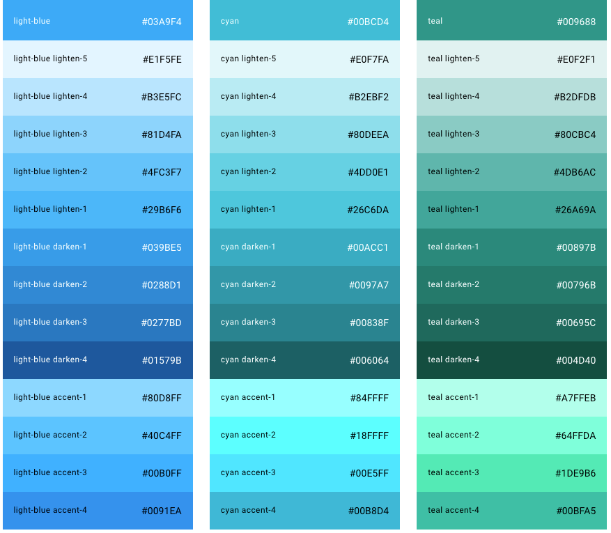
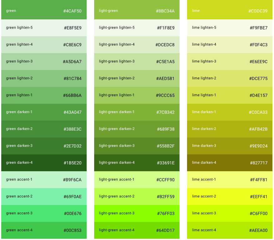
아이콘은 material design icons 닷컴을 참고 하면 수천가지가 있다.
dark 키워드를 주면 글씨가 흰색이 된다. (다크모드 지정)
구글의 유수 디자이너들이 선정 해놓은 이쁜 컬러 팔레트에서 색을 고른다면 센스 있는 개발자가 될 수 있다.
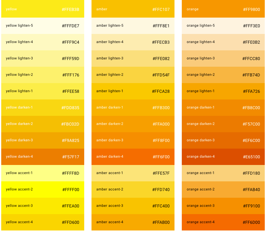
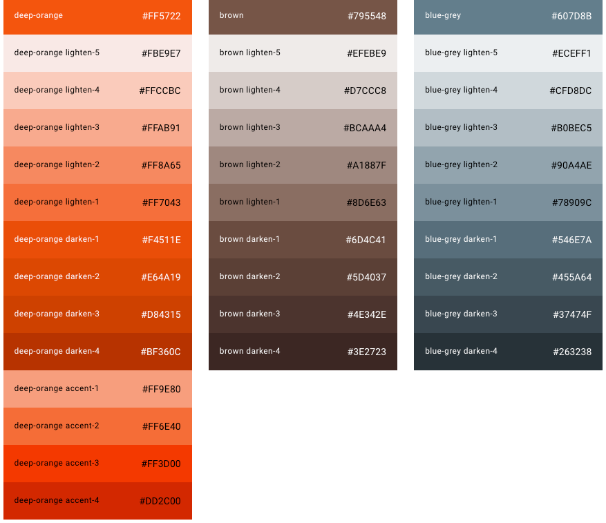
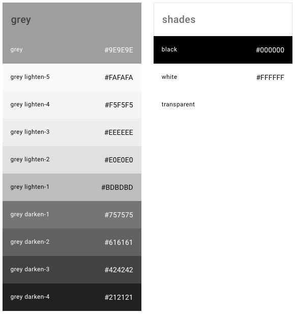
이상 뷰티파이의 버튼에 대해서 완전 자세하게 알고 싶은 사람은 공식 홈페이지의 문서를 참고 하면 된다.
참고사이트
- 뷰티파이 공식 사이트 https://vuetifyjs.com
- 아이콘 모음 https://materialdesignicons.com/
- 색깔 모음 https://vuetifyjs.com/en/styles/colors/