div와 span
div 태그는 블록(block) 요소이며 인라인(inline) 요소와 텍스트를 포함하고 다시금 블록 레벨 요소를 포함할 수 있다. 한편 span 태그는 인라인(inline) 요소이며 인라인 요소와 텍스트를 포함하지만 블록 레벨 요소를 포함할 수는 없다.
<body>
  <div>나는 div태그</div><div>나도 div태그</div>
  <span>나는 span태그</span><span>나도 span태그</span>
</body>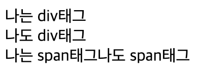
div는 블록이라서 밑으로 내려가지만 span은 인라인이라 밑으로 내려가지 않는다.
div class와 id
id는 '유일'한 요소에 적용, class는 '복수'의 요소에 적용할 수 있다.
id는 #임의의 이름 / class는 .임의의 이름
<style>
    #title {
      color: red;
      text-align: center;
      font-size: 30px;
    }
    .container .item {
      width: 70%;
      height: 40px;
      border: 1px solid#000;
      margin-top: 20px;
    }
  </style>
  <title>Document</title>
</head>
<body>
  <div id="title">레이아웃 학습</div>
    <div class="container">
      <div class="item">item1</div>
      <div class="item">item2</div>
      <div class="item">item3</div>
      <div class="item">item4</div>
    </div>
</body>
id에 title이라는 이름을 만들었고, class에 item이라는 이름을 만들었음.
그래서 style안에 #title{}만들어서 꾸며 주었고 .container(부모)안에 .item(자식){}만들어서 꾸며주었다.
disply: flex;
Flex 레이아웃 배치할 때 쓰인다.
먼저, flex-direction 아이템들이 배치되는 축의 방향을 결정하는 속성을 가진다.
flex-direction: row; - 왼쪽에서 오른쪽
flex-direction: column; -위에서 아래로
flex-direction: row-reverse; 오른쪽에서 왼쪽으로
flex-direction: column-reverse; 아래에서 위로
그 다음, flex-wrap 컨데이너 안에 있는 아이템들이 한줄에 꽉 찼을 경우 줄바꿈을 어떻게 할건지 결정하는 거다.
flex-wrap: nowrap; - 컨테이너안에 꽉차도 빠져나가게 하는거
flex-wrap: wrap; - 꽉 찼을 경우 다음(아래)줄로 넘어가게 하는거
flex-wrap: wrap-reverse; - 이건 꽉 찼을 경우 위로 올라가는거
그다음, justify-content 메인축 방향으로 정렬하는것이다.
justify-content: flex-start; flex-direction이 row일 때는 왼쪽, column일 때는 위 , 시작점에서 시작하는거justify-content: flex-end; 이건 반대인 끝점에서 시작하는거
justify-content: center; 가운데
justify-content: space-between; 시작점-센터-끝점
justify-content: space-around; -아이템--아이템--아이템- 요런식
justify-content: space-evenly; -아이템-아이템-아이템- 요런식
다음, align-items 수직축 방향으로 정렬하는것이다.
align-items: stretch; - 수직축으로 끝까지 있는거
align-items: flex-start; - 아이템 시작점에서 시작
align-items: flex-end; - 이건 그럼 끝점에서 시작
align-items: center; - 말 그대로 센터!!!
align-items: baseline; - 이건 뭐 텍스트 베이스기준에 맞춰서 정령한다는데 별로 안쓴다고 한듯,,,
오늘은 여기까지 공부해야지.. 내일 하자 !
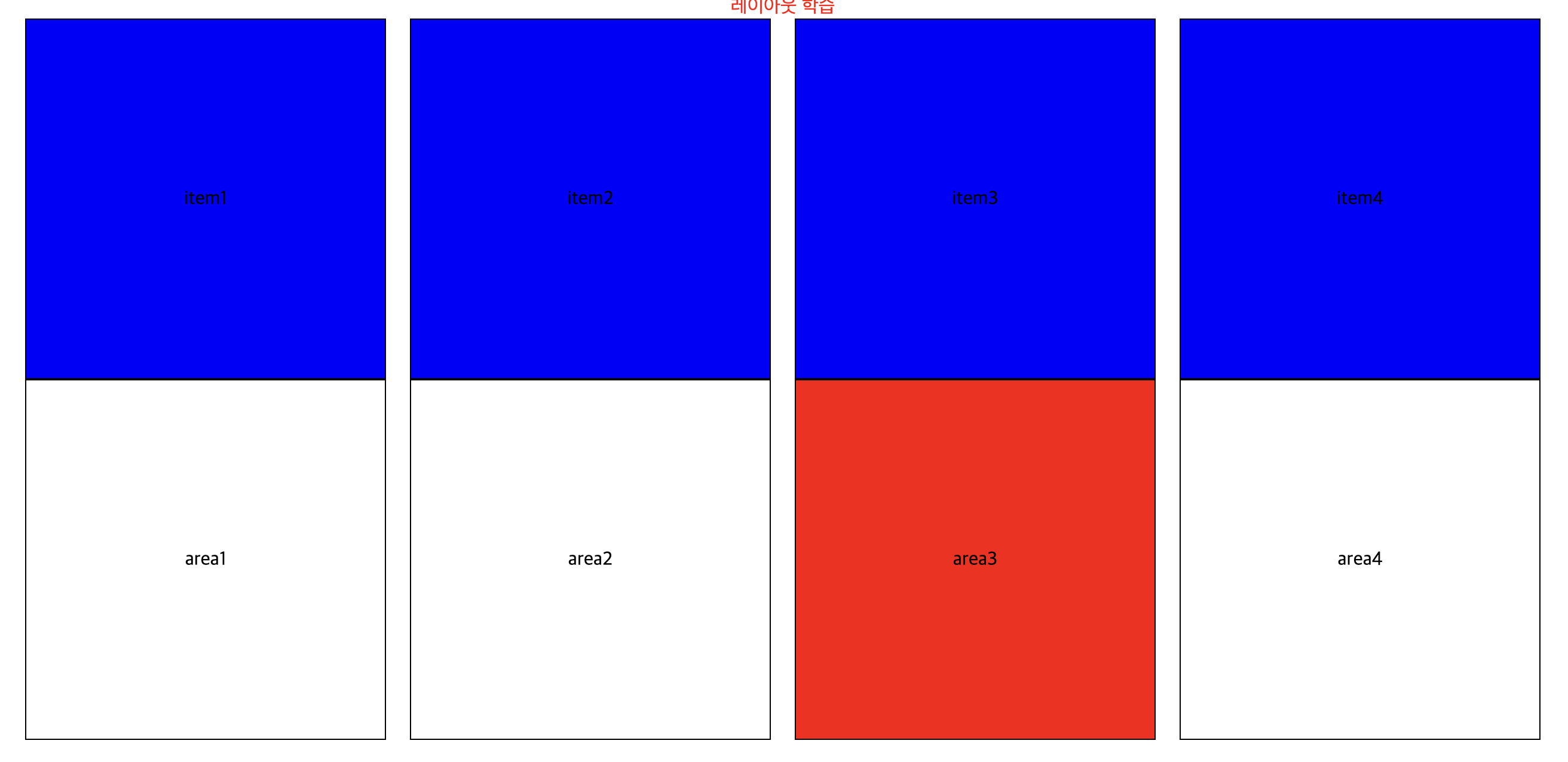
<style>
      .container .item {
        width: 300px;
        height: 300px;
        border: 1px solid #000;
      }

      #title {
        color: red;
        text-align: center;
      }

      div:nth-child(3) {
        background-color: red;
      }

      .container {
        display: flex;
        justify-content: center;
        align-items: center;
      }
      .container .item + .item {
        margin-left: 20px;
      }

      .container .item {
        display: flex;
        justify-content: center;
        align-items: center;
        background-color: blue;
      }
      .wrap {
        display: flex;
        flex-direction: row;
        justify-content: center;
      }
      .wrap .area {
        display: flex;
        width: 300px;
        height: 300px;
        border: 1px solid #000;
        align-items: center;
        justify-content: center;
      }
      .wrap .area.area_3 {
        background-color: red;
      }

      .wrap .area + .area {
        margin-left: 20px;
      }
    </style>
  </head>
  <body>
    <div id="title">레이아웃 학습</div>
    <div class="container">
      <div class="item item1">item1</div>
      <div class="item item2">item2</div>
      <div class="item item3">item3</div>
      <div class="item item4">item4</div>
    </div>
    <div>
      <div class="item">
        <div class="item1"></div>
      </div>
    </div>

    <div class="wrap">
      <div class="area">area1</div>
      <div class="area">area2</div>
      <div class="area area_3">area3</div>
      <div class="area">area4</div>
    </div>

    <div class="card_list">
      <div class="card_item">
        <div class="img_area"></div>
        <div class="text_area"></div>
      </div>
    </div>
이건 저번에 했었던거ㅓㅓㅓ 지금은 느리지만 하다보면 빨라지겠지?!