flex-basis
기본적인 아이템의 크기를 설정한다. flex-direction이 row이면 너비, column이면 높이!!
flex-basis: auto;
flex-basis: 0;
flex-basis: 50%;
flex-basis: 300px;
flex-basis: 10rem;
flex-basis: content;
flex-grow
이거는 flex-grow:0; / flex-grow:1; 0값을 주면 크기의 변화가 없고
1을 주면 크기가 늘어나게 된다.
order
아이템 배치 순서를 바꾼다.
nth-child(1) {
order: 3; } - 블루
.item:nth-child(2) {
order: 1; } - 레드
.item:nth-child(3) {
order: 2; } - 그린
이렇게 있으면 레드 그린 블루순으로 바뀐다, 근데 시각적으로만 바껴서 보이는거지 구조상으로는 바뀐게 아니라고 한다.
z-index
이거는 위로 올라오게 하는거라는데. 음
만약에 ABC의 세개의 아이템이 있으면 B:nth-child(2){z-index:1;만 주면 a와c보다 b가 위로 올라오게된다.
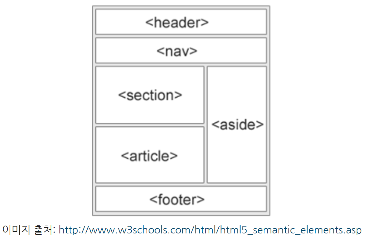
이거를 만들어볼게요
.container {
        display: flex;
        flex-direction: column;
        align-items: center;
      }
      .container .box {
        display: flex;
        align-items: center;
        justify-content: center;
        width: 90%;
        height: 50px;
        border: 1px solid#000;
        margin-top: 20px;
      }
      .container1 {
        display: flex;
        flex-direction: row;
        align-items: center;
        justify-content: flex-start;
        margin-top: 20px;
        margin-left: 5%;


      }
      .container1 .boxmom {
        display: flex;
        flex-direction: column;
        align-items: center;
        justify-content: center;
        width: 47%;
        height: 200px;


}
      .container1 .boxmom .box {
        display: flex;

        flex-direction: column;
        align-items: center;
        justify-content: center;
        width: 100%;
        height: 200px;
        border: 1px solid#000;

      }
      .container1 .box1 {
        display: flex;
        text-align: center;
        align-items: center;
        justify-content: center;
        margin-left: 10px;
        width: 650px;
        height: 200px;
        border: 1px solid#000;
      }
     .box3 {
      display: flex;
        align-items: center;
        justify-content: center;
        width: 90%;
        height: 50px;
        border: 1px solid#000;
        margin-top: 20px;
        margin-left: 5%;
     }
    </style>
    <title>Document</title>
  </head>
  <body>
    <div class="container">
      <div class="box">header</div>
      <div class="box">nav</div>
    </div>
    <div class="container1">
      <div class="boxmom">
        <div class="box">section</div>
        <div class="box">article</div>
      </div>
      <div class="box1">aside</div>
    </div>

    <div class="box3">footer</div>
    </div>
막상 완성하니깐 어느정도 부모형제선택자 이해는 완료했고 중간중간에 들어가는 사이간격이라던지 크기 이런거를 좀 더 공부하면 될거같다.

파이팅ㅎ자ㅏㅏㅏㅏ

하이