
* 웹 페이지 제작
1. 큰 박스로 먼저 나누기
<div class="header"></div>
<div class="nav"></div>
<div class="content-wrap"></div>
2. 맨위에 박스부터 순차적으로 제작하기
header > nav > content-wrap
3. 나눈 박스를 세부적 다시 나눠서 제작하기
header
html
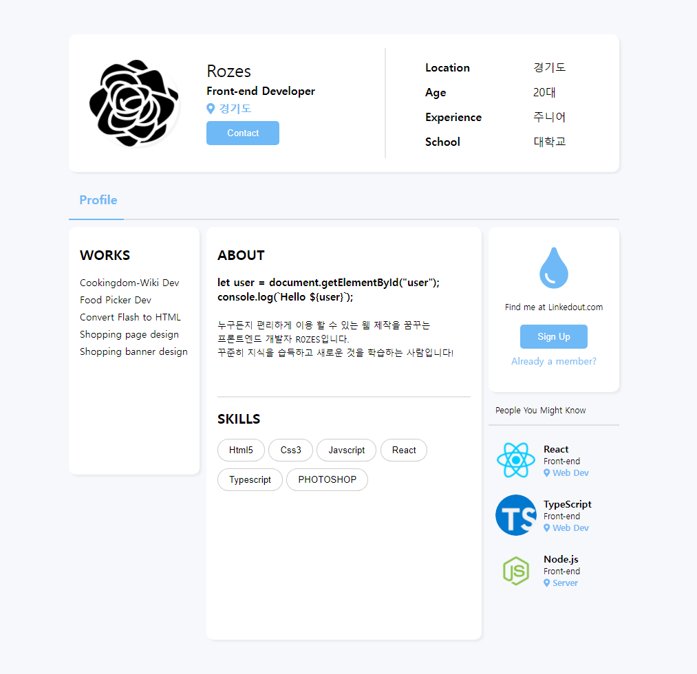
<div class="header">
        <div class="header-wrap">
            <div class="header-box-wrap">
                <div class="header-box-60">
                    <div class="header-box-60__profile">
                        <img src="../image/rose.png">
                        <div class="header-box-60__profile--text">
                            <h4>Rozes</h4>
                            <p>Front-end Developer</p>
                            <div class="header-box-60__profile--text--local">
                                <i class="fas fa-map-marker-alt"></i>
                                <span>경기도</span>
                            </div>
                            <button>Contact</button>
                        </div>
                    </div>
                </div>
                <div class="header-box-40">
                    <div class="header-box-40__profile--main">
                        <h4>Location</h4>
                        <h4>Age</h4>
                        <h4>Experience</h4>
                        <h4>School</h4>
                    </div>
                    <div class="header-box-40__profile--text">
                        <p>경기도</p>
                        <p>20대</p>
                        <p>주니어</p>
                        <p>대학교</p>
                    </div>
                </div>
            </div>
        </div>
    </div>
css
/* hedaer --> */
.header {
    width: 100%;
    max-width: 800px;
    height: 200px;
    padding: 50px 100px 30px 100px;
}
.header-wrap {
    background-color: white;
    box-shadow: 3px 3px 3px rgba(0, 0, 0, 0.05);
    width: 100%;
    height: 100%;
    border-radius: 10px;
}
.header-box-wrap {
    padding: 20px;
    display: flex;
    flex-direction: row;
}
.header-box-60 {
    width: 60%;
    height: 140px;
    padding: 10px;
    border-right: 2px solid rgba(0, 0, 0, 0.09);
}
.header-box-60__profile {
    height: 100%;
    display: flex;
    align-items: center
}
.header-box-wrap img {
    width: 130px;
    height: 90%;
    border-radius: 70px;
    margin-right: 40px;
    box-shadow: 3px 3px 3px rgba(0, 0, 0, 0.05);
}
.header-box-60__profile--text h4 {
    font-size: 25px;
    margin: 0;
    margin-bottom: 10px;
}
.header-box-60__profile--text p {
    font-size: 16px;
    font-weight: 600;
    margin: 0;
    margin-bottom: 10px;
}
.header-box-60__profile--text--local {
    color: RGB(111, 185, 246);
    font-weight: 600;
}
.header-box-60__profile--text--local {
    margin-bottom: 10px;
}
.header-box-60__profile--text button {
    padding: 10px 30px;
    color: white;
    background-color: RGB(111, 185, 246);
    border-radius: 5px;
    border: none;
    cursor: pointer;
}
.header-box-40 {
    width: 40%;
    padding: 20px;
    display: flex;
    justify-content: space-around;
    align-items: center;
}
.header-box-40__profile--main h4 {
    font-size: 16px;
    font-weight: 600;
    margin-bottom: 20px;
}
.header-box-40__profile--text p {
    font-size: 16px;
    margin-bottom: 20px;
}
/* <-- hedaer */
nav
html
<div class="nav">
  <div class="nav-wrap">
    <div class="nav-wrap-10">
      <h4>Profile</h4>
    </div>
    <div class="nav-wrap-90"></div>
  </div>
</div>
css
/* nav --> */
.nav {
    width: 100%;
    max-width: 800px;
    height: 50px;
    padding: 0px 100px;
}
.nav-wrap {
    width: 100%;
    height: 40px;
    display: flex;
}
.nav-wrap-10 {
    width: 10%;
    height: 100%;
    padding: 0px 15px;
    box-sizing: border-box;
    text-align: center;
    border-bottom: 2px solid RGB(111, 185, 246);
}
.nav-wrap-10 h4 {
    font-size: 18px;
    font-weight: 600;
    color: RGB(111, 185, 246);
}
.nav-wrap-90 {
    width: 90%;
    height: 100%;
    padding: 10px;
    box-sizing: border-box;
    border-bottom: 2px solid rgba(0, 0, 0, 0.1);
}
/* <-- nav */
content-wrap
content-wrap은 3가지 박스를 나누어서 개발
aside-left > main-content > aside-right 순으로 개발
html
<div class="content-wrap">
  <div class="aside-left"></div>
  <div class="main-content"></div>
  <div class="aside-right"></div>
</div>
css
/*  content-wrap --> */
.content-wrap {
    width: 100%;
    max-width: 800px;
    min-height: 600px;
    padding: 0px 100px;
    display: flex;
    margin-bottom: 50px;
}
/* <-- content */
aside-left
html
<div class="aside-left">
            <div class="aside-left-box">
                <h4>WORKS</h4>
                <p>Cookingdom-Wiki Dev</p>
                <p>Food Picker Dev</p>
                <p>Convert Flash to HTML</p>
                <p>Shopping page design</p>
                <p>Shopping banner design</p>
            </div>
</div>
css
 /* aside-left --> */
    .aside-left {
        width: 25%;
        height: 100%;
    }
    .aside-left-box {
        width: 190px;
        height: 60%;
        background-color: white;
        padding: 30px 16px;
        border-radius: 10px;
        box-shadow: 3px 3px 3px rgba(0, 0, 0, 0.05);
        white-space: nowrap;
        box-sizing: border-box;
        line-height: 20px;
    }
    .aside-left-box h4 {
        font-size: 20px;
        font-weight: 600;
        margin-bottom: 20px;
    }
    .aside-left-box p {
        font-size: 14px;
        font-weight: 500;
        margin-bottom: 5px;
    }
/*  <-- aside-left  */
main-content
html
<div class="main-content">
            <div class="main-content-wrap">
                <div class="main-content-wrap-textbox">
                    <h4>ABOUT</h4>
                    <p><span style="font-size: 15px; font-weight: 600;">let user = document.getElementById("user");
                        console.log(`Hello ${user}`); <br><br></span>
                        누구든지 편리하게 이용 할 수 있는 웹 제작을 꿈꾸는<br> 프론트엔드 개발자 R0ZES입니다.
                        <br>꾸준히 지식을 습득하고 새로운 것을 학습하는 사람입니다!
                        </p>
                </div>
                <div class="main-content-wrap-btnbox">
                    <h4>SKILLS</h4>
                    <button>Html5</button>
                    <button>Css3</button>
                    <button>Javscript</button>
                    <button>React</button>
                    <button>Typescript</button>
                    <button>PHOTOSHOP</button>
                </div>
            </div>
        </div>
css
/* main-content --> */
    .main-content {
        width: 50%;
        height: 100%;
    }
    .main-content-wrap {
        width: 100%;
        height: 100%;
        background-color: white;
        padding: 30px 16px;
        border-radius: 10px;
        box-shadow: 3px 3px 3px rgba(0, 0, 0, 0.05);
        white-space: nowrap;
        box-sizing: border-box;
    }
    .main-content-wrap-textbox {
        height: 40%;
        white-space: normal;
        border-bottom: 2px solid rgba(0, 0, 0, 0.1);
        margin-bottom: 20px;
    }
    .main-content-wrap-textbox h4 {
        font-size: 20px;
        font-weight: 600;
        margin-bottom: 20px;
    }
    .main-content-wrap-textbox p {
        font-size: 13px;
        line-height: 20px;
    }
    .main-content-wrap-btnbox {
        white-space: normal;
    }
    .main-content-wrap-btnbox h4 {
        font-size: 20px;
        font-weight: 600;
        margin-bottom: 20px;
    }
    .main-content-wrap-btnbox button {
        background-color: white;
        border: 1px solid rgba(0, 0, 0, 0.2);
        padding: 8px 16px;
        border-radius: 20px;
        margin-bottom: 10px;
        cursor: pointer;
    }
/* <-- main-content */
aside-right
html
<div class="aside-right">
            <div class="aside-right-box">
                <i class="fas fa-tint"></i>
                <p>Find me at Linkedout.com</p>
                <button>Sign Up</button>
                <span>Already a member?</span>
            </div>
            <div class="aside-right-sub-box">
                <p class="aside-right-sub-box-title">People You Might Know</p>
                <div class="aside-right-sub-box__profiles">
                    <div class="aside-right-sub-box__profile">
                        <img src="../image/react.png">
                        <div class="aside-right-sub-box__profile--text">
                            <h4>React</h4>
                            <p>Front-end</p>
                            <div class="aside-right-sub-box__profile--text--local">
                                <i class="fas fa-map-marker-alt"></i>
                                <span>Web Dev</span>
                            </div>
                        </div>
                    </div>
                    <div class="aside-right-sub-box__profile">
                        <img src="../image/typescript.png">
                        <div class="aside-right-sub-box__profile--text">
                            <h4>TypeScript</h4>
                            <p>Front-end</p>
                            <div class="aside-right-sub-box__profile--text--local">
                                <i class="fas fa-map-marker-alt"></i>
                                <span>Web Dev</span>
                            </div>
                        </div>
                    </div>
                    <div class="aside-right-sub-box__profile">
                        <img src="../image/node.js.png">
                        <div class="aside-right-sub-box__profile--text">
                            <h4>Node.js</h4>
                            <p>Front-end</p>
                            <div class="aside-right-sub-box__profile--text--local">
                                <i class="fas fa-map-marker-alt"></i>
                                <span>Server</span>
                            </div>
                        </div>
                    </div>
                </div>
            </div>
        </div>
css
/* aside-rigth --> */
    .aside-right {
        width: 25%;
        height: 100%;
        display: flex;
        flex-direction: column;
    }
    .aside-right-box {
        width: 190px;
        height: 40%;
        background-color: white;
        padding: 30px 16px;
        border-radius: 10px;
        box-shadow: 3px 3px 3px rgba(0, 0, 0, 0.05);
        white-space: nowrap;
        box-sizing: border-box;
        margin-left: 10px;
        display: flex;
        flex-direction: column;
        align-items: center;
    }
    .aside-right-box i {
        font-size: 60px;
        color: RGB(111, 185, 246);
        margin-bottom: 20px;
    }
    .aside-right-box p {
        font-size: 12px;
        margin-bottom: 20px;
    }
    .aside-right-box button {
         border: none;
         background-color: RGB(111, 185, 246);
         padding: 10px 25px;
         color: white;
         border-radius: 5px;
         margin-bottom: 10px;
         cursor: pointer;
    }
    .aside-right-box span {
        color: RGB(111, 185, 246);
        font-size: 14px;
    }
    .aside-right-sub-box {
        height: 50%;
        margin-top: 20px;
        margin-left: 10px;
    }
    .aside-right-sub-box-title {
        font-size: 12px;
        padding-left: 10px;
        padding-bottom: 15px;
        border-bottom: 2px solid rgba(0, 0, 0, 0.1);
    }
    .aside-right-sub-box__profiles {
    }
    .aside-right-sub-box__profile {
        display: flex;
        align-items: center;
        margin: 20px 0px;
    }
    .aside-right-sub-box__profile img {
        width: 60px;
        height: 60px;
        border-radius: 30px;
        margin: 0 10px;
    }
    .aside-right-sub-box__profile h4 {
        font-size: 14px;
        font-weight: 600;
        margin-bottom: 5px;
    }
    .aside-right-sub-box__profile p {
        font-size: 12px;
        margin-bottom: 5px;
    }
    .aside-right-sub-box__profile--text--local {
        color: RGB(111, 185, 246);
        font-size: 12px;
        font-weight: 600;
    }
/* <-- aside-rigth */
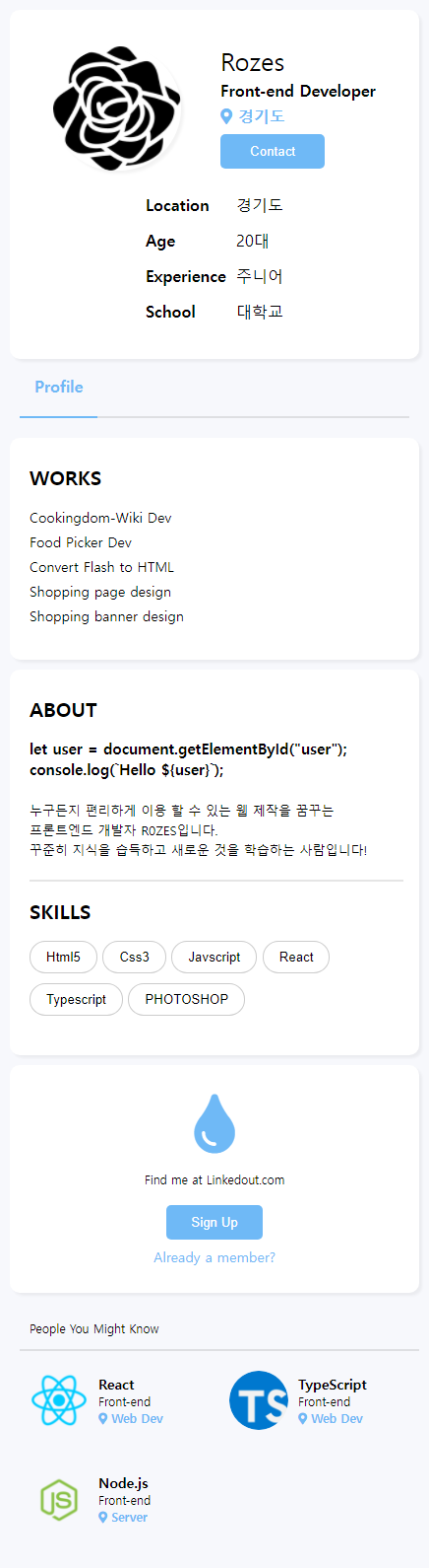
4. 반응형 추가하기
css
/* media query --> */
@media screen and (max-width:436px) {
    .header {
        width: 100%;
        max-width: 436px;
        padding: 10px;
        height: 100%;
        box-sizing: border-box;
    }
    .header-wrap {
        width: 100%;
        margin-left: auto;
        margin-right: auto;
        max-width: 570px;
    }
    .header-box-wrap {
        display: flex;
        flex-direction: column;
        align-items: center;
    }
    .header-box-60 {
        width: 100%;
        display: flex;
        justify-content: space-evenly;
        border-right: none;
        margin-bottom: 10px;
    }
    .header-box-40 {
        padding: 0;
    }
    .nav {
        width: 100%;
        padding: 10px 20px;
        box-sizing: border-box;
    }
    .nav-wrap {
        width: 100%;
    }
    .nav-wrap-10 {
        width: 20%;
    }
    .nav-wrap-10 h4 {
        font-size: 16px;
    }
    .content-wrap {
        margin-top: 10px;
        padding: 10px;
        display: flex;
        flex-direction: column;
        box-sizing: border-box;
        margin-bottom: 0;
    }
    .aside-left, .main-content, .aside-right, .aside-right-box {
        width: 100%;
        margin-bottom: 10px;
    }
    .aside-left-box, .main-content-wrap {
        width: 100%;
        padding-left: 20px;
    }
    .main-content-wrap-textbox {
        padding-bottom: 20px;
    }
    .aside-right-box {
        box-sizing: border-box;
        margin-left: 0px;
    }
    .aside-right-sub-box__profiles {
        display: flex;
        flex-direction: row;
        flex-wrap: wrap;
    }
    .aside-right-sub-box__profile {
        width: 50%;
    }
}
/* <-- media query  */

A fancy web like a rose