
* 웹 페이지 제작
1. 큰 박스로 먼저 나누기
<div class="header"></div>
<div class="sub-header"></div>
<div class="nav"></div>
<div class="content"></div>
<div class="footer"></div>
2. 맨위에 박스부터 순차적으로 제작하기
header > sub-header > nav > content > footer
3. 나눈 박스를 세부적 다시 나눠서 제작하기
header
html
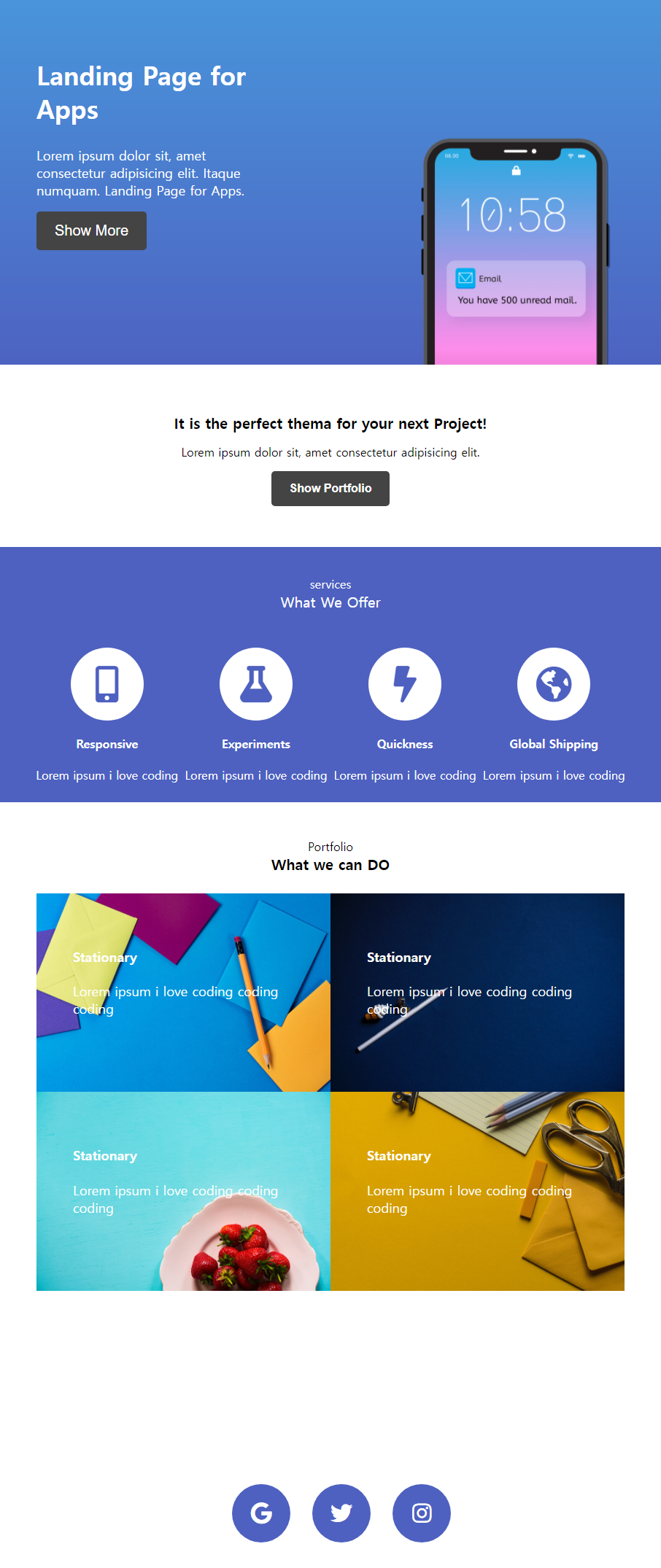
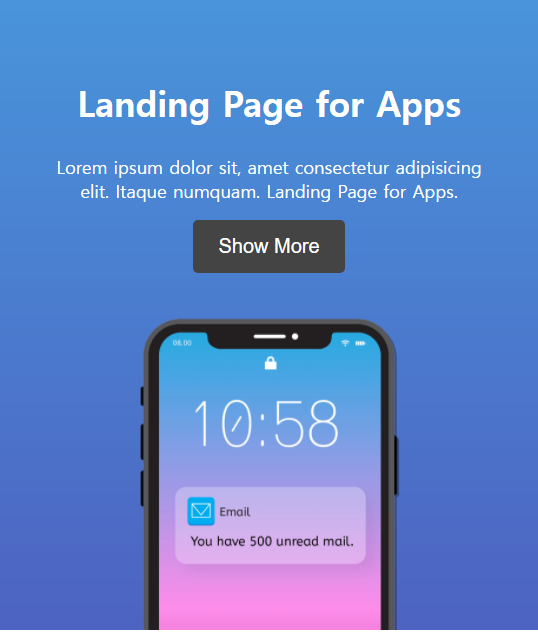
<div class="header">
  <div class="header__info">
    <div class="header__info--text">
      <h2>Landing Page for Apps</h2>
      <p>Lorem ipsum dolor sit, amet consectetur adipisicing elit. Itaque numquam. Landing Page for Apps.</p>
      <button type="submit">Show More</button>
    </div>
    <div class="header__info--img-wrap">
      <img class="header__info--img" src="../image/p/iphone.png">
    </div>
  </div>
</div>
css
/* header --> */
.header {
    width: 100%;
    max-width: 1200px;
    height: 500px;
    background: linear-gradient(RGB(73, 149, 219), RGB(78, 99, 194));
}
.header__info {
    padding: 50px 50px 0 50px;
    display: flex;
}
.header__info--text {
    width: 50%;
    color: white;
    margin-right: 200px;
}
.header__info--text h2 {
    font-size: 35px;
}
.header__info--text p {
    font-size: 18px;
}
.header__info--text button {
    font-size: 20px;
    padding: 15px 25px;
    border-radius: 5px;
    border:none;
    background-color: RGB(68, 68, 68);
    color: white;
    cursor: pointer;
}
.header__info--img-wrap {
    margin-top: 124px;
    width: 50%;
    text-align: right;
}
.header__info--img {
    width: 300px;
}
/* <-- header */
sub-header
html
<div class="sub-header">
  <div class="sub-header__text">
    <h4>It is the perfect thema for your next Project!</h4>
    <p>Lorem ipsum dolor sit, amet consectetur adipisicing elit.</p>
    <button type="submit">Show Portfolio</button>
  </div>
</div>
css
/* sub-header --> */
.sub-header {
    width: 100%;
    max-width: 1200px;
    height: 250px;
    padding: 20px;
    display: flex;
    flex-direction: column;
    align-items: center;
    justify-content: center;
    text-align: center;
}
.sub-header__text h4 {
    font-size: 20px;
    margin: 10px;
}
.sub-header__text p {
    font-size: 16px;
}
.sub-header__text button {
    border: none;
    color: white;
    font-size: 16px;
    font-weight: 600;
    padding: 15px 25px;
    border-radius: 5px;
    background-color: RGB(68, 68, 68);
    cursor: pointer;
}
/* <-- sub-header */
nav
html
<div class="nav">
  <div class="nav-wrap">
    <div class="nav-wrap__text">
      <p>services</p>
      <span>What We Offer</span>
    </div>
    <div class="nav-wrap__list">
      <div class="nav-wrap__list--item">
        <i class="fas fa-mobile-alt"></i>
        <h4>Responsive</h4>
        <p>Lorem ipsum i love coding</p>
      </div>
      <div class="nav-wrap__list--item">
        <i class="fas fa-flask"></i>
        <h4>Experiments</h4>
        <p>Lorem ipsum i love coding</p>
      </div>
      <div class="nav-wrap__list--item">
        <i class="fas fa-bolt"></i>
        <h4>Quickness</h4>
        <p>Lorem ipsum i love coding</p>
      </div>
      <div class="nav-wrap__list--item">
        <i class="fas fa-globe-americas"></i>
        <h4>Global Shipping</h4>
        <p>Lorem ipsum i love coding</p>
      </div>
    </div>
  </div>
</div>
css
/* nav --> */
.nav {
    width: 100%;
    max-width: 1200px;
    height: 350px;
    padding: 20px;
    background-color: RGB(78, 97, 192);
    text-align: center;
    color: white;
}
.nav-wrap {
    display: flex;
    flex-direction: column;
    margin: 20px;
}
.nav-wrap__text {
    margin-bottom: 50px;
}
.nav-wrap__text p {
    margin: auto;
}
.nav-wrap__text span {
 font-size: 20px;
 margin-top: auto;
}
.nav-wrap__list {
    display: flex;
    align-items: center;
    justify-content: space-evenly;
}
.nav-wrap__list--item i {
    color: RGB(78, 97, 192);
    font-size: 50px;
    width: 100px;
    height: 100px;
    background-color: white;
    border-radius: 50px;
    padding-top: 25px;
    box-sizing: border-box;
}
/* <-- nav */
content
html
<div class="content">
  <div class="content-text">
    <span>Portfolio</span>
    <h4>What we can DO</h4>
  </div>
  <div class="content-img-box">
    <div class="content-img-box__wrap">
      <div style="position: absolute;">
        <h4>Stationary</h4>
        <p>Lorem ipsum i love coding coding coding</p>
      </div>
      <img src="../image/p/portfolio-1.jpg" alt="1.jpg">
    </div>
    <div class="content-img-box__wrap">
      <div style="position: absolute;">
        <h4>Stationary</h4>
        <p>Lorem ipsum i love coding coding coding</p>
      </div>
      <img src="../image/p/portfolio-2.jpg" alt="2.jpg">
    </div>
    <div class="content-img-box__wrap">
      <div style="position: absolute;">
        <h4>Stationary</h4>
        <p>Lorem ipsum i love coding coding coding</p>
      </div>
      <img src="../image/p/portfolio-3.jpg" alt="3.jpg">
    </div>
    <div class="content-img-box__wrap">
      <div style="position: absolute;">
        <h4>Stationary</h4>
        <p>Lorem ipsum i love coding coding coding</p>
      </div>
      <img src="../image/p/portfolio-4.jpg" alt="4.jpg">
    </div>
  </div>
</div>
css
/*  content --> */
.content {
    width: 100%;
    max-width: 1200px;
    height: 900px;
    padding: 50px;
    text-align: center;
    display:flex;
    flex-direction: column;
}
.content-text h4 {
    margin-top: 0px;
    font-size: 20px;
}
.content-img-box {
    width: 100%;
    display: flex;
    flex-direction: row;
    flex-wrap: wrap;
}
.content-img-box__wrap {
    width: 50%;
    position: relative;
    transition: all 1s;
}
.content-img-box__wrap>div {
    padding: 50px;
    width: 100%;
    height: 100%;
}
.content-img-box__wrap:hover {
    padding: 20px;
}
.content-img-box__wrap>div * {
 text-align: left;
 font-size: 18px;
 color: white;
}
.content-img-box img {
    width: 100%;
    height: 100%;
}
/* <-- content */
footer
html
<div class="footer">
  <a href="#">
    <i class="fab fa-google"></i>
  </a>
  <a href="#">
    <i class="fab fa-twitter"></i>
  </a>
  <a href="#">
    <i class="fab fa-instagram"></i>
  </a>
</div>
css
/*  footer --> */
.footer {
    width: 100%;
    max-width: 1200px;
    height: 150px;
    padding: 20px;
    text-align: center;
    font-size: 30px;
    display: flex;
    justify-content: center;
    align-items: center
}
.footer i {
    background-color: RGB(78, 97, 192);
    color: white;
    width: 80px;
    height: 80px;
    padding-top: 25px;
    box-sizing: border-box;
    margin-left: 30px;
    border-radius: 40px;
}
/* <-- footer */
4. 반응형 추가하기
css
/* 화면의 width 값이 576이하일때 css 속성 */
@media screen and (max-width:576px) {
    .header {
        height: 630px;
    }
    .header__info {
        display: flex;
        flex-direction: column;
        align-items: center
    }
    .header__info--text {
        margin-right: 0px;
        width: 100%;
        text-align: center;
    }
    .header__info--img-wrap {
        width: 100%;
        text-align: center;
        margin-top: 30px;
        margin-left: auto;
        margin-right: auto;
    }
}

A fancy web like a rose