- 방향을 잡아야 하는데..
디자이너가 9명. 개발자가 4명. 디자이너가 너무 많아서 좀 쫄렸지만 인원이 많아서 디자인이 곧 나오겠구나 싶었다. 사실은 기존에 인턴을 하고있던 분들이라고 해서 디자인이 이미 나왔을 줄 알았는데 같이 진행될줄은... 몰랐음.
API가 없다. 데이터도 없다. 3주가 주어졌는데 아무것도 안할 수는 없으니 일단 할 수 있는것을 했다.
어떤 도구를 쓸 것인가
1. flutter
2. riverpod: 상태관리도구
3. 서버 및 데이터: supabase
4. branch: main - dev - 각자dev 브랜치 생성
5. commit:
Feat: 새로운 기능을 추가할 경우
Fix: 버그를 고친 경우
Design: CSS등 사용자 UI 디자인 변경
!BREAKING CHANGE: 커다란 API 변경의 경우
!HOTFIX: 급하게 치명적인 버그를 고쳐야하는 경우
Style: 코드 포맷 변경, 세미 콜론 누락, 코드 수정이 없는 경우
Refactor: 프로덕션 코드 리팩토링
Comment: 필요한 주석 추가 및 변경
Docs: 문서를 수정한 경우
Test: 테스트 추가, 테스트 리팩토링
Chore: 빌드 태스트 업데이트, 패키지 매니저를 설정하는 경우(프로덕션 코드 변경 X)
Rename: 파일 혹은 폴더명을 수정하거나 옮기는 작업만인 경우
Remove: 파일을 삭제하는 작업만 수행한 경우
참고: https://overcome-the-limits.tistory.com/entry/%ED
6. file, widget:
file: snake_case
widget: camelCase7. 사용 패키지들
  equatable: ^2.0.5
  flutter_riverpod: ^2.4.9
  flutter_svg: ^2.0.9
  fluttertoast: ^8.2.4
  freezed: ^2.4.6
  go_router: ^13.0.0
  supabase_flutter: ^2.0.2
문제발생: tab
import 'package:flutter/material.dart';
import 'package:flutter_app/common.dart';
import 'package:flutter_app/view/widgets/community_page_widgets/tab_item.dart';
class TabWidget extends StatelessWidget {
const TabWidget({
super.key,
required this.tabContents,
});
final List<TabItem> tabContents;
Widget build(BuildContext context) {
return DefaultTabController(
length: tabContents.length,
child: Column(
mainAxisSize: MainAxisSize.min,
children: [
Padding(
padding: const EdgeInsets.symmetric(horizontal: 20.0),
child: Stack(
children: [
Positioned.fill(
child: Container(
decoration: BoxDecoration(
border: Border(
bottom: BorderSide(
color: DesignColor.Neutral.shade20,
),
),
),
),
),
TabBar(
// labelPadding: const EdgeInsets.only(
// right: 29,
// ), //2. width 채우기 위해 라벨에 padding을 29씩 줌. 대신 마지막 탭에도 29의 패딩이 생김
indicatorWeight: 3,
indicatorColor: DesignColor.Neutral,
labelColor: DesignColor.Neutral,
unselectedLabelColor: DesignColor.Neutral.shade20,
unselectedLabelStyle: FontStyle.Label_2_regular,
labelStyle: FontStyle.Label_2_SemiBold,
indicatorSize: TabBarIndicatorSize.label,
isScrollable: true,
//1. 인디케이터 Width를 padding + 글자만큼으로 하기 위해서는 isScrollable을 써야함. 그러나 width를 채우지는 않음
tabs: tabContents
.map(
(tabItem) => Padding(
padding: const EdgeInsets.symmetric(horizontal: 10),
child: Tab(
text: tabItem.label,
),
),
)
.toList(),
),
],
),
),
Flexible(
fit: FlexFit.loose,
child: TabBarView(
children: tabContents
.map(
(tabItem) => tabItem.content,
)
.toList(),
),
),
],
),
);
}
}
tabbar 커스텀 하면서 많은 문제에 직면했다.
Tab
해결하지는 못함. 다만 세가지 방법의 대안이 있다.
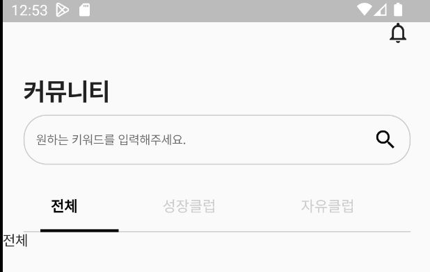
디자이너로부터 받은 디자인은 아래와 같음.
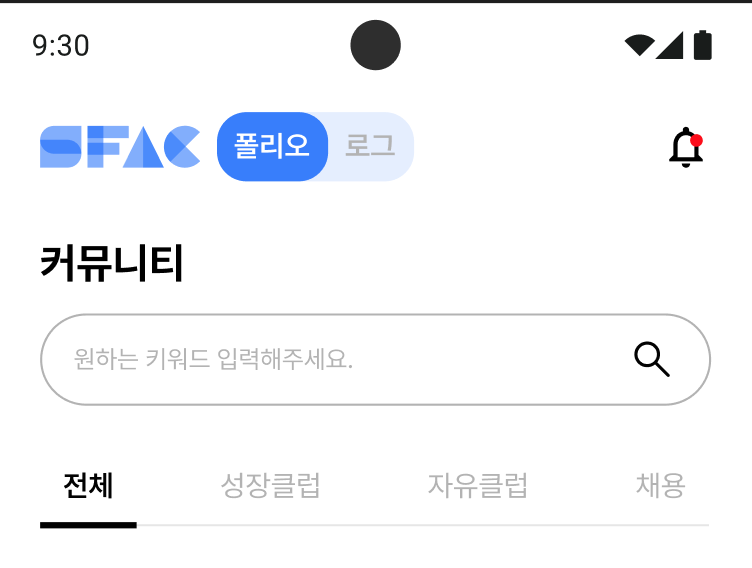
1. indicator가 1/n인 경우
제일 손이 안가는 방법. 그러나 글자가 짤린다. 전체/성장/자유/채용 이렇게만 보임
TabBar(
indicatorWeight: 3,
indicatorColor: DesignColor.Neutral,
labelColor: DesignColor.Neutral,
unselectedLabelColor: DesignColor.Neutral.shade20,
unselectedLabelStyle: FontStyle.Label_2_regular,
labelStyle: FontStyle.Label_2_SemiBold,
indicatorSize: TabBarIndicatorSize.label,
tabs: tabContents
.map(
(tabItem) => Padding(
padding: const EdgeInsets.symmetric(horizontal: 10),
child: Tab(
text: tabItem.label,
),
),
)
.toList(),
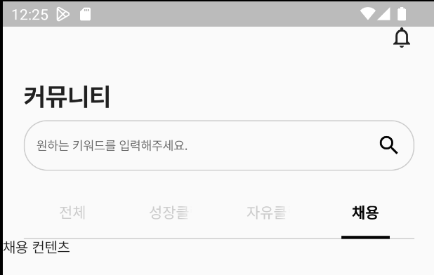
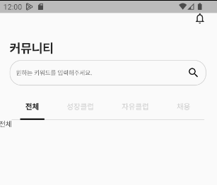
),2. indicator가 글자크기 + 패딩10이고 devider가 1/n으로 분배된 경우
TabBar(
                  indicatorWeight: 3,
                  indicatorColor: DesignColor.Neutral,
                  labelColor: DesignColor.Neutral,
                  unselectedLabelColor: DesignColor.Neutral.shade20,
                  unselectedLabelStyle: FontStyle.Label_2_regular,
                  labelStyle: FontStyle.Label_2_SemiBold,
                  indicatorSize: TabBarIndicatorSize.label,
                  isScrollable: true,
                  //1. 인디케이터 Width를 padding + 글자만큼으로 하기 위해서는 isScrollable을 써야함. 그러나 width를 채우지는 않음
                  tabs: tabContents
                      .map(
                        (tabItem) => Padding(
                          padding: const EdgeInsets.symmetric(horizontal: 10),
                          child: Tab(
                            text: tabItem.label,
                          ),
                        ),
                      )
                      .toList(),
                ),
3. indicator가 글자크기 + 패딩10이고 첫번째 탭 앞에 devider를 없앤 경우

TabBar(
                  labelPadding: const EdgeInsets.only(
                    right: 29,
                  ),
                  indicatorWeight: 3,
                  indicatorColor: DesignColor.Neutral,
                  labelColor: DesignColor.Neutral,
                  unselectedLabelColor: DesignColor.Neutral.shade20,
                  unselectedLabelStyle: FontStyle.Label_2_regular,
                  labelStyle: FontStyle.Label_2_SemiBold,
                  indicatorSize: TabBarIndicatorSize.label,
                  isScrollable: true,
                  tabs: tabContents
                      .map(
                        (tabItem) => Padding(
                          padding: const EdgeInsets.symmetric(horizontal: 10),
                          child: Tab(
                            text: tabItem.label,
                          ),
                        ),
                      )
                      .toList(),
                ),
이 경우에는 마지막 탭에서 디바이더가 길게 노출된다.
그리고 패딩값을 29로 고정했기 때문에 기기에 따라 tab을 스크롤해야하는 수고가 생길 수 있음.

사실 문제 해결을 위해 점점 나아지긴 했는데,,,
채용 옆에 라인을 보이지 않도록 하려면 lebelPadding을 0을 줘야할 것 같은데, 방법을 모르겠다.
실패한 방법: Row + SizedBox
indicator 사이즈가 바뀌어서 실패..
TabBar(
                  padding: const EdgeInsets.only(
                    right: 0,
                  ),
                  indicatorWeight: 3,
                  indicatorColor: DesignColor.Neutral,
                  labelColor: DesignColor.Neutral,
                  unselectedLabelColor: DesignColor.Neutral.shade20,
                  unselectedLabelStyle: FontStyle.Label_2_regular,
                  labelStyle: FontStyle.Label_2_SemiBold,
                  indicatorSize: TabBarIndicatorSize.label,
                  isScrollable: true,
                  tabs: tabContents
                      .asMap()
                      .entries
                      .map(
                        (entry) => Row(
                          children: [
                            Padding(
                              padding:
                                  const EdgeInsets.symmetric(horizontal: 10),
                              child: Tab(
                                text: entry.value.label,
                              ),
                            ),
                            entry.key == tabContents.length - 1
                                ? Container()
                                : const SizedBox(width: 29),
                          ],
                        ),
                      )
                      .toList(),
                ),
결론적으로,
Tab으로 컨트롤하려고하면 indicator width가 바뀌므로 TabBar에서 컨트롤해야한다.
TabBar(
                  padding: const EdgeInsets.only(
                    right: -29,
                  ),
                  labelPadding: const EdgeInsets.only(right: 29),
이런식으로 전체 탭바의 right 패딩을 없애보려고도 시도했으나 에러가 발생함.ㅠ
labelPadding을 선별적으로 n번째 아이템에 0을 줄 수 있는 방법이 있을지 찾아봐야 할 것 같다.
문제발생: 스크롤 범위를 바꾸어야한다.
그런데 탭바뷰 부분에서 height이 정해지질 않으니까 계속 오류가 난다. 탭 너무 어렵다... appBar에 탭이 있는 게 아닌 경우에 대해서만 공식문서에 있어서...
Column을 줘도 ListView를 줘도 계속 에러 행진.
Expanded, Flexible을 줘도 마찬가지...ㅠ
일단은 탭 내부에서만 스크롤 되는 형태로 둔 뒤 다른 페이지를 개발하기 시작했다.
9일까지 이제 6일 남았다. 빠르게 진행할 필요가 있다.
깃허브에서 이슈, pr을 적극적으로 쓰려고 노력했다.
글 정리 잘 한다고 칭찬받았다 헷🤭
항상 추상화하고 다른사람이 봤을때 파악이 힘들지 않도록 코드를 짜려고 하는데, 그리고 코드 알아보기 쉽다고 해주셔서 노력을 인정받은 것 같아 기뻤음.
시간이 급박하기도 하고, 마이페이지라던가 하는 다른 사람들이 내 코드를 가져다 쓸 일이 있을 것 같아 아래와 같이 사용법에 대해 자세히 기술했다.

브랜치도 기능별로 쓰면 좋았을텐데 팀원들이 깃에 익숙지 않아 각자 이름으로 브랜치를 썼다. 뭐 브랜치 여러개 만들었다 삭제했다 안해도 돼서 그건 편하긴 했음.
본 후기는 유데미-스나이퍼팩토리 앱/웹 개발자 인턴형 프로그램 학습 일지 후기로 작성 되었습니다.