㉠ 일단 div태그로 공간을 나누기
- 유지보수가 편해진다.
- 협업이 쉬워진다. 개발자들마다 규칙이 정해질 겁니다.
div. class id 부여할 필요가 있을 때 직관적으로 이름을 이해할 수 있게끔 지정한다. ex) header, footer, headerSearch, header-search, 명사 + 명사
㉡ 부모태그의 css는 자식도 영향을 받습니다 - inherit
상속이 되는 css(color, font-size, font-weight...)/안되는 css (border)
<div style="border: 1px solid black;">
	<p> Lorem ipsum dolor sit amet, consectetur adipisicing elit.
		Incidunt amet cupiditate sit excepturi dolorum cum animi dicta odio.
    	Eligendi perspiciatis quos voluptates eveniet commodi, asperiores qui
    	blanditiis quibusdam? Vitae, facere?</p>

    <p> Lorem ipsum dolor sit amet, consectetur adipisicing elit.
        Incidunt amet cupiditate sit excepturi dolorum cum animi dicta odio.
        Eligendi perspiciatis quos voluptates eveniet commodi, asperiores qui
        blanditiis quibusdam? Vitae, facere?</p>

    <p> Lorem ipsum dolor sit amet, consectetur adipisicing elit.
        Incidunt amet cupiditate sit excepturi dolorum cum animi dicta odio.
        Eligendi perspiciatis quos voluptates eveniet commodi, asperiores qui
        blanditiis quibusdam? Vitae, facere?</p>

    <p> Lorem ipsum dolor sit amet, consectetur adipisicing elit.
        Incidunt amet cupiditate sit excepturi dolorum cum animi dicta odio.
        Eligendi perspiciatis quos voluptates eveniet commodi, asperiores qui
        blanditiis quibusdam? Vitae, facere?</p>
</div>
px와 em 그리고 rem
<body>
	px,em,rem

    <div class="container" style="font-size: 8px">

    <!-- 일반적으로 16px = 1em = 1rem -->

    	<p class="px">PX</p>
        <p class="em">EM</p>
        	부모태그에게 font-size 속성이 있으면, 그 속성을 1em으로 계산합니다.

        <p class="rem">REM</p>
        	html font-size 1rem


         우클릭- 검사 - 글꼴 크기 작게 크게 조절할 때 rem에만 영향이 간다.

</body>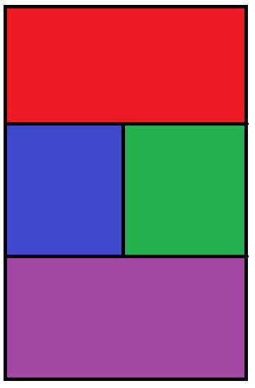
레이아웃 만들기 - display_inline
<body>
	<div class="container">
    	<div class="top"></div>
        <div class="left"></div>
        <div class="right"></div>
        <div class="bottom"></div>
	</div>
</body>
----------------------------------------------------------------------------------------------
.container {
width: 400px;
height: 600px;
border: 1px solid black;
★font-size: 0px;
}
.top{
background: red;
width: 400px;
height: 200px;
}
.left{
background: blue;
width: 200px;
height: 200px;
display: inline-block
vertical-align: top; // p태그 차지하는 공간에 맞추기
}
.right{
background: green;
width: 200px;
height: 200px;
display: inline-block
}
.bottom{
background: purple;
width: 400px;
height: 200px;
}
레이아웃 만들기 - float
float: none;

.container {
	width: 400px;
    height: 600px;
    border: 1px solid black;
    ★font-size: 0px;
  }


 .top{
  	background: red;
    width: 400px;
    height: 200px;
  }

   .left{
  	background: blue;
    width: 200px;
    height: 200px;
    float: left;
  }

   .right{
  	background: green;
    width: 200px;
    height: 200px;
    float: left;

  }

   .bottom{
   ★clear: both;
  	background: purple;
    width: 400px;
    height: 200px;
  }
레이아웃 만들기 - flex
<body>
	<div class="container">
    	<div class="top"></div>
        <div class="flexBox">
        	<div class="left"></div>
        	<div class="right"></div>
        </div>
        <div class="bottom"></div>
	</div>
</body>
코드를 입력하세요

--------------------------------------------------------------------------------
.container {
	width: 400px;
    height: 600px;
    border: 1px solid black;
  }


 .top{
  	background: red;
    width: 400px;
    height: 200px;
  }

   .left{
  	background: blue;
    width: 200px;
    height: 200px;
  }

   .right{
  	background: green;
    width: 200px;
    height: 200px;

  }

   .bottom{
  	background: purple;
    width: 400px;
    height: 200px;
  }

  .flexBox{
  	★display: flex;
  }
 <div class="flexBox">
	<span>판</span>
    <span>다</span>
    <span>코</span>
    <span>딩</span>
 </div>

--------------------------------------------------
* flex-direction (contents 전개방향)
: row/column/row-reverse/column-reverse
* flex-wrap (부모 container 길이보다 자식 contents 합 길이가 초과되었을때 최대한 반영할 건지)
: no-wrap(네, 최대한 부모의 길이에 맞춰 정렬하겠습니다) / wrap(아니요, myway로 제 길이에 맞추겠습니다)
* align-content (2줄 이상일때만 효력이 있다. 아이템이 여러줄의 아이템들의 수직정렬을 의미한다) ( 만약 flex-start 값을 주면 여러줄의 아이템들은 각 줄의 윗쪽에 배치될거고, center로 값을 주면 각 줄의 center로 배치된다)
: center / start / space-between / space-around
* justify-content (가로줄(수평) 기준 위치정렬)
: center / flex-start / flex-end / space-between / space-around/ space-evenly
* align-items (세로줄(수직) 기준 이동정렬)
: center / flex-start / flex-end
레이아웃 만들기 - grid
<body>
	<div class="container">
	</div>
</body>

----------------------------------------------------
.container {
width: 400px;
height: 600px;
border: 1px solid black;
display: grid;
grid-template-columns: 1fr 1fr 1fr;
grid-template-rows: 1fr 1fr 1fr;
grid-template-areas:
"top top right"
"left left right"
"bottom bottom right";
}
.top{
background: red;
★grid-area: top;
width: auto;
height: auto;
}
.left{
background: blue;
★grid-area: left;
width: auto;
height: auto;
}
.right{
background: green;
★grid-area: right;
width: auto;
height: auto;
}
.bottom{
background: purple;
★grid-area: bottom;
width: auto;
height: auto;
}
폰트를 꾸며주는 CSS 속성들
color: red;
font-style : italic;
font-weight : Lighter(100), normal(400), bold(700), bolder(900)
font-variant : small-caps;
font-size : 매우 많다. 잘 사용하지 않음
line-height : 줄간격 (48px, 1.2em 보통)
font-family : 'Lucida Sans', 'Lucida Sans Regular'... 첫번째 적용 안되는건 다음거로 넘어감
@font-face {
	font-family : ;
    src: url( * otf,ttf 로 다운받은 파일경로 선언)
   }
margin이란 친구는 겹치기도 합니다.
margin 겹침, margin collapsing
default margin 뺀 상태에서!!!!!!
p {
	margin: 0;
  }

h1 {
	margin-top: 5rem;
    margin-bottom: 5rem; //변화가 없는데...?
 }
 <div class="flexBox">
	<h1> 안녕하세요 </h1>
    <h1> 판다코딩입니다 </h1>
 </div>
1번째 margin-top과 2번째 margin-bottom이 겹침 그 중 큰 값을 따라감
css 중 border 지정을 할때는 margin 겹침이 안나는데 설정을 지우니까 또 겹침