
Intro
지난 포스팅(Autoencoder와 LSTM Autoencoder)에 이어 LSTM Autoencoder를 통해 Anomaly Detection하는 방안에 대해 소개하고자 한다. Autoencoder의 경우 보통 이미지의 생성이나 복원에 많이 사용되며 이러한 구조를 이어받아 대표적인 딥러닝 생성 모델인 GAN(Generative Adversarial Network)으로 까지 이어졌는데 이러한 자기 학습 모델은 Anomaly Detection 분야에서도 널리 사용되고 있다.
대표적으로 이미지 분야에서도 정상적인 이미지로 모델 학습 후 비정상적인 이미지를 넣어 이를 디코딩 하게 되면 정상 이미지 특성과 디코딩 된 이미지 간의 차이인 재구성 손실(Reconstruction Error)를 계산하게 되는데 이 재구성 손실이 낮은 부분은 정상(normal), 재구성 손실이 높은 부분은 이상(Abnormal)로 판단할 수 있다.
이러한 Anomaly Detection은 이미지 뿐만 아니라 이제부터 살펴보고자 하는 시계열 데이터에도 적용이 가능하다. 예를 들어 특정 설비의 센서를 통해 비정상 신호를 탐지하고자 한다면 Autoencoder를 LSTM 레이어로 구성한다면 이러한 시퀀스 학습이 가능하게 된다. 이를 통해 정상 신호만을 이용하여 모델을 학습시켜 추후 비정상 신호가 모델에 입력되면 높은 reconstruction error를 나타낼 것이므로 이를 비정상 신호로 판단할 수 있게 된다.
LSTM Autoencoder
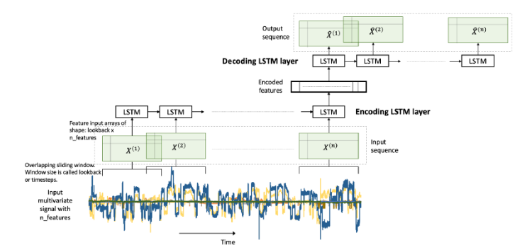
LSTM Autoencoder는 시퀀스(sequence) 데이터에 Encoder-Decoder LSTM 아키텍처를 적용하여 구현한 오토인코더이다. 모델에 입력 시퀀스가 순차적으로 들어오게 되고, 마지막 입력 시퀀스가 들어온 후 디코더는 입력 시퀀스를 재생성하거나 혹은 목표 시퀀스에 대한 예측을 출력한다.
위에서 설명한 것과 마찬가지로 LSTM Autoencoder 학습 시에는 정상(normal) 신호의 데이터로만 모델을 학습시키게 된다. encoder와 decoder는 학습이 진행될 수 록 정상 신호를 더 정상 신호 답게 표현하는 방법을 학습하게 될 것이며 최종적으로 재구성 한 결과도 정상 신호와 매우 유사한 분포를 가지는 데이터일 것이다. 그렇기 때문에 이 모델에 비정상 신호를 입력으로 넣게 되면 정상 분포와 다른 특성의 분포를 나타낼 것이기 때문에 높은 reconstruction error를 보이게 될 것이다.
Curve Shifting을 적용한 LSTM Autoencoder
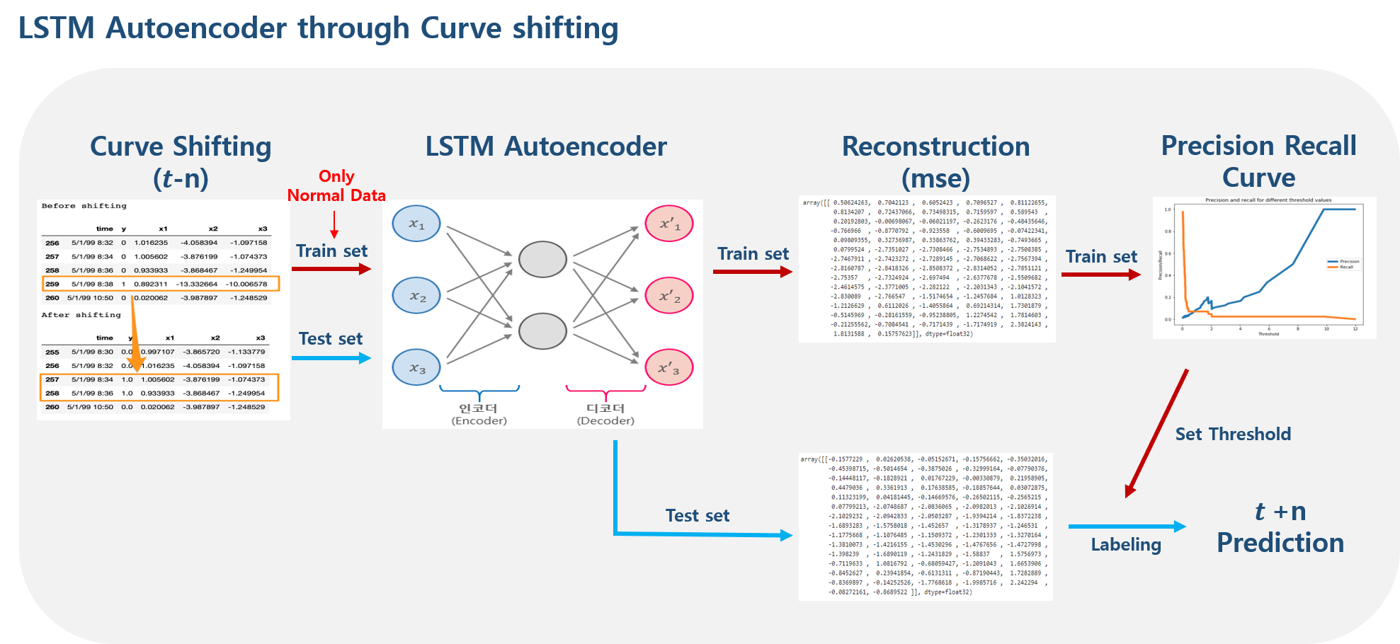
전체 프로세스는 위 아키텍처와 같다. 먼저 Curve Shifting을 통해 데이터의 시점을 변환해주고 normal 데이터만을 통해 LSTM Autoencoder 모델을 학습시키게 된다. 그 후 재구성 손실을 계산 후 Precision Recall Curve를 통해 normal/abnormal을 구분하기 위한 threshold를 지정하게 되고 이 threshold를 기준으로 마지막으로 테스트 셋의 재구성 손실을 분류하여 t+n 시점을 예측하게 된다.
각 부분에 대해 아래에서 좀 더 상세히 살펴보자.
1. Curve Shifting
비정상 신호를 탐지하기 위해서는 비정상 신호가 들어오기 전에 즉, 뭔가 고장 혹은 결함이 발생하기 전에 미리 예측을 해야만 한다. 그렇기 때문에 단순히 현재 시점의 error를 계산하여 비정상 신호를 탐지하는 것은 이미 고장이 발생한 후 예측하는 것과 다름이 없기 때문에 데이터에 대한 시점 변환이 꼭 필요하다.
이러한 future value 예측을 위해 다양한 방법이 있는데 여기서는 Curve Shifting이라는 기법을 적용할 것이다.
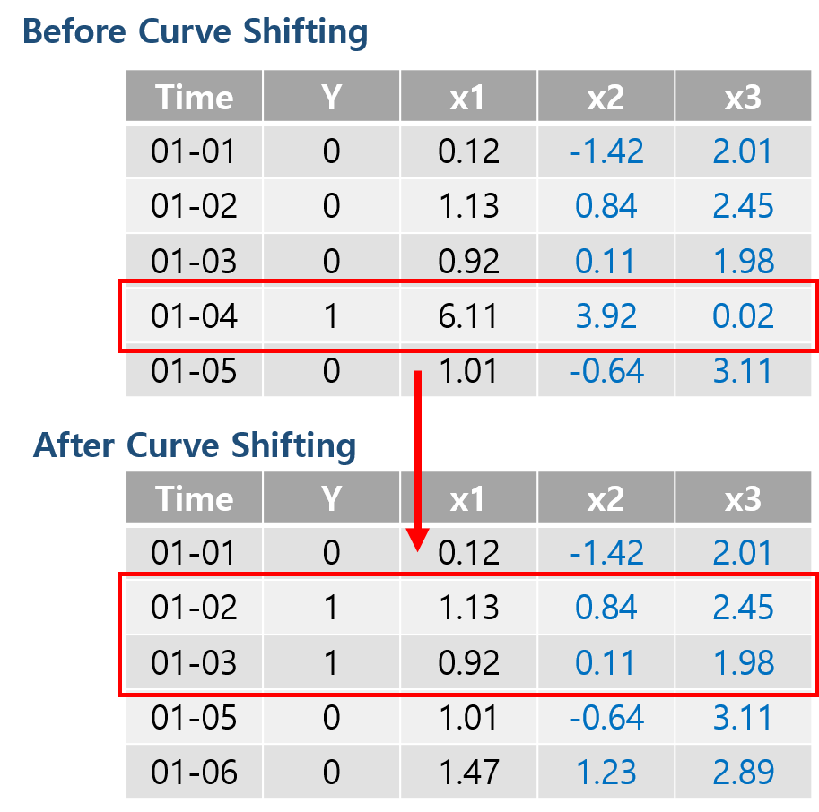
Curve Shifting은 사전 예측 개념을 적용하기 위한 Shifting 방법이다. 예를 들어 위 그림과 같이 비정상 신호(1)를 2일 전에 조기 예측 하고자 한다면 단순히 Y값을 두 칸씩 내리는 것이 아니라 비정상 신호(1)가 있는 날짜로부터 2일 전까지의 데이터를 비정상 신호(1)로 바꾸어주는 것이다. 이는 비정상 신호가 발생하기 전 어떠한 조짐이 있을 것이며 이러한 조짐이 데이터 특성에 나타날 것이라는 가정을 가지고 학습하는 방법이다.
그리고 나서 본래 비정상 신호(1) 데이터를 제거해주는데 이렇게 하는 이유는 라벨을 바꿔주는 순간 이는 비정상 신호 예측 문제가 아닌 비정상 신호 조짐 예측 문제가 되는 것이 때문에 데이터의 학습 혼동을 없애주기 위해 제거하는 것이라 보면 될 것이다.
2. Threshold by Precision-Recall-Curve
Autoencoder는 재구성 된 결과를 intput과 비교하여 재구성 손실(Reconstruction Error)를 계산한다고 말했다. 그리고 이 재구성 손실값을 통해 손실값이 낮으면 정상으로, 손실값이 높으면 이상으로 판단한다고 하였는데, 이 정상과 이상을 나누는 기준은 과연 무엇일까?
일반적으로 모델이 정상 데이터만으로 학습을 하여 정상 데이터를 재구성하였을 때 학습이 잘 되었다고 가정하면 손실값은 0에 가까울 것이고, 학습이 잘 안되었다고 하면 손실값은 1에 가까울 것이다. 보통 분류(Classification)문제에서는 예측 확률값(0% ~ 100%)을 통해 50%를 기준으로 분류를 하게 되는데, 이 recontruction error의 경우 그렇게 극단적으로 값이 튀기는 힘들기 때문에 정상과 이상을 분리하는 타당한 threshold값을 정하는 것이 필요하다.
Precision Recall Curve
위와 같은 문제의 적절한 threshold값을 적용하기 위한 방법 중 하나로 precision recall curve가 있다. 이는 Recall(재현율)과 Precision(정밀도)가 서로 Trade off 관계를 가지기 때문에 어느 한쪽에 치우지지 않는 최적의 threshold를 구하기 위한 방법이다.
추후 이 검증 기법을 적용하여 LSTM Autoencoder를 통해 재구성 된 정상 신호와 비정상 신호를 구분하기 위한 적절한 threshold를 찾아낼 것이다.
Implementation
적용해 볼 데이터는 펄프 제지 공장의 Sheet breaks(종이 씹힘)에 관한 이진 라벨 데이터이다. 데이터 설명에 따르면 해당 공장에서 한번 sheet break가 발생하면 수천 달러의 손해가 발생한다고 하며, 이러한 사고가 적어도 매일 한 번 이상 발생한다고 한다.
해당 데이터는 15일치에 해당하는 18,268 rows를 가지고 있으며 이 중 sheet break에 해당하는 positive label의 비율은 124개로 전체 데이터의 0.6%를 차지하고 있다.
데이터는 여기에서 신청 후 받을 수 있다.
1. Import Libraries
import pandas as pd
import numpy as np
import matplotlib.pyplot as plt
import seaborn as sns
from pylab import rcParams
from collections import Counter
import tensorflow as tf
from tensorflow.keras import Model ,models, layers, optimizers, regularizers
from tensorflow.keras.callbacks import ModelCheckpoint

from sklearn.preprocessing import StandardScaler
from sklearn.model_selection import train_test_split
from sklearn import metrics
2. Load Data
time과 라벨 y값을 빼면 총 61개의 칼럼을 가지고 있다.
LABELS = ['Normal', 'Break']

df = pd.read_csv('./data/processminer-rare-event-mts-csv.csv')
df.head()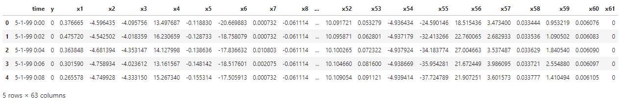
normal(0)이 18,274건, break(1)가 124건으로 구성 되어있다.
Counter(df['y']) # Counter({0: 18274, 1: 124})3. Curve Shifting
time 칼럼을 보면 2분 단위로 데이터가 나누어져 있는 것을 알 수 있다. 여기서의 목표는 break가 발생하기 4분 전에 조기 예측하는 것이다. 그러므로 4분 전까지의 데이터를 break 데이터로 만들기 위해서는 curve shifting을 2개의 row만큼만 적용하면 된다. 이후, 본래 break 데이터는 제거한다.
sign = lambda x: (1, -1)[x < 0]
def curve_shift(df, shift_by):
	vector = df['y'].copy()
	for s in range(abs(shift_by)):
		tmp = vector.shift(sign(shift_by))
		tmp = tmp.fillna(0)
		vector += tmp
	labelcol = 'y'
	# Add vector to the df
	df.insert(loc=0, column=labelcol+'tmp', value=vector)

	# Remove the rows with labelcol == 1.
	df = df.drop(df[df[labelcol] == 1].index)

	# Drop labelcol and rename the tmp col as labelcol
	df = df.drop(labelcol, axis=1)
	df = df.rename(columns={labelcol+'tmp': labelcol})

	# Make the labelcol binary
	df.loc[df[labelcol] > 0, labelcol] = 1

	return df
# shift the response column y by 2 rows to do a 4-min ahead prediction
shifted_df = curve_shift(df, shift_by=-5)
shifted_df.head()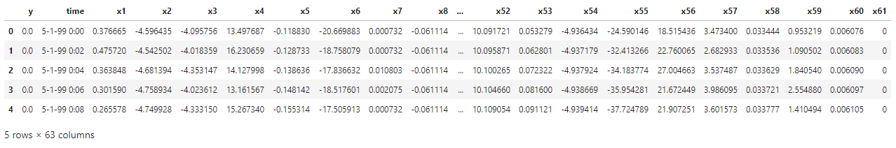
몇 가지 불필요한 데이터는 제거한 후, 데이터와 라벨을 분리해준다.
# drop remove columns
shifted_df = shifted_df.drop(['time','x28','x61'], axis=1)

# x, y
input_x = shifted_df.drop('y', axis=1).values
input_y = shifted_df['y'].values

n_features = input_x.shape[1]
4. Transform to Series Data
LSTM 모델은 (samples, timesteps, feature)에 해당하는 3d 차원의 shape을 가지므로, 데이터를 시퀀스 형태로 변환한다. timesteps은 5(즉, 10분)만큼 잡았다.
def temporalize(X, y, timesteps):
	output_X = []
	output_y = []
	for i in range(len(X) - timesteps - 1):
		t = []
		for j in range(1, timesteps + 1):
			# Gather the past records upto the lookback period
			t.append(X[[(i + j + 1)], :])
		output_X.append(t)
		output_y.append(y[i + timesteps + 1])
	return np.squeeze(np.array(output_X)), np.array(output_y)
timesteps = 5
# Temporalize
x, y = temporalize(input_x, input_y, timesteps)
print(x.shape) # (18268, 5, 59)5. Split Train / Valid / Test
이후, 훈련, 검증, 테스트 용 데이터로 분리한다. 각각 11,691, 2,923, 3,654개로 나누어주었다.
# Split into train, valid, and test
x_train, x_test, y_train, y_test = train_test_split(x, y, test_size=0.2)
x_train, x_valid, y_train, y_valid = train_test_split(x_train, y_train, test_size=0.2)

print(len(x_train))  # 11691
print(len(x_valid))  # 2923
print(len(x_test))   # 3654
LSTM Autoencoder 학습 시에는 Normal(0) 데이터만으로 학습할 것이기 때문에 데이터로 부터 Normal(0)과 Break(1) 데이터를 분리한다.
# For training the autoencoder, split 0 / 1
x_train_y0 = x_train[y_train == 0]
x_train_y1 = x_train[y_train == 1]

x_valid_y0 = x_valid[y_valid == 0]
x_valid_y1 = x_valid[y_valid == 1]
6. Standardize
각기 다른 데이터 특성의 표준화를 위해 z-score 정규화인 scikit-learn의 StandardScaler()를 적용하였다. 해당 함수를 적용하기 위해서는 2d 형태여야 하므로 Flatten 과정을 거친 후 스케일을 적용하였으며 이후 다시 3d 형태로 변환하였다.
def flatten(X):
    flattened_X = np.empty((X.shape[0], X.shape[2]))  # sample x features array.
    for i in range(X.shape[0]):
        flattened_X[i] = X[i, (X.shape[1]-1), :]
    return(flattened_X)

def scale(X, scaler):
    for i in range(X.shape[0]):
        X[i, :, :] = scaler.transform(X[i, :, :])

    return X
scaler = StandardScaler().fit(flatten(x_train_y0))
x_train_y0_scaled = scale(x_train_y0, scaler)
x_valid_scaled = scale(x_valid, scaler)
x_valid_y0_scaled = scale(x_valid_y0, scaler)
x_test_scaled = scale(x_test, scaler)7. Training LSTM Autoencoder
대칭 구조의 Staked Autoencoder 형태로 LSTM Autoencoder를 구성하여 정상 데이터로만 구성 된 데이터를 통해 총 200 epoch 학습시켰다.
epochs = 200
batch = 128
lr = 0.001
lstm_ae = models.Sequential()
# Encoder
lstm_ae.add(layers.LSTM(32, activation='relu', input_shape=(timesteps, n_features), return_sequences=True))
lstm_ae.add(layers.LSTM(16, activation='relu', return_sequences=False))
lstm_ae.add(layers.RepeatVector(timesteps))
# Decoder
lstm_ae.add(layers.LSTM(16, activation='relu', return_sequences=True))
lstm_ae.add(layers.LSTM(32, activation='relu', return_sequences=True))
lstm_ae.add(layers.TimeDistributed(layers.Dense(n_features)))
lstm_ae.summary()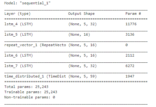
# compile
lstm_ae.compile(loss='mse', optimizer=optimizers.Adam(lr))

# fit
history = lstm_ae.fit(x_train_y0_scaled, x_train_y0_scaled,
                     epochs=epochs, batch_size=batch,
                     validation_data=(x_valid_y0_scaled, x_valid_y0_scaled))
Train on 11314 samples, validate on 2830 samples
Epoch 1/200
11314/11314 [==============================] - 4s 393us/sample - loss: 0.8505 - val_loss: 0.6345
Epoch 2/200
11314/11314 [==============================] - 1s 86us/sample - loss: 0.5249 - val_loss: 0.4738
Epoch 3/200
11314/11314 [==============================] - 1s 83us/sample - loss: 0.4049 - val_loss: 0.3784
: : : :
Epoch 198/200
11314/11314 [==============================] - 1s 94us/sample - loss: 0.1256 - val_loss: 0.1308
Epoch 199/200
11314/11314 [==============================] - 1s 97us/sample - loss: 0.1209 - val_loss: 0.1282
Epoch 200/200
11314/11314 [==============================] - 1s 96us/sample - loss: 0.1212 - val_loss: 0.1308train loss와 valid loss 모두 0.1근처로 수렴하고 있다.
plt.plot(history.history['loss'], label='train loss')
plt.plot(history.history['val_loss'], label='valid loss')
plt.legend()
plt.xlabel('Epoch'); plt.ylabel('loss')
plt.show()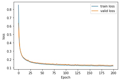
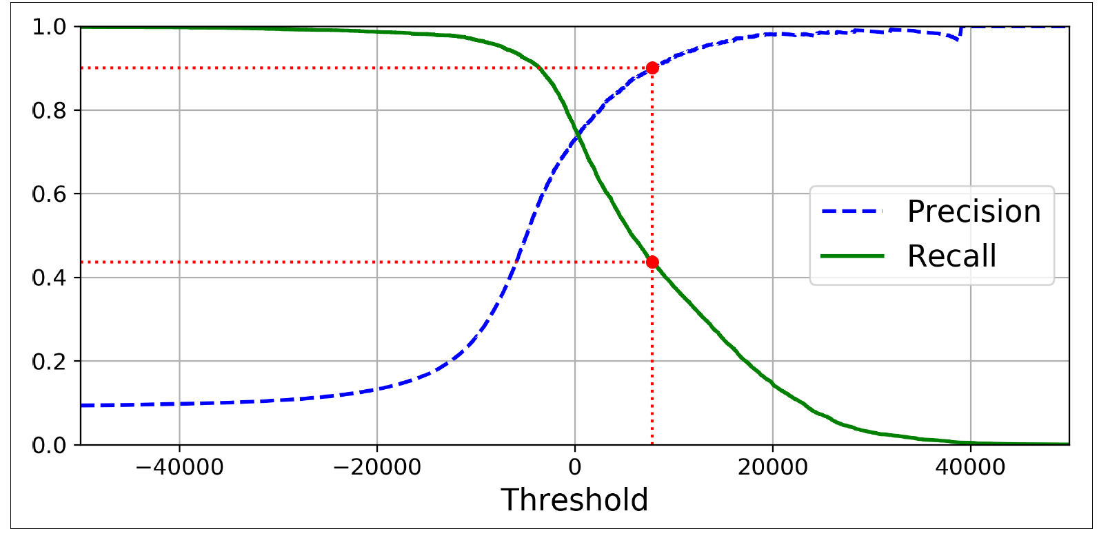
8. Threshold by Precision Recall Curve
normal과 break를 구분하기 위한 threshold를 지정하기 위해 precision recall curve를 적용한다. 주의해야할 것은 디코딩 된 재구성 결과가 아닌 재구성 손실(reconstruction error)와 실제 라벨 값을 비교한다는 것이다.
valid_x_predictions = lstm_ae.predict(x_valid_scaled)
mse = np.mean(np.power(flatten(x_valid_scaled) - flatten(valid_x_predictions), 2), axis=1)

error_df = pd.DataFrame({'Reconstruction_error':mse,
                         'True_class':list(y_valid)})
precision_rt, recall_rt, threshold_rt = metrics.precision_recall_curve(error_df['True_class'], error_df['Reconstruction_error'])

plt.figure(figsize=(8,5))
plt.plot(threshold_rt, precision_rt[1:], label='Precision')
plt.plot(threshold_rt, recall_rt[1:], label='Recall')
plt.xlabel('Threshold'); plt.ylabel('Precision/Recall')
plt.legend()
plt.show()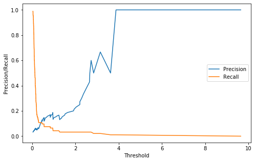
여기서 threshold의 경우 Recall과 Precision의 값이 교차되는 지점을 최적의 threshold 지점으로 잡았다.
여기서 최적의 threshold는 0.407이다.
# best position of threshold
index_cnt = [cnt for cnt, (p, r) in enumerate(zip(precision_rt, recall_rt)) if p==r][0]
print('precision: ',precision_rt[index_cnt],', recall: ',recall_rt[index_cnt])

# fixed Threshold
threshold_fixed = threshold_rt[index_cnt]
print('threshold: ',threshold_fixed)
precision: 0.10752688172043011 , recall: 0.10752688172043011
threshold: 0.407771424138432379. Predict Test
이제 테스트 셋에 적용해볼 차례이다. 학습하였던 LSTM Autoencoder 모델을 통해 테스트 셋을 예측 후 재구성 손실을 계산한다. 그 후 위에서 찾은 threshold를 적용하여 Normal과 Break를 구분한다.
test_x_predictions = lstm_ae.predict(x_test_scaled)
mse = np.mean(np.power(flatten(x_test_scaled) - flatten(test_x_predictions), 2), axis=1)

error_df = pd.DataFrame({'Reconstruction_error': mse,
                         'True_class': y_test.tolist()})

groups = error_df.groupby('True_class')
fig, ax = plt.subplots()

for name, group in groups:
    ax.plot(group.index, group.Reconstruction_error, marker='o', ms=3.5, linestyle='',
            label= "Break" if name == 1 else "Normal")
ax.hlines(threshold_fixed, ax.get_xlim()[0], ax.get_xlim()[1], colors="r", zorder=100, label='Threshold')
ax.legend()
plt.title("Reconstruction error for different classes")
plt.ylabel("Reconstruction error")
plt.xlabel("Data point index")
plt.show();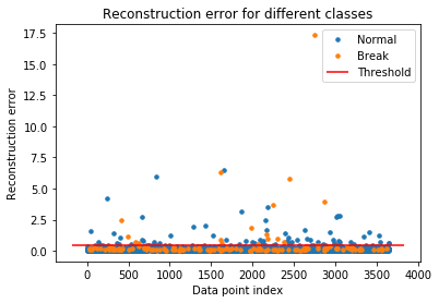
10. Evaluation
confusion matrix
테스트 셋에 대한 재구성 손실을 threshold를 기준으로 0/1로 나누고 이를 confusion matrix로 표현하였다.
Break에 대한 예측 결과가 실망스러울 수 있지만 이렇게 Sheet Break의 10%만 줄여도 엄청난 손실을 줄일 수 있다고 한다.
# classification by threshold
pred_y = [1 if e > threshold_fixed else 0 for e in error_df['Reconstruction_error'].values]

conf_matrix = metrics.confusion_matrix(error_df['True_class'], pred_y)
plt.figure(figsize=(7, 7))
sns.heatmap(conf_matrix, xticklabels=LABELS, yticklabels=LABELS, annot=True, fmt='d')
plt.title('Confusion Matrix')
plt.xlabel('Predicted Class'); plt.ylabel('True Class')
plt.show()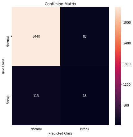
ROC Curve and AUC
false_pos_rate, true_pos_rate, thresholds = metrics.roc_curve(error_df['True_class'], error_df['Reconstruction_error'])
roc_auc = metrics.auc(false_pos_rate, true_pos_rate,)

plt.plot(false_pos_rate, true_pos_rate, linewidth=5, label='AUC = %0.3f'% roc_auc)
plt.plot([0,1],[0,1], linewidth=5)

plt.xlim([-0.01, 1])
plt.ylim([0, 1.01])
plt.legend(loc='lower right')
plt.title('Receiver operating characteristic curve (ROC)')
plt.ylabel('True Positive Rate'); plt.xlabel('False Positive Rate')
plt.show()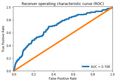
11. Result
최종적으로 테스트 셋에 대한 재구성 손실을 threshold를 통해 구분한 pred_y의 마지막 5번째(timestep만큼)을 출력하여 예측 결과를 확인할 수 있다.
pred_y[-5:] # [0, 0, 1, 0, 0]위 결과를 해석하기가 애매모호한 부분이 있지만, 대략 넓게 잡았을 때 최소 10분 이내에는 Break가 발생할 것 같다고 해석할 수 있을 것이다.
References
.jpeg)

감사합니다.