
matplotlib
matplotlib 란?
- 파이썬의 대표 시각화 도구
- matplotlib은
plt로 줄여서 사용 - Jupyter notebook 유저의 경우 matplotlib 결과가 out session애 나타나는 것이 유리해, %matplotlib inline 옵션을 사용한다
그래프
시작 : plt.figure(figsize=(그림에 대한 속성))
그림을 그려라 : plt.plot([], [] ...)
끝 : plt.show()
그래프 명령어
-
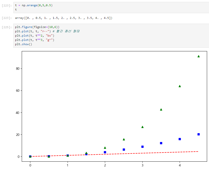
000 = np.arrange(a, b, s): 000을 a 부터 b 까지 s 간격으로 그려라 -
그래프의 결과가 중요한 경우
코드는 def() 함수로로 작성한다
-> 나중에 별도의 셀에서 그림만 나타낼 수 있기 때문 -
명령어 종류
def drawGraph() :
	plt.figure(figsize=(10, 6))  # ⭐시작!, 사이즈 지정
    plt.plot(t, np.sin(t), label="sin") # t값, t갑이 들어간 sin()함수, 이름은 "sin"
    plt.plot(t, np.cos(t), label="cos") # t값, t갑이 들어간 cos()함수, 이름은 "cos"
    plt.grid() # 그래프의 격자 완성
    plt.legend() # label 들의 범례를 표현
    plt.xlabel("time") # X축의 제목
    plt.ylabel("Amplitude") #y축의 제목
    plt.title("Example of sinewave") #그래프의 제목
    plt.show() # 마무리 (⭐항상 마지막에 써줘야 함)
1. 이론
import matplotlib.pyplot as plt
from matplotlib import rc

rc("font", family="Malgun Gothic")
get_ipython().run_line_magic("matplotlib", "inline")plt.figure(figsize=(10,6))
plt.plot([0,1,2,3,4,5,6,7,8,9], [1,1,2,3,4,2,3,5,-1,3])
plt.show()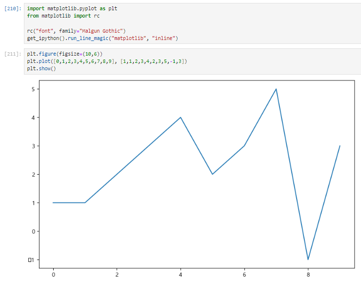
2. 실습_(1) 기본
1. 그래프 기본
삼각함수 그리기
- np.arange(a,b,s) : a부터 b까지 s간격
- np.sin(value)
import numpy as np

t = np.arange(0, 12, 0.01)
y = np.sin(t)plt.figure(figsize=(10, 6))
plt.plot(t, np.sin(t))
plt.plot(t, np.cos(t))
plt.show()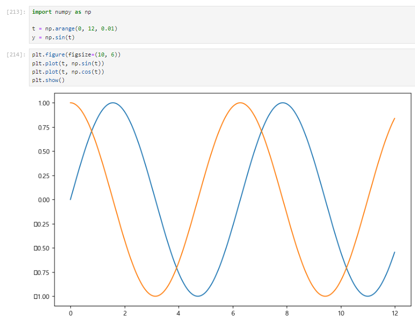
2. 격자 무늬 추가
plt.grid(True)
plt.figure(figsize=(10, 6))
plt.plot(t, np.sin(t))
plt.plot(t, np.cos(t))
plt.grid(True)
plt.show()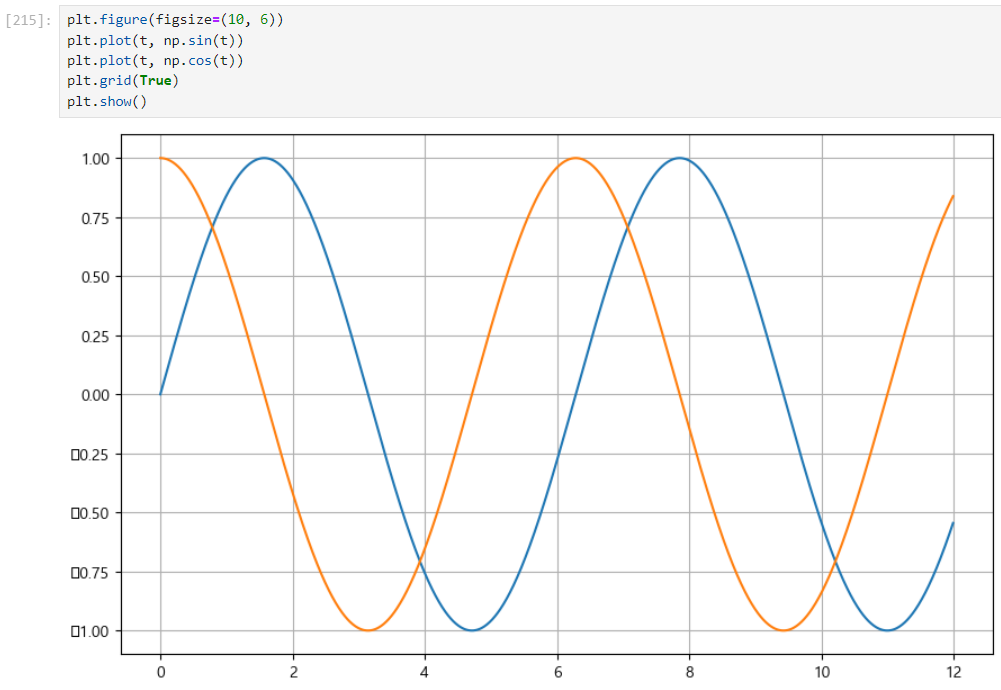
3. 그래프 제목 추가
plt.title ("Example of sinwave")
plt.figure(figsize=(10, 6))
plt.plot(t, np.sin(t))
plt.plot(t, np.cos(t))
plt.grid(True)
plt.title ("Example of sinewave")
plt.show()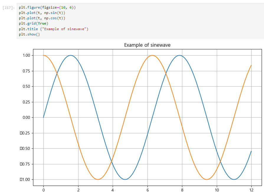
4. x축, y축 제목 추가
plt.xlabel("time")
plt.ylabel("Amplitude")plt.figure(figsize=(10, 6))
plt.plot(t, np.sin(t))
plt.plot(t, np.cos(t))
plt.grid(True)
plt.title ("Example of sinewave")
plt.xlabel("time")
plt.ylabel("Amplitude")
plt.show()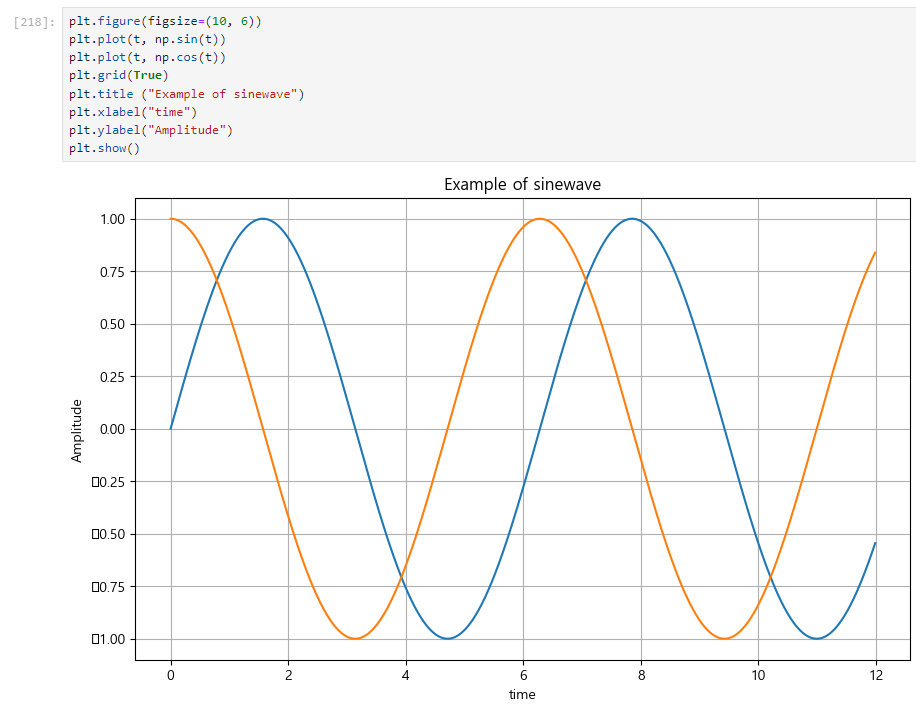
5. 주황색, 파란색 선 데이터 의미 구분
plt.legend(labels=["sin", "cos"])
plt.figure(figsize=(10, 6))
plt.plot(t, np.sin(t))
plt.plot(t, np.cos(t))
plt.grid(True)
plt.title ("Example of sinewave")
plt.xlabel("time")
plt.ylabel("Amplitude")
plt.legend(labels=["sin", "cos"])
plt.show()
📌아래 방법을 더 선호
plt.figure(figsize=(10, 6))
plt.plot(t, np.sin(t), label="sin") 📌
plt.plot(t, np.cos(t), label="cos") 📌
plt.legend() 📌
plt.grid(True)
plt.title ("Example of sinewave")
plt.xlabel("time")
plt.ylabel("Amplitude")
plt.show()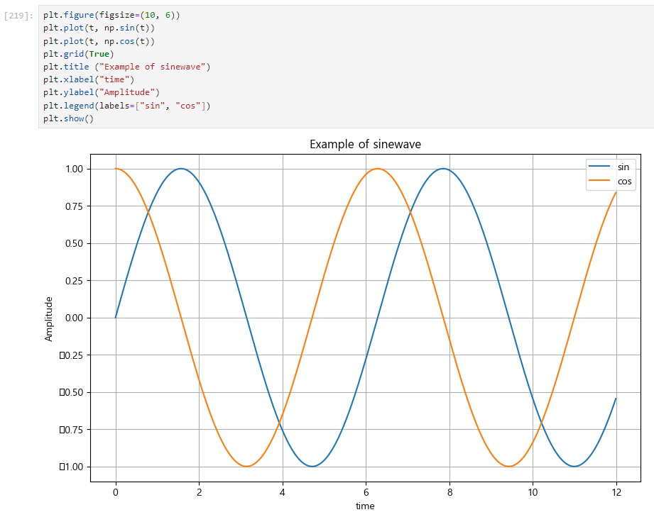
3. 실습_(2) 커스텀
1. 점 모양 변경
2. 선형 그래프
def drawGraph():
    plt.figure(figsize=(10,6))
    plt.plot(
        t,
        y,
        color="green",
        linestyle="dashed", # 점선 형태의 선
        marker="o", #동그라미 모양
        markerfacecolor="blue",
        markersize=15,
    )
    plt.xlim([-0.5, 6.5]) # x축의 범위
    plt.ylim([0.5, 9.5]) # y축의 범위
    plt.show
drawGraph()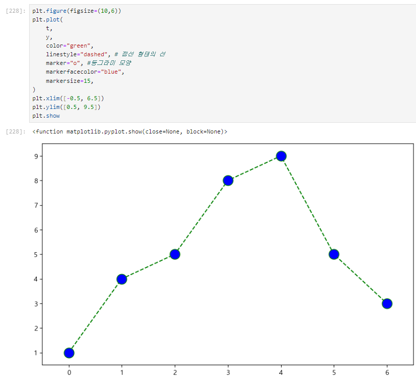
3. scatter plot
t = np.array(range(0, 10))
y = np.array([9,8,7,9,8,3,2,4,3,4])
def drawGraph():
plt.figure(figsize=(10,6))
plt.scatter(t, y)
plt.show()
drawGraph()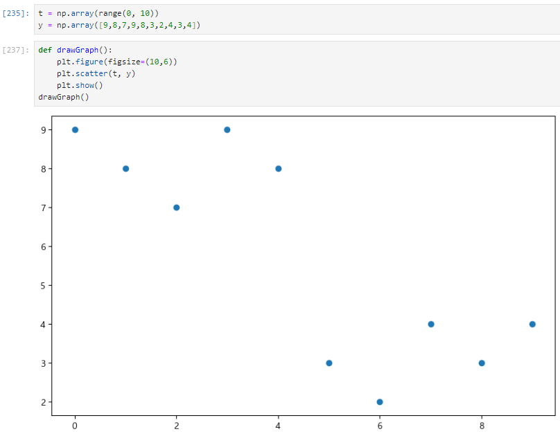
4. scatter plot_커스텀
colormap = t

def drawGraph():
    plt.figure(figsize=(20,6))
    plt.scatter(t, y, s=50, c=colormap, marker=">")
    plt.colorbar() # 오른쪽에 color bar
    plt.show()
drawGraph()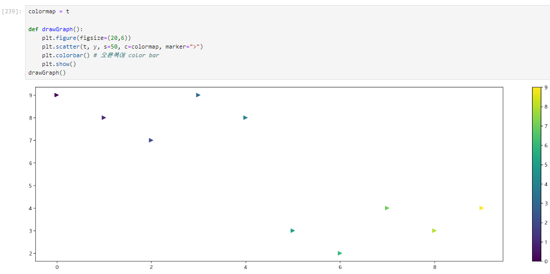
Pandas에서 plot 그리기
⭐
google > matplotlib > documentation > Examples > Gallery 참고 할 것..!
data_result.head()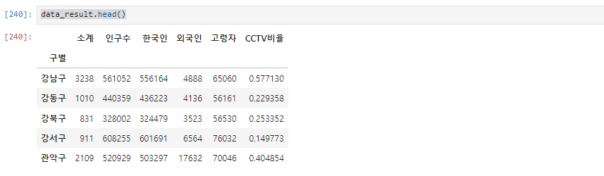
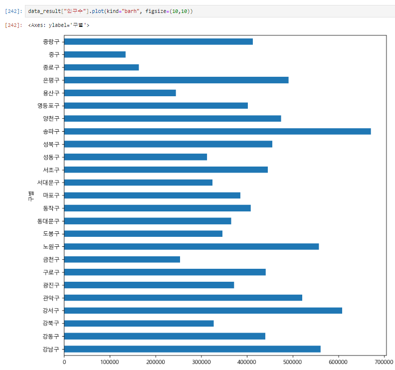
data_result["인구수"].plot(kind="bar", figsize=(10,10))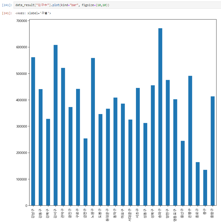
data_result["인구수"].plot(kind="barh", figsize=(10,10))kind="barh" h 를 추가하면 가로 막대 그래프로 변경
Seaborn
1. 시작
2. 실습
1. seaborn 기초
x= np.linspace(0,14,100) # 0~14까지 100개의 data를 만들어라
y1 = np.sin(x)
y2 = 2 * np.sin(x + 0.5)
y3 = 3 * np.sin(x + 1.0)
y4 = 4 * np.sin(x + 1.5)plt.figure(figsize=(10,6))
plt.plot(x, y1, x, y2, x, y3, x, y4)
plt.show()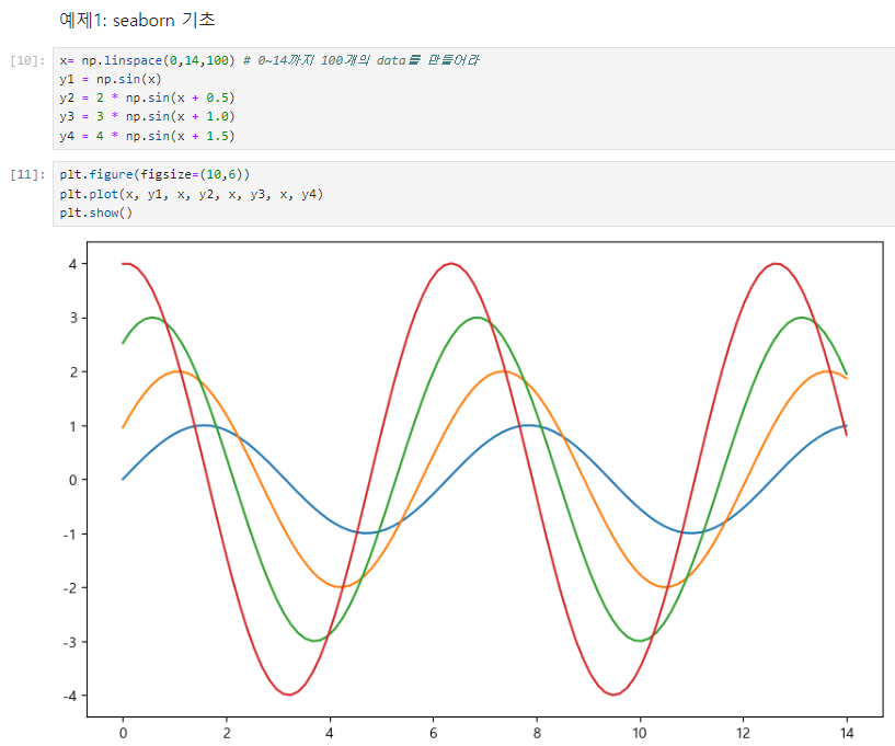
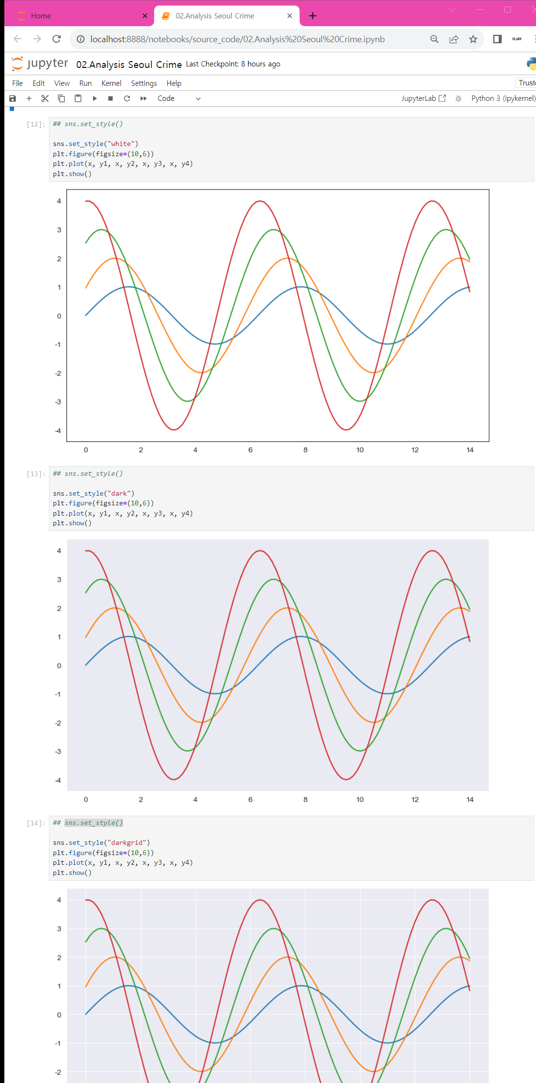
2. sns.set_style()
- white, whitegrid, dark, darkgrid, ticks
3. seaborn tips data
boxplot
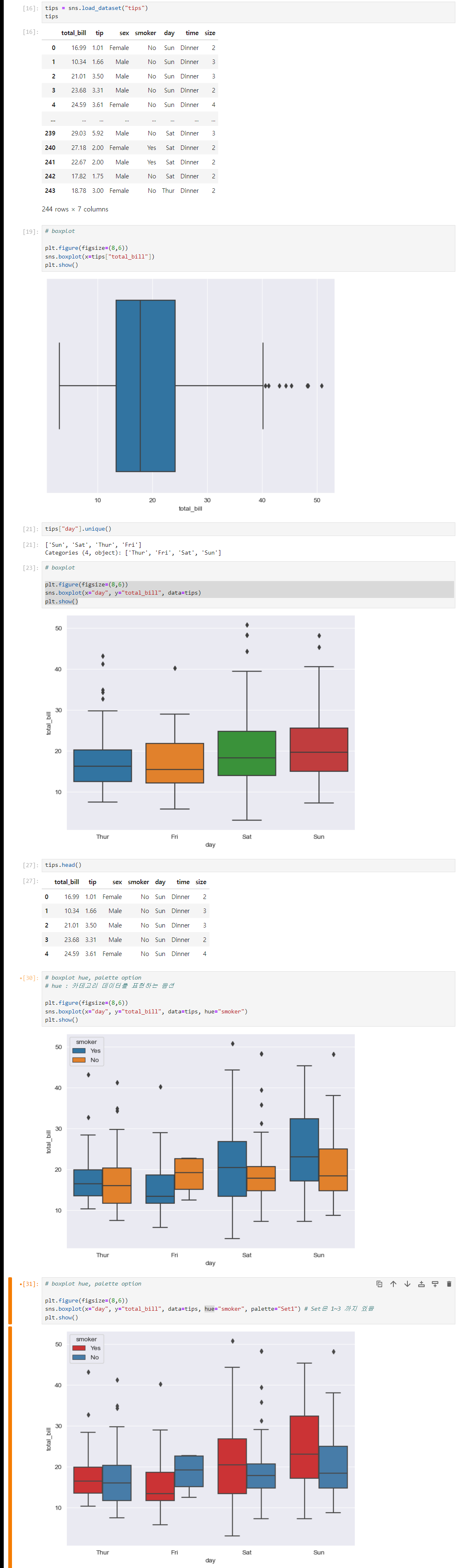
swarmplot
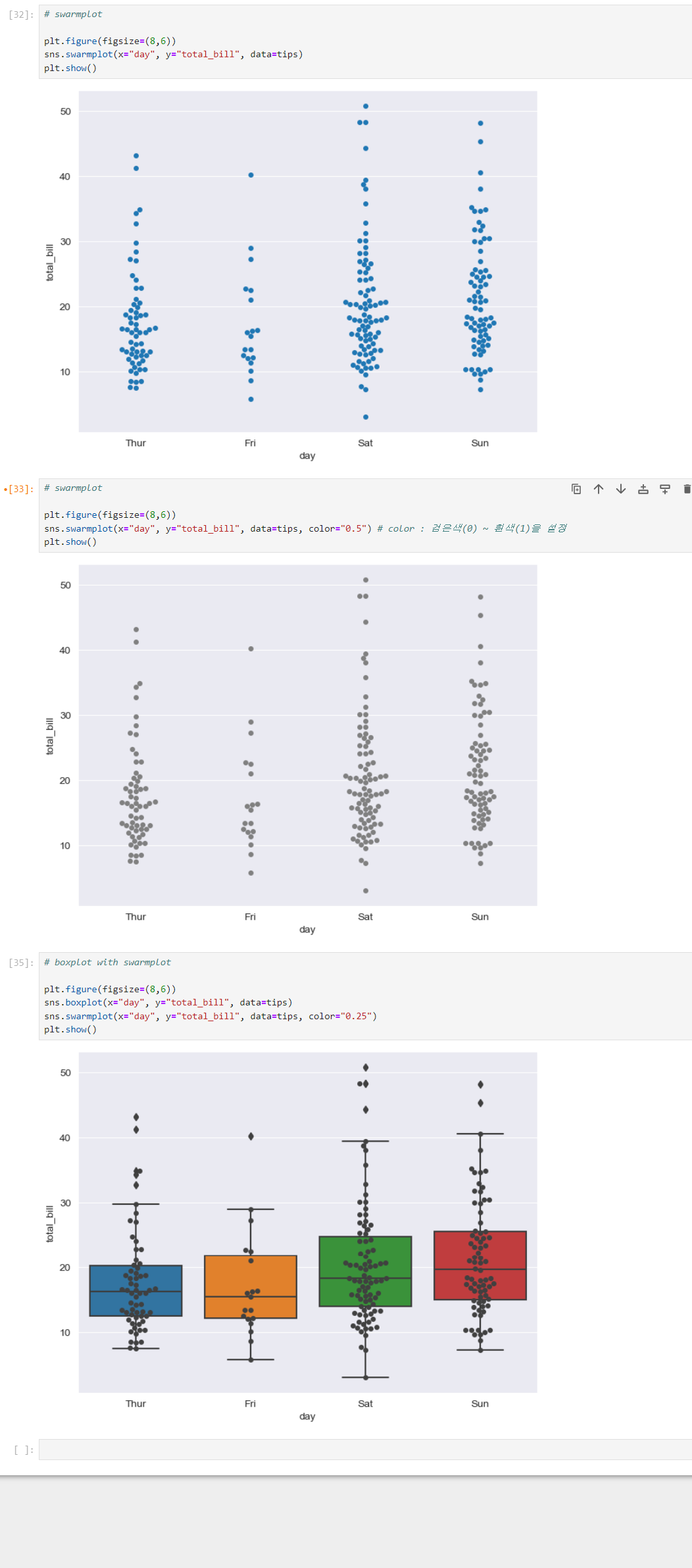
-
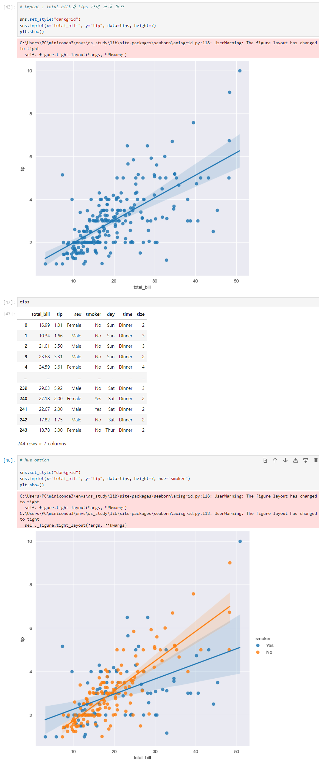
lmplot (엘엠피엘오티) i 아님, 주의!
total_bill과 tips 사이 관계 파악
4. flight data
pivot
pivot 구성 3가지 요소 : index, colums, valuesflights = flights.pivot(index="month", columns="year", values="passengers") flights.head()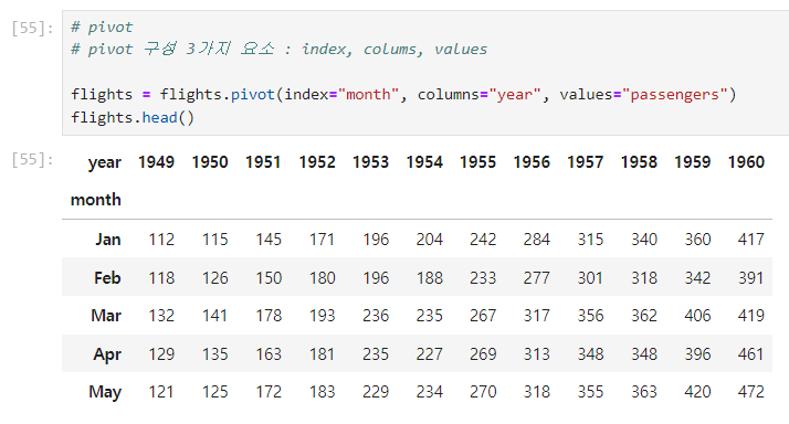
heatmap
annot=True: 네모 칸 안의 숫자 넣(true), 안넣(false)
fmt="d": 정수형으로 표현 (f:플롯형)plt.figure(figsize=(10,8)) sns.heatmap(data=flights, annot=True, fmt="d") plt.show()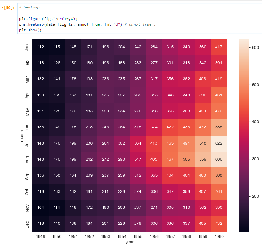
heatmap
cmap="YlGnBu": 색상 변경plt.figure(figsize=(10,8)) sns.heatmap(data=flights, annot=True, fmt="d", cmap="YlGnBu") plt.show()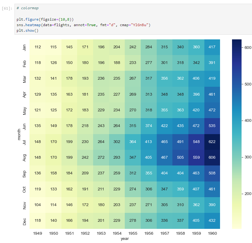
5. iris data (pairplot)
pairplot
sns.pairplot(iris)
plt.show()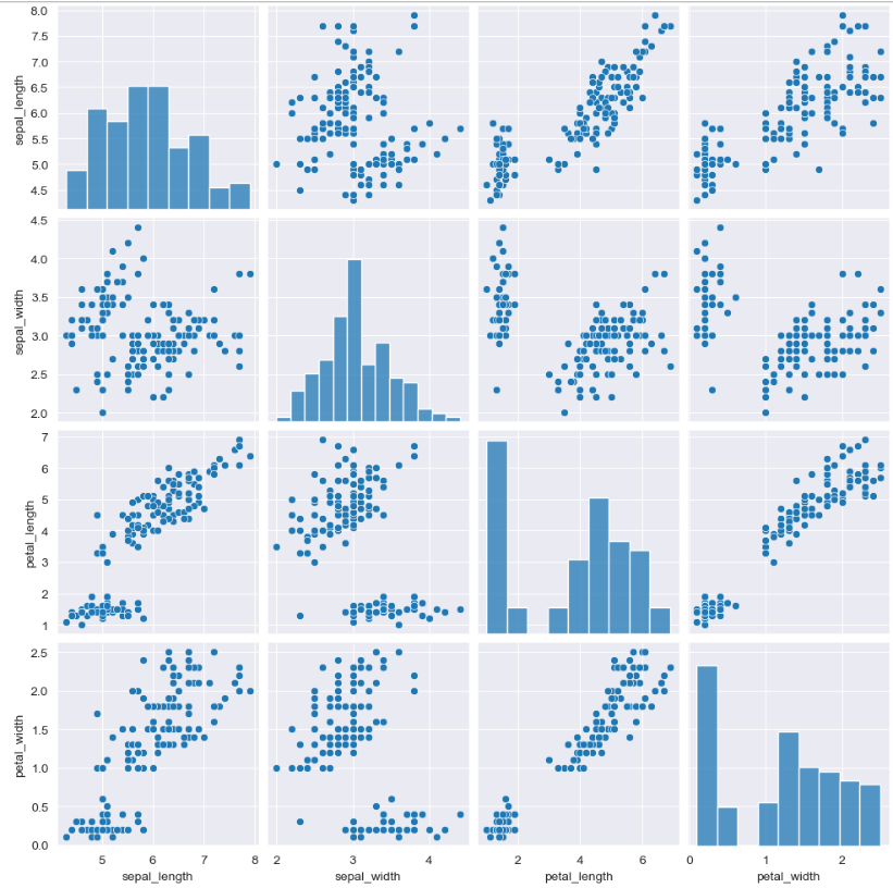
스타일 지정
sns.set_style("ticks"): 스타일 지정 코드
종류 : white, whitegrid, dark, darkgrid, ticks
sns.set_style("ticks")
sns.pairplot(iris)
plt.show()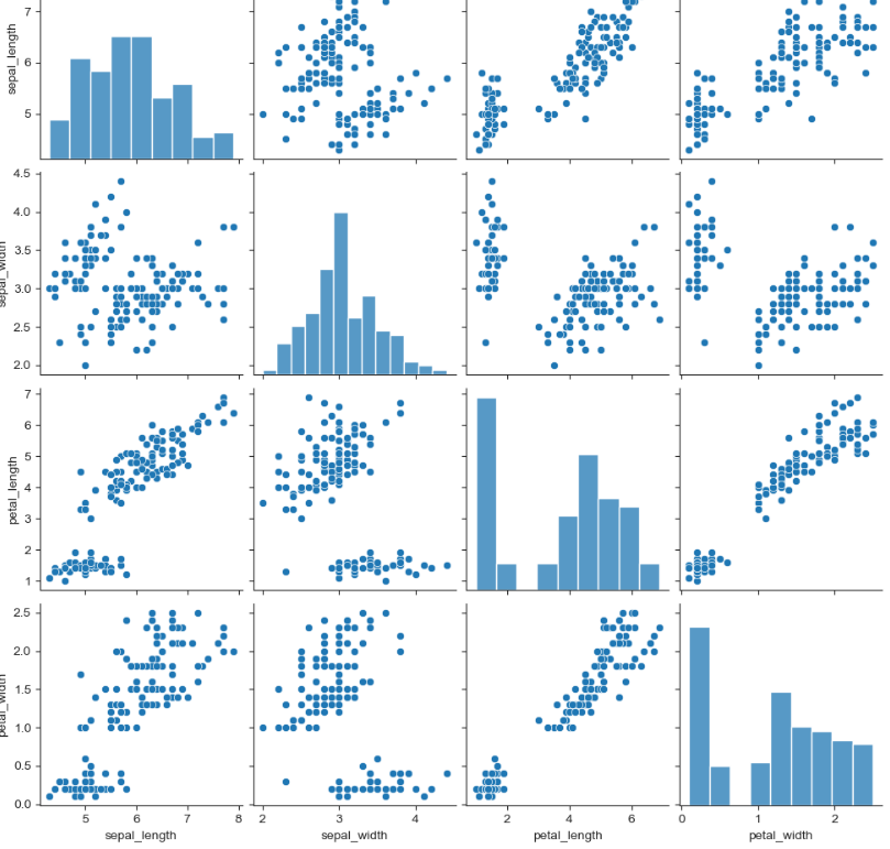
담겨있는 데이터 확인
iris["species"].unique()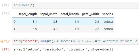
카테고리별 항목 확인
hue option을 활용 한다sns.pairplot(iris, hue="species") plt.show()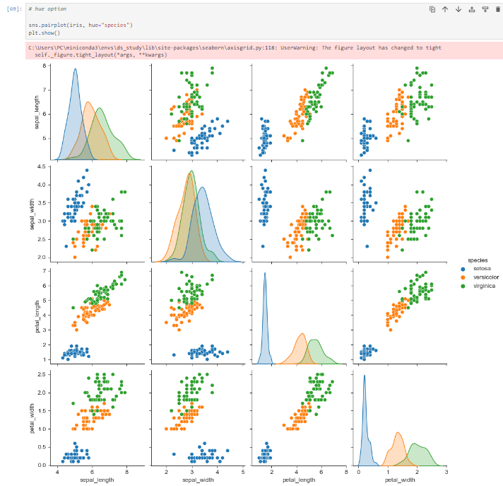
원하는 항목만 그리기
sns.pairplot(iris, x_vars=["sepal_width", "sepal_length"], y_vars=["petal_width", "petal_length"])
plt.show()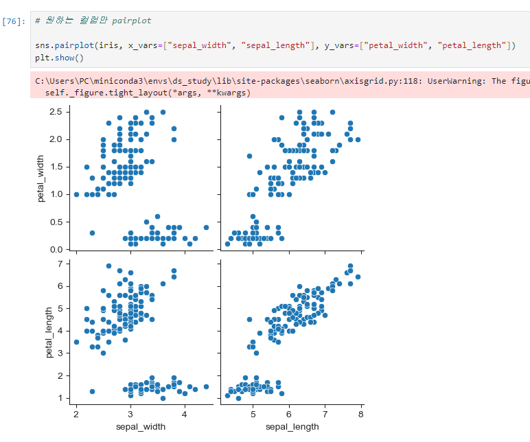
6.

비전공자의 데이터 공부법