08. CSS의 기본개념
🐣 CSS 선언방식
✔️ 우선순위: in-line>내장, 아랫쪽 선언>윗쪽
➊ in-line
< div style="background-color: lightcyan;">내용이 들어감< /div>
➋ 내장(embedded)
< style>
div{ background-color: lightgray;}
< /style>
➌ link
< link rel="stylesheet" href="./css1.css">
div {
background-color: lightblue;
font-size: 2em;
}
➍ @import
@import url(./test.css);
🐥 사이즈
✅ 사이즈: width/height(기본값 auto)
✅ 최대 사이즈: max-width/max-height(기본값 none)
✅ 최소 사이즈: min-width/min-height(기본값 0)
✔️ 인라인 요소는 넓이/높이 적용되지 않아서 디스플레이 값을 변경해주어야함
display: inline-block;
✔️ 사이즈를 벗어난 영역 설정
✅ overflow: visible(기본값), hidden(감춤), scroll(가로세로 스크롤)
✅ overflow-x/overflow-y: 가로/세로 스크롤 감춤
🐥 단위
✅ px: 픽셀 ✅ %: 상대단위, 부모요소 대비
✅ em: 부모요소에 적용된 폰트 단위 비율
✅ rem: 루트에서 적용된 폰트 사이즈 비율
✅ vw/vh: 뷰포트 넓이/높이
- 기본 폰트크기: 16px
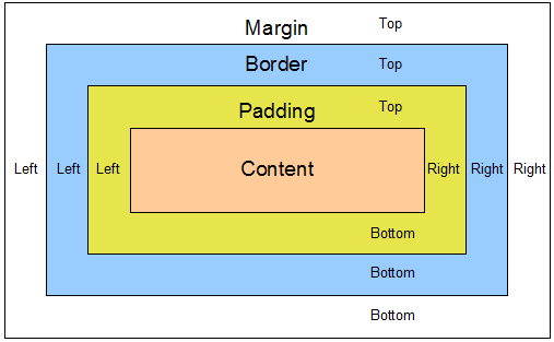
🐤 padding
✔️ 요소 내부 여백 지정
✔️ padding:상 우 하 좌_시계방향/ 상 [좌, 우] 하 / [상, 하][좌, 우] / [전체적용]
✔️ padding-top/padding-bottom/padding-right/padding-left
- box-sizing:content-box: 기본값, 콘텐츠 영역까지만 요소의 크기 계산
- box-sizing:padding-box: 패딩 영역까지만
- box-sizing:border-box: 추가된 padding값 만큼 요소의 크기가 커지므로 이를 막기위해 자동계산, 너미에 안쪽 여백과 테두리 선을 포함하여 요소 크기 계산
🐤 margin
✔️ 요소 외부 여백 지정, 음수 사용X
✔️ margin:상 우 하 좌 / 상 [좌, 우] 하 / [상, 하][좌, 우] / [전체적용]
✔️ margin-top/margin-bottom/margin-right/margin-left
✔️ 마진 중복 해결방법
✅ 형제요소: 각 형제 요소에 float속성 적용,
사이즈가 늘어났을 때 형제들이 옆으로 나열되므로 레이아웃에 적용되는 요소들은 float 사용X
✅ 부모자식요소:
❶ 부모요소에 float속성 적용
❷ overflow:hidden(auto)
❸ position:absolute(fixed)
❹ padding:1px 이상
❺ border:1px 이상
🐤 border
✔️ 요소의 테두리 선
✔️ 속기형-border:두께 종류 색상;
✔️ border-top/border-top-width/border-top-style/border-top-color
✅ border-width: 선의 두께(기본값 medium)
ㄴthin/thick/px/em
✅ border-style: 선의 종류(기본값 none)
ㄴhidden/solid/dotted/dashed/double/groove/ridge/inset/outset
✅ border-color: 선의 색상(기본값 black)
ㄴ색상/transparent(투명)
09. 요소의 위치
🐤 position
✅ static: 기본위치,
✔️ 이미 설정된 position을 무력화하기 위해 사용 가능
✔️ 좌표속성(TBLR)을 같이 사용할 수 없음
✅ relative: 상대위치, 좌표속성
✔️ static과의 차이점은 좌표 프로퍼티의 동작여부
✅ absolute: 절대위치
✔️ 부모/가장가까운 조상요소 기준으로 좌표속성만큼 이동
✔️ 부모요소를 배치기준으로 삼기 위해서는 부모 relative
✔️ 부유객체로 변경
✔️ width는 inlin요소와 같이 작용하므로 적절한 width 재설정
✅ fixed: 고정위치
✔️ 브라우저 viewport기준으로 좌표사용(스크롤되더라도 고정)
✔️ width는 inlin요소와 같이 작용하므로 적절한 width 재설정
✅ sticky: 특정 위치 이상 올라가지 않음
✔️ position 안쪽에 위치하면 적용되지 않음<-body의 직계자식으로 설정
-
display변경: absolute/fixed가 적용될 경우 inline의 형태로 변경되어 width,height 재설정(넓이 속성이 사라져서 컨텐츠만큼의 넓이만 보여짐)
-
부유객체: absolute/fixed가 적용될 경우 다음 요소의 위치에 영향을 주어 겸침현상 발생<-z-index 우선순위
-
좌표속성: static제외 속성값 좌표설졍_ top, bottom, left, right(음수가능)
-
z-index: 우선순위, 기본값 0
✔️ 숫자가 높을수록 사용자의 시선 앞으로 이동
✔️ 같은 레벨이면 구조문사 앙래의 작성된 요소 우선 -
!important: 우선순위 무시하고 적용
-
모달 영역: 화면 전체를 덮는 요소
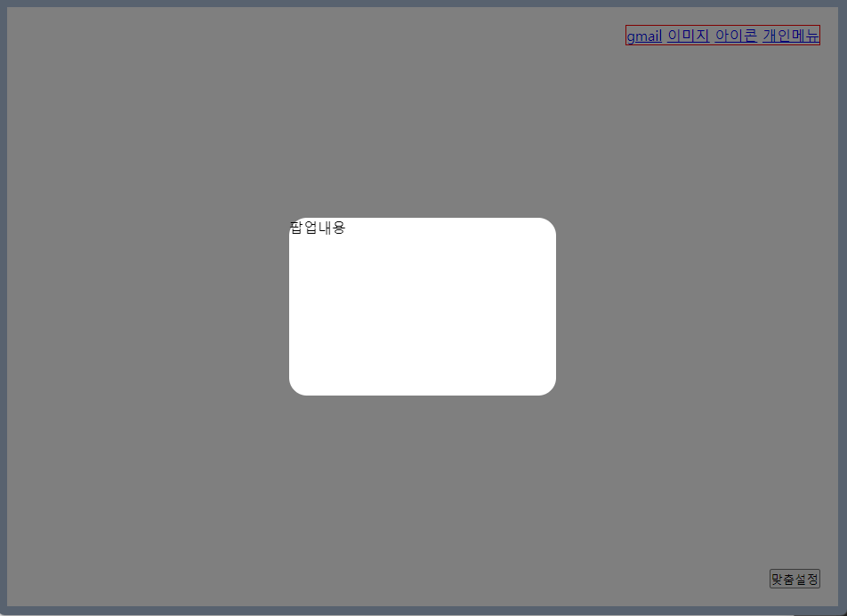
 <!-- 상단에 선언했다면 z-index 높게 설정 -->
    <div class="popup">
        <div class="inner">팝업내용</div>
    </div>
.popup{
position:fixed;
width:100%; height: 100%;
top:0;
background-color: rgba(0,0,0,0.5);
z-index: 10;
/* display:none; */
}
.inner{
position:absolute;
background-color: white;
width: 300px; height:200px;
/* 둥근 모서리 */
border-radius: 20px;
left:50%; top:50%;
transform: translate(-50%, -50%);
}🐣 실습
- border-radius: 둥근 모서리
- transform: translate(-50%, -50%); : 정중앙 위치
<body>
<section class="con">
<div class="person">
<a href="#">gmail</a>
<a href="#">이미지</a>
<a href="#">아이콘</a>
<a href="#">개인메뉴</a>
</div>
<div class="search">
<p>로고</p>
<input type="text">
</div>
<button class="btn">맞춤설정</button>
</section>
<!-- 상단에 선언했다면 z-index 높게 설정 -->
<div class="popup">
<div class="inner">팝업내용</div>
</div>
</body><!-- css -->
*{
margin:0; padding:0;
box-sizing:border-box;
}
.con{
border:10px solid lightsteelblue;
height:100vh;
position:relative;
}
.person{
border:1px solid red;
position:absolute;
right: 20px;;
top:20px;
}
.search{
border:1px solid lightseagreen;
position:absolute;
left:50%; top:50%;
transform: translate(-50%, -50%);
}
.btn{
position: absolute;
bottom:20px; right:20px;
}
    .popup{
    position:fixed;
    width:100%; height: 100%;
    top:0;
    background-color: rgba(0,0,0,0.5);
    z-index: 10;
    /* display:none; */
}
.inner{
    position:absolute;
    background-color: white;
    width: 300px; height:200px;
    /* 둥근 모서리 */
    border-radius: 20px;
    left:50%; top:50%;
    transform: translate(-50%, -50%);
}