1. 뷰포트(viewport) 란?
브라우저를 띄운 상태로 보여지는 화면 그 자체
2. position 4가지 속성에 대하여 설명하시오.
- position에는 static, fixed(거의 비슷한 sticky), relative, absolute가 있다.
static
- block과 inline을 그대로 받는 기본적인(default) 위치 선정
- top, left와 같은 위치 이동 속성이 적용되지 않는다.
fixed(sticky)
- viewport를 기준으로 위치를 잡는다.
- 위치가 잡히면 항상 그 자리에 있도록 적용되며 스크롤을 내려도(sticky는 스크롤을 하면 위아래로 움직이긴 하나 해당 부모요소에 붙어 위치가 변함) 설정한 위치에 고정되어있다.
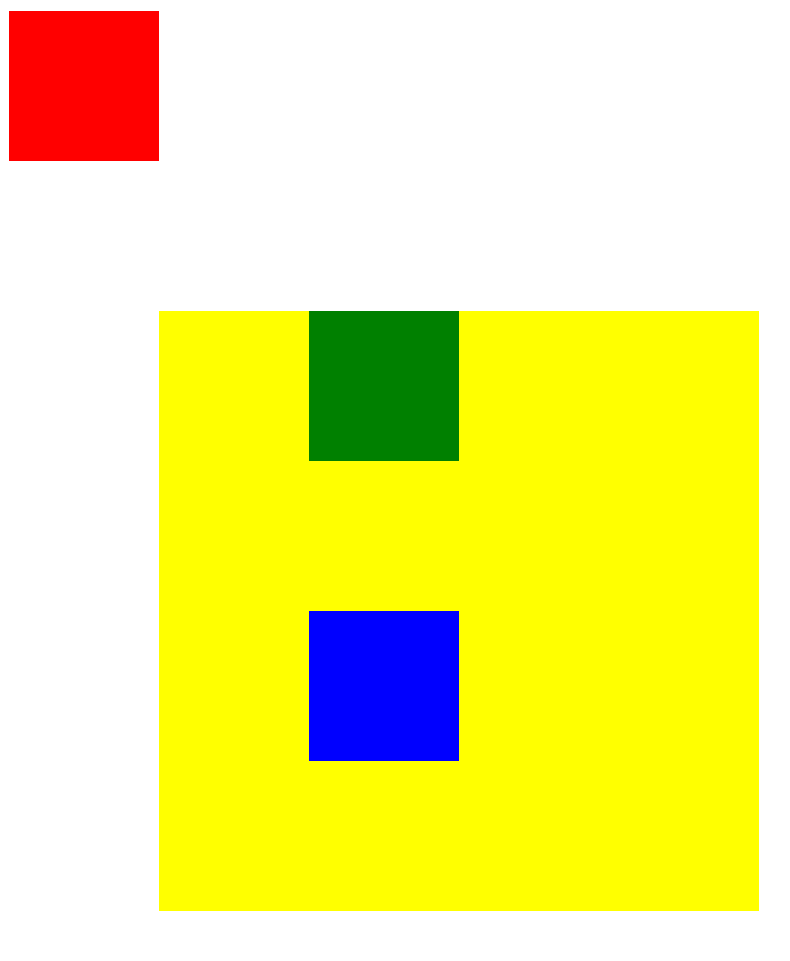
relative
- top, left를 적용할 시에 원래 내가 위치해야할 곳에서부터 시작
- 100px * 100px인 div태그가 yellow안에 green과 blue가 있는데, blue는 원래 yellow의 맨 왼쪽에 붙어 두번째 줄에 있어야 하는데, top과 left 속성을 각각 100px씩 주어 이런 식으로 위치해있다.
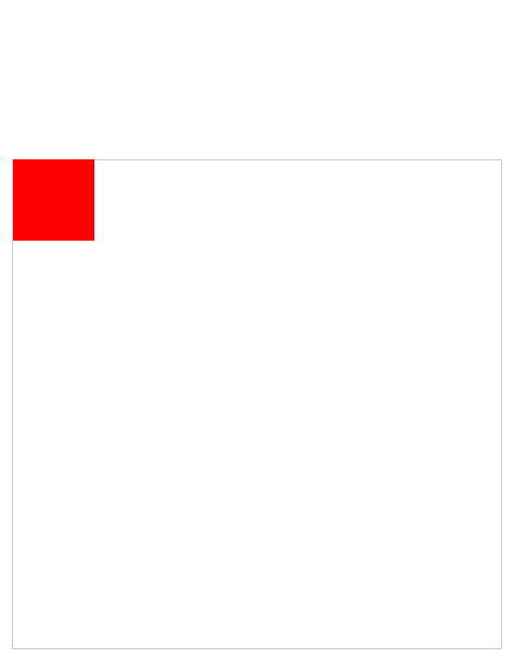
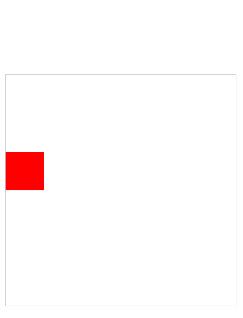
absolute
- top, left 등을 적용할 시, 상위에 relative가 있는 곳이 기준이 된다. 만약 상위에 relative가 없을 경우 body가 기준
- 안에 있는 빨간 사각형이 position absolute에 top 100px을 줬을 경우 두 가지가 가능하다.
- 겉 사각형에 relative 속성을 지웠을 때
- 겉 사각형에 relative 속성을 줬을 때
3. 아래를 설명하시오.
- float
- 상하로 정렬되는 컨텐츠들을 왼쪽, 오른쪽으로 정렬할 수 있도록 만들어주는 속성
- overflow : hidden
- 정해진 사이즈 내부에 컨텐츠가 넘쳐버릴 경우 그것을 가리는 역할을 한다.
- clear : both
- floating된 content들의 floating을 풀어준다. left만 되어있으면 left 값만 넣어주면 되나, right를 사용했을 경우도 있으니 both를 해주는 것이 좋다.
4. position 속성중 absolute 의 기준에 대하여 설명하시오.
- top, left 등을 적용할 시, 상위에 relative가 있는 곳이 기준이 된다. 만약 상위에 relative가 없을 경우 body가 기준
5. box-sizing 속성 2개를 설명하시오.
- content-box와 border-box가 있다.
- box-sizing의 속성 중 border-box를 적용하면 border와 margin의 경계가 크기
- box-sizing을 content-box로 하면 padding과 content의 경계가 크기
값은 content-box, border-box, initial, inherit가 있다.
6. html_css_13_1_ex3.html 을 구현하시오.
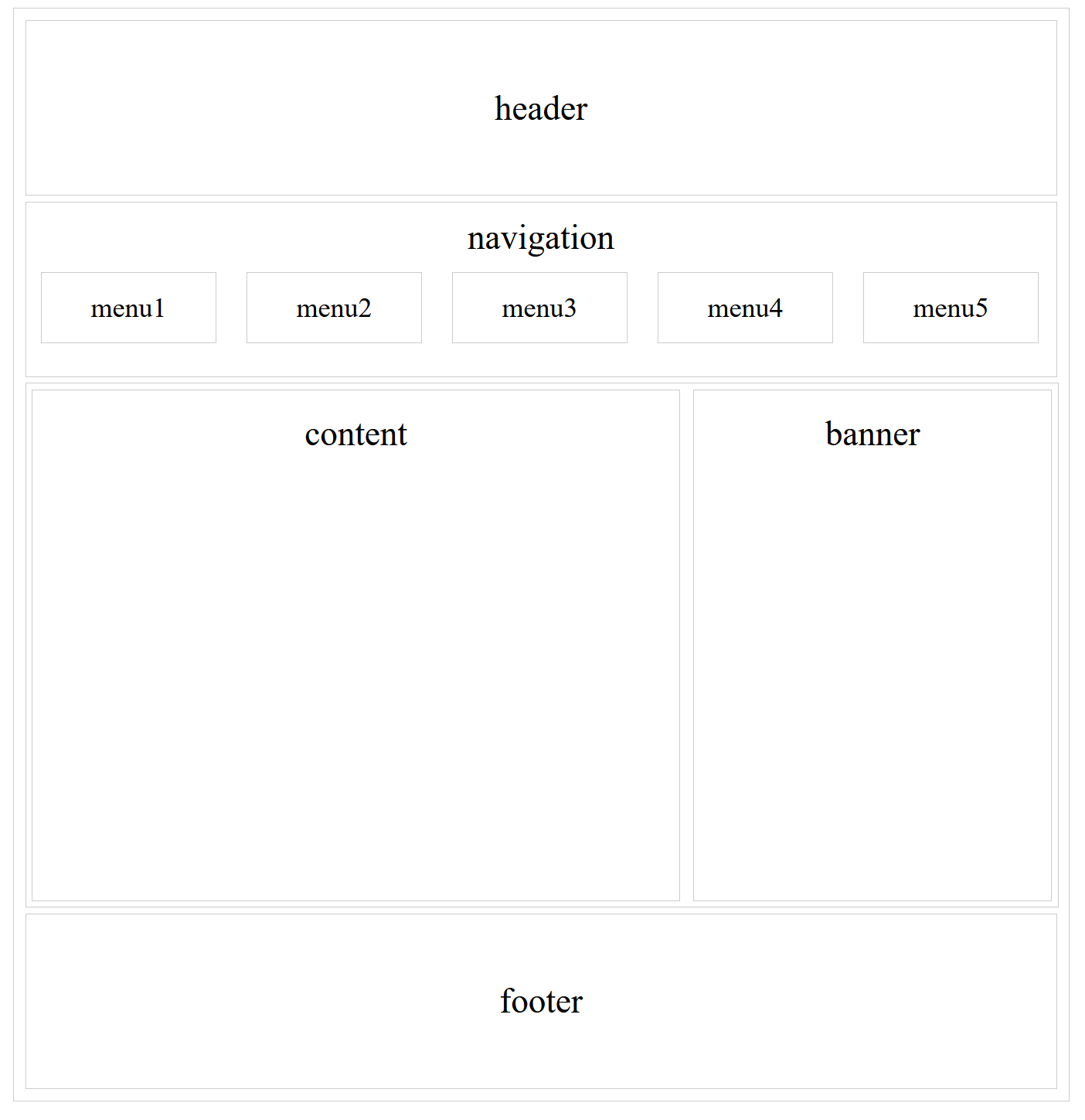
<!DOCTYPE html>
<html lang="en">

<head>
  <meta charset="UTF-8">
  <meta name="viewport" content="width=device-width, initial-scale=1.0">
  <title>Document</title>
  <style>
    body {
      font-size: 30px;
      text-align: center;
    }

    #wrapper {
      width: 900px;
      padding: 5px;
      margin: 0 auto;
      border: 1px solid #cccccc;
    }

    #header {
      height: 150px;
      line-height: 150px;
      border: 1px solid #cccccc;
      margin: 5px;
    }

    #nav {
      clear: both;
      height: 150px;
      line-height: 2em;
      border: 1px solid #cccccc;
      margin: 5px;
    }

    ul {
      list-style: none;
      margin: 0 auto;
      padding: 0;
    }

    li {
      float: left;
      width: 150px;
      font-size: 0.8em;
      border: 1px solid #cccccc;
      margin: 0 13px;
    }

    #section {
      clear: both;
      width: 890px;
      border: 1px solid #cccccc;
      margin: 5px;
      overflow: hidden;
    }

    #content {
      float: left;
      width: 500px;
      height: 400px;
      padding: 20px 29px;
      border: 1px solid #cccccc;
      margin: 5px;
    }

    #banner {
      float: right;
      width: 250px;
      height: 400px;
      padding: 20px 29px;
      border: 1px solid #cccccc;
      margin: 5px;
    }

    #footer {
      clear: both;
      height: 150px;
      line-height: 150px;
      border: 1px solid #cccccc;
      margin: 5px;
    }
  </style>
</head>

<body>
  <div id="wrapper">
    <div id="header">
      header
    </div>
    <div id="nav">
      navigation
      <ul>
        <li>menu1</li>
        <li>menu2</li>
        <li>menu3</li>
        <li>menu4</li>
        <li>menu5</li>
      </ul>
    </div>

    <div id="section">
      <div id="content">
        content
      </div>
      <div id="banner">
        banner
      </div>
    </div>
    <div id="footer">
      footer
    </div>
  </div>
</body>

</html>

-