💡 내가 만들고자 하는 꺾은선그래프
0. 미리 작업해 놓은 데이터프레임
dfTeen = df.iloc[
    [210,211,221,253,254,264,296,297,307,339,340,350,382,383,393,425,426,436,468,469,479],
    [0,3]
]
dfTeen.head()| 죄종별 | 소계 | |
|---|---|---|
| 시점 | ||
| 2016 | 계 | 75757 |
| 2016 | 강력범죄 | 2410 |
| 2016 | 폭력범죄 | 20403 |
| 2017 | 계 | 72425 |
| 2017 | 강력범죄 | 2311 |
💡 df.iloc[]와 df.loc[] 차이
기존 데이터프레임을 재구성할 때 loc와 iloc를 사용할 수 있는데 둘의 차이점을 잘 모르겠어서 검색해보았다. 정리하면 [ 표-1 ]과 같다.
[ 표-1 ]
| 구분 | 문법 | 끝 값 포함 |
|---|---|---|
| iloc | df.iloc[행 위치(row_index), 컬럼 위치(column_index)] | ❌ |
| loc | df.loc[행(index), 컬럼명(column)] | ⭕ |
➕ 참고 사이트 | pandas dataframe에서 데이터 읽기: loc, iloc 사용법
1. 조건에 맞는 특정 컬럼 추출
조건 ➡️ 죄종별 == "강력범죄"
dfTeenSvg = dfTeen[dfTeen.죄종별 == '강력범죄']
dfTeenSvg.drop(labels='죄종별', axis=1, inplace=True)
dfTeenSvg.head(3)| 소계 | |
|---|---|
| 시점 | |
| 2016 | 2410 |
| 2017 | 2311 |
| 2018 | 2267 |
조건 ➡️ 죄종별 == "폭력범죄"
dfTeenVio = dfTeen[dfTeen.죄종별 == '폭력범죄']
dfTeenVio.drop(labels='죄종별', axis=1, inplace=True)
dfTeenVio.head(3)| 소계 | |
|---|---|
| 시점 | |
| 2016 | 20403 |
| 2017 | 21948 |
| 2018 | 20617 |
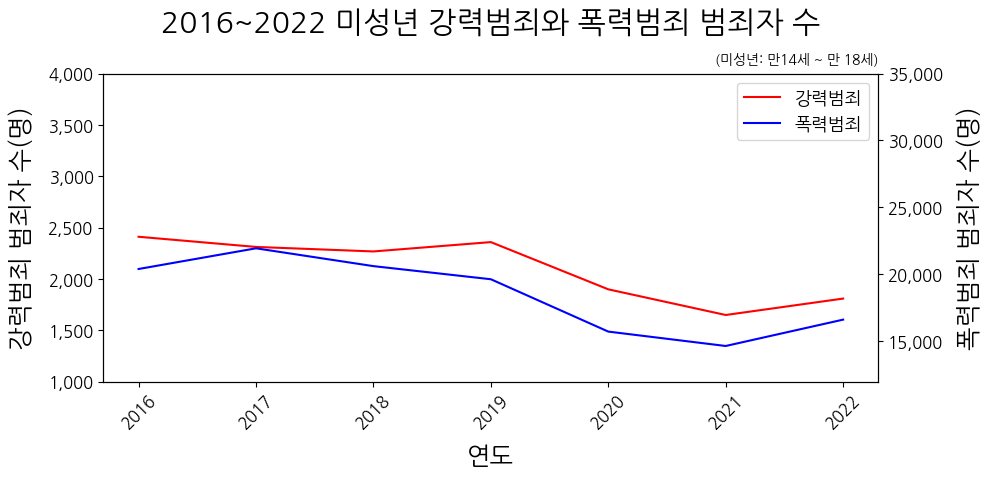
2. 이중y축 꺾은선그래프
#그래프 생성
fig, ax1 = plt.subplots(figsize=(10, 4)) #figsize: 그래프 크기 = (너비, 높이)


#ax1('강력범죄' 그래프 생성)
line1 = ax1.plot(dfTeenSvg, color='r', label='강력범죄')

ax1.set_xlabel('연도', labelpad=10) #x축 타이틀과 여백
ax1.tick_params(labelsize=12) #x·y축 글자 크기
ax1.tick_params(axis='x', labelrotation=45) #x축 글자 특징

ax1.set_ylabel('강력범죄 범죄자 수(명)', labelpad=10) #y축 타이틀과 여백
ax1.set_ylim(1000, 4000) #y축 범위

ax1.set_title('2016~2022 미성년 강력범죄와 폭력범죄 범죄자 수', pad=30) #그래프 타이틀과 여백

ax1.text(6.3, 4200, '(미성년: 만14세 ~ 만 18세)', va='top', ha='right', fontsize=10) #그래프에 텍스트 추가

#y축 숫자 천단위 콤마 찍기
current_value = plt.gca().get_yticks()
plt.gca().set_yticklabels(['{:,.0f}'.format(x) for x in current_value])


#더블 y축 생성
ax2 = ax1.twinx()

#ax2('폭력범죄' 그래프 생성)
line2 = ax2.plot(dfTeenVio, color='b', label='폭력범죄')

ax2.set_ylabel('폭력범죄 범죄자 수(명)', labelpad=10) #y축 타이틀과 여백
ax2.tick_params(axis='y', labelsize=12) #y축 글자 특징
ax2.set_ylim(12000, 35000) #y축 범위

#y축 숫자 천단위 콤마 찍기
current_values = plt.gca().get_yticks()
plt.gca().set_yticklabels(['{:,.0f}'.format(x) for x in current_values])


# 2개의 그래프 합쳐서 통합 범례 생성
lines = line1 + line2
labels = [l.get_label() for l in lines]
ax1.legend(lines, labels, loc='upper right', fontsize=13)


plt.show()
😭 어려웠던 점
이전까지는 plt.title(), plt.xlabel(), plt.ylim()을 활용하여 그래프를 생성했지만 이번에는 subplot()을 사용하니 좀 낯설고 어려웠다.
ax1.xlabel('강력범죄 범죄자 수(명)')
ax1.xticks(fontsize=12)

plt.show()
지금껏 그래왔던 것처럼 ax1 그래프 x축의 제목과 글자 설정을 하려고 .xlabel()과 .xticks() 메소르들 작성했더니 AttributeError: 'Axes' object has no attribute 'xlabel' 오류가 발생했다. 오류를 검색했더니 subplot()에서는 .xlabel() 대신 .set_xlabel()을 사용한다고 한다.
오류를 수정했더니 다른 오류('Axes' object has no attribute 'xticks')가 발생했다. 이때는 .tick_params()을 사용하면 된다. 만약 x축에만 적용하고 싶으면 .tick_params(axis='x')라고 작성하면 된다.
subplot()는 matplotlib.pyplot의 모듈로 여러 개의 그래프를 하나의 그림에 나타낸다.
➕참고 사이트 | Matplotlib 이중 Y축 표시하기, [matplotlib 기초] 눈금/눈금선 커스터마이징 | ax.tick_params, ax.set_xticks, 그래프 크기 설정, tick_params() 사용법, x·y축 label과 범위 설정, y축 숫자 천단위 콤마 찍기, 그래프 창 내에 텍스트 삽입