Node 01. 데이터를 한눈에! Visualization
%matplotlib inlineAIFFELKDELinestyleMarkerannotatebar graphbarplotcatplotfig.add_subplotfigure!gridheatmaplineplotmatplotlibpandas.plotplt.xlimplt.ylimpointplotseabornsubplottitleviolinplotvisualizationxlabelylabel()데싸데싸 3기데이터 사이언스데이터사이언티스트데이터사이언티스트 3기산점도(scatter plot)선 그래프(line graph)시각화시계열 데이터아이펠파이썬 머신러닝 완벽 가이드확률 밀도 그래프히스토그램
☺️ AIFFEL 데이터사이언티스트 3기
목록 보기
41/115

1-1. 들어가며
학습 목표
- 파이썬 라이브러리로 그래프 그리기
- Pandas, Matplotlib, Seaborn
- 데이터셋으로 시각화 진행 -> EDA 및 인사이트 도출해보기
1-2. 파이썬으로 그래프를 그린다는 건?
- 사용 라이브러리
- Matplotlib, Seaborn
1-3. 간단한 그래프 그리기 (1) 막대그래프 그려보기
그래프 데이터 정의
- 일반적인 리스트 형식으로 데이터 정의 가능
%matplotlib inline: Rich output 매직 메서드(그래프, 그림, 소리 등 output), 해당 메서드 사용 시 그래프 바로 출력
축 그리기
- figure를 만들고 -> subplot 추가
- figure만 만들면 -> 축은 없어도 객체는 생성
- figure() 객체에 add_subplot 메서드로 축 생성
- figsize 인자값으로 그래프 크기 지정
fig = plt.figure()
ax1 = fig.add_subplot(1,1,1)
- 여러 개의 축도 가능 -> add_subplot 인자로 조정
- nrows, ncols, index순
fig = plt.figure(figsize=(5,2))
ax1 = fig.add_subplot(1,1,1)
- 그래프 추가
fig = plt.figure()
ax1 = fig.add_subplot(2,2,1)
ax2 = fig.add_subplot(2,2,2)
ax3 = fig.add_subplot(2,2,4)
fig2 = plt.figure()
ax1 = fig2.add_subplot(2,3,1)
ax2 = fig2.add_subplot(2,3,4)
ax3 = fig2.add_subplot(2,3,5)
ax4 = fig2.add_subplot(2,3,6)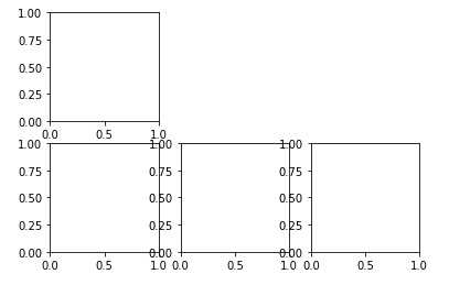
그래프 그리기
- bar 메서드로 막대그래프 그리기
- x, y 순으로 데이터 넣기
subject = ['English', 'Math', 'Korean', 'Science', 'Computer']
points = [40, 90, 50, 60, 100]

fig = plt.figure()
ax1 = fig.add_subplot(1,1,1)

ax1.bar(subject,points)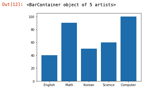
그래프 요소 추가
- xlabel() : x 라벨
- ylabel() : y 라벨
- title() : 그래프 제목
plt.xlabel('Subject')
plt.ylabel('Points')
plt.title("Yuna's Test Result")
전체 코드 적용

1-4. 간단한 그래프 그리기 (2) 선 그래프 그려보기
Pandas Series 데이터 활용
price.plot(ax=ax, style='black')- Pandas plot 사용, matplotlib 정의 subplot
ax사용
- Pandas plot 사용, matplotlib 정의 subplot
좌표축 설정
plt.xlim(),plt.ylim(): x,y 좌표 범위 설정
그래프 주석
annotate()
그리드
grid()
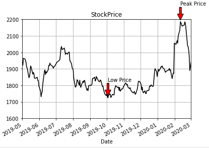
실습: 최고가(High) 데이터로 그래프 그리기
1-5. 간단한 그래프 그리기 (3) plot 사용법 상세
plt.plot()로 그래프 그리기
plt.plot(): 가장 최근에 그렸던 figure와 subplot을 그림.- 인자로 x, y, 마커, 색상 지정 가능
import numpy as np

x = np.linspace(0, 10, 100)

plt.plot(x, np.sin(x), 'o')
plt.plot(x, np.cos(x), '--', color='black')
plt.show()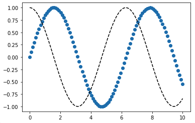
plt.subplot()으로 서브플롯 추가 가능
x = np.linspace(0, 10, 100)

plt.subplot(2,1,1)
plt.plot(x, np.sin(x), 'o', color='orange')

plt.subplot(2,1,2)
plt.plot(x, np.cos(x), 'orange')
plt.show()
linestyle, marker 옵션
- 라인 스타일 및 색상 지정
-
라인 스타일 -> linestyle 뒤에 이름 넣기
- plt.plot(x, x + 0, linestyle='solid')
- plt.plot(x, x + 1, linestyle='dashed')
- plt.plot(x, x + 2, linestyle='dashdot')
- plt.plot(x, x + 3, linestyle='dotted')
-
색상도 지정 -> 해당 기호 뒤에 붙이면 됨.
- solid :
- - dashed :
-- - dashdot :
-. - dotted :
:
plt.plot(x, x + 0, '-g') # solid green plt.plot(x, x + 1, '--c') # dashed cyan plt.plot(x, x + 2, '-.k') # dashdot black plt.plot(x, x + 3, ':r'); # dotted red - solid :
-


Pandas로 그래프 그리기
pandas.plot
- 판다스 시리즈 형태일 경우
| 메서드 이름 | 기능 |
|---|---|
label | 그래프 범례 네임 |
ax | matplotlib subplot |
style | matplotlib 스타일 문자열) |
alpha | 그래프 투명도 (0 ~ 1) |
kind | 그래프 종류: 'line', 'bar', 'barh', 'kde' |
logy | Y축 로그 스케일 여부 |
use_index | 객체 색인 -> 눈금 이름으로 쓸 때 사용 |
rot | 눈금 이름 회전(0 ~ 360) |
xticks | x축 눈금 |
yticks | y축 눈금 |
xlim | x축 범위 제한값 : [min, max] |
ylim | y축 범위 제한값 : [min, max] |
grid | 그리드 표시 |
- 데이터 프레임일 경우
| 메서드 이름 | 기능 |
|---|---|
subplots | 컬럼을 서브플롯에 그림 |
sharex | subplots=True -> X축 공유, 축 범위, 눈금 연결 |
sharey | subplots=True -> Y축 공유 |
figsize | (튜플) 그래프 크기 지정 |
title | (문자열) 그래프 제목 지정 |
sort_columns | 컬럼 -> 알파벳 순서 정렬 |
예시
- 막대그래프 : kind로 bar 옵션 사용
data.plot(kind='bar', ax=axes[0], color='blue', alpha=1)
data.plot(kind='barh', ax=axes[1], color='red', alpha=0.3)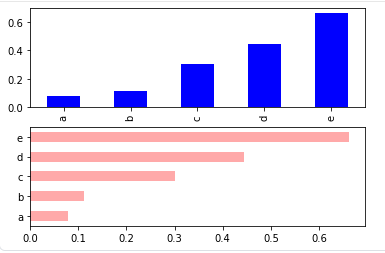
- 선 그래프
df = pd.DataFrame(np.random.rand(6,4), columns=pd.Index(['A','B','C','D']))
df.plot(kind='line')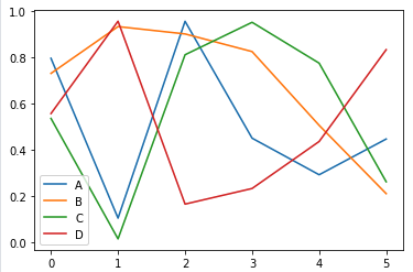
1-6. 간단한 그래프 그리기 (4) 정리해 보자
그래프 생성 과정
1️⃣ fig = plt.figure()
- figure 객체 선언
2️⃣ ax1 = fig.add_subplot(1,1,1)
- 축 생성
3️⃣ ax1.bar(x, y) 축 안에 그릴 그래프 메서드 선택, 데이터 삽입
4️⃣ grid, xlabel, ylabel으로 레이블 추가
5️⃣ plt.savefig으로 저장

1-7. 그래프 4대 천왕 (1) 데이터 준비
데이터 준비
sns.load_dataset을 이용해 API로 예제 데이터 다운로드 및 로드
데이터 살펴보기 (EDA)
-
df = pd.DataFrame(tips)

-
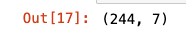
df.shape : 행과 열 개수 파악
-
df.describe()

-
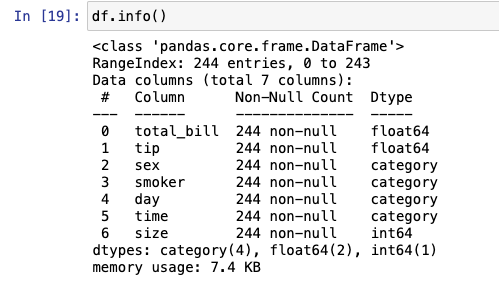
df.info()
- 결측치 X
- 카테고리(범주)형 데이터 : sex, smoker, day, time, size(테이블 인원을 의미)
- 수치형 데이터 : tips, total_bill
-
df['변수명'].value_counts()
- 변수의 카테고리별 개수 구하기
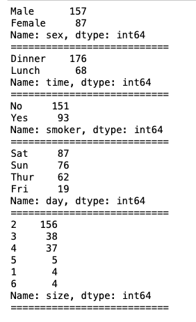
- 변수의 카테고리별 개수 구하기
1-8. 그래프 4대 천왕 (2) 범주형 데이터
범주형 데이터
- 범주형 데이터는
막대그래프로 수치 요약- 가로, 세로, 누적, 그룹화 막대 그래프 이용
막대그래프(bar graph)
Pandas, Matplotlib
-
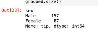
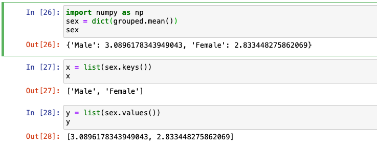
tip 컬럼 -> 성별에 대한 평균으로 나타내기
- 각 성별 그룹에 대한 정보 : 총합, 평균, 데이터량 등

- 각 성별 그룹에 대한 정보 : 총합, 평균, 데이터량 등
-
성별별 팁 평균

-
성별별 팁 횟수
-
성별에 따른 팁 액수 평균 -> 막대그래프로
-
x, y 지정
-
그래프 그리기
import matplotlib.pyplot as plt

plt.bar(x = x, height = y)
plt.ylabel('tip[$]')
plt.title('Tip by Sex')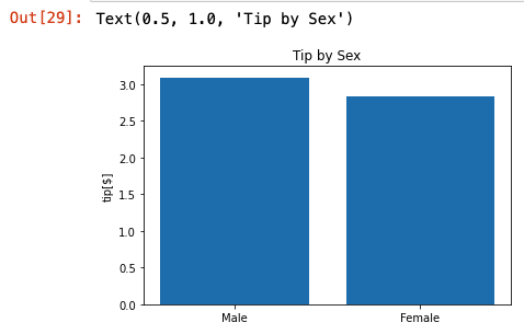
-
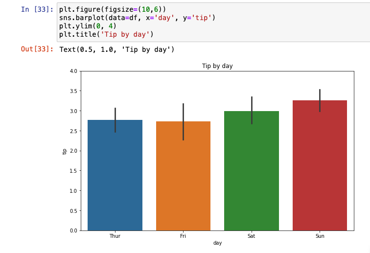
- 실습 : 요일(day)에 따른 평균 tip 그래프
grouped = df['tip'].groupby(df['day']).mean()

x = list(grouped.index)
y = list(grouped.values)

plt.bar(x = x, height = y)

plt.ylabel('tip[$]')
plt.title('Tip by Day')
plt.show()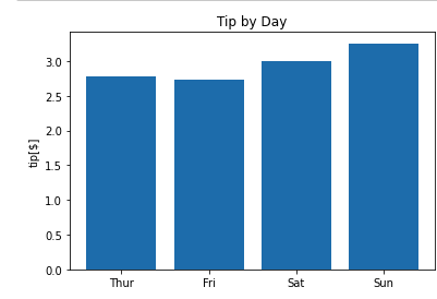
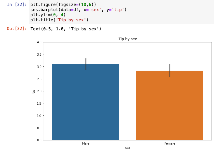
⭐️ Seaborn, Matplotlib
-
sns.barplot사용

-
옵션 추가
-
요일(day)에 따른 평균 tip 그래프
-
violinplot- 범주형 그래프를 나타내기 좋음.
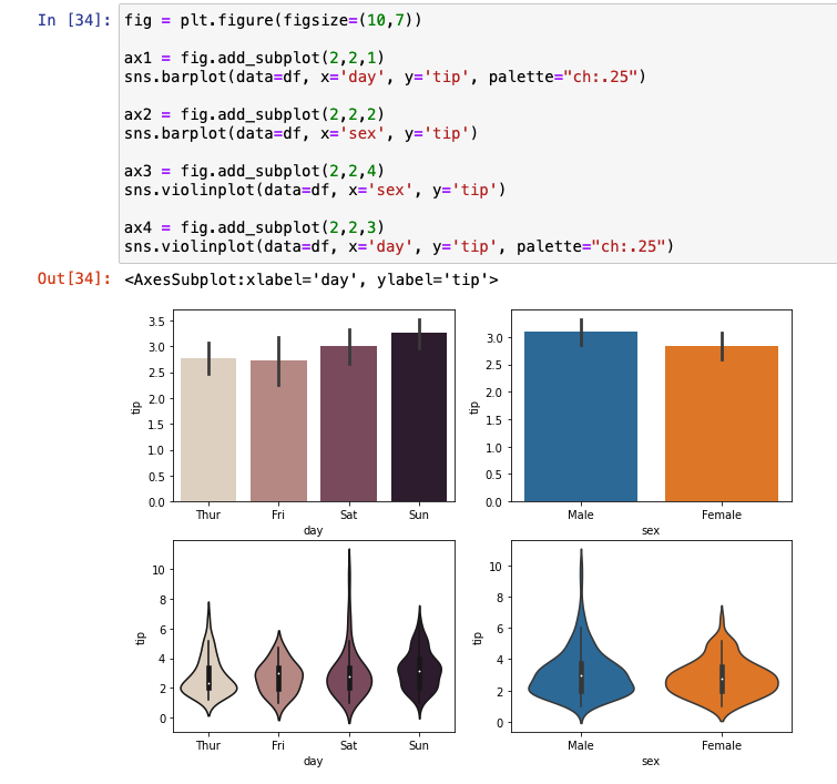
- 범주형 그래프를 나타내기 좋음.
-
catplot

-
실습 : 시간대(time)에 따른 그래프

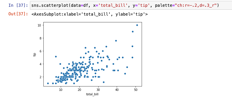
1-9. 그래프 4대 천왕 (3) 수치형 데이터
수치형 데이터
- 산점도, 선 그래프가 좋음.
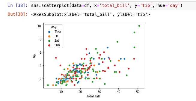
전체 음식 가격(total_bill)에 따른 tip 데이터 시각화
산점도(scatter plot)
- 요일에 따른 tip, Total_bill 관계
선 그래프(line graph)
-
numpy로 임의 데이터 생성해 그래프 그려보기
np.random.randn: 표준 정규분포에서 난수 생성cumsum(): 누적합


-
Seaborn
히스토그램
-
도수분포표를 그래프로!
- 가로축 : 변수 구간, bin
- 세로축 : 빈도수, frequency
- 전체 총량 : n
-
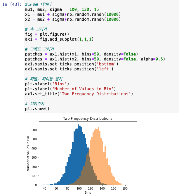
히스토그램 그려보기
- x1 : mean 100, std 15인 정규분포를 따름.
- x2 : mean 130, std 15인 정규분포를 따름.
- 도수 : 50개 구간, 빈도
예제 데이터 히스토그램

-
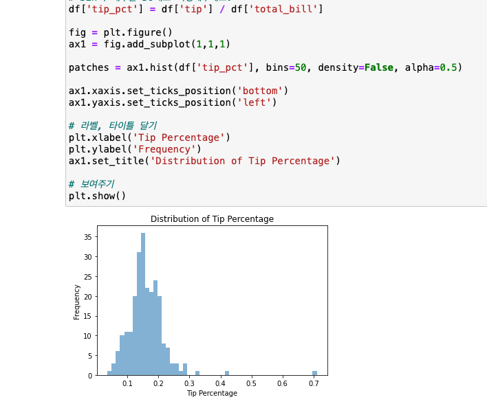
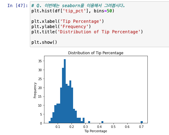
전체 결제 금액 대비 팁 비율 히스토그램
-
seaborn
-
확률 밀도 그래프

1-10. 시계열 데이터 시각화하기
1949년-1960년도별 탑승객 예제 데이터
데이터 가져오기
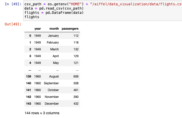
그래프 그리기
-
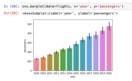
seaborn barplot
-
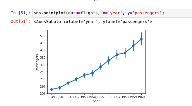
seaborn pointplot
-
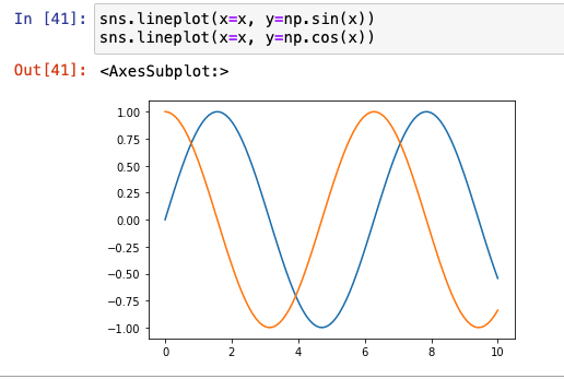
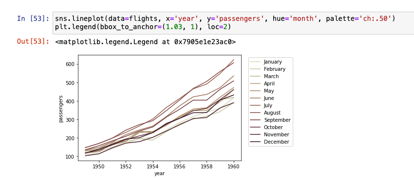
seaborn lineplot

-
달별로 보기 위한 인자 할당
-
히스토그램

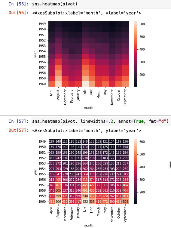
1-11. Heatmap
- 데이터 차원 제한은 없으나 -> 모두 2차원으로 시각화!
-
pivot()- flights 탑승객 수를 year, month로 pivot
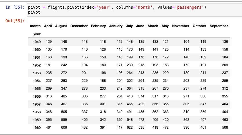
- flights 탑승객 수를 year, month로 pivot
-
히트맵 그리기

언젠가 내 코드로 세상에 기여할 수 있도록, Data Science&BE 개발 기록 노트☘️