matplotlib 기초
- 파이썬의 대표 시각화 도구
- 통상적으로 matplotlib의 pyplot은 plt로 naming 한다
- 주로 %matplotlib inline 옵션을 사용한다(결과창을 새 창에 열지 않고 현재 Jupyter Notebook 창에 출력)
한글 설정
from matplotlib import rc
rc('font',family='Malgun Gothic')
import matplotlib
import matplotlib.pyplot as plt # matlab의 기능을 담아둔 것이 pyplot
%matplotlib inline # 주피터노트북에 포함시켜서 나타나게 하는 옵션
plt.rcParams('axes.unicode_minus'] = False
# 마이너스 부호 때문에 한글이 깨질 수 있어서 설정하는 부분
plt.figure
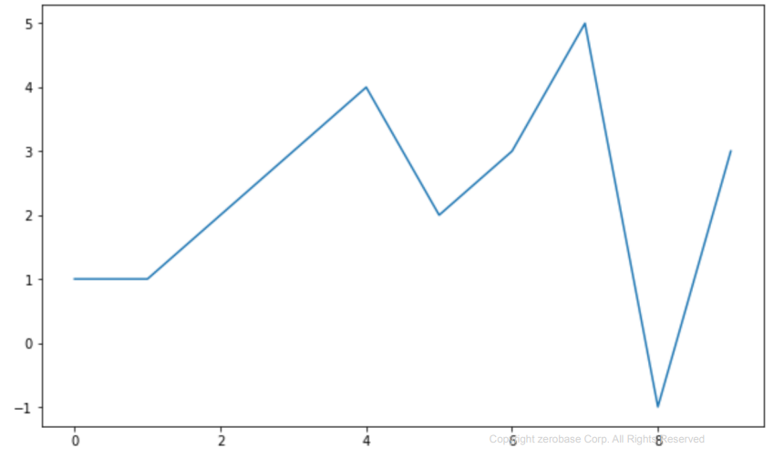
plt.figure(figsize=(10,6))
plt.plot([0,1,2,3,4,5,6,7,8,9], [1,1,2,3,4,2,3,5,-1,3]) # x축, y축
plt.show()
matplotlib 기본 형태
- plt.figure() : 그래프에 대한 속성 설정
- plt.plot([가로축], [세로축]) : 세로축, 가로축의 데이터 설정
- plt.show() : 결과 출력
삼각함수 그리기
import numpy as np

t = np.arange(0,12,0.01) # 0부터 12까지 0.01간격으로
y = np.sin(t)

def drawGraph():
	plt.figure(figsize=(10,6))
    plt.plot(t, np.sin(t), label='sin') #label : 해당 그래프의 이름
    plt.plot(t, np.cos(t), label='cos')
    plt.grid() # 그래프 배경에 격자 표시
    plt.legend() # 범례(plot의 label 표시)
    plt.xlabel('time') # x축 제목
    plt.ylabel('Amplitude') # y축 제목
    plt.title('Example of sinewave') #전체 그래프의 제목
    plt.show()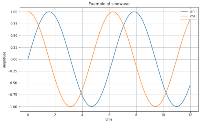
- numpy의 sin() 사용
- np.arange(a,b,s) : a부터 b까지의 s간격의 데이터
- np.sin(value) : 사인 함수
다양한 스타일
t = np.arange(0,5,0.5)


def drawGraph():
	plt.figure(figsize=(10,6))
    plt.plot(t,t, 'r--') # r-- : r은 빨간색, --은 점선
    plt.plot(t,t**2, 'bs') # bs : b는 파랑색, s는 사각형
    plt.plot(t,t**3, 'g^') # g^ : g는 초록색, ^는 위 방향 화살표

    plt.show()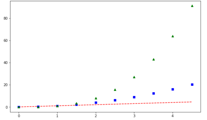
t = [0, 1, 2, 3, 4, 5, 6]
y = [1, 4, 5, 8, 9, 5, 3]

def drawGraph():
    plt.figure(figsize=(10,6))
    plt.plot(
        # x축
        t,
        # y축
        y,
        # 그래프 색상
        color = "green",
        # 그래프 스타일
        linestyle="dashed",
        # 마커 스타일
        marker="o",
        # 마커 색상
        markerfacecolor="blue",
        # 마커 사이즈
        markersize=12,
    )
    # x축과 y축의 범위 지정
    plt.xlim([-0.5, 6.5])
    plt.ylim([0.5,9.5])
    plt.show()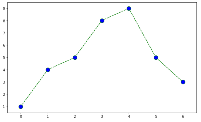
scatter
- 점을 뿌리듯이 그리는 그림
t = np.array([0,1,2,3,4,5,6,7,8,9])
y = np.array([9,8,7,9,8,3,2,4,3,4])

def drawGraph():
	plt.figure(figsize=(10,6))
    plt.scatter(t,y)
    plt.show()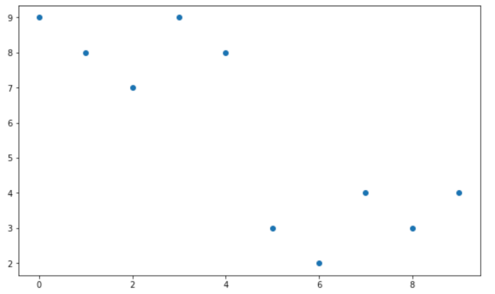
colormap = t

def drawGraph():
    plt.figure(figsize=(10, 6))
    # marker : 점의 모양
    plt.scatter(t, y, s=50, c=colormap, marker=">")
    # colormap의 색상을 막대 그래프로 출력
    plt.colorbar()

    plt.show()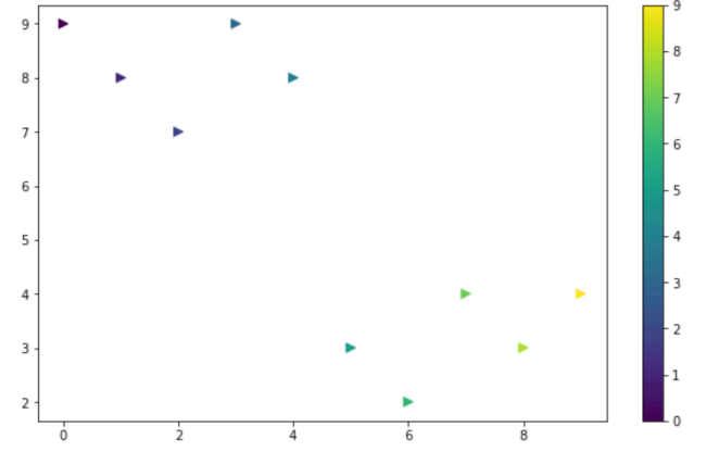
CCTV 데이터와 그래프로 표현하기
표로만 정보를 전달하는 것은 한계가 있다.
이를 보완하기 위해 시각화(Visualization)한다.
matplotlib에서 한글 사용을 위해 폰트 변경
import matplotlib.pyplot as plt
from matplotlib import rc
# 마이너스 부호 때문에 한글이 깨질 수 있기 때문에 설정
plt.rcParams["axes.unicode_minus"] = False
rc('font', family='Malgun Gothic')
bar 그리기
- bar : 수직 그래프, barh : 수평 그래프
data_result['소계'].plot(kind=''barh', grid=True, figsize=(10,6)); # barh: 수평바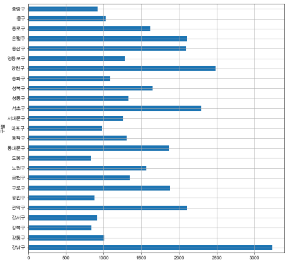
- Pandas DataFrame은 데이터 변수에서 바로 plot()명령을 사용할 수 있다
- 데이터(컬럼)가 많은 경우 정렬한 후 그리는 것이 효과적일 때가 많다
- 세미콜론을 적는 이유 : 주피터 노트북은 입력셀 마지막에 변수가 존재하면 그 변수 내용을 보여주는데 이게 보기 싫은 경우 ";"을 붙여서 안나오게 할 수 있다
- 보는데 불편함이 있다
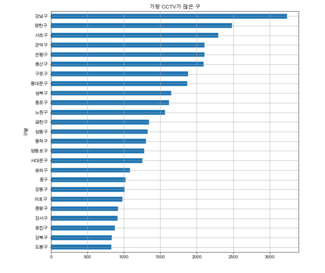
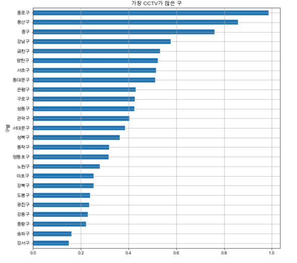
소계 정렬 후 bar 그리기
def drawGraph():
	date_result['소계'].sort_values().plot(
    	kind='barh',
        grid=True,
        title='가장 CCTV가 많은 구',
        figsize=(10,10)
 	)
CCTV비율 정렬 후 bar 그리기
def drawGraph():
	date_result['CCTV비율'].sort_values().plot(
    	kind='barh',
        grid=True,
        title='가장 CCTV가 많은 구',
        figsize=(10,10)
 	)
데이터 경향 그리기
경향을 파악할 필요
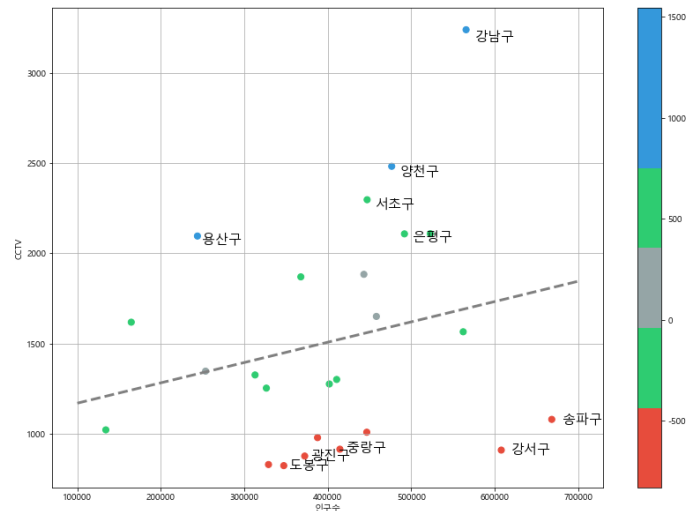
- 단순 CCTV 수와 인구대비 CCTV 비율
- 단순 CCTV 수 : 강남, 양천, 서초, 관악, 은평, 용산
- 인구대비 CCTV 수 : 종로, 용산, 중구
- 전체 경향을 함께 보지 않으면 데이터를 제대로 이해하기 어렵다
scatter 그리기
def drawGraph():
	plt.figure(figsize=(10,6))
    plt.scatter(data_result['인구수'], data_result['소계'], s=50)
    plt.xlabel('인구수')
    plt.ylabel('CCTV')
    plt.grid()
    plt.show()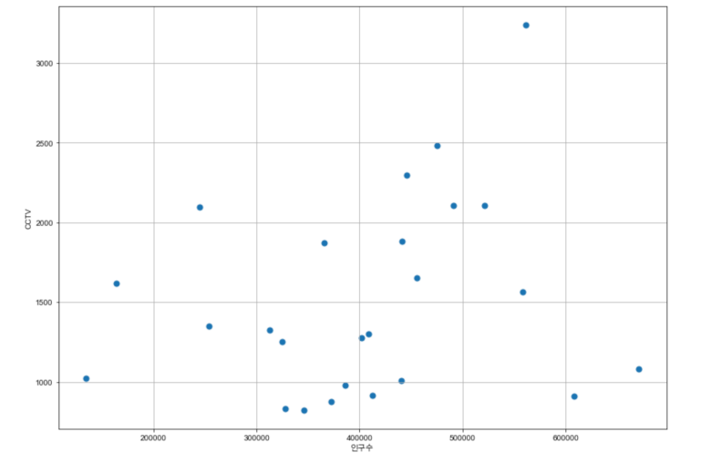
trend 파악
- Linear Regression(선형회귀)
- 직선을 구성하기 위해선 기울기와 y절편을 알아야 한다
- Numpy를 이용한 1차 직선 만들기
- np.polyfit
직선을 구성하기 위한 계수 계산
직선을 구성하기 위한 자료인 기울기와 y절편을 알려준다 - np.poly1d
polyfit으로 찾은 계수로 python에서 사용할 함수로 만들어 줌
방정식을 구성하는 함수
계수 2개를 넣으면 함수를 만들어준다
fp1 = np.polyfit(data_result['인구수'], data_result['소계'],1)
# 인구수를 x축, CCTV개수를 y축으로 1차식을 만들어달라
fp1
- 순서대로 y절편, x기울기를 반환
f1 = np.poly1d(fp1)
f1(400000)

- 25개 구의 데이터를 기준으로 인구수 40만인 구에는 CCTV가 몇 개 있는가
경향선 그리기
fx = np.linspace(100000,700000,100)- 경향선을 그리기 위해 X 데이터 생성
- np.linspace(a,b,n) : a부터 b까지 n개의 등간격 데이터 생성
def drawGraph():
	plt.figure(figsize=(10,6))
    plt.scatter(data_result['인구수'], data_result['소계'],s=50)
    plt.plot(fx,f1(fx), ls='dashed', lw=3, color='g')
    plt.xlabel('인구수')
    plt.ylabel('CCTV')
    plt.grid()
    plt.show()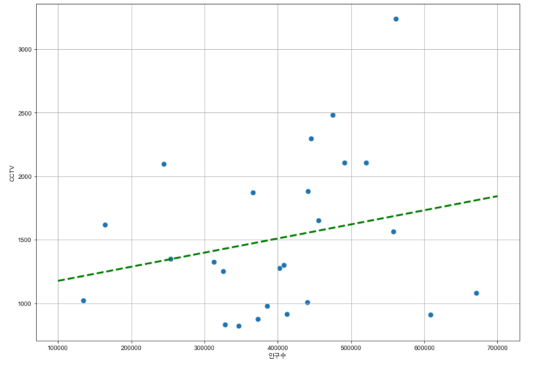
경향에서 벗어난 데이터 강조하기
그래프 다듬기
- 경향과의 오차를 만들기
오차 = (CCTV의 수) - 경향선(인구수) - data_result['오차'] = data_result['소계'] - f1(data_result['인구수'])
fp1 = np.polyfit(data_result["인구수"], data_result["소계"], 1)
f1 = np.poly1d(fp1)
fx = np.linspace(100000, 700000, 100)

data_result["오차"] = data_result["소계"] - f1(data_result["인구수"])

# 경향과 비교해서 데이터의 오차가 너무 나는 데이터 계산
df_sort_f = data_result.sort_values(by="오차", ascending=False)
df_sort_t = data_result.sort_values(by="오차", ascending=True)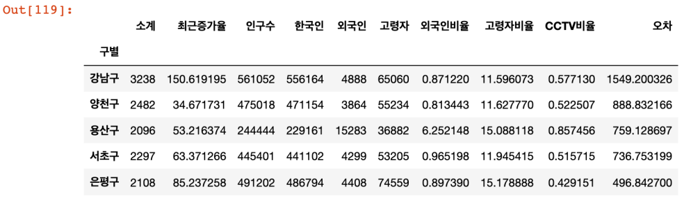
df_sort_t.head()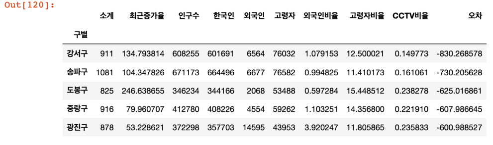
색상 설정
from matplotlib.colors import ListedColormap

# color map을 사용자 정의(user define)로 세팅
color_step = ['#e74c3c','#2ecc71','#95a5a6','#2ecc71','#3498db','#3498db']
my_cmap = ListedColormap(color_step)
데이터 강조하기
def drawGraph():
	plt.figure(figsize=(14,10))
    plt.scatter(data_result['인구수'], data_result['소계'],c=data_result['오차'],s=50, cmap=my_map) # cmap : 사용자 정의한 맵을 적용 / c : color 세팅에 방금 계산한 경향과의 오차를 적용
    plt.plot(fx,f1(fx), ls='dashed', lw=3, color='grey')

    # 오차가 큰 데이터 아래 위로 5개씩 특별히 마커 옆에 구 이름을 명시
    for n in range(5):
    	plt.text(
        	df_sort_f['인구수'][n] * 1.02,# 구 이름이 마커에 겹치지 않도록
            df_sort_f['소계'][n] * 0.98,# 구 이름이 마커에 겹치지 않도록
            df_sort_f.index[n],
            fontsixe=15,
        )

    	plt.text(
        	df_sort_t['인구수'][n] * 1.02,# 구 이름이 마커에 겹치지 않도록
            df_sort_t['소계'][n] * 0.98,# 구 이름이 마커에 겹치지 않도록
            df_sort_t.index[n],
            fontsixe=15,
        )
    plt.xlabel('인구수')
    plt.ylabel('CCTV')
    plt.colorbar()
    plt.grid()
    plt.show()
데이터 저장
data_result.to_csv('저장 경로/파일 이름', sep=',',encoding='utf-8')- to_csv : DataFrame을 csv파일로 저장

+database