💡 position 속성
-
Static: 기본값
-
Relative: 자기 자신 기준 - position이 아무것도 없을 때(Static일 때)의 자기 자신 기준
-
Absolute: 부모 요소를 기준으로 절대적인 값
-
Fixed: 뷰포트 기준 ex) 채팅상담창 (스크롤 내려도 위치 고정)
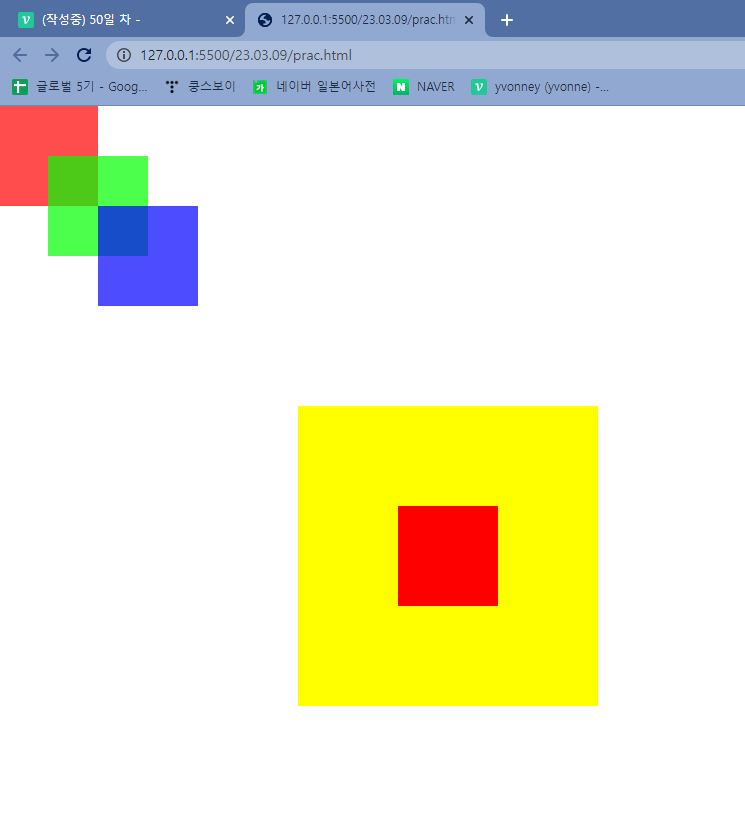
<!DOCTYPE html>

<html lang="en" xmlns="http://www.w3.org/1999/xhtml">
  <head>
    <meta charset="utf-8" />
    <title></title>

    <style>
      div {
        width: 100px;
        height: 100px;
        opacity: 0.7;
      }

      div:nth-child(1) {
        background-color: #ff0000;
        position: absolute;
        top: 0;
        left: 0;
      }

      div:nth-child(2) {
        background-color: #00ff00;
        position: absolute;
        top: 50px;
        left: 50px;
      }

      div:nth-child(3) {
        background-color: #0000ff;
        position: absolute;
        top: 100px;
        left: 100px;
      }

      #wrap {
        width: 300px;
        height: 300px;
        position: absolute;
        top: 300px;
        left: 300px;
        background-color: yellow;
        opacity: 1;
      }

      #wrap .content {
        width: 100px;
        height: 100px;
        position: absolute;
        top: 100px; /*top,left는 static일 때는 적용안됨*/
        left: 100px;
        background-color: red;
        opacity: 1;
      }
    </style>
  </head>
  <body>
    <div></div>
    <div></div>
    <div></div>
    <div id="wrap">
      <div class="content"></div>
    </div>
  </body>
</html>
- 결과
1. 반응형 웹(Responsible Web)
- 디바이스 종류에 따라 웹 페이지 크기가 자동적으로 변하는 웹
💡 미디어 쿼리(Media Query)
- 미디어 쿼리: 화면의 크기나 환경에 따라 웹 사이트를 변경하는 기술
- 미디어 쿼리 문법
@media[only 또는 not][미디어 타입][and 또는 ,](속성){실행문}
----------------------------------------------------------
  * @media: 미디어 쿼리 문법의 시작
  * \[only 또는 not]: only는 미디어 쿼리를 지원하는 브라우저에서만 미디어 쿼리를 해석하게 해주는 키워드 /
  					  not은 다음에 따라오는 미디어 유형 조건을 부정하는 키워드
  * [미디어 타입]: all(모든 장치) / print(인쇄 장치) / screen(컴퓨터 화면 또는 스마트 기기) 등
  * [and 또는 ,]: 'and'는 앞 뒤 조건 모두 사실이어야 실행문을 실행
  				 ',콤마'는 앞 뒤 조건 중 하나만 사실이어도 실행문 실행
  * (속성): 속성 지정
  * {실행문}: 앞 조건들이 모두 사실일 때 실행
- 미디어 쿼리 예시
<!DOCTYPE html>
<html>
  <head>
    <meta charset="utf-8" />
    <title>Media Queries</title>
    <meta name="viewport" content="width=device-width, initial-scale=1" /> /* viewport는 반응형이라는 것을 의미 */

    <style>
      body {
        background: url(images/bg0.jpg) no-repeat fixed;
        background-size: cover;
      }
      @media screen and (max-width: 1024px) {
        /* 미디어 쿼리 */
        body {
          background: url(images/bg1.jpg) no-repeat fixed;
          background-size: cover;
        }
      }
      @media screen and (max-width: 768px) {
        body {
          background: url(images/bg2.jpg) no-repeat fixed;
          background-size: cover;
        }
      }
      @media screen and (max-width: 320px) {
        body {
          background: url(images/bg3.jpg) no-repeat fixed;
          background-size: cover;
        }
      }
    </style>
  </head>

  <body></body>
</html>
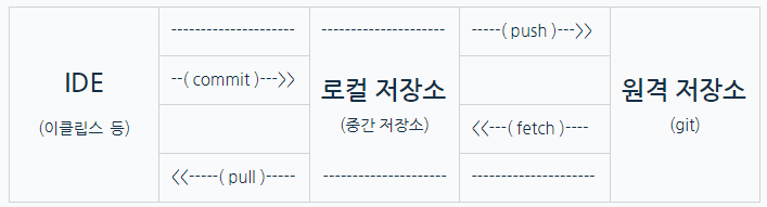
2. Git 활용
-
🔎Branch: 브랜치는 원격 저장소에 있는 소스와 관계없이 독립적으로 개발을 진행할 수 있도록 함
-
🔎Commit: 로컬 영역에서 개발한 부분을 로컬 저장소에 저장하는 것
(커밋 메세지를 작성하여 히스토리를 남길 수 있음 -> 형상 관리, 협업) -
🔎Push: 로컬 저장소의 소스 파일을 원격 저장소에 공유하는 것
(Push를 진행하면 원격 저장소와 로컬 저장소의 소스가 같아짐) -
🔎Pull: 원격 저장소의 소스 파일을 로컬 저장소에 다운로드하는 것
(협업 과정에서 올라가는 원격 저장소의 버전과 로컬 저장소의 싱크를 맞추기) -
🔎Fetch: 원격 저장소의 소스와 로컬 저장소에 있는 소스를 비교하는 개념
(원격 저장소의 소스를 병합하기 전에 충돌 나는 부분을 확인하고 병합할 지 결정) -
🔎Merge: 브랜치끼리 병합하는 것
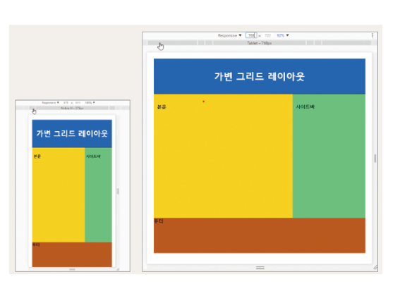
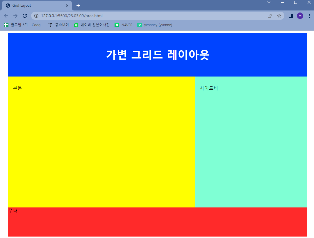
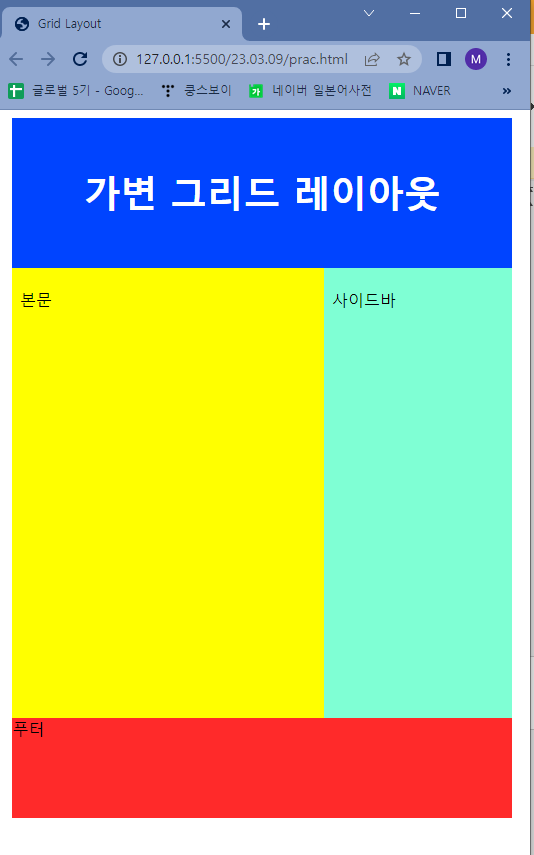
3. 가변 그리드 레이아웃 만들기
- 어제 작성한 그리드 레이아웃 변형
<!DOCTYPE html>
<html>
  <head>
    <meta charset="utf-8" />
    <title>Grid Layout</title>
    <style>
      #wrap {
        width: 96%;		/* %로 값을 주어 가변 설정 */
        height: 700px;
        margin: 0 auto;
        overflow: hidden;
      }
      #nav {
        width: 100%;
        height: 150px;
        background: rgb(0, 68, 255);
        line-height: 150px;
        color: #fff;
        font-size: 2.3em;
        font-weight: bold;
        text-align: center;
      }

      #content {
        width: 62.5%;
        height: 450px;
        float: left;
        line-height: 50px;
        padding: 1.5%;
        box-sizing: border-box;
        background: yellow;
      }

      #side {
        width: 37.5%;
        height: 450px;
        line-height: 50px;
        padding: 1.5%;
        box-sizing: border-box;
        float: left;
        background: aquamarine;
      }

      #footer {
        width: 100%;
        height: 100px;
        float: left;
        background: rgb(255, 42, 42);
      }
    </style>
  </head>
  <body>
    <div id="wrap">
      <div id="nav">가변 그리드 레이아웃</div>
      <div id="content">본문</div>
      <div id="side">사이드바</div>
      <div id="footer">푸터</div>
    </div>
  </body>
</html>- 결과
2.
개발 연습장