
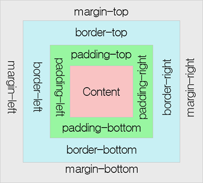
1. 박스 모델(Box Model)
-
모든 HTML 요소는 박스(box) 모양으로 구성되며, 이것을 박스 모델(box model)이라고 한다.
-
박스 모델은 HTML 요소를 패딩(padding), 테두리(border), 마진(margin), 내용(content)으로 구분한다.
-
내용(content) : 텍스트나 이미지가 들어있는 박스의 실질적인 내용 부분
-
패딩(padding) : 내용과 테두리 사이의 간격으로 패딩은 눈에 보이지 않는다.
-
테두리(border) : 내용와 패딩 주변을 감싸는 테두리
-
마진(margin) : 테두리와 이웃하는 요소 사이의 간격으로 마진은 눈에 보이지 않는다.
💡display속성
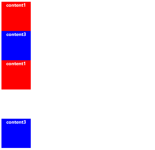
<!DOCTYPE html>

<html lang="en" xmlns="http://www.w3.org/1999/xhtml">
  <head>
    <meta charset="utf-8" />
    <title></title>

    <style>
      body div:nth-child(1) {       /* body태그 자손 div, (n)th-child는 몇번째 자손인지를 나타내는 태그 */
        width: 100px;
        height: 100px;
        background-color: #ff0000;
        color: #ffffff;
        font-weight: bold;
        text-align: center;
      }

      body div:nth-child(2) {
        width: 100px;
        height: 100px;
        background-color: #00ff00;
        color: #ffffff;
        font-weight: bold;
        text-align: center;
      }

      body div:nth-child(3) {
        width: 100px;
        height: 100px;
        background-color: #0000ff;
        color: #ffffff;
        font-weight: bold;
        text-align: center;
      }

      body div:nth-child(4) {
        width: 100px;
        height: 100px;
        background-color: #ff0000;
        color: #ffffff;
        font-weight: bold;
        text-align: center;
      }

      body div:nth-child(5) {
        width: 100px;
        height: 100px;
        background-color: #00ff00;
        color: #ffffff;
        font-weight: bold;
        text-align: center;
        display: inline;
        margin: 10px 10px 10px 10px;
      }

      body div:nth-child(6) {
        width: 100px;
        height: 100px;
        background-color: #0000ff;
        color: #ffffff;
        font-weight: bold;
        text-align: center;
        display: inline;
      }
      body div:nth-child(7) {
        width: 100px;
        height: 100px;
        background-color: #ff0000;
        color: #ffffff;
        font-weight: bold;
        text-align: center;
        display: none;
      }
      body div:nth-child(8) {
        width: 100px;
        height: 100px;
        background-color: #00ff00;
        color: #ffffff;
        font-weight: bold;
        text-align: center;
        display: inline;
      }
      body div:nth-child(9) {
        width: 100px;
        height: 100px;
        background-color: #0000ff;
        color: #ffffff;
        font-weight: bold;
        text-align: center;
        display: inline-block;
      }
    </style>
  </head>
  <body>
    <div>content1</div>
    <div>content2</div>
    <div>content3</div>
    <div>content4</div>
    <div>content5</div>
    <div>content6</div>
    <div>content7</div>
    <div>content8</div>
    <div>content9</div>
  </body>
</html>
- display 속성의 inline: 블록 속성을 잃고 자기 자신(content) 크기만큼 박스의 크기 제한 (width, height 적용 안됨)
- display 속성의 inline-block: inline 속성을 가지지만 블록 속성을 가짐
- 줄바꿈 적용 x
- 블록처럼 width, height 지정 가능 (지정하지 않을 경우 inline처럼 content만큼의 영역만 잡힘)
💡visibility 속성
<!DOCTYPE html>

<html lang="en" xmlns="http://www.w3.org/1999/xhtml">
  <head>
    <meta charset="utf-8" />
    <title></title>

    <style>
      body div:nth-child(1) {
        /* body태그 자손 div */
        width: 100px;
        height: 100px;
        background-color: #ff0000;
        color: #ffffff;
        font-weight: bold;
        text-align: center;
      }

      body div:nth-child(2) {
        width: 100px;
        height: 100px;
        background-color: blue;
        color: #ffffff;
        font-weight: bold;
        text-align: center;
        display: none;
      }

      body div:nth-child(3) {
        width: 100px;
        height: 100px;
        background-color: blue;
        color: #ffffff;
        font-weight: bold;
        text-align: center;
      }

      body div:nth-child(4) {
        width: 100px;
        height: 100px;
        background-color: #ff0000;
        color: #ffffff;
        font-weight: bold;
        text-align: center;
      }

      body div:nth-child(5) {
        width: 100px;
        height: 100px;
        background-color: #ff0000;
        color: #ffffff;
        font-weight: bold;
        text-align: center;
        visibility: hidden;
      }

      body div:nth-child(6) {
        width: 100px;
        height: 100px;
        background-color: blue;
        color: #ffffff;
        font-weight: bold;
        text-align: center;
      }
    </style>
  </head>
  <body>
    <div>content1</div>
    <div>content2</div>
    <div>content3</div>
    <div>content1</div>
    <div>content5</div>
    <div>content3</div>
  </body>
</html>
-
display: none -> 아예 영역이 사라져서 보이지 않음
-
visibility: hidden -> 영역은 남아있지만 보이지 않음
-
결과
💡margin과 padding 속성
<!DOCTYPE html>

<html lang="en" xmlns="http://www.w3.org/1999/xhtml">
  <head>
    <meta charset="utf-8" />
    <title></title>

    <style>
      body {
        margin: 0;
      }

      div {
        width: 200px;
        height: 200px;
        color: #ffffff;
        font-weight: bold;
        text-align: center;
      }

      #content1 {
        background-color: red;
      }

      #content2 {
        background-color: green;
        margin: 10px 10px 10px 10px; /* top left bottom right 순 (숫자 한번만 적으면 네 방향 모두 적용) */
      }

      #content3 {
        background-color: blue;
        padding: 10px 10px 10px 10px;
      }

      #content4 {
        background-color: yellow;
        margin: 10px 10px 10px 10px;
        padding: 10px 10px 10px 10px;
        border: 10px solid black; /*border와 padding은 내부에 적용*/
      }
    </style>
  </head>
  <body>
    <div id="content1">200*200</div>
    <div id="content2">
      200*200 <br />
      margin
    </div>
    <div id="content3">
      200*200 <br />
      padding
    </div>
    <div id="content4">
      200*200 <br />
      margin <br />
      padding
    </div>
  </body>
</html>
- margin: 외부에 적용되는 값
- padding: 내부에 적용되는 값
💡 box-sizing 속성
<!DOCTYPE html>

<html lang="en" xmlns="http://www.w3.org/1999/xhtml">
  <head>
    <meta charset="utf-8" />
    <title></title>

    <style>
      body {
        margin: 0;
        background-color: #dddddd;
      }

      div {
        width: 200px;
        height: 200px;
        margin: 10px;
        padding: 10px;
        border: 10px solid #ff8d00;
      }

      div:nth-child(1) {
        /* 함수 오버라이딩 적용 */
        margin: 0;
        border: 0;
        padding: 0;
        background-color: #ff0000;
      }

      div:nth-child(2) {
        background-color: #00ff00;
        box-sizing: border-box; /* padding, border를 포함한 크기가 w 200px, h 200px 인 사각형*/
      }

      div:nth-child(3) {
        background-color: #0000ff;
        box-sizing: content-box; /* content영역까지의 크기가 w 200px, h 200px인 사각형*/
      }
    </style>
  </head>
  <body>
    <div>200*200</div>
    <div>200*200</div>
    <div>200*200</div>
  </body>
</html>
- border-box: 테두리를 기준으로 크기를 정한다.
- content-box: content 영역을 기준으로 크기를 정한다.
💡background image 설정
<!DOCTYPE html>

<html lang="en" xmlns="http://www.w3.org/1999/xhtml">
  <head>
    <meta charset="utf-8" />
    <title></title>

    <style>
      div:first-child {
        width: 80%; /* 전체의 80% 차지하게 돼서 양쪽으로 10%씩 여백 */
        margin: 0 auto;
        height: 400px;
        background-image: url("https://newsimg.sedaily.com/2022/10/11/26CB5S28AA_11.png");
        background-size: 50%;
      }

      div:last-child {
        width: 80%;
        margin: 0 auto;
        height: 400px;
        background-image: url("https://newsimg.sedaily.com/2022/10/11/26CB5S28AA_11.png");
        background-size: 30%;
        background-repeat: no-repeat; /*default는 repeat */
      }
    </style>
  </head>
  <body>
    <div></div>
    <div></div>
  </body>
</html>
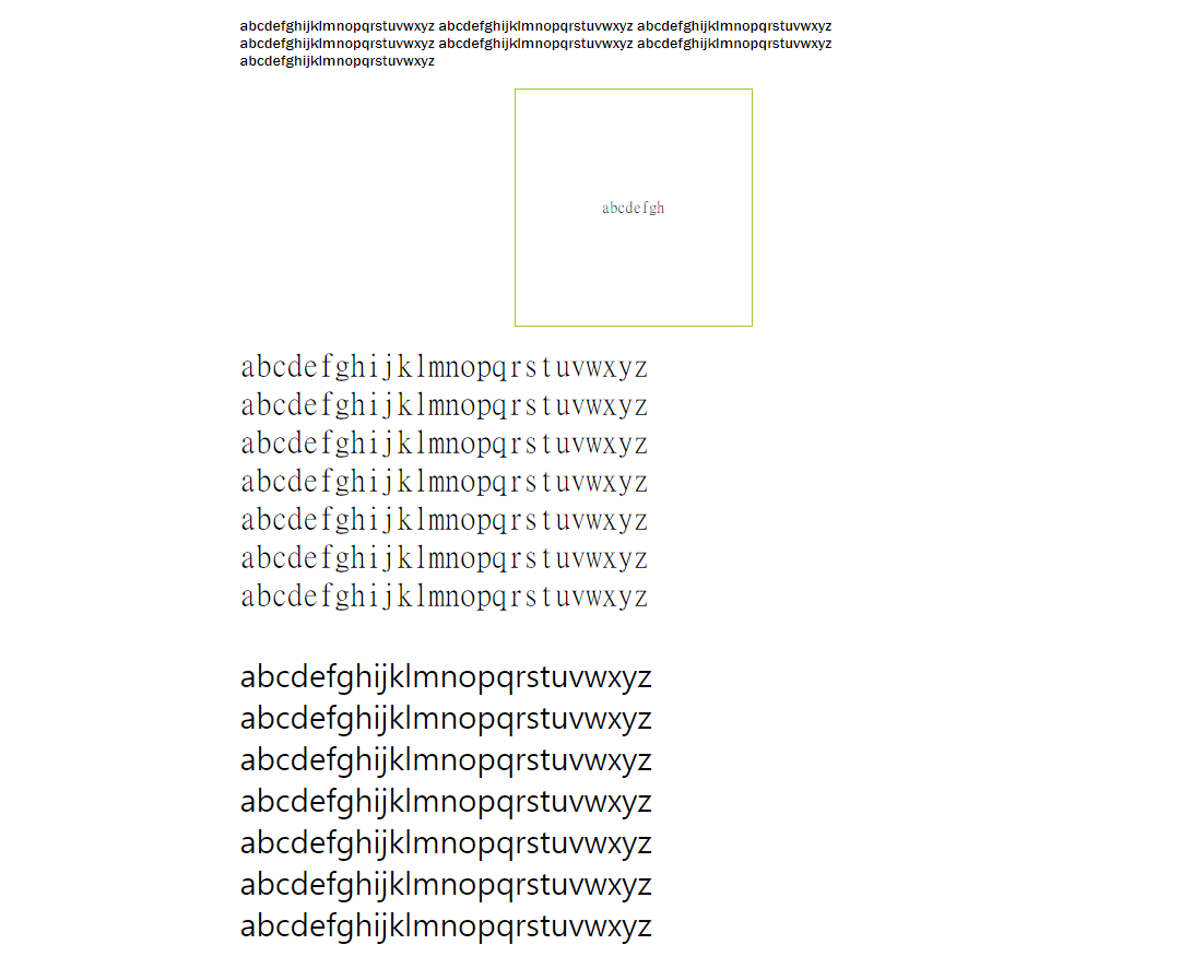
💡font
<!DOCTYPE html>

<html lang="en" xmlns="http://www.w3.org/1999/xhtml">
  <head>
    <meta charset="utf-8" />
    <title></title>

    <style>
      div {
        width: 800px;
        margin: 0 auto;
        padding: 20px;
      }

      div:nth-child(1) {
        font-family: "Franklin Gothic Medium", "Arial Narrow", Arial, sans-serif;
      }

      div:nth-child(2) {
        font-family: MingLiU_HKSCS-ExtB;
        width: 200px;
        height: 200px;
        text-align: center;
        line-height: 200px; /*height 크기와 같게 설정하면 중앙정렬 */
        border: 1px solid yellowgreen;
      }

      div:nth-child(3) {
        font-family: "MingLiU_HKSCS-ExtB";
        font-size: 32px;
      }

      div:nth-child(4) {
        font-family: "Bernard MT";
        font-size: 2em;
      }
    </style>
  </head>
  <body>
    <div>
      abcdefghijklmnopqrstuvwxyz abcdefghijklmnopqrstuvwxyz
      abcdefghijklmnopqrstuvwxyz abcdefghijklmnopqrstuvwxyz
      abcdefghijklmnopqrstuvwxyz abcdefghijklmnopqrstuvwxyz
      abcdefghijklmnopqrstuvwxyz
    </div>

    <div>abcdefgh</div>

    <div>
      abcdefghijklmnopqrstuvwxyz abcdefghijklmnopqrstuvwxyz
      abcdefghijklmnopqrstuvwxyz abcdefghijklmnopqrstuvwxyz
      abcdefghijklmnopqrstuvwxyz abcdefghijklmnopqrstuvwxyz
      abcdefghijklmnopqrstuvwxyz
    </div>

    <div>
      abcdefghijklmnopqrstuvwxyz abcdefghijklmnopqrstuvwxyz
      abcdefghijklmnopqrstuvwxyz abcdefghijklmnopqrstuvwxyz
      abcdefghijklmnopqrstuvwxyz abcdefghijklmnopqrstuvwxyz
      abcdefghijklmnopqrstuvwxyz
    </div>
  </body>
</html>
- 결과
2. 💡float💡
<!DOCTYPE html>
<html>
  <head>
    <title>Document</title>
    <style>
      #nav {
        width: 800px;
        margin: 0 auto;
        border: 1px solid #cccccc;
        overflow: hidden; /* float 처리된 요소들을 감싸면서 처리 */
      }
      #nav div {
        width: 150px;
        height: 100px;
        float: left;
        line-height: 100px;
        text-align: center;
        font-size: 1.5em;
        border-top: 1px solid #cccccc;
        border-bottom: 1px solid #cccccc;
        margin: 5px;
      }
    </style>
  </head>
  <body>
    <div id="nav">
      <div>menu1</div>
      <div>menu2</div>
      <div>menu3</div>
      <div>menu4</div>
      <div>menu5</div>
    </div>
  </body>
</html>- float: 웹 요소를 문서 위에 떠있게 만드는 태그
| float 속성 | 설명 |
|---|---|
| Left | 해당 요소를 문서의 왼쪽으로 배치 |
| Right | 해당 요소를 문서의 오른쪽으로 배치 |
| None | 좌우 어느 쪽으로도 배치하지 않음 |
- overflow: 내부 요소가 부모의 범위를 벗어날 때 어떻게 처리할 지 지정하는 속성
| overflow 속성 | 설명 |
|---|---|
| Visible | 영역을 벗어나도 그대로 보여지도록 처리 (default) |
| Hidden | 영역을 벗어나는 부분은 숨김처리 |
| Scroll | 영역을 벗어나는 부분을 스크롤로 처리 |
| Auto | 영역을 벗어나지 않으면 스크롤이 나오지 않고, 영역을 벗어나면 스크롤 처리 |
3. line-height의 용도
- line-height: 문장의 줄 간격을 조절할 때 사용
- 🔎 height 값과 line-height 값을 같게 설정하면 가운데 정렬 효과를 얻을 수 있다.
💡활용예제
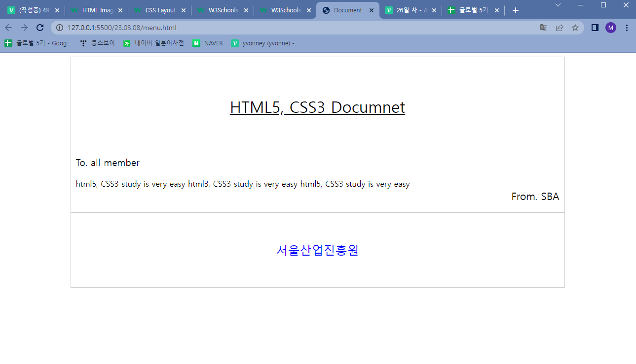
<!DOCTYPE html>
<html>
  <head>
    <title>Document</title>
    <style>
      #nav {
        width: 1000px;
        margin: 0 auto;
        border: 1px solid #cccccc;
        overflow: hidden; /* float 처리된 요소들을 감싸면서 처리 */
      }
      #nav div:nth-child(1) {
        height: 200px;
        line-height: 200px;
        text-decoration: underline;
        text-align: center;
        font-size: 2em;
      }

      #nav div:nth-child(2) {
        margin-left: 10px;
        font-size: 1.2em;
        font-weight: 500;
      }

      #nav div:nth-child(3) {
        margin-top: 20px;
        margin-left: 10px;
        font-size: 1em;
      }

      #nav div:nth-child(4) {
        font-size: 1.3em;
        margin-right: 10px;
        text-align: right;
      }

      #nav div:nth-child(5) {
        margin-top: 20px;
        text-align: center;
        color: blue;
        border-top: 2px solid #cccccc;
        font-size: 1.5em;
        height: 150px;
        line-height: 150px;
      }
    </style>
  </head>
  <body>
    <div id="nav">
      <div>HTML5, CSS3 Documnet</div>
      <div>To. all member</div>
      <div>
        html5, CSS3 study is very easy html3, CSS3 study is very easy html5,
        CSS3 study is very easy
      </div>
      <div>From. SBA</div>
      <div>서울산업진흥원</div>
    </div>
  </body>
</html>
- 결과
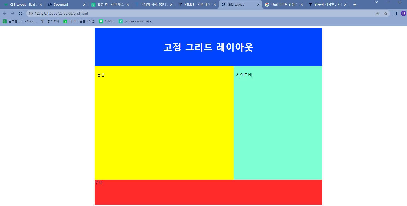
💡 아래의 그리드 레이아웃을 구성하시오.
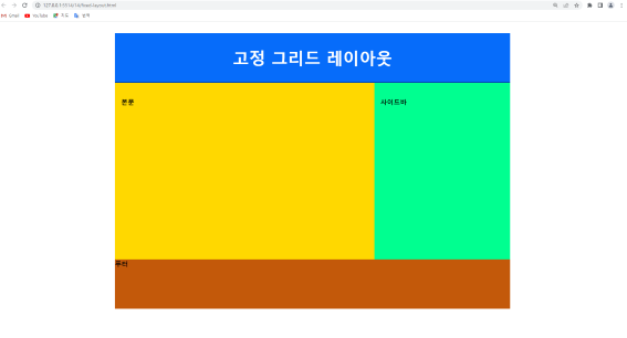
<!DOCTYPE html>
<html>
  <head>
    <meta charset="utf-8" />
    <title>Grid Layout</title>
    <style>
      #wrap {
        width: 900px;
        height: 700px;
        margin: 0 auto;
        overflow: hidden;
      }
      #nav {
        width: 900px;
        height: 150px;
        background: rgb(0, 68, 255);
        line-height: 150px;
        color: #fff;
        font-size: 2.3em;
        font-weight: bold;
        text-align: center;
      }

      #content {
        width: 550px;
        height: 450px;
        float: left;
        line-height: 50px;
        padding: 10px;
        box-sizing: border-box;
        background: yellow;
      }

      #side {
        width: 350px;
        height: 450px;
        line-height: 50px;
        padding: 10px;
        box-sizing: border-box;
        float: left;
        background: aquamarine;
      }

      #footer {
        width: 900px;
        height: 100px;
        float: left;
        background: rgb(255, 42, 42);
      }
    </style>
  </head>
  <body>
    <div id="wrap">
      <div id="nav">고정 그리드 레이아웃</div>
      <div id="content">본문</div>
      <div id="side">사이드바</div>
      <div id="footer">푸터</div>
    </div>
  </body>
</html>- 결과
개발 연습장