📙 HTML 코드
<!DOCTYPE html>
<html lang="ko-KR">
<head>
    <meta charset="UTF-8">
    <meta http-equiv="X-UA-Compatible" content="IE=edge">
    <meta name="viewport" content="width=device-width, initial-scale=1.0">
    <title>박스 꾸미기</title>
    <link href="style.css" rel="stylesheet">
</head>
<body>
    <section>
        <div>
            Hello🖐
        </div>
        <div>
            Hello🖐
        </div>
        <div>
            Hello🖐
        </div>
    </section>
<body>
</html>
📘 CSS 코드
div{
    width: 100px;
    height: 40px;
    color: white;
    margin: 20px;
    display: flex;
    justify-content: center;
    align-items: center;
    font-weight: 800;
}

div:first-child {
    background-color: #343f50;
    border-top: 2px solid #4a5568;
    border-left: 2px solid #4a5568;
    box-shadow: 0 0 0 2px black ;
}

div:nth-child(2) {
    background: rgb(2,0,36);
    background: linear-gradient(90deg, rgba(2,0,36,1) 0%, rgba(223,108,231,1) 0%, rgba(0,83,255,1) 100%);
    border-radius: 25px;
    border: 3px dashed rgb(233, 215, 255);
    background-clip: padding-box;
}

div:last-child {
    color: black;
    border: 2px solid rgb(235, 235, 235);
    border-radius: 0px 25px 25px 25px;
    box-shadow : 5px 5px 5px rgb(235, 235, 235);
}
📒 완성작
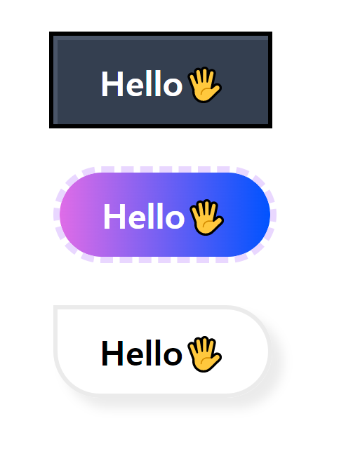
div를 이용해 박스를 만들어주었고, 가상 선택자를 이용해 각각 박스를 꾸며주었다.
-
첫 번째 박스
border 속성을 이용해 ㄱ자의 회색 효과를 주었고, box-shadow를 이용해 검정색의 테두리를 적용해주었다. -
두 번째 박스
https://cssgradient.io/
위의 사이트를 이용해 그라데이션 배경을 적용하여 주었다.
border의 dashed 속성을 이용해 점선으로 꾸며주었다.
순조롭게 되는듯 했지만 border-radius 부분에서 문제가 발생했다.
내가 만들 박스는 아래 그림과 같은 모양이었지만

내 코드를 통해 만들어진 모양은 위에 그림과 달리 타원형에 가까운 모양이었다.

이유를 찾아본 결과 %를 사용해서 그런 것이었다.
px를 사용해주니 내가 만드려고 했던 모양으로 만들 수 있었다.
다음번에도 이와 같은 문제에 직면했을때 헷갈리지 않기 위해 border-radius에서 px와 %의 차이점을 정리해보았다.
📍 border-radius에서 px와 %의 차이
- px(픽셀) : 가로 세로 동일한 값으로 둥근 모양의 외곽선 적용
- % : 사각형 가로 길이에 대해서도 비율만큼 크기가 둥근 모양으로 외곽선 적용
- 세 번째 박스
border-radius를 이용해 left-top을 나타내는 첫번째 값을 0으로 입력하여 원하는 모양을 만들어주었고, border와 box-shadow를 이용해 테두리와 그림자를 적용해주었다.

새로움을 두려워 하지 않는 도전하는 프론트엔드 개발자👩💻