오늘 배운 것
React Custom Component
- Styled Components를 활용해 다양한 기능의 커스텀 컴포넌트를 구현해보았다.
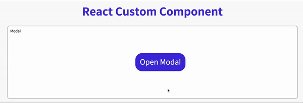
✅ Modal
전체 코드
import { useState } from 'react';
import styled from 'styled-components';
import {FiX} from "react-icons/fi"

export const ModalContainer = styled.div`
  height: 100%;
  display: flex;
  justify-content: center;
  align-items: center;
  position: relative;
`;

export const ModalBackdrop = styled.div`
  position: fixed;
  display: flex;
  justify-content: center;
  align-items: center;
  top: 0;
  left: 0;
  right: 0;
  bottom: 0;
  background-color: rgba(44,44,44,0.4);
`;

export const ModalBtn = styled.button`
  background-color: var(--coz-purple-600);
  text-decoration: none;
  border: none;
  padding: 20px;
  color: white;
  border-radius: 30px;
  cursor: grab;
`;

export const ModalView = styled.div.attrs((props) => ({
  // attrs 메소드를 이용해서 아래와 같이 div 엘리먼트에 속성을 추가할 수 있습니다.
  role: "dialog",
}))`
  width: 400px;
  height: 150px;
  margin-bottom: 200px;
  background-color: white;
  border-radius: 6px;
  display: flex;
  justify-content: center;
  align-items: center;
  position: relative;
  z-index: 5;

  .close {
    position: absolute;
    top: 0;
    margin-top: 20px;
    cursor: pointer;
  }

  .text {
    font-size: 26px;
    color: #946cdd;
  }
`;


export const Modal = () => {
  const [isOpen, setIsOpen] = useState(false);

  const openModalHandler = () => {
    setIsOpen(!isOpen)
  };


  return (
    <>
      <ModalContainer>
        <ModalBtn onClick={openModalHandler}>
          {isOpen ? "Opened!" : "Open Modal"}
        </ModalBtn>
        {isOpen ? (
          <ModalBackdrop onClick={openModalHandler}>
            <ModalView onClick={e => e.stopPropagation()}>
              <FiX className="close" onClick={openModalHandler} />
              <div className="text">HELLO CODESTATES!</div>
            </ModalView>
          </ModalBackdrop>
        ) : null}
      </ModalContainer>
    </>
  );
};
코드 분석
export const Modal = () => {
  const [isOpen, setIsOpen] = useState(false);

  const openModalHandler = () => {
    setIsOpen(!isOpen)
  };
	...
isOpen state는 모달 창의 열고 닫힘 여부를 확인할 수 있다
openModalHandler 함수는 isOpen의 상태를 변경한다. (버튼을 클릭하면 함수가 실행된다)
 	  ...
 	{isOpen ? (
          <ModalBackdrop onClick={openModalHandler}>
            <ModalView>
              <FiX className="close" onClick={openModalHandler} />
              <div className="text">HELLO CODESTATES!</div>
            </ModalView>
          </ModalBackdrop>
        ) : null}
      ...
isOpen이 true일 때, 모달창이 보이도록 기능구현을 하였다.
FiX는 react-icons에서 가져온 아이콘으로 모달창 내부에 넣어주었으며, 클릭이벤트가 발생하면 openModalHandler 함수가 실행되게 하였다.
++
ModalBackdrop을 클릭하면 모달창이 사라지게 구현하였다.
여기서 문제가 하나 발생하였는데, 자식 컴포넌트인 ModalView를 클릭해도 모달창이 사라지는 것이였다.
ModalView컴포넌트를 클릭하면 창이 닫히지 않아야하는데 부모 컴포넌트인ModalBackdrop의 클릭이벤트가 발생해서 자식 컴포넌트에도 이벤트가 적용이 된다.이를 방지하기 위해서 현재 이벤트가 캡처링/버블링 단계에서 더 이상 전파되지 않도록 방지해주는 메서드인 stopPropagation( )을 사용하였다.
<ModalView onClick={e => e.stopPropagation()}>
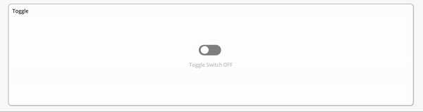
✅ Toggle
전체 코드
import { useState } from "react";
import styled from "styled-components";

const ToggleContainer = styled.div`
  position: relative;
  z-index: 1;
  margin-top: 8rem;
  left: 47%;
  cursor: pointer;

.toggle-container {
    width: 70px;
    height: 33px;
    border-radius: 30px;
    background-color: #8b8b8b;
    transition: 0.3s;

    &.toggle--checked {
      background-color: var(--coz-purple-600);
      transition: 0.3s;
    }
  }

.toggle-circle {
    position: absolute;
    top: 4px;
    left: 6px;
    width: 25px;
    height: 24px;
    border-radius: 50%;
    background-color: #ffffff;
    transition: 0.3s;

    &.toggle--checked {
      left: 39px;
      transition: 0.3s;
    }
  }
`;
// 위의 &은 div가 toggle--checked 라는 클래스명을 가지고 있을 때, 적용된다

const Desc = styled.div`
  text-align: center;
  margin-top: 20px;
.off {
    color: rgba(44,44,44,0.3);
  }
.on {
    color: var(--coz-purple-600);
  }
`;

export const Toggle = () => {
  const [isOn, setisOn] = useState(false);

  const toggleHandler = () => {
    setisOn(!isOn);
  };
return ( <> <ToggleContainer onClick={toggleHandler}> {/* TODO : 아래에 div 엘리먼트 2개가 있습니다. 각각의 클래스를 'toggle-container', 'toggle-circle' 로 지정하세요. */} {/* TIP : Toggle Switch가 ON인 상태일 경우에만 toggle--checked 클래스를 div 엘리먼트 2개에 모두 추가합니다. 조건부 스타일링을 활용하세요. */} <div className={`toggle-container ${isOn ? "toggle--checked" : null}`} /> <div className={`toggle-circle ${isOn ? "toggle--checked" : null}`} /> </ToggleContainer> {/* TODO : Desc 컴포넌트를 활용해야 합니다. */} {/* TIP: Toggle Switch가 ON인 상태일 경우에 Desc 컴포넌트 내부의 텍스트를 'Toggle Switch ON'으로, 그렇지 않은 경우 'Toggle Switch OFF'가 됩니다. 조건부 렌더링을 활용하세요. */} <Desc> {isOn ? ( <div className="on">Toggle Switch ON</div> ) : ( <div className="off">Toggle Switch OFF</div> )} </Desc> </> ); };
코드 분석
토글은 CSS 스타일에 중점을 두었다.
.toggle-container {
    width: 70px;
    height: 33px;
    border-radius: 30px;
    background-color: #8b8b8b;
    transition: 0.3s;

    &.toggle--checked {
      background-color: var(--coz-purple-600);
      transition: 0.3s;
    }
  }

...

.toggle-circle {
    position: absolute;
    top: 4px;
    left: 6px;
    width: 25px;
    height: 24px;
    border-radius: 50%;
    background-color: #ffffff;
    transition: 0.3s;

    &.toggle--checked {
      left: 39px;
      transition: 0.3s;
    }
  }
Toggle 컴포넌트의 상태인 isOn의 초기값은 false이다.
const [isOn, setisOn] = useState(false);
isOn의 상태가 true가 되면, .toggle--checked 클래스를 div에 추가해줘야 하는데 여기서 &(ampersand)를 사용하였다.
&.toggle--checked: div 요소의 className에 toggle-checked가 있을 때 스타일이 적용된다
toggle-checked의 존재여부는 아래 코드에서 정해진다.
조건부 스타일링
<ToggleContainer onClick={toggleHandler}>
  <div
    className={`toggle-container ${isOn ? "toggle--checked" : null}`}
   />
  <div className={`toggle-circle ${isOn ? "toggle--checked" : null}`} />
</ToggleContainer>
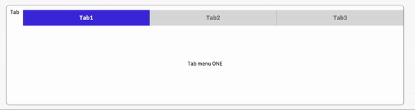
✅ Tab
전체 코드
import { useState } from 'react';
import styled from 'styled-components';

const TabMenu = styled.ul`
  background-color: #dcdcdc;
  color: rgba(73, 73, 73, 0.5);
  font-weight: bold;
  display: flex;
  flex-direction: row;
  justify-items: center;
  align-items: center;
  list-style: none;
  margin-bottom: 7rem;
  cursor: pointer;
  margin-top: 15px;

  .submenu {
    ${"" /* 기본 Tabmenu 에 대한 CSS를 구현합니다. */}
    width: 100%;
    height: 50px;
    font-size: 18px;
    color: #6f6f6f;
    display: flex;
    justify-content: space-around;
    align-items: center;
    transition: 0.1s;
    :not(:last-child) {
      border-right: 1px inset rgba(73, 73, 73, 0.3);
    }
  }

  .focused {
    ${"" /* 선택된 Tabmenu 에만 적용되는 CSS를 구현합니다.  */}
    transition: 0.3s;
    background-color: var(--coz-purple-600);
    color: white;
  }

  & div.desc {
    text-align: center;
  }
`;

const Desc = styled.div`
  text-align: center;
`;

export const Tab = () => {
  // TIP: Tab Menu 중 현재 어떤 Tab이 선택되어 있는지 확인하기 위한
  // currentTab 상태와 currentTab을 갱신하는 함수가 존재해야 하고, 초기값은 0 입니다.
  const [currentTab, setCurrentTab] = useState(0);

  const menuArr = [
    { name: 'Tab1', content: 'Tab menu ONE' },
    { name: 'Tab2', content: 'Tab menu TWO' },
    { name: 'Tab3', content: 'Tab menu THREE' },
  ];

  const selectMenuHandler = (index) => {
    // TIP: parameter로 현재 선택한 인덱스 값을 전달해야 하며, 이벤트 객체(event)는 쓰지 않습니다
    // TODO : 해당 함수가 실행되면 현재 선택된 Tab Menu 가 갱신되도록 함수를 완성하세요.
    setCurrentTab(index);
  };

  return (
    <>
      <div>
        <TabMenu>
          {/*TODO: 아래 하드코딩된 내용 대신에, map을 이용한 반복으로 코드를 수정합니다.*/}
          {/*TIP: li 엘리먼트의 class명의 경우 선택된 tab 은 'submenu focused' 가 되며,
                  나머지 2개의 tab은 'submenu' 가 됩니다.*/}
          {
            menuArr.map((el, index) => {
              return (
                <li key={index} className={currentTab === index ? "submenu focused" : "submenu"} onClick={() => selectMenuHandler(index)}>
                {el.name}
                </li>
              );
            })
          }
        </TabMenu>

        <Desc>
          {/*TODO: 아래 하드코딩된 내용 대신에, 현재 선택된 메뉴 따른 content를 표시하세요*/}
          <p>{menuArr[currentTab].content}</p>
        </Desc>
      </div>
    </>
  );
};
코드 분석
const [currentTab, setCurrentTab] = useState(0);

  const menuArr = [
    { name: 'Tab1', content: 'Tab menu ONE' },
    { name: 'Tab2', content: 'Tab menu TWO' },
    { name: 'Tab3', content: 'Tab menu THREE' },
  ];

  const selectMenuHandler = (index) => {
    setCurrentTab(index);
  };
현재 선택되어있는 탭을 확인하기 위한 상태인
currentTab, 현재 선택된 Tab Menu 가 갱신되도록 하는 함수인selectMenuHandler를 작성하였다.
{
    menuArr.map((el, index) => {
      return (
       <li key={index} className={currentTab === index
        ? "submenu focused" : "submenu"} onClick={() => selectMenuHandler(index)}>
         {el.name}
       </li>
             );
          })
}
menuArr에 map 메서드를 사용하여 TabMenu의 자식으로 li 요소를 생성해주었다.
탭을 클릭하면 currentTab의 상태를 변경하는 함수를 실행시켰으며, 조건부 연산자를 이용하여 선택되어있는 탭에만 focused 클래스를 추가해주었다.
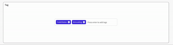
✅ Tag
전체 코드
import { useState } from 'react'; import styled from 'styled-components'; export const TagsInput = styled.div` margin: 8rem auto; display: flex; align-items: flex-start; flex-wrap: wrap; min-height: 48px; width: 480px; padding: 0 8px; border: 1px solid rgb(214, 216, 218); border-radius: 6px; ul { display: flex; flex-wrap: wrap; padding: 0; margin: 11px 0 0 0; .tag { width: auto; height: 32px; display: flex; align-items: center; justify-content: center; color: #fff; padding: 0 8px; font-size: 14px; list-style: none; border-radius: 6px; margin: 0 8px 8px 0; background: var(--coz-purple-600); .tag-close-icon { display: block; width: 16px; height: 16px; line-height: 16px; text-align: center; font-size: 12px; margin-left: 8px; padding-top: 1px; color: var(--coz-purple-600); border-radius: 50%; background: #fff; cursor: pointer; } .tag-title { color: rgba(255,255,255,0.9); } } } input { flex: 1; border: none; height: 46px; font-size: 14px; padding: 4px 0 0 0; :focus { outline: transparent; } } &:focus-within { border: 1px solid var(--coz-purple-600); } `; export const Tag = () => { const initialTags = ['CodeStates', 'kimcoding']; const [tags, setTags] = useState(initialTags); const removeTags = (indexToRemove) => { // TODO : 태그를 삭제하는 메소드를 완성하세요. setTags(tags.filter(el => el !== tags[indexToRemove])); }; const addTags = (event) => { if (event.target.value === "") return null; if (event.keyCode === 13 && tags.filter(el => el === event.target.value).length !== 1) { setTags([...tags, event.target.value]); event.target.value = ""; } }; return ( <> <TagsInput> <ul id="tags"> {tags.map((tag, index) => ( <li key={index} className="tag"> <span className="tag-title">{tag}</span> <span className="tag-close-icon" onClick={()=>removeTags(index)}> × </span> </li> ))} </ul> <input className="tag-input" type="text" onKeyUp={(e) => { addTags(e) }} placeholder="Press enter to add tags" /> </TagsInput> </> ); };
코드 분석
현재 태그에는 initialTags 배열이 들어가 있다.
  const initialTags = ['CodeStates', 'kimcoding'];

  const [tags, setTags] = useState(initialTags);
태그의 x버튼을 클릭하면 실행되는 함수로 index값을 가져와서 tags의 상태를 변경한다.
const removeTags = (indexToRemove) => {

    setTags(tags.filter(el => el !== tags[indexToRemove]));
  };
인풋창에서 엔터키를 누르면 실행되는 함수로 이벤트를 인자로 받아 주석으로 작성되어있는 3가지 기능을 수행한다.
  const addTags = (event) => {
    // - 아무것도 입력하지 않은 채 Enter 키 입력시 메소드 실행하지 말기
    // - 이미 입력되어 있는 태그인지 검사하여 이미 있는 태그라면 추가하지 말기
    // - 태그가 추가되면 input 창 비우기
    if (event.target.value === "") return null;

    if (event.keyCode === 13 && tags.filter(el => el === event.target.value).length !== 1) {
      setTags([...tags, event.target.value]);
      event.target.value = "";
    }
  };
Bare Minimum Requirement 는 정리가 끝났다.
Advanced Challenges 2가지가 남아있는데 글이 너무 길어진 관계로 다음 게시글에서 정리할 예정이다.