오늘 배운 것
React Custom Component 2
- Advanced Challenge
Autocomplete Component , ClickToEdit Component 를 만들어보았다.
( React Custom Component 1 / Modal, Toggle, Tap, Tag )
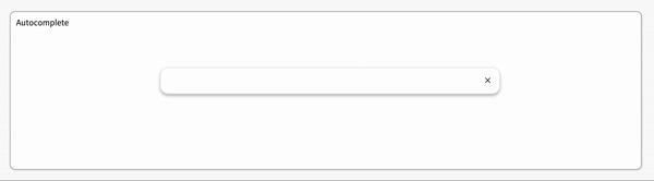
✅ Autocomplete Component
텍스트 input에 값을 입력하면, dropdown으로 input 값과 유사한 추천 검색 옵션을 보여주는 자동 완성 기능입니다.
전체 코드
import { useState, useEffect } from "react";
import styled from "styled-components";
const deselectedOptions = [
"rustic",
"antique",
"vinyl",
"vintage",
"refurbished",
"신품",
"빈티지",
"중고A급",
"중고B급",
"골동품",
];
/* TODO : 아래 CSS를 자유롭게 수정하세요. */
const boxShadow = "0 4px 6px rgb(32 33 36 / 28%)";
const activeBorderRadius = "1rem 1rem 0 0";
const inactiveBorderRadius = "1rem 1rem 1rem 1rem";
export const InputContainer = styled.div`
margin-right: 7rem;
margin-top: 7rem;
background-color: #ffffff;
display: flex;
padding: 1rem;
border: 1px solid rgb(223, 225, 229);
border-radius: ${ props => props.radius};
z-index: 3;
box-shadow: 0;
width: 60%;
&:focus-within {
box-shadow: ${boxShadow};
}
> input {
flex: 1 0 0;
background-color: transparent;
border: none;
margin: 0;
padding: 0;
outline: none;
font-size: 16px;
margin-left: 17px;
}
> div.delete-button {
cursor: pointer;
}
`;
export const DropDownContainer = styled.ul`
background-color: #ffffff;
display: block;
width: 60%;
margin-left: auto;
margin-right: auto;
list-style-type: none;
margin-block-start: 0;
margin-block-end: 0;
margin-inline-start: 0px;
margin-inline-end: 0px;
padding-inline-start: 0px;
margin-right: 7rem;
margin-top: -1px;
padding: 0.5rem 0;
border: 1px solid rgb(223, 225, 229);
border-radius: 0 0 1rem 1rem;
box-shadow: ${boxShadow};
z-index: 3;
> li {
padding: 0 1rem;
&:hover {
background-color: rgba(44, 44, 44, 0.1);
cursor: pointer;
}
&.select {
background-color: rgba(44, 44, 44, 0.1);
}
}
`;
export const Autocomplete = () => {
/**
* Autocomplete 컴포넌트는 아래 3가지 state가 존재합니다. 필요에 따라서 state를 더 만들 수도 있습니다.
* - hasText state는 input값의 유무를 확인할 수 있습니다.
* - inputValue state는 input값의 상태를 확인할 수 있습니다.
* - options state는 input값을 포함하는 autocomplete 추천 항목 리스트를 확인할 수 있습니다.
*/
const [hasText, setHasText] = useState(false);
const [inputValue, setInputValue] = useState("");
const [options, setOptions] = useState(deselectedOptions);
const [select, setSelect] = useState(-1);
// useEffect를 아래와 같이 활용할 수도 있습니다.
useEffect(() => {
//첫 렌더링, 입력창의 값이 변함에 따라 안의 코드가 작동한다
if (inputValue === "") {
setHasText(false);
setOptions([]); // 입력창이 빈 상태에는 리스트가 뜨지 않도록 함
setSelect(-1);
}
if (inputValue !== "") {
setOptions(
deselectedOptions.filter((el) =>
el.toLowerCase().includes(inputValue.toLowerCase())
)
); //입력값과 자동완성을 소문자로 통일해줌
}
}, [inputValue]);
const handleInputChange = (event) => {
console.log(event);
setInputValue(event.target.value); // string 타입
setHasText(true);
};
const handleDropDownClick = (clickedOption) => {
setInputValue(clickedOption);
};
const handleDeleteButtonClick = () => {
    setInputValue("");
  };
// Advanced Challenge: 상하 화살표 키 입력 시 dropdown 항목을 선택하고, Enter 키 입력 시 input값을 선택된 dropdown 항목의 값으로 변경하는 handleKeyUp 함수를 만들고,
// 적절한 컴포넌트에 onKeyUp 핸들러를 할당합니다. state가 추가로 필요한지 고민하고, 필요 시 state를 추가하여 제작하세요.
const handleKeyUp = (event) => {
if (hasText) {
if (event.key === "ArrowDown" && options.length - 1 > select) {
setSelect(select + 1);
}
if (event.key === "ArrowUp" && select !== -1) { //keyup을 눌렀을 때, select가 초기값보다 큰 상태면
setSelect(select - 1);
}
if (event.key === "Enter" && select !== -1) { //엔터키를 눌렀을 때
handleDropDownClick(options[select]);
setSelect(-1);
}
}
};
// console.log(options)
// console.log(select);
return (
<div className="autocomplete-wrapper">
<InputContainer
radius={inputValue !== "" ? activeBorderRadius : inactiveBorderRadius}
>
<input
type="text"
value={inputValue}
onChange={handleInputChange}
onKeyDown={(event) => handleKeyUp(event)}
/>
<div className="delete-button" onClick={handleDeleteButtonClick}>
×
</div>
</InputContainer>
{hasText && (
<DropDown
options={options}
handleDropDownClick={handleDropDownClick}
select={select}
handleKeyUp={handleKeyUp}
/>
)}
</div>
);
};
export const DropDown = ({ options, select, handleDropDownClick, handleKeyUp }) => {
return (
<DropDownContainer>
{options.map((option, index) => {
return (
<li className={select === index ? "select" : null}
key={index}
onClick={() => handleDropDownClick(option)}
onKeyUp={(event) => handleKeyUp(event)}
>
{option}
</li>
);
})}
</DropDownContainer>
);
};
자동완성 컴포넌트의 동작방식
hasText를 이용하여 input 값의 유무를 확인한다.
hasText가 true일 때,handleInputChange함수를 이용하여inputValue를 변경한다. (inputValue는 input값의 상태)
inputValue를 포함한 추천 항목 리스트를 담고있는options를 조건부 연산자를 이용해 보여준다.// hasText가 true일 때 보여지게 작성 ( 단축평가 이용 ) {hasText && ( <DropDown options={options} handleDropDownClick={handleDropDownClick} select={select} handleKeyUp={handleKeyUp} /> )}
추가적인 기능
-
입력창의 ×버튼을 누르면 입력창이 비워진다.
x 버튼은 HTML 엔티티를 이용하여 표현해 주었다. 참고
const handleDeleteButtonClick = () => { setInputValue(""); };입력창이 비워지는 것은 onClick 이벤트를 이용하여 함수가 실행되면
inputValue의 값을 빈문자열로 변경해주었다. -
드랍다운 리스트를 클릭하면 입력창의 항목이 선택한 Dropdown 항목으로 변한다.
  const handleDropDownClick = (clickedOption) => {
    setInputValue(clickedOption);
  };
위의 함수는 클릭한 옵션을 인자로 받아
inputValue를 변경하는 함수이며,{options.map((option, index) => { return ( <li className={select === index ? "select" : null} key={index} onClick={() => handleDropDownClick(option)} onKeyUp={(event) => handleKeyUp(event)} {option} </li> ); })}클릭한 li요소의 option을 인자로 전달해준다.
- Advanced : 상하 화살표 키 입력 시 dropdown 항목을 선택하고, Enter 키 입력 시 input값을 선택된 dropdown 항목의 값으로 변경한다.
선택한 dropdown 항목의 index를 저장하기위한 상태를 만들었다.
( 초기값은 아무것도 선택되지 않은 상태이므로 -1 )const [select, setSelect] = useState(-1);handleKeyUp 함수 : 입력한 키를 받아 select의 상태를 변경하는 함수
const handleKeyUp = (event) => { if (hasText) { if (event.key === "ArrowDown" && options.length - 1 > select) { setSelect(select + 1); } if (event.key === "ArrowUp" && select !== -1) { //keyup을 눌렀을 때, select가 초기값보다 큰 상태면 setSelect(select - 1); } if (event.key === "Enter" && select !== -1) { //엔터키를 눌렀을 때 handleDropDownClick(options[select]); setSelect(-1); } } };주의할점: 어떤 키가 눌렸는지 확인하는 이벤트 처리 방식으로 event.KeyCode 를 사용하면 안된다. 참고
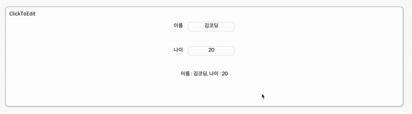
✅ ClickToEdit Component
input 창을 클릭하면 수정이 가능하고, input 창이 아닌 다른 곳을 클릭하면 수정한 내용이 반영되는 기능을 가진 컴포넌트입니다.
전체 코드
import { useEffect, useState, useRef } from 'react';
import styled from 'styled-components';

export const InputBox = styled.div`
  text-align: center;
  display: inline-block;
  width: 150px;
  height: 30px;
  border: 1px #bbb dashed;
  border-radius: 10px;
  margin-left: 1rem;
  padding: 1px;
  > span {
    display: inline-block;
    &.action { // value가 빈문자열일 때, 클릭을 쉽게 하기위해 추가
      width: 20px;
      height: 20px;
    }
  }
`;

export const InputEdit = styled.input`
  text-align: center;
  display: inline-block;
  width: 150px;
  height: 30px;
`;

export const InputView = styled.div`
  text-align: center;
  align-items: center;
  margin-top: 3rem;

  div.view {
    margin-top: 3rem;
  }
`;

export const MyInput = ({ value, handleValueChange }) => { //ClickToEdit의 자식 컴포넌트
  const inputEl = useRef(null);
  const [isEditMode, setEditMode] = useState(false);
  const [newValue, setNewValue] = useState(value); //isEditMode가 true일 때, 업데이트 되며 보이게 될 값을 상태로 가진다

  useEffect(() => {
    if (isEditMode) {
      inputEl.current.focus();
    }
  }, [isEditMode]);

  useEffect(() => {
    setNewValue(value);
  }, [value]);

  console.log(newValue);

  const handleClick = () => {
    // TODO : isEditMode 상태를 변경합니다.
    setEditMode(!isEditMode);
  };

  const handleBlur = () => {
    // TODO : Edit가 불가능한 상태로 변경합니다.
    handleValueChange(newValue);
    setEditMode(false);
  };

  const handleInputChange = (e) => {
    console.log(e);
    // TODO : 저장된 value를 업데이트합니다.
    setNewValue(e.target.value);
  };

  return (
    <InputBox>
      {isEditMode ? (
        <InputEdit
          type="text"
          value={newValue}
          ref={inputEl}
          onChange={handleInputChange}
          onBlur={handleBlur}

          // TODO : 포커스를 잃으면 Edit가 불가능한 상태로 변경되는 메소드가 실행되어야 합니다.
          // TODO : 변경 사항이 감지되면 저장된 value를 업데이트 되는 메소드가 실행되어야 합니다.
        />
      ) : (
          <span className={newValue === "" ? "action" : null} onClick={handleClick}>{newValue}</span>
      )}
    </InputBox>
  );
}

const cache = {
  name: '김코딩',
  age: 20
};

export const ClickToEdit = () => {
  const [name, setName] = useState(cache.name);
  const [age, setAge] = useState(cache.age);

  return (
    <>
      <InputView>
        <label>이름</label>
        <MyInput value={name} handleValueChange={(newValue) => setName(newValue)} />
      </InputView>
      <InputView>
        <label>나이</label>
        <MyInput value={age} handleValueChange={(newValue) => setAge(newValue)} />
      </InputView>
      <InputView>
        <div className='view'>이름 : {name}, 나이 : {age}</div>
      </InputView>
    </>
  );
};
위의 autocomplete에 비해서는 기능구현이 빠르게 끝난 것 같다.
focus, blur
useRef와isEditMode상태를 이용하여 true일 때,inputEdit컴포넌트에 focus를 주었다.useEffect(() => { if (isEditMode) { inputEl.current.focus(); } }, [isEditMode]);
- onBlur 이벤트를 이용하여 요소가 포커스를 잃으면, Edit이 불가능한 상태를 만들어야하는데 아래의 함수를 실행시켜 기능구현을 완료했다.
  const handleBlur = () => {
    // TODO : Edit가 불가능한 상태로 변경합니다.
    handleValueChange(newValue);
    setEditMode(false);
  };
++ 컴포넌트를 완성 후, 기능구현이 잘 되는지 여러가지를 입력해보다가 value가 없을 때(빈 문자열), 다시 입력이 되지 않는 상황을 발견했다.

이유는 span요소 때문인데 내용이 없으면 컨텐츠의 크기가 0이되어 선택이 안되는 것이였다.
이를 해결하기 위해서 아래의 코드들을 추가하였다.
span에는 action이라는 클래스를 조건부 연산자를 이용하여 추가해줬다.<span className={newValue === "" ? "action" : null} onClick={handleClick}>{newValue}</span>action이라는 클래스가 존재할 때, 아래의 스타일을 추가해준다.
span {
    display: inline-block;
    &.action { // value가 빈문자열일 때, 클릭을 쉽게 하기위해 추가
      width: 20px;
      height: 20px;
    }
여기서
display: inline-block속성을 줘야지 아래의 스타일이 적용된다. (span을 block 엘리먼트처럼 width와 height 속성 지정이 가능해진다)