home.html css로 꾸며주기.
드디어 python scrapper를 다듬으려고 한다. css를 통해 home.html과 detail.html, export.html 까지 쌈빡하게 만들어보려고 한다.(sass를 이용해서 만들긴 했으나 나중에 다시 css로 코드를 짰다. 왜냐면 sass가 가능하려면 nodejs 를 이용해 compile해야하는데 repl에서는 그게 힘들것 같아서 그냥 마지막에 바로바로 변경가능한 css를 선택하기로 했다.)
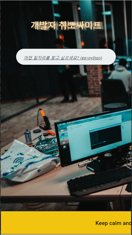
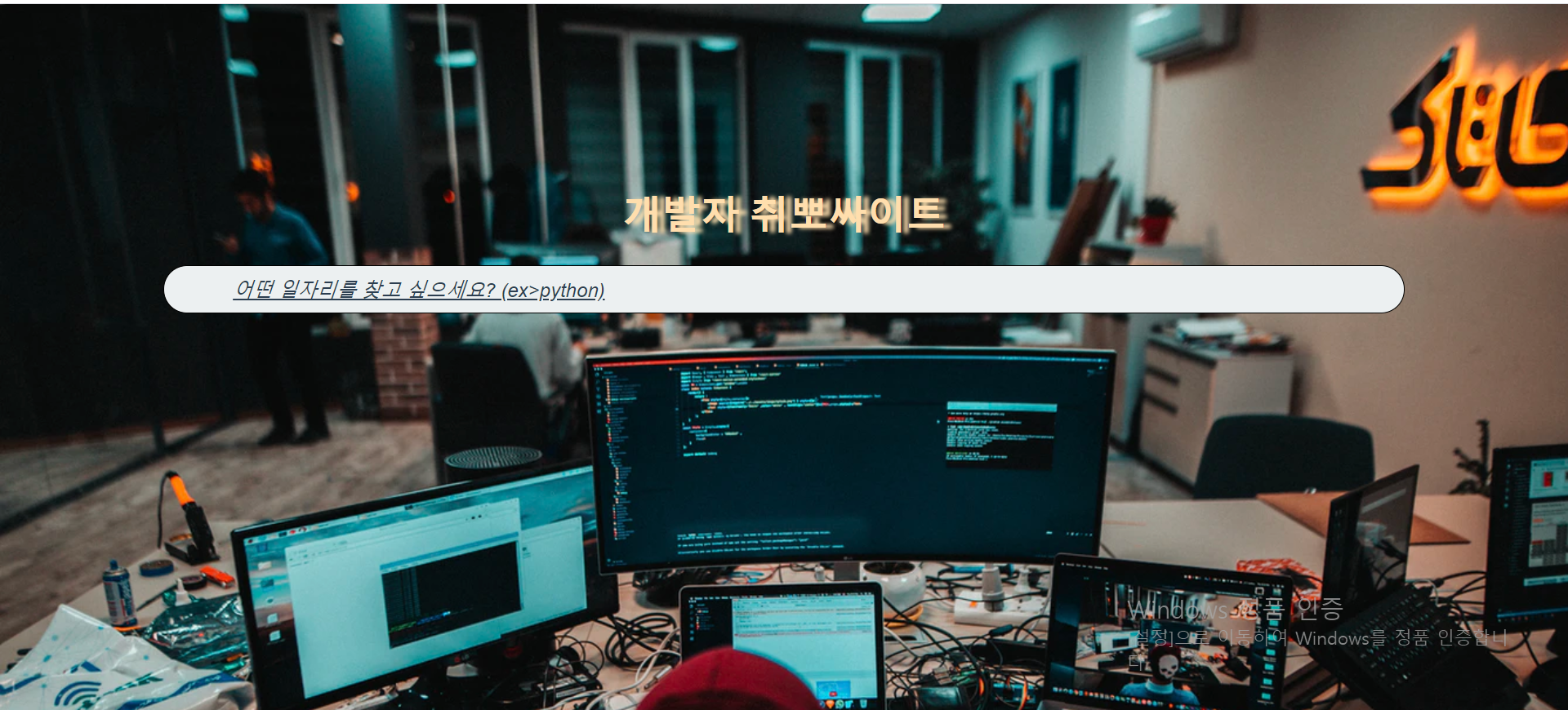
home.html 같은경우는 grid, flex를 통해 가운데로 정렬하고 배경을 추가하려고 한다.
<!DOCTYPE html>
<html>
<head>
    <meta charset="UTF-8">
    <meta name="viewport" content="width=device-width, initial-scale=1.0">
    <title>Job search</title>
    <link rel="stylesheet" href="url_for('static', filename='css/styles_home.css')">
    <!-- href 안에 값 양끝쪽에 중괄호 2개를 씌우자 -->
</head>
<body>
    <header>
        <h1>
            개발자 취뽀 사이트
        </h1>
    </header>
    <main>
        <form action = "detail" method = "GET">
            <input placeholder = "어떤 일자리를 찾고 싶으세요? 키워드를 입력하고 엔터를 누르세요(ex>python)" required name = "job"/>
        </form>
         <div class="moving"><span>Keep calm and Searching on😎</span></div>
    </main>
</body>
</html>
우선 틀은 이렇게 생깄다. 참고로 flask 에서 css 나 javascript를 추가하려면 "static" 이라는 폴더를 만들고(templates 처럼) 그 안에 css파일을 넣으면 된다. 그리고 url_for('static', filename='css/styles_home.css') 라고 명시해주면 끝!
home.css
body는 grid를 적용하였고 body 안에 있는 form header는 flex를 적용해 가운데 정렬 하였다. 다만 background-size 가 애를 좀 먹였다.
cover로 하거나 auto로 하면 배경이 쪼개져버렸다. 그래서 폰에서도 웹에서도 꽉찬 화면을 유지할 수 있게 이리저리 조정해보다가 auto 285%이 최적의 값임을 발견하고 적용하였다.
@import url(https://fonts.googleapis.com/css2?family=Roboto:wght@500&display=swap);

* {box-sizing:border-box}

body{
	display:grid;
	height:29vh;
	margin-top:10%;
	background:url(https://images.unsplash.com/photo-1486312338219-ce68d2c6f44d?ixlib=rb-1.2.1&ixid=eyJhcHBfaWQiOjEyMDd9&auto=format&fit=crop&w=1052&q=80);
	background-size:auto 285%;
	font-family:'Roboto',sans-serif;
	grid-template-columns:1fr;
	grid-template-rows:repeat(2,1fr);
	position:center;
}

form,header,main {
	display:flex;
	justify-content:center
}


header h1 {
	font-size:40px;
	font-weight:900;
	text-shadow:8px 1px 4px #ffdead;
}

form {
	height:49px;
	border:1px solid;
	border-radius:200px;
	background-color:#ecf0f1;
	width:80%;
}

input {
	width:90%;
	padding:12px 7px;
	border:0;
	background:0 0;
	color:#2c3e50;
	font-size:24px;
}

::placeholder {
	display:flex;
	color:#2c3e50;
	font-style:italic;
	font-size:20px;
	text-decoration:underline;
	justify-content:center;
}
또한 header에 text-shadow를 추가하여 가독성을 높였다. 또한, placeholder의 간격을 넓히고 스타일을 추가하여 더 깔끔하게 보이게 했다.
반응형으로 만들기
그리고 폰에서도 최적화하기 위해 반응형으로 만들었다. 재밌는것은 moving class가 나타난다는 것이고 움직이는 텍스트로 만들었다는 것이다.
@media (max-width:500px) {
    header h1 {
        font-size: 25px;
	}
	::placeholder {
		display:flex;
		color:#2c3e50;
		font-style:italic;
		font-size:12px;
		text-decoration:underline;
		justify-content:center;
	}
	.moving {
		position: absolute;
		bottom: 0;
		left: 0;
		right: 0;
		display: grid;
		grid-template-columns: 1fr;
		grid-template-rows: 1fr;
		text-align: center;
		align-items: center;
		width: 100%;
		height: 10%;
		background-color: #f1c40f;
		border: 1px solid;
	}

	.moving span {
		animation: mymove 12s linear infinite;
	}

	@keyframes mymove {
		0% {
			transform: translateX(100%);
		}
		100% {
			transform: translateX(-80%);
		}
	/* } css 클래스에서 터득한걸 잘 써먹는다 */
}

@media (min-width:500px) {
	.moving {
		display: none;
	}
}
결과물을 확인해보면!
home
home_phone