
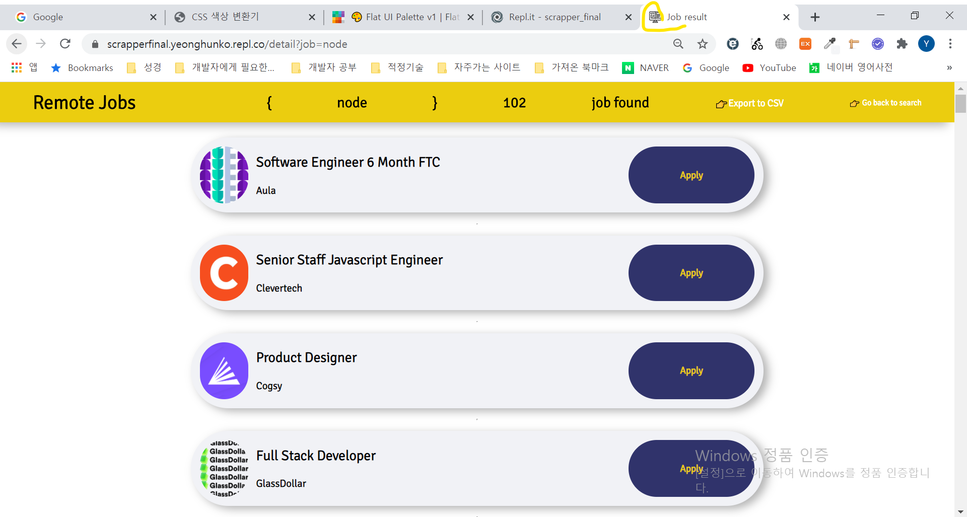
detail.html 꾸미기
home.html과 마찬가지로 favicon도 추가하였다. 추가하는 방법은 css와 동일하다.
<!DOCTYPE html>
<html lang="en">
<head>
    <meta charset="UTF-8">
    <meta name="viewport" content="width=device-width, initial-scale=1.0">
    <title>Job result</title>
    <link rel="stylesheet" href="url_for('static', filename='css/styles_detail.css')">
    <link rel="shortcut icon" href=" url_for('static', filename='favicon.ico') ">
</head>
<body>
    <header>
        <h1>Remote Jobs</h1>
        <h3><h2>{</h2><h2>{{searchingWord}}</h2><h2>}</h2> <h2>searchingResult</h2> <h2>job found</h2> </h3>
        <h4><a href="/export?job=searchingWord">👉Export to CSV</a></h4>
        <h5><a href="/">👉 Go back to search</a> </h5>
    </header>
    <main>
        {% for job in jobs %}
        <div>
            {% if job.logo  == "no logo" %}
            <div class="no_logo">no logo😓</div>
            {% else %}
            <a href="job.link"  id = 'logo' style="background-image: url({{job.logo}});" target="_blank"></a>
            {% endif %}
            <div class="data">
                <h4>{{job.title}}</h4>
                <h4>{{job.company}}</h4>
            </div>
            <a class="link" href="{{job.link}}" target="_blank">Apply</a>
        </div>
        <hr/>
        {% endfor %}
    </main>
</body>
</html>
detail.css
header와 main은 flex를 사용하였고 안에 결과 데이터는 grid를 사용하였다. 또한 box-shadow를 추가해 입체감을 살리고 logo / link를 hover할때 강조되도록 스타일을 추가했다.
@import url('https://fonts.googleapis.com/css2?family=Signika:wght@300&display=swap');

* {
    box-sizing: border-box;
}

body {
    font-family: 'Signika', sans-serif;
    margin: 0;
}

header {
    display: flex;
    justify-content: space-around;
    align-items: center;
    height: 67px;
    background-color: rgba(235, 205, 15,1);
    position: fixed;
    margin-bottom: 31px;
    width: 100%;
    z-index: 1;
    box-shadow: inset 0 0em 0em rgba(0,0,0,0.1), 0 0 0 0px rgb(255,255,255), -0.7em 0.3em 1em rgba(0,0,0,0.3);

}

header h5 > a,
header h4 > a {
    color:white;
    text-decoration: none;
}

header h5 > a:hover,
header h4 > a:hover {
    opacity: 0.5;
}


main {
    display: flex;
    flex-direction: column;
    align-items: center;
    margin-top: 82px;
    position: absolute;
    width:100%;

}

main > div {
    display: grid;
    grid-template-columns: 84px 3fr 1fr;
    grid-template-rows: 13vh;
    margin: 10px 10px;
    padding: 15px 15px;
    width:60%;
    background-color: rgba(241, 242, 246,1.0);
    border-radius: 150px;
    box-shadow: inset 0 0em 0em rgba(0,0,0,0.1), 0 0 0 0px rgb(255,255,255), 0.5em 0.3em 0.9em rgba(0,0,0,0.3);
}


#logo {
    background-size: contain;
    background-position: center;
    height: 100%;
    width: 95%;
    border-radius: 150px;
}


#logo:hover {
    opacity: 0.5;
}


.no_logo {
    display: flex;
    justify-content: center;
    align-items: center;
    background-size: contain;
    background-position: center;
    background-color: rgba(235, 205, 15,1);
    height: 100%;
    width: 95%;
    border-radius: 150px;

}

.data {
    display: flex;
    flex-direction: column;
    justify-content: space-around;
    margin-left: 9px;
    font-size: 1px;


}


.data  h4:nth-of-type(1) {
    font-size: 23px;
    margin: 0;
}

.data h4:nth-of-type(2) {
    font-size: 17px;
    margin: 0;
}

.link {
    text-align: center;
    background-color: rgba(48, 51, 107,1.0);
    display: flex;
    justify-content: center;
    align-items: center;
    border-radius: 150px;
    text-decoration: none;
    color: rgba(235, 205, 15,1);
    font-weight: 900;

}

.link:hover {
    box-shadow: 4px 4px 20px 10px rgba(19, 15, 64,1.0);
    transition: all 200ms ease-out;
}
css challenge 때 배운 직계자손 선택자, nth-of-type 선택자를 잘 사용하였다.
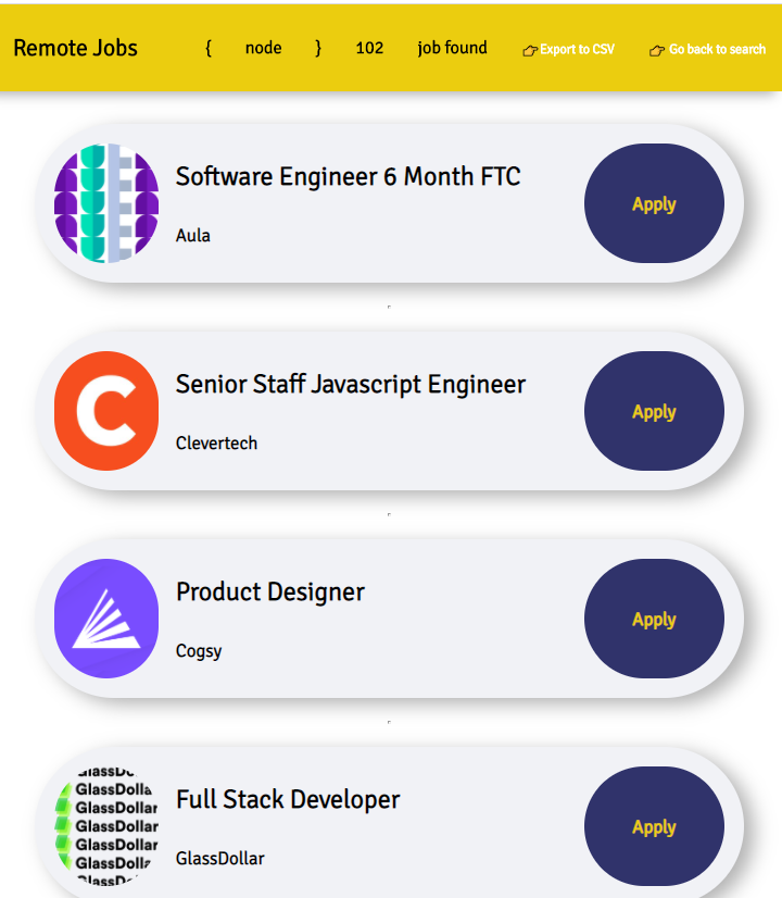
반응형으로 만들기.
역시 detail.html도 폰에서 접속하면 글자가 너무커서 삐져나왔다. 따라서 글자만 작게하고 타원의 넓이를 좀더 넓혔다.
@media (max-width:670px) {
header {
font-size: 9px;
}
.data h4:nth-of-type(1) {
font-size: 20px;
margin: 0;
}
.data h4:nth-of-type(2) {
font-size: 14px;
margin: 0;
}
.link {
font-size: 14px;
}
main > div {
width: 90%;
}
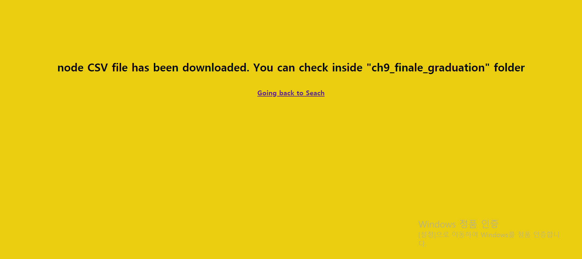
}export.css
export.css는 정말 별거 없다. 그냥 배경노란색으로 만들었고 가운데 정렬했다.
body {
    background-color: rgba(235, 205, 15,1);
  }

  header {
    display: flex;
    flex-direction: column;
    justify-content: center;
    align-items: center;
    margin-top: 20vh;
  }

  h1 {
    font-size: 30px;
  }
결과물은 아래와 같다.😎
detail
detail_phone
export

'과연 이게 최선일까?' 끊임없이 생각하기