🤼♀️ HTML과 CSS Raplit문제를 풀면서 position에 대한 개념을 정확히 이해할 필요성을 간절하게 느꼈다. CSS를 처음 배울 때 margin과 padding을 꺼이꺼이 넣어서 절대 동적인 화면에 구현할 수 없는 이색적인 코드를 작성하던 그 때와 큰 차이가 없음을 깨달으며 정확하게 개념을 살펴보고자 한다. 그래서 오늘은 position과 싸우는 날이다! 미래에 나는 그림을 보고 바로 "아!"하고 바로 파악할 수 있을 것이다. 믿어!
1. 영상 활용 개념 잡기
- 유튜브 드림코딩을 보며 정리해보았다.
- container와 item을 꾸며줄 수 있는 속성을 나누어 공부를 하니 이전보다 더 이해하기 수월했다!
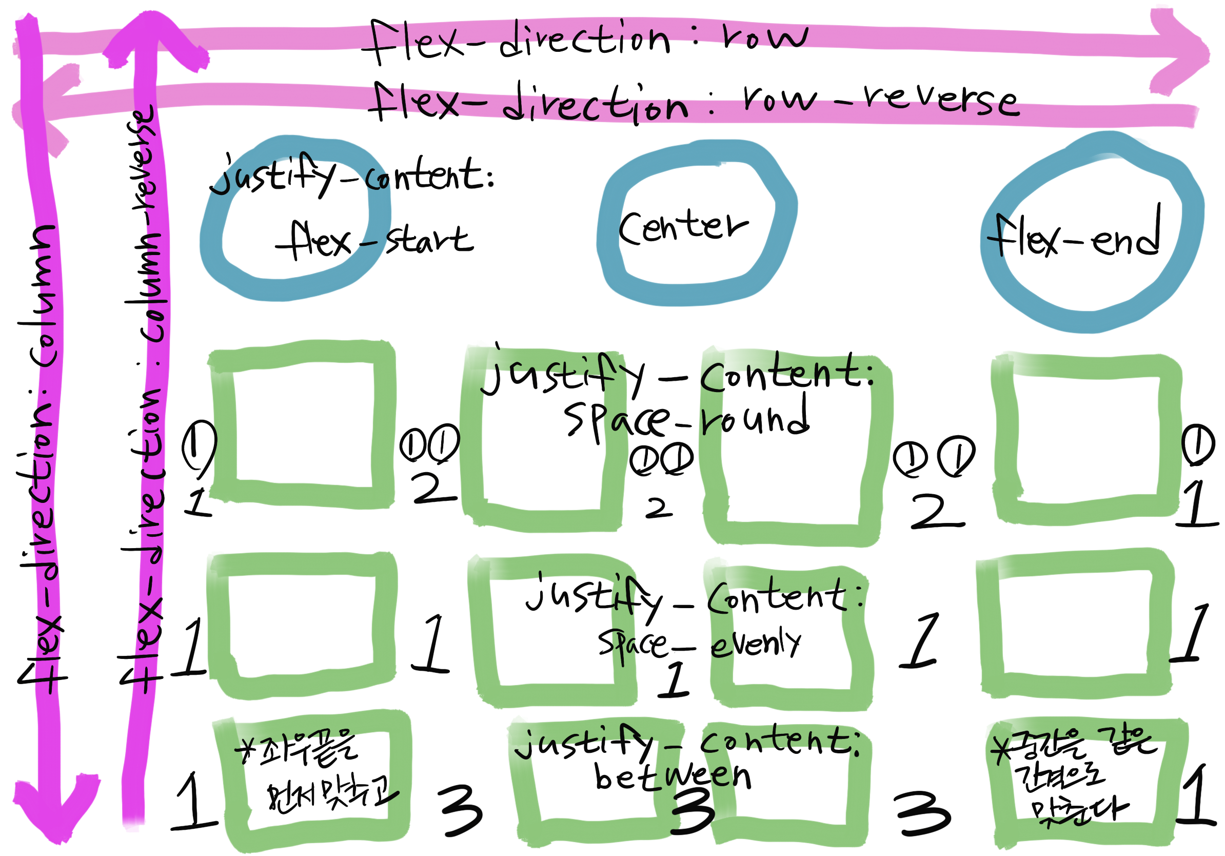
1. container를 꾸며줄 수 있는 속성
-
display
-
flex-direction
-
flex-wrap
-
flex-flow
-
justify-content
-
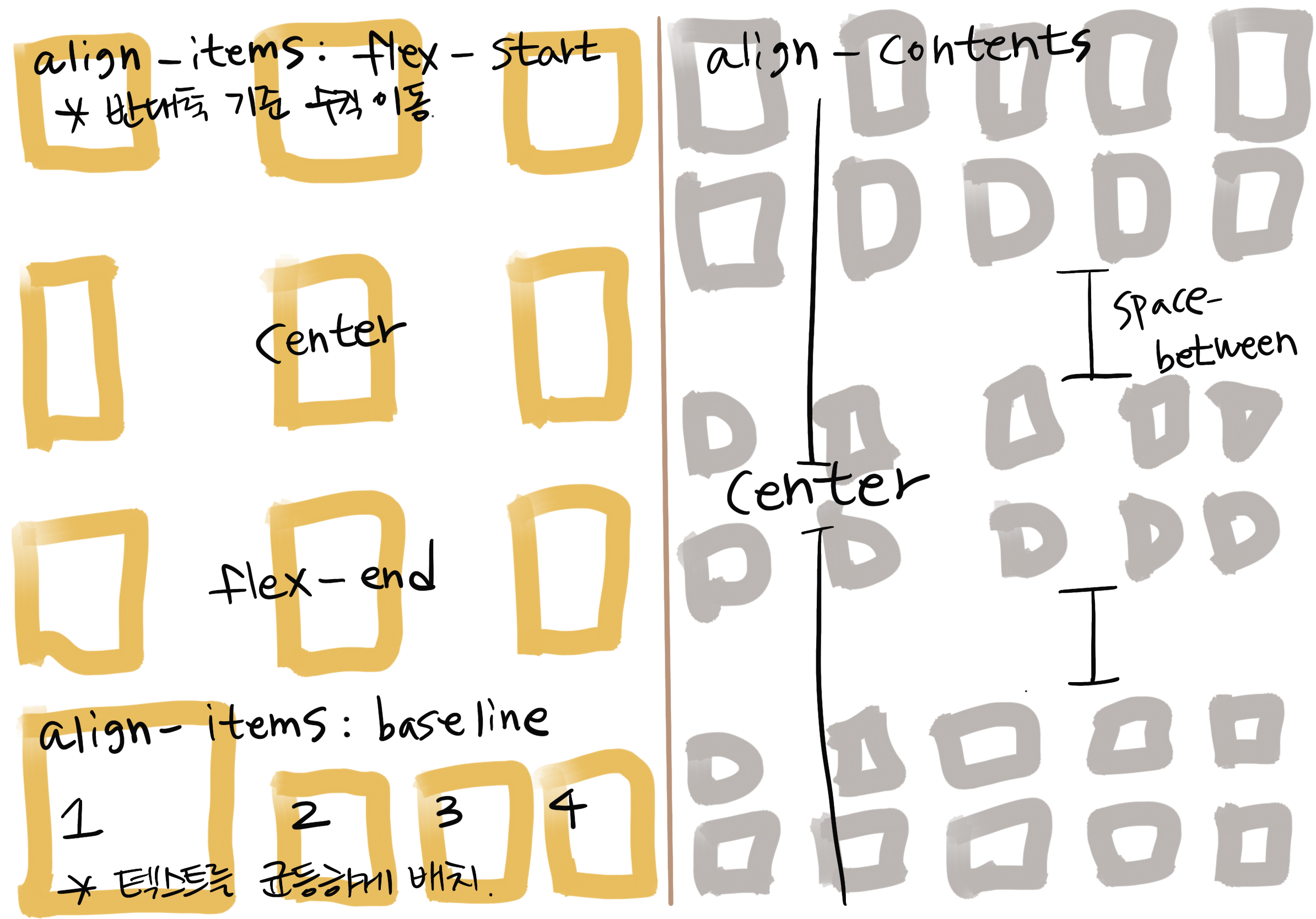
align-items
-
align-content
2.item을 꾸며 줄 수 있는 속성
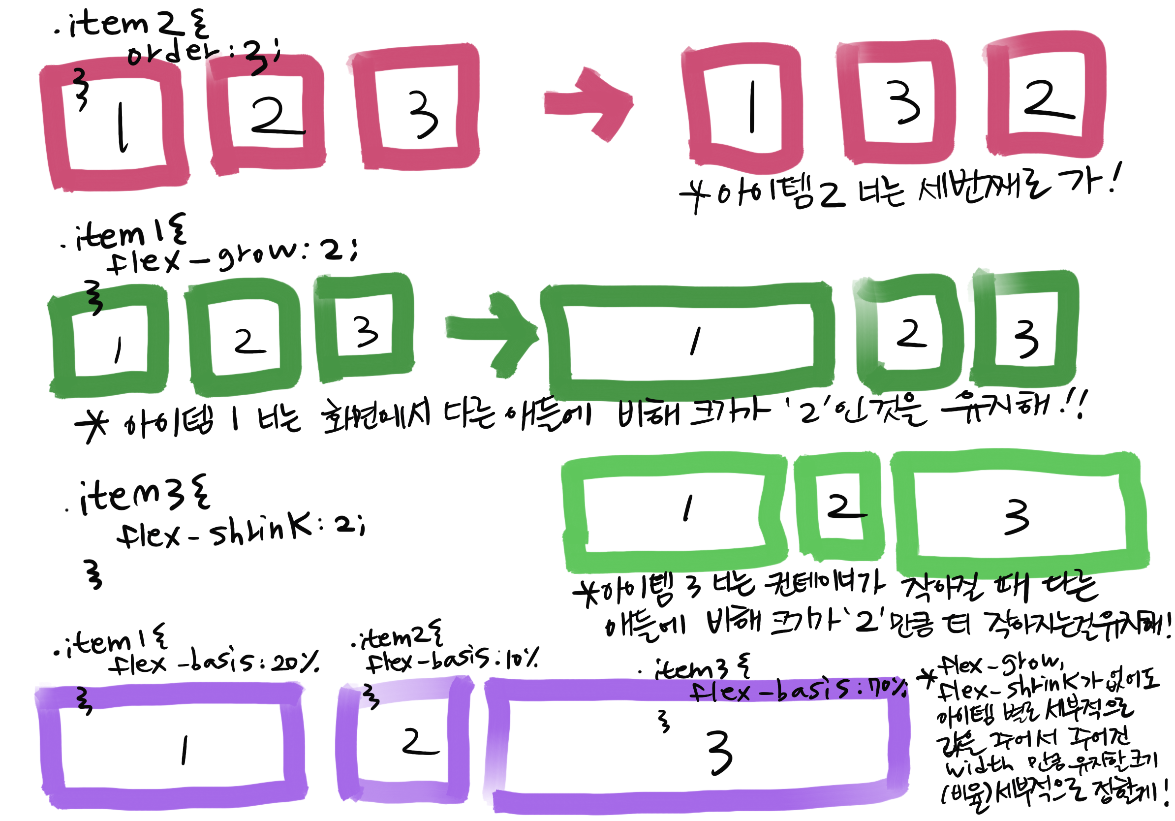
- order
- flex-grow
- flex-shrink
- flex
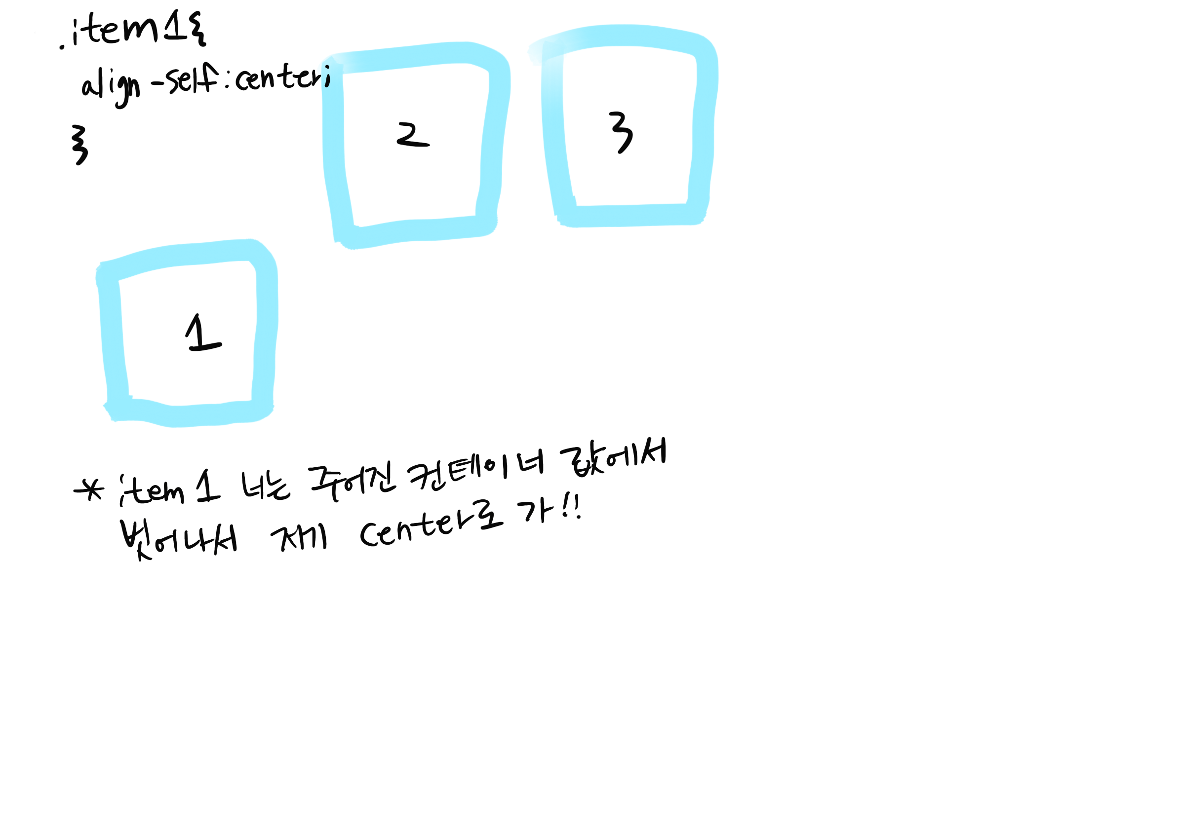
- align-self
2. 연신내역LCD화면 따라하기
- 최근 지하철을 타고 다니면서 지하철 내부에 있는 안내 LCD화면을 보면서 Position을 실습해보기 좋아 보여서 따라 해보았다. 오늘은 10월 9일 한글날이므로 한글만 따라하였다😊
1. 실습
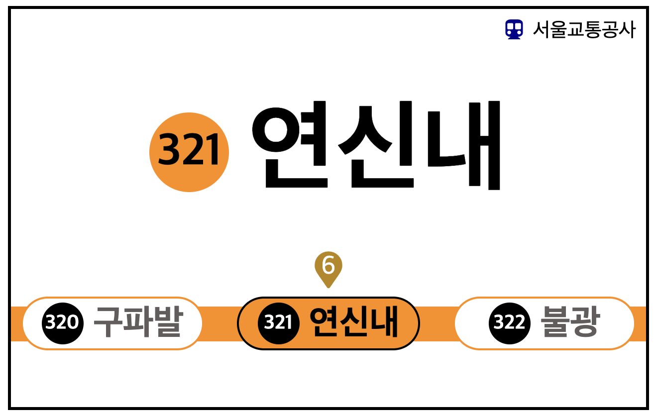
- 완성된 화면이다. padding과 margin은 적절히 사용하고 화면의 크기가 변해도 위치를 유지할 수 있도록 노력해보았다.
작성한 HTML
<body>
    <header class="top">
        <div class="mark">
            <i class="fas fa-subway"></i>
        </div>
        <div class="makrname">
            서울교통공사
        </div>
    </header>

    <section class="station">
        <div class="stat_num">321</div>
        <div class="stat_name"> 연신내</div>
    </section>

    <section class="marker_sub">
            <i class="fas fa-map-marker"></i>
            <div class="line_num">6</div>
    </section>

    <section class="ol_sub">
        <div class="front_sub">
            <div class="front_num">320</div>
            <div class="front_name"> 구파발</div>
        </div>
        <div class="now_sub">
            <div class="now_num">321</div>
            <div class="now_name"> 연신내</div>
        </div>
        <div class="next_sub">
            <div class="next_num">322</div>
            <div class="next_name"> 불광</div>
        </div>
        <div class="line_sub">
        </div>
    </section>
</body>
</html>
작성한 CSS
- 기존에는 주석을 남기지 않고 수정을 하였더니 무엇을 몰랐는지, 무엇을 고민했는지 생각이 나지 않아서 주석을 달면서 고민을 해보았다.
html{
    width: 100%;
    height: 100%;
}

body {
 margin:10px;
 height: 400px;
 border-style: solid;
 border-color: black;
 /* display: flex; */
}

.top{  /*내가 원하는 건 우측 맨끝 정렬 */
    display:flex;
    justify-content: flex-end; /*콘텐츠를 어디에 위치시킬지 이동시켜준다.*/
    font-size: 20px;
    padding:10px;
}

.top .mark i{
   margin-right: 10px;
   color:darkblue;
}

.station  {
    display:flex;
    justify-content: center; /* 중심축에서 가운데 위치*/
     width: auto; /*정해진 화면에서 넓이 유지 */
    height: 200px; /*내가 원하는 높이*/
    align-items: center; /*반대축에서 가운데 위치*/
}

.station .stat_num{
    font-size:45px;
    font-weight: bold;
    background-color: darkorange;
    width: 80px;  /*원 크기??이렇게? */
    height: 80px;
    border-radius: 50%;
    margin-right: 20px;
    /* text-align: center;
    align-items: baseline; 반대축에서 가운데 위치 */
    display: flex; /* 321글자가 가운데 정렬이 안됬는데 item에도 flex를 주고 설정을 하니 원하는 위치로 갔다!*/
    justify-content: center;
    align-items: center;
}

.station .stat_name{
    font-size: 100px;
    font-weight: bold; /*글자 굵게*/
}

.marker_sub{
    display: flex;
    justify-content: center;
    position: relative;
}

.marker_sub  i, .line_num{
    display: flex;
}

.marker_sub  i{
    font-size: 37px;
    color:darkgoldenrod;
}

.marker_sub .line_num {
    position:absolute;
    color:white;
    font-size: 26px;
    /* display: flex;
    justify-content: center;
    align-items: center;
    여기서는 세부적으로 flex안줘도 쏙 들어가네*/
}

.ol_sub{
    display: flex;
    justify-content: space-between;
    width: auto;
    height:70px;
    align-items: center;
    position:relative;
    z-index: 1;
}

.now_sub{
    display:flex;
    border-style: solid;
    border-color: black;
    border-width: 2px;
    border-radius: 30px;
    width: 180px;
    height:50px;
    background-color: darkorange;
    display: flex; /* 321글자가 가운데 정렬이 안됬는데 item에도 flex를 주고 설정을 하니 원하는 위치로 갔다!*/
    justify-content: center;
    align-items: center;
}

.front_sub ,  .next_sub {
    display:flex;
    border-style: solid;
    border-color:  darkorange;
    border-width: 2px;
    border-radius: 30px;
    width: 180px;
    height:50px;
    background-color: white;
    display: flex;
    justify-content: center;
    align-items: center;
    margin:10px;
}

/* section { 반대축에서 위치는 간격 안줘도 될까?
    align-content: space-between;
} */

.front_num, .now_num, .next_num{
    font-size:20px;
    font-weight: bold;
    color: white;
    background-color: black;
    width: 42px;  /*원 크기??이렇게? */
    height: 42px;
    border-radius: 50%;
    /* text-align: center;
    align-items: baseline; 반대축에서 가운데 위치 */
    display: flex; /* 321글자가 가운데 정렬이 안됬는데 item에도 flex를 주고 설정을 하니 원하는 위치로 갔다!*/
    justify-content: center;
    align-items: center;
    margin-right:10px;
}

.front_name, .next_name{
    font-size: 35px;
    font-weight: bold;
    color:rgb(97, 93, 93);
}

.now_name{
    font-size: 35px;
    font-weight: bold;
    color:black;
}


.line_sub {
  display: flex;
  position:absolute;
  /* position:relative; */
  /* width: 714px; */
  width: 100%; /*왜 Auto로는 안될까?*/
  height: 35px;
  background-color: darkorange;
  z-index: -1; /*DIV를 다른 엘리먼트와 상관없이 위치를 지정하고 다른 요소보다 위 또는 아래의 위치를 설정할 수있다*/
}
2. 느낌점
🔴 HTMl 구역 나누기 연습이 필요하다. 구역 잘 나누는 방법이 있을까?
🟠 CSS 위치 잡을 때 헷갈린다면 종이에 직접 그리며 생각해보자!
🟢 다음 목표는 JavaScript를 사용해서 실제 움직이는 화면 처럼 구현해보자! 와 정말 멋지겠다!@
영원히 공부하는 멋진 장선생!!