예제1. 그래프 기초
삼각함수 그리기
-
np.arange(a, b, s)
-
np.sin(value)
-
- 격자무늬 추가 #plt.grid(True)
-
- 그래프 제목 추가 #plt.title(title)
-
- x축, y축 제목 추가 #plt.xlabel(xlabel), plt.ylabel(ylabel)
-
- 주황색, 파란색 선의 데이터 의미 구분 #plt.legned(label=[x label, y label])
plt.legend(loc="위치", label=[범례])
예제2. 그래프 커스텀
t = np.arange(0, 5, 0.5)
array([0. , 0.5, 1. , 1.5, 2. , 2.5, 3. , 3.5, 4. , 4.5])
plt.figure(figsize=(10,6))
plt.plot(t, t, "r--")
plt.plot(t, t 2, "bs")
plt.plot(t, t 3, "g^")
plt.show
t = [0, 1, 2, 3, 4, 5, 6]
t = list(range(0, 7))
y = [1, 4, 5, 8, 9 ,5, 3]
plt.figure(figsize=(10,6))
plt.plot(
t,
y,
color="green",
linestyle="dashed",
marker="o",
markerfacecolor="blue",
markersize=15,
)
plt.xlim([-0.5, 6.5])
plt.ylim([0.5, 9.5])
plt.show()
예제3:scatter plot
t = np.array(range(0, 10))
y = np.array([9, 8, 7, 9, 8, 3, 2, 4, 3, 4])
plt.figure(figsize=(10,6))
plt.scatter(t, y)
plt.grid(True)
plt.show()
정렬 후 플롯그리기
data_result["소계"].sort_values().plot(kind="barh", figsize=(10,10), grid=True);
6.데이터 경향 표시
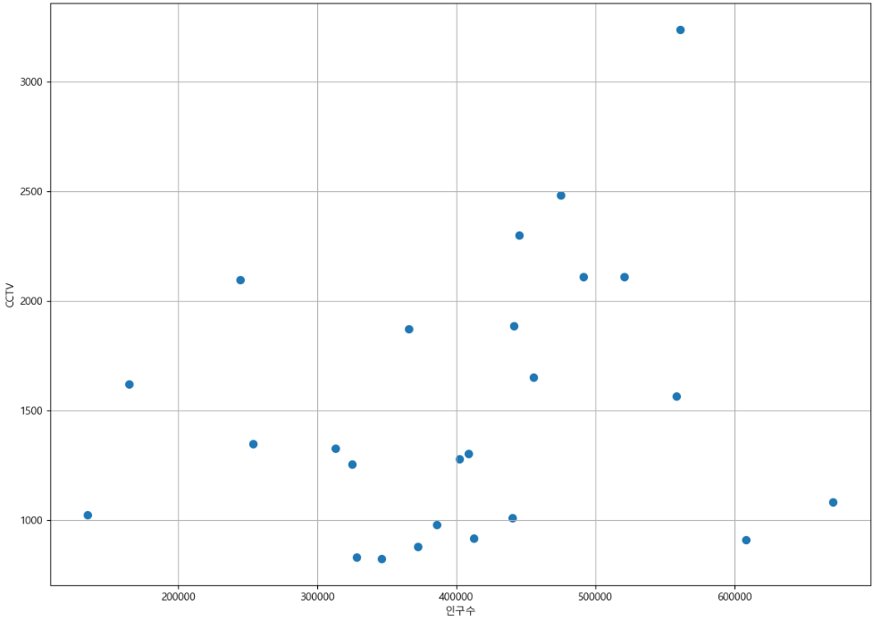
인구수와 소계 컬럼으로 scatter plot 그리기
def drawGraph():
plt.figure(figsize=(14, 10))
plt.scatter(data_result["인구수"], data_result["소계"], s=50)
plt.xlabel("인구수")
plt.ylabel("CCTV")
plt.grid(True)
plt.show()
drawGraph()
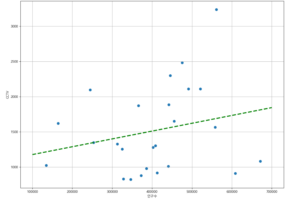
Numpy를 이용한 1차 직선 만들기
- np.polyfit() : 직선을 구성하기 위한 계수를 계산
- np.polyl1d() : polyfit으로 찾은 계수로 파이썬에서 사용할 수 있는 함수로 만들어주는 기능
fp1 = np.polyfit(data_result["인구수"], data_result["소계"], 1)
f1 = np.poly1d(fp1)
fx = np.linspace(100000, 700000, 100)
def drawGraph():
plt.figure(figsize=(14, 10))
plt.scatter(data_result["인구수"], data_result["소계"], s=50)
plt.plot(fx, f1(fx), ls="dashed", lw=3, color="g")
plt.xlabel("인구수")
plt.ylabel("CCTV")
plt.grid(True)
plt.show()
drawGraph()
def drawGraph():
plt.figure(figsize=(14, 10))
plt.scatter(data_result["인구수"], data_result["소계"], s=50, c=data_result["오차"], cmap=my_cmap)
plt.plot(fx, f1(fx), ls="dashed", lw=3, color="g")
for i in range(5):
    #상위 5개
    plt.text(
        df_sort_f["인구수"][i] * 1.02,
        df_sort_f["소계"][i] * 0.98,
        df_sort_f.index[i],
        fontsize=15,
    )
    #하위 5개
    plt.text(
        df_sort_t["인구수"][i] * 1.02,
        df_sort_t["소계"][i] * 0.98,
        df_sort_t.index[i],
        fontsize=15
    )
plt.text(df_sort_f["인구수"][0] * 1.02, df_sort_f["소계"][0] * 0.98, df_sort_f.index[0], fontsize=15)
plt.xlabel("인구수")
plt.ylabel("CCTV")
plt.colorbar()
plt.grid(True)
plt.show()
drawGraph()