그리드 레이아웃 - 플렉서블 박스 레이아웃
그리드 레이아웃(grid layout)
-
그리드 레이아웃 : 웹 사이트를 여러개의 칼럼(column)으로 나눈 후 메뉴나 본문, 이미지 등의 웹 요소를 화면세 맞게 배치
-
반응형 웹 디자인을 사용한 사이트는 화면 너비에 따라 웹 문서의 요소를 재배치 해야하며, 재배치 레이아웃을 위해 그리드 레이아웃 사용
-
그리드 레이아웃을 사용하면 화면을 규칙적으로 배열 가능
🎄 그리드 레이아웃 만드는 방법
-
CSS의 float 속성 사용
-
플렉서블 박스 레이아웃 사용
-
CSS 그리드 레이아웃 사용
플렉서블 박스 레이아웃(Flexable box layout)
-그리드 레이아웃을 기본으로 하고 각 박스를 원하는 위치에 따라 배치
-여유공간이 생길 경우 너비나 높이를 적절하게 늘리거나 줄일 수 있음
-플렉스 박스는 수평방향이나 수직방향 중 한쪽을 주축으로 정하고 박스를 배치
-주축을 수평으로 정하면 박스를 왼쪽에서 오른쪽의 순서로 배치하는데, 화면 너비를 넘어가면 수직으로 이동해서 다시 순서대로 배치
CSS 그리드 레이아웃(CSS grid layout)
-플렉스 박스는 주축이라는 개념이 있어 수평이나 수직 중 하나를 기준으로 요소를 배치하지만 CSS그리드 레이아웃은 수평과 수직 어느 방향이든 배치 가능
🎁 플렉서블(플렉스) 박스 레이아웃
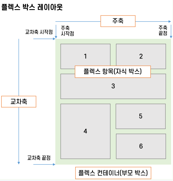
플렉스 컨테이너(부모 박스): 플렉스 박스 레이아웃을 적용할 대상을 묶는 요소플렉스 항목(자식 박스): 플렉스 박스 레이아웃을 적용할 대상으로 예시 그림에서 1~6번 박스주축(main axis): 플렉스 컨테이너 안에서 플렉스 항목을 배치하는 방향. 기본적으로 왼쪽에서 오른쪽이고, 수평 방향으로 배치함. 플렉스 항목의 배치가 시작되는 위치를 '주축 시작점', 끝나는 위치를 '주축 끝점'이라고 함교차축(cross axis): 주축과 교차하는 방향. 기본적으로 위에서 아래로 배치하며 플렉스 항목의 배치가 시작되는 위치를 '교차축 시작점', 끝나는 위치를 '교차축 끝점'이라고 함
🎨 플렉서블 박스 항목 지정 속상값
플렉서블(플렉스) 박스 항목을 배치하는 속성
- 플렉스 박스에는 플렉스 항목이 여러개 있는데, 일괄적으로 한꺼번에 배치하거나 주축이나 교차축 기준으로 다양하게 배치함
| 종류 | 설명 |
|---|---|
| justify-content | 주축 방향의 정렬 방법 |
| align-items | 교차축 방향의 정렬 방법 |
| align-self | 교차축에 있는 개별 항목의 정렬 방법 |
| align-content | 교차축에서 여러 줄로 표시된 항목의 정렬 방법 |
플렉서블(플렉스) 컨테이너를 지정하는 display 속성
- 플렉스 박스 레이아웃을 만들기위해 웹 콘텐츠를 플렉스 컨테이너로 묶어야 하며, 특정요소가 플렉스 컨테이너로 동작하려면 display 속성에 플렉스 레이아웃을 지정해야함
| 종류 | 설명 |
|---|---|
| flex | 컨테이너 안의 플렉스 항목을 블록 레벨 요소로 배치 |
| inline-flex | 컨테이너 안의 플렉스 항목을 인라인 레벨 요소로 배치 |
플렉서블(플렉스) 방향을 지정하는 flex-direction 속성
- 플렉스 컨테이너 안에서 플렉스 항목을 배치하는 주축과 방향을 지정하는 속성
| 종류 | 설명 |
|---|---|
| row | 주축을 가로로 지정, 왼쪽에서 오른쪽으로 배치(기본값) |
| row-reverse | 주축을 가로로 지정, 오른쪽에서 왼쪽으로 배치 |
| column | 주축을 세로로 지정, 위쪽에서 아래쪽으로 배치 |
| column-reverse | 주축을 세로로 지정, 아래쪽에서 위쪽으로 배치 |
<!DOCTYPE html>
<html lang="en">
<head>
  <meta charset="UTF-8">
  <title>Document</title>
  <style>
    .container {
      width: 700px;
      display: flex; /*플렉스 컨테이너 지정*/
      background-color: #eee;
      border: 1px solid #222;
      margin-bottom: 30px;
    }
    .box {
      padding: 5px 45px;
      margin: 5px;
      width: 80px;
      background-color: #222;
    }
    #opt1 { flex-direction: row; }
    #opt2 { flex-direction: row-reverse; }
    #opt3 { flex-direction: column; } /*flex-flow: column과 같음*/
    #opt4 { flex-direction: column-reverse; }
    p {
      color: #fff;
      text-align: center;
    }
  </style>
</head>
<body>
  <div class="container" id="opt1">
    <div class="box"><p>1</p></div>
    <div class="box"><p>2</p></div>
    <div class="box"><p>3</p></div>
  </div>

  <div class="container" id="opt2">
    <div class="box"><p>1</p></div>
    <div class="box"><p>2</p></div>
    <div class="box"><p>3</p></div>
  </div>

  <div class="container" id="opt3">
    <div class="box"><p>1</p></div>
    <div class="box"><p>2</p></div>
    <div class="box"><p>3</p></div>
  </div>

  <div class="container" id="opt4">
    <div class="box"><p>1</p></div>
    <div class="box"><p>2</p></div>
    <div class="box"><p>3</p></div>
  </div>
</body>
</html>
플렉서블(플렉스) 항목의 줄을 바꾸는 flex-wrap 속성
- flex-wrap 속성은 플렉스 컨테이너 너비보다 많은 플렉스 항목이 있을 경우 줄을 바꿀지 여부 지정
| 종류 | 설명 |
|---|---|
| nowrap | 플렉스 항목을 한 줄에 표시(기본값) |
| wrap | 플렉스 항목을 여러줄에 표시 |
| wrap-reverse | 플렉스 항목을 여러줄에 표시. 시작점과 끝점이 바뀜 |
<!DOCTYPE html>
<html lang="en">
<head>
  <meta charset="UTF-8">
  <title>DOM</title>
  <meta name="viewport" content="width=device-width, initial-scale=1">
  <style>
    .container {
      display: flex;  /*플레스 컨테이너 지정*/
      background-color: #eee;
      border: 1px solid #222;
      margin-bottom: 30px;
    }
    .box {
      padding: 5px 45px;
      margin: 5px;
      width: 80px;
      background-color: #222;
    }
    #opt1 { flex-wrap: nowrap; }
    #opt2 { flex-wrap: wrap; }
    #opt3 { flex-wrap: wrap-reverse; }
    p {
      color: #fff;
      text-align: center;
    }

  </style>
</head>
<body>
  <div class="container" id="opt1">
    <div class="box"><p>1</p></div>
    <div class="box"><p>2</p></div>
    <div class="box"><p>3</p></div>
    <div class="box"><p>4</p></div>
    <div class="box"><p>5</p></div>
    <div class="box"><p>6</p></div>
  </div>

  <div class="container" id="opt2">
    <div class="box"><p>1</p></div>
    <div class="box"><p>2</p></div>
    <div class="box"><p>3</p></div>
    <div class="box"><p>4</p></div>
    <div class="box"><p>5</p></div>
    <div class="box"><p>6</p></div>
  </div>

  <div class="container" id="opt3">
    <div class="box"><p>1</p></div>
    <div class="box"><p>2</p></div>
    <div class="box"><p>3</p></div>
    <div class="box"><p>4</p></div>
    <div class="box"><p>5</p></div>
    <div class="box"><p>6</p></div>
  </div>
</body>
</html>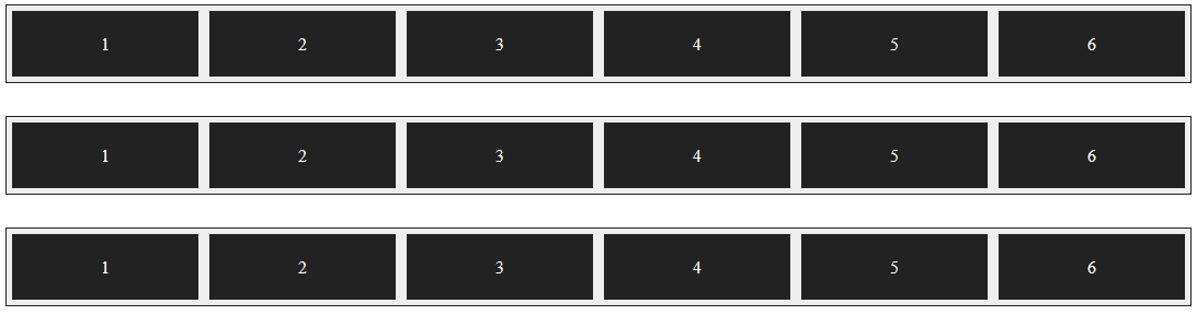

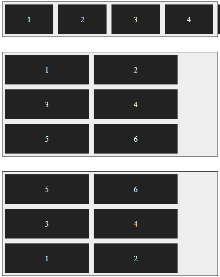
배치방향과 줄바꿈을 한꺼번에 지정하는 flex-flow 속성
- flex-direction 속성과 flex-wrap 속성을 한꺼번에 지정(배치방향 & 줄바꿈)
- 기본값은 row nowrap
<!DOCTYPE html>
<html lang="en">
<head>
  <meta charset="UTF-8">
  <title>DOM</title>
  <meta name="viewport" content="width=device-width, initial-scale=1">
  <style>
    .container {
      display: flex;
      background-color: #eee;
      border: 1px solid #222;
      margin-bottom: 10px;
    }
    #opt1 { flex-flow: column; }
    #opt2 { flex-flow: row nowrap; }
    .box {
      padding: 5px 45px;
      margin: 5px;
      background-color: #222;
    }
    p {
      color: #fff;
      text-align: center;
    }
  </style>
</head>
<body>
  <div class="container" id="opt1">
    <div class="box"><p>1</p></div>
    <div class="box"><p>2</p></div>
    <div class="box"><p>3</p></div>
    <div class="box"><p>4</p></div>
    <div class="box"><p>5</p></div>
    <div class="box"><p>6</p></div>
  </div>

  <div class="container" id="opt2">
    <div class="box"><p>1</p></div>
    <div class="box"><p>2</p></div>
    <div class="box"><p>3</p></div>
    <div class="box"><p>4</p></div>
    <div class="box"><p>5</p></div>
    <div class="box"><p>6</p></div>
  </div>
</body>
</html>
주축 정렬 방법을 지정하는 justify-content 속성
- 주축에서 플렉스 항목 간의 정렬 방법을 지정
| 종류 | 설명 |
|---|---|
| flex-start | 주축의 시작점에 맞춰 배치 |
| flex-end | 주축의 끝점에 맞춰 배치 |
| center | 주축의 중앙에 맞춰 배치 |
| space-between | 첫번째 항목과 끝 항목을 주축의 시작점과 끝점에 배치한 후 나머지 항목은 그 사이에 같은 간격으로 배치 |
| space-around | 모든 항목을 주축에 같은 간격으로 배치 |
<!DOCTYPE html>
<html lang="en">
<head>
  <title>DOM</title>
  <meta name="viewport" content="width=device-width, initial-scale=1">
  <style>
    .container {
      display: flex; /*플렉스 컨테이너 지정*/
      background-color: #eee;
      border: 1px solid #222;
      margin-bottom: 30px;
    }

    #opt1 { justify-content: flex-start; } /*주축의 시작점에 맞춰 배치*/
    #opt2 { justify-content: flex-end; } /*주축의 끝점에 맞춰 배치*/
    #opt3 { justify-content: center; } /*주축의 중앙에 맞춰 배치*/
    #opt4 { justify-content: space-between; } /*첫번째 항목과 끝항목을
    주축의 시작과 끝점에 배치한 후 나머지 항목은 그 사이에 같은 간격으로 배치*/
    #opt5 { justify-content: space-around; } /*모든 항목을 주축에 같은 간격으로 배치*/
    .box {
      padding: 5px 45px;
      margin: 5px;
      background-color: #222;
    }
    p {
      color: #fff;
      text-align: center;
    }
  </style>
</head>
<body>
  <div class="container" id="opt1">
    <div class="box"><p>1</p></div>
    <div class="box"><p>2</p></div>
    <div class="box"><p>3</p></div>
    <div class="box"><p>4</p></div>
  </div>

  <div class="container" id="opt2">
    <div class="box"><p>1</p></div>
    <div class="box"><p>2</p></div>
    <div class="box"><p>3</p></div>
    <div class="box"><p>4</p></div>
  </div>

  <div class="container" id="opt3">
    <div class="box"><p>1</p></div>
    <div class="box"><p>2</p></div>
    <div class="box"><p>3</p></div>
    <div class="box"><p>4</p></div>
  </div>

  <div class="container" id="opt4">
    <div class="box"><p>1</p></div>
    <div class="box"><p>2</p></div>
    <div class="box"><p>3</p></div>
    <div class="box"><p>4</p></div>
  </div>

  <div class="container" id="opt5">
    <div class="box"><p>1</p></div>
    <div class="box"><p>2</p></div>
    <div class="box"><p>3</p></div>
    <div class="box"><p>4</p></div>
  </div>
</body>
</html>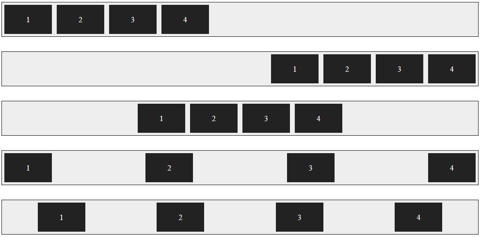
교차축 정렬 방법을 지정하는 align-items 속성
- 교차축을 기준으로 플렉스 항목간의 정렬 방법을 지정
| 종류 | 설명 |
|---|---|
| flex-start | 교차축의 시작점에 맞춰 배치 |
| flex-end | 교차축의 끝점에 맞춰 배치 |
| center | 교차축의 중앙에 맞춰 배치 |
| baseline | 교차축의 문자 기준선에 맞춰 배치 |
| stretch | 플렉스 항목을 늘려 교차축에 가득차게 배치 |
<!DOCTYPE html>
<html lang="en">
<head>
  <meta name="viewport" content="width=device-width, initial-scale=1">
  <title>DOM</title>
  <style>
    .container {
      width: 100%;
      height: 150px;
      display: flex;
      background-color: #eee;
      border: 1px solid #222;
      margin-bottom: 20px;
    }
    #opt1 { align-items: flex-start; }
    #opt2 { align-items: flex-end; }
    #opt3 { align-items: center; }
    #opt4 { align-items: baseline; }
    #opt5 { align-items: stretch; }
    .box {
      padding: 5px 45px;
      margin: 5px;
      background-color: #222;
    }
    p {
      color: #fff;
      text-align: center;
    }
  </style>
</head>
<body>
  <div class="container" id="opt1">
    <div class="box"><p>1</p></div>
    <div class="box"><p>2</p></div>
    <div class="box"><p>3</p></div>
    <div class="box"><p>4</p></div>
  </div>

  <div class="container" id="opt2">
    <div class="box"><p>1</p></div>
    <div class="box"><p>2</p></div>
    <div class="box"><p>3</p></div>
    <div class="box"><p>4</p></div>
  </div>

  <div class="container" id="opt3">
    <div class="box"><p>1</p></div>
    <div class="box"><p>2</p></div>
    <div class="box"><p>3</p></div>
    <div class="box"><p>4</p></div>
  </div>

  <div class="container" id="opt4">
    <div class="box"><p>1</p></div>
    <div class="box"><p style="font-size: 14px;">2</p></div>
    <div class="box"><p style="font-size: 25px;">3</p></div>
    <div class="box"><p style="font-size: 10px;">4</p></div>
  </div>

  <div class="container" id="opt5">
    <div class="box"><p>1</p></div>
    <div class="box"><p>2</p></div>
    <div class="box"><p>3</p></div>
    <div class="box"><p>4</p></div>
  </div>

</body>
</html>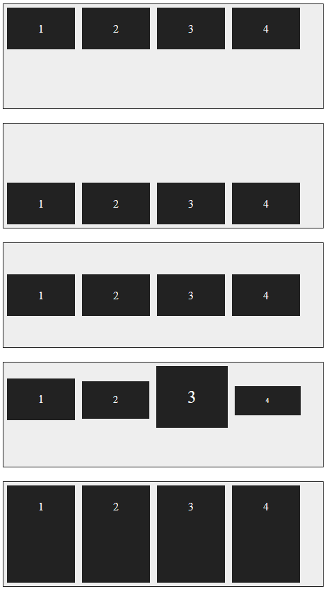
특정 항목만 정렬 방법을 지정하는 align-self 속성
- align-items 속성은 교차축을 기준으로 플렉스 항목의 정렬 방법을 결정하지만 그 중에서 특정항목만 지정하고 싶다면 align-self 속성 사용
- align-items 속성은 플렉스 컨테이너를 지정하는 선택자에 사용하지만, align-self 속성은 플렉스 항목 선택자에 사용
- align-self 속성값은 align-items 속성에서 사용하는 값과 같음
<!DOCTYPE html>
<html lang="en">
<head>
  <meta name="viewport" content="width=device-width, initial-scale=1.0">
  <title>DOM</title>
  <style>
    .container {
      width: 450px;
      height: 150px;
      background-color: #eee;
      border: 1px solid #222;
      margin-bottom: 20px;
      display: flex;  /*플레스 컨테이너 지정*/
      align-items: center;  /*교차축의 중앙에 배치*/
    }
    .box {
      padding: 5px 45px;
      margin: 5px;
      background-color: #222;
    }
    #box1 { align-self: flex-start; }
    #box3 { align-self: stretch; }
    p {
      color: #fff;
      text-align: center;
    }
  </style>
</head>
<body>
  <div class="container">
    <div class="box" id="box1"><p>1</p></div>
    <div class="box"><p>2</p></div>
    <div class="box" id="box3"><p>3</p></div>
    <div class="box"><p>4</p></div>
  </div>
</body>
</html>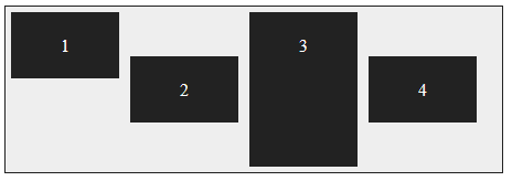
여러 줄일 때 교차축 정렬 방법을 지정하는 align-content 속성
- 주축에서 줄 바꿈이 생겨서 플렉스 항목을 여러 줄로 표시할 때, align-content 속성을 사용하면 교차축에서 플렉스 항목간의 간격을 지정할 수 있음
| 종류 | 설명 |
|---|---|
| flex-start | 교차축의 시작점에 맞춰 배치 |
| flex-end | 교차축의 끝점에 맞춰 배치 |
| center | 교차축의 중앙에 맞춰 배치 |
| space-between | 첫번째 항목과 끝 항목을 주축의 시작점과 끝점에 배치한 후 나머지 항목은 그 사이에 같은 간격으로 배치 |
| space-around | 모든 항목을 주축에 같은 간격으로 배치 |
| stretch | 플렉스 항목을 늘려 교차축에 가득차게 배치 |
<!DOCTYPE html>
<html lang="en">
<head>
  <meta name="viewport" content="width=device-width, initial-scale=1">
  <title>DOM</title>
  <style>
    .container {
      float: left;
      width: 200px;
      height: 150px;
      display: flex; /*플렉스 컨테이너*/
      flex-flow: row wrap; /*왼쪽에서 오른쪽*/
      border: 1px solid #222;
      background-color: #eee;
      margin: 30px;
    }
    #opt1 { align-content: flex-start; }
    #opt2 { align-content: flex-end; }
    #opt3 { align-content: center; }
    #opt4 { align-content: space-between; }
    #opt5 { align-content: space-around; }
    #opt6 { align-content: stretch; }
    .box {
      width: 80px;
      background-color: #222;
      border: 1px dotted #e9e9e9;
    }
    p {
      color: #fff;
      text-align: center;
    }
  </style>
</head>
<body>
  <div class="container" id="opt1">
    <div class="box"><p>1</p></div>
    <div class="box"><p>2</p></div>
    <div class="box"><p>3</p></div>
    <div class="box"><p>4</p></div>
  </div>

  <div class="container" id="opt2">
    <div class="box"><p>1</p></div>
    <div class="box"><p>2</p></div>
    <div class="box"><p>3</p></div>
    <div class="box"><p>4</p></div>
  </div>

  <div class="container" id="opt3">
    <div class="box"><p>1</p></div>
    <div class="box"><p>2</p></div>
    <div class="box"><p>3</p></div>
    <div class="box"><p>4</p></div>
  </div>

  <div class="container" id="opt4">
    <div class="box"><p>1</p></div>
    <div class="box"><p>2</p></div>
    <div class="box"><p>3</p></div>
    <div class="box"><p>4</p></div>
  </div>

  <div class="container" id="opt5">
    <div class="box"><p>1</p></div>
    <div class="box"><p>2</p></div>
    <div class="box"><p>3</p></div>
    <div class="box"><p>4</p></div>
  </div>

  <div class="container" id="opt6">
    <div class="box"><p>1</p></div>
    <div class="box"><p>2</p></div>
    <div class="box"><p>3</p></div>
    <div class="box"><p>4</p></div>
  </div>
</body>
</html>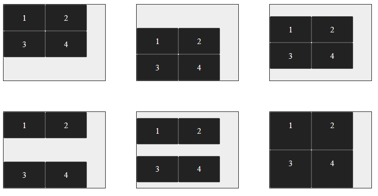
플렉스 레이아웃을 활용해 항상 중앙에 표시
<!DOCTYPE html>
<html lang="en">
<head>
  <meta name="viewport" content="width=device-width, initial-scale=1.0">
  <title>Document</title>
  <style>
    * {
      margin: 0;
      box-sizing: border-box;
    }

    body {
      background: url('../img/starbucks.png')no-repeat left top fixed;
      background-size: cover;
      display: flex;
      justify-content: center;
      align-items: center;
      min-height: 100vh;
    }
    button {
      background-color: #ccc;
      font-size: 1.2em;
      padding: 1em 2em;
      border: none;
      border-radius: 5px;
      box-shadow: 1px 1px 2px #fff;
    }
  </style>
</head>
<body>

  <button>coffee</button>

</body>
</html>
안녕 나의 새로운 세상