💙 반응형 헤더 만들기.
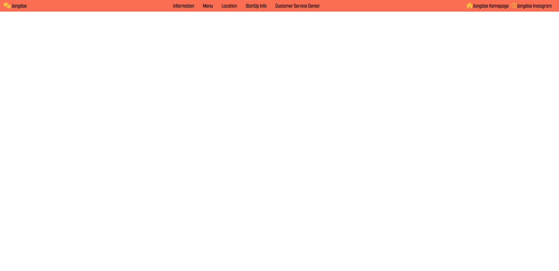
✔ 완성본
-
가로 > 570px
-
가로 ≤ 570px
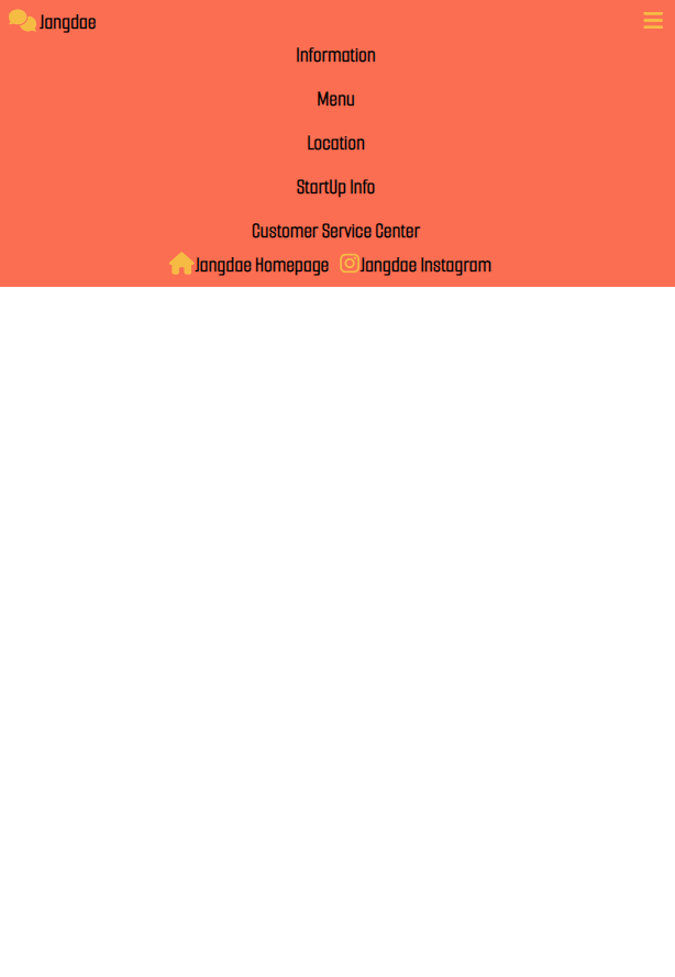
여기서 css변수를 이용해서 약간 색을 변경시켰다.
✔ 레이아웃 잡아내기.
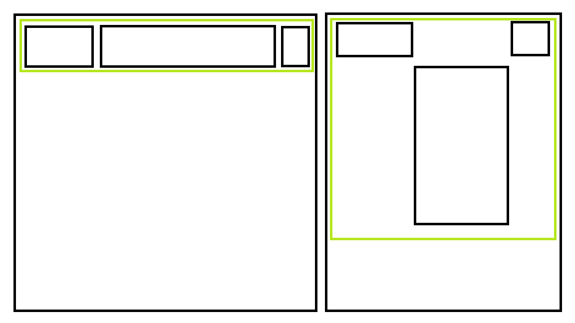
박스 안에 박스가 있기 때문에, flex-box의 개념을 이용하면 된다.
✔ html + css + js 연결하기.
<link rel="stylesheet" href="style jangdae RH.css" />
<script src="app jangdae RH.js" defer></script>
// defer 넣어주면 더 빠르게 돌아간다.
여기서 google font와 font awesome을 넣어주면 된다. 다만, 내가 짠 css보다 밑에 두면 안된다. 그렇게 되면 내 css코드가 먹힐 수 있다.
<link
      href="https://fonts.googleapis.com/css2?family=Black+Han+Sans&family=Hubballi&family=Nanum+Gothic+Coding&family=Smooch+Sans&display=swap"
      rel="stylesheet"
    />
    <!-- google font -->
    <script
      src="https://kit.fontawesome.com/4646fb7bcc.js"
      crossorigin="anonymous"
    ></script>
    <!-- font awesome -->
✔ html 구조 생성하기.
구조를 보면서 짜면 된다. nav를 이용하면 좋다.
의미가 담긴 시맨틱 태그를 이용해서 html을 짜야한다.
- header VS nav
- header = container (for navigational links OR introductory content containing h1 ~ h6)
- nav = a block of container (for menu OR tables of contents)
출처: codeacademy
<!DOCTYPE html>
<html lang="ko">
  <head>
    <meta charset="UTF-8" />
    <meta http-equiv="X-UA-Compatible" content="IE=edge" />
    <meta name="viewport" content="width=device-width, initial-scale=1.0" />
    <title>Jangdae Responsive Header :: 반응형 헤더 만들기</title>
    <link rel="preconnect" href="https://fonts.googleapis.com" />
    <link rel="preconnect" href="https://fonts.gstatic.com" crossorigin />
    <link
      href="https://fonts.googleapis.com/css2?family=Black+Han+Sans&family=Hubballi&family=Nanum+Gothic+Coding&family=Smooch+Sans&display=swap"
      rel="stylesheet"
    />
    <!-- google font -->
    <script
      src="https://kit.fontawesome.com/4646fb7bcc.js"
      crossorigin="anonymous"
    ></script>
    <!-- font awesome -->
    <link rel="stylesheet" href="style jangdae RH.css" />
    <script src="app jangdae RH.js" defer></script>
  </head>
  <body>
    <nav class="navbar">
      <nav class="nav__logo">
        <i class="fa-solid fa-comments"></i>
        <a href="#">Jangdae</a>
      </nav>
      <ul class="nav__menu">
        <li><a href="#">Information</a></li>
        <li><a href="#">Menu</a></li>
        <li><a href="#">Location</a></li>
        <li><a href="#">StartUp Info</a></li>
        <li><a href="#">Customer Service Center</a></li>
      </ul>
      <ul class="nav__icons">
        <li>
          <i class="fa-solid fa-house"></i><a href="#">Jangdae Homepage</a>
        </li>
        <li>
          <i class="fa-brands fa-instagram"></i
          ><a href="#">Jangdae Instagram</a>
        </li>
      </ul>
      <nav class="nav__toogleBtn"><i class="fa-solid fa-bars"></i></nav>
    </nav>
  </body>
</html>
✔ css 디자인 꾸미기.
⭐ 주의할 점: 꼭 큰 영역부터 css 디자인을 설정해주고, 세부 내용들을 천천히 디자인 짜주기. 위에서 아래로 짜줘야 된다. 이렇게 해야 깔끔하게 코드가 짜진다.
그리고, 박스 안에 박스가 있기 때문에 flex-box를 이용해주면 된다.
display: flex를 이용하고, 행을 기준으로 할 것인지 열을 기준으로 할 것인지 정해줘야 한다.
justify-content와 align-items들을 잘 이용해주자.
@import "reset.css";
:root {
  --text-color: #2f343c;
  --background-color: #fb6e52;
  --minibackgroung-color: #fcac9c;
  --logo-color: #f6bb43;
}

/* 큰 영역부터 작은 영역으로 내려가기. */

body {
  font-family: "Black Han Sans", sans-serif;
  font-family: "Hubballi", cursive;
  font-family: "Nanum Gothic Coding", monospace;
  font-family: "Smooch Sans", sans-serif;
}

.navbar {
  display: flex;
  flex-direction: row;
  justify-content: space-between;
  background-color: var(--background-color);
  align-items: center;
  padding: 8px 12px;
}

.nav__logo {
  color: var(--logo-color);
}

.nav__logo a {
  color: var(--text-color);
  text-decoration: none;
  font-weight: bold;
}

.nav__menu {
  display: flex;
  flex-direction: row;
  align-items: center;
}

.nav__menu li a {
  color: var(--text-color);
  text-decoration: none;
  font-weight: bold;
  padding: 8px 12px;
}

.nav__menu li:hover {
  background-color: var(--minibackground-color);
  border-radius: 5px;
}

.nav__icons {
  display: flex;
  flex-direction: row;
  align-items: center;
  color: var(--logo-color);
}

.nav__icons li a {
  color: var(--text-color);
  text-decoration: none;
  font-weight: bold;
  padding-left: 1px;
  padding-right: 8px;
}

.nav__toogleBtn {
  display: none;
  position: absolute;
  right: 12px;
  color: var(--logo-color);
}

@media screen and (max-width: 570px) {
  .navbar {
    display: flex;
    flex-direction: column;
    align-items: flex-start; /* 항상 범위가 더 큰 부분부터 지정해주기. */
  }

  .nav__menu {
    display: flex;
    flex-direction: column;
    align-items: center; /* 옮겨줘도 변하지 않는 이유 : 너비 자체가 좁기 때문이다. */
    width: 100%;
    display: none; /* 메뉴가 보여지지 않는다. */
  }

  .nav__menu li {
    padding: 8px 12px;
  }

  .nav__menu li:hover {
    width: 100%;
    text-align: center;
  }

  .nav__icons {
    display: flex;
    justify-content: center;
    width: 100%;
    display: none; /* 아이콘이 보여지지 않는다. */
  }

  .nav__toogleBtn {
    display: block;
  }

  .nav__menu.active,
  .nav__icons.active {
    display: flex;
  }
}
✔ js 코드 짜기.
-
querySelector를 이용해서 html에서 원하는 부분을 가져온 뒤에, 그것을 변수로 지정해주기.
-
addEventLister(type, function)을 이용해서 이벤트를 지정해준다.
여러 번 사용하는 함수라면, 따로 함수를 만들어주면 좋겠지만 한번만 쓰는 경우는 바로 화살표 함수로 적어서 이용하자. -
classList는 DomTokenList 반환하는 읽기 전용 프로퍼티이다. toggle도 그 프로퍼티의 기능 중의 하나이고, 한번 누르면 어떤 기능이 on이 되고, 다시 누르면 그 기능이 off가 된다. 우리가 흔히 사용하는 버튼의 기능이 toggle이라고 생각하면 된다.
toggle("active")를 주어 마우스를 클릭했다가 떼는 순간에 toogle로 인하여 어떤 기능이 on/ off가 되게끔 만들어주자. -
그런 다음에 css에서 원하는 디자인으로 만들어주면 된다.
const toogleBtn = document.querySelector(".nav__toogleBtn");
const menu = document.querySelector(".nav__menu");
const icons = document.querySelector(".nav__icons");

toogleBtn.addEventListener("click", () => {
  menu.classList.toggle("active");
  icons.classList.toggle("active");
});
@media screen and (max-width: 570px) {
.navbar {
display: flex;
flex-direction: column;
align-items: flex-start; /* 항상 범위가 더 큰 부분부터 지정해주기. */
}
.nav__menu {
display: flex;
flex-direction: column;
align-items: center; /* 옮겨줘도 변하지 않는 이유 : 너비 자체가 좁기 때문이다. */
width: 100%;
display: none; /* 메뉴가 보여지지 않는다. */
}
.nav__menu li {
padding: 8px 12px;
}
.nav__menu li:hover {
width: 100%;
text-align: center;
}
.nav__icons {
display: flex;
justify-content: center;
width: 100%;
display: none; /* 아이콘이 보여지지 않는다. */
}
.nav__toogleBtn {
display: block;
}
// active가 되었을 경우에, 다시 menu와 icons이 보여지도록 만들어준다.
.nav__menu.active,
.nav__icons.active {
display: flex;
}
}✔ css 변수 이용하기.
수정 시에 유용하게 이용할 수 있다.
이미 css 쪽에 코드를 올려놓았다. 이 부분은 나중에 모든 코드를 짠 뒤에 적용해주면 된다.
:root {
  --text-color: #2f343c;
  --background-color: #fb6e52;
  --minibackgroung-color: #fcac9c;
  --logo-color: #f6bb43;
}

// 이렇게 지정해준 뒤에, 사용하고 싶을 때 사용하면 된다.
ex. background-color: var(--minibackground-color);