💙 WIT 3기 동아리 도전하기.
✔ 동아리 겸 대외활동 도전하기.
✔ 과제를 수행하는 기간 : 2022. 02. 26 ~ 2022. 3. 4
약 10개월 정도의 장기 프로젝트의 일원을 뽑고 있었다. 초보자들도 가능하다고 해서 도전해보기로 했다. 26일에 공고를 봐서 바로 시작했다.
선택 과제는 "웹 퍼블리싱"이다. 아직 입문한 지 1달 정도 밖에 안되어서 잘 하지 못하지만, 그래도 최대한 나의 힘으로 과제를 완성하고 싶다.
✔ 공고 : WIT 3기 모집
✔ 2022. 2. 26
-
html으로 구조를 만들었다. 일단 웹사이트 자체가 복잡했어서 노트에 그림을 그려서 구조를 짜고, class의 이름을 정해주었다.
그림으로 그리고 나니, 머릿 속에서 잘 그려져서 html을 짤 때 조금 수월하게 짤 수 있었다. -
css를 이용해서 웹페이지를 꾸몄다. 헤더 고정, 밑줄이 그어지는 효과 등 css를 이용해서 짜보았다. 모르는 부분은 열심히 구글링해서 만들었다.
짜다보니 css 부분에서 부족한 부분을 발견했다.
✔ css 부족한 부분
- 박스 모델에 대한 이해가 부족했다.
- float 개념에 대해서 잘 이해하지 못했다.
- position relative와 absolute의 이해가 부족하다.
- 트랜지션과 애니메이션에 대한 이해가 부족하다.
- 미디어 쿼리에 대해서는 아예 사용하지 못 하고 있다.
✔ 해결해야 되는 부분
- 해더 부분을 내렸을 때, 흰색 네모로 변해야 된다.
- nav 부분에 있는 세부 내용들이 마우스로 클릭했을 경우에만 열리도록 만들어야 한다.
- 사진 옆에 글씨가 들어오도록 만들어야 한다.
- our favorite model 부분의 버튼이 옆으로 가게 만들어야 하고, 버튼을 누르는 순간 신발들이 옆으로 넘어가게 만들어야 한다.
- 그 신발들 사진 위에 마우스를 올려놓으면, 다른 신발 사진으로 변하도록 만들어야 한다.
- store 사진을 양 옆에 나란히 둬야 한다.
- footer 부분의 세부 내용 위치 조금 조정하기.
- 몇몇 버튼 위에 마우스 올렸을 때, 애니메이션 효과 주기.
- ⭐⭐⭐ 📢 미디어 쿼리.... 할 수 있는 곳까지 끝내보기~!
: 이 부분은 정말 잘 몰라서, 유튜버 앨리 님의 강의를 참고한 뒤에 다시 한번 제작할 예정이다.
✔ 유튜브 참고: 웹사이트 따라만들기, 반응형 헤더편 | 프론트엔드 개발자 입문편: HTML, CSS, Javascript - background 이미지와 그 옆에 텍스트 애니메이션 효과 주기.
이 정도 고치면 되는데, 다 할 수 있을지는 모르겠다.. 그래도 할 수 있는 곳까지 최선을 다해서 만들어보자.
✔ 2022. 3. 1
- nav 부분에 있는 세부 내용들이 마우스로 클릭했을 경우에만 열리도록 만들어야 한다.
- 참고 블로그: css로 토글 메뉴 생성하기
input-checkbox와 label 그리고 ul을 이용해서 토글 메뉴를 생성해주기.
:checked 가상 선택자를 이용해준다.
label과 input을 연결시키고, checked 된 경우에만 열리도록 css를 짜준다.
- 특정 선택자 제외시키기.
nth-child() 등의 선택자들은 같은 부모에 있는 경우가 아닌 경우에는 잘 안 돌아간다. 그런 경우에는 not을 이용해주기.
:not(제외시키고 싶은 선택자의 id나 class를 적어주기)- 이미지 옆에 글씨 붙이기.
[이미지] float: left;
[글씨] float: right;
그리고 display: flex를 이용하면 내가 원하는 부분에 배치시킬 수 있다. 다만, 사이즈도 원하는 사이즈로 조절하기.
display: flex;
flex-direction: row/ column;
align-items: center;
글씨 위치는 이미지와 텍스트를 div로 나눠줘서 margin과 padding으로 글씨를 원하는 위치에 옮겨주었다.
- section을 내가 원하는 위치에 붙이기.
display: flex;
flex-direction: row/ column;
align-items: center/ flex-start;
그리고, 원하는 사이즈로 맞춰주면 된다.
- 어려워서 유튜브를 참고하였다.
✔ 유튜브 참고: 웹사이트 따라만들기, 반응형 헤더편 | 프론트엔드 개발자 입문편: HTML, CSS, Javascript
아.. 근데 수업을 듣다보니 내가 더럽게 코드를 짠 것이 보인다. flex-box와 position에 대한 이해가 굉장히 부족했으며, 다시 고쳐야 할 부분이 좀 많아 보인다.. 일단 "반응형 헤더"를 만들어보고, 다시 홈페이지를 고쳐보자.
✔ 2022. 3. 2
✔ "반응형 헤더" 만드는 과정 정리 : 나의 블로그
이 실습을 이용해서 WIT 3기에 제출할 반응형 헤더를 만들어보자.
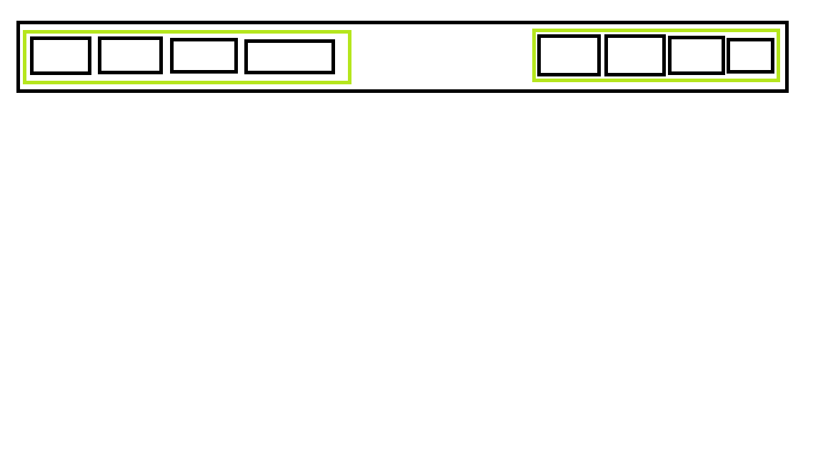
flex-box를 이용할 것이다. 일단 html에서 header부분을 수정할 것이다.
header {
  position: sticky; /* header를 스크롤 내려도 고정시키기. */
  top: 0; /* 상단을 기준으로 얼마나 밑에 위치시킬 것 인가? static인 경우에는 사용 불가능 */
}

.navbar {
  display: flex;
  flex-direction: row;
  align-items: flex-start;
}

.navbar1 {
  display: flex;
  flex-direction: row;
  justify-content: flex-start;
  align-items: center;
  padding-left: 8px;
}

.navbar1 a {
  text-decoration: none;
  color: black;
  padding: 8px 12px;
}

.nav__logo img {
  width: 150px;
}

.navbar2 {
  display: flex;
  flex-direction: row;
  justify-content: flex-start;
  padding: 8px 12px;
  margin-top: 25px;
}

.navbar2 nav {
  padding: 8px 12px;
}

.navbar2 li,
.navbar2 a {
  text-decoration: none;
  color: black;
}

.nav__help h3 {
  font-weight: bold;
}

.nav__toogleBtn4 img {
  width: 20px;
}

.dropDown1 {
  display: none;
}

.dropDown1.active {
  display: flex;
}

.dropDown2 {
  display: none;
}

.dropDown2.active {
  display: flex;
}

.dropDown3 {
  display: none;
}

.dropDown3.active {
  display: flex;
}

.dropDown4 {
  display: none;
}

.dropDown4.active {
  display: flex;
}

.dropDown1,
.dropDown2,
.dropDown3,
.dropDown4 {
  flex-direction: column;
}

.div__dropDown3 {
  display: flex;
  justify-content: space-between;
}
const toogleBtn1 = document.querySelector(".nav__toogleBtn1");
const toogleBtn2 = document.querySelector(".nav__toogleBtn2");
const toogleBtn3 = document.querySelector(".nav__toogleBtn3");
const toogleBtn4 = document.querySelector(".nav__toogleBtn4");
const DropDown1Cnt = document.querySelector(".dropDown1");
const DropDown2Cnt = document.querySelector(".dropDown2");
const DropDown3Cnt = document.querySelector(".dropDown3");
const DropDown4Cnt = document.querySelector(".dropDown4");
toogleBtn1.addEventListener("click", () => {
DropDown1Cnt.classList.toggle("active");
});
toogleBtn2.addEventListener("click", () => {
DropDown2Cnt.classList.toggle("active");
});
toogleBtn3.addEventListener("click", () => {
DropDown3Cnt.classList.toggle("active");
});
toogleBtn4.addEventListener("click", () => {
DropDown4Cnt.classList.toggle("active");
});얼추 다 만들기는 했는데, 이벤트를 적용할 때마다 헤더 부분이 자꾸 움직인다..ㅠ

😀 마무리...
마감 기한이 임박해서 일단 제출했다. 하지만 5가지는 꼭 해결할 것이다. 해결할 때마다 추가로 올릴 예정이다.