I’ll guide you through enhancing your Python script to automate weekly reporting via email and add predictive modeling for vaccine hesitancy forecasting. Since I don’t have access to your full dataset (df), I’ll assume it contains columns like "income_category", "vaccine_received" (binary: 0 or 1), and possibly others like demographics or dates. I’ll structure the solution generically, and you can adapt it to your data.
Here’s a step-by-step process:
1. Automating Weekly Reports via Email
To automate reporting, we’ll:
Use smtplib to send emails with the summary table and plot.
Schedule the script with schedule or a cron job.
Here’s the code:
python
import matplotlib.pyplot as plt
import seaborn as sns
import pandas as pd
import smtplib
from email.mime.multipart import MIMEMultipart
from email.mime.text import MIMEText
from email.mime.image import MIMEImage
import io
import schedule
import time
Assuming df is your DataFrame (replace with your data loading logic)
Example: df = pd.read_csv("your_data.csv")
Function to generate report and send email
def generate_and_send_report():
# Summary Table
summary = df.groupby("income_category")["vaccine_received"].agg(["count", "sum", "mean"])
summary.columns = ["Total Population", "Vaccinated", "Vaccination Rate"]
summary["Vaccination Rate"] = summary["Vaccination Rate"] * 100  # Convert to percentage

# Visualization
plt.figure(figsize=(10, 5))
sns.barplot(x=summary.index, y=summary["Vaccination Rate"], palette="coolwarm")
plt.title("Vaccination Rate by Income Level (Week of Feb 20, 2025)")
plt.ylabel("Vaccination Rate (%)")
plt.xlabel("Income Level")

# Save plot to a BytesIO object
img_buffer = io.BytesIO()
plt.savefig(img_buffer, format="png", bbox_inches="tight")
img_buffer.seek(0)
plt.close()

# Prepare email content
html_content = f"""
<h2>Vaccination Report - Week of Feb 20, 2025</h2>
<p>Here is the latest vaccination rate summary:</p>
{summary.to_html()}
<p>Visual representation:</p>
<img src="cid:plot_image">
"""

# Email setup
sender_email = "your_email@gmail.com"
receiver_email = "recipient_email@example.com"
password = "your_app_specific_password"  # Use an app-specific password for Gmail

msg = MIMEMultipart()
msg["From"] = sender_email
msg["To"] = receiver_email
msg["Subject"] = "Weekly Vaccination Report - Feb 20, 2025"

# Attach HTML content
msg.attach(MIMEText(html_content, "html"))

# Attach the image
img = MIMEImage(img_buffer.read())
img.add_header("Content-ID", "<plot_image>")
msg.attach(img)

# Send email
with smtplib.SMTP("smtp.gmail.com", 587) as server:
    server.starttls()
    server.login(sender_email, password)
    server.sendmail(sender_email, receiver_email, msg.as_string())
print("Report sent successfully!")
Schedule the task (e.g., every Monday at 9 AM)
schedule.every().monday.at("09:00").do(generate_and_send_report)
Keep the script running
while True:
schedule.run_pending()
time.sleep(60) # Check every minute
Notes:
Email Setup: Replace your_email@gmail.com, recipient_email@example.com, and your_app_specific_password with actual values. For Gmail, generate an app-specific password if 2FA is enabled.
Scheduling: This uses schedule. Alternatively, use a cron job (e.g., 0 9 * * 1 python script.py for Mondays at 9 AM).
Data: Ensure df is loaded or updated weekly (e.g., from a database or CSV).
2. Predictive Modeling for Vaccine Hesitancy
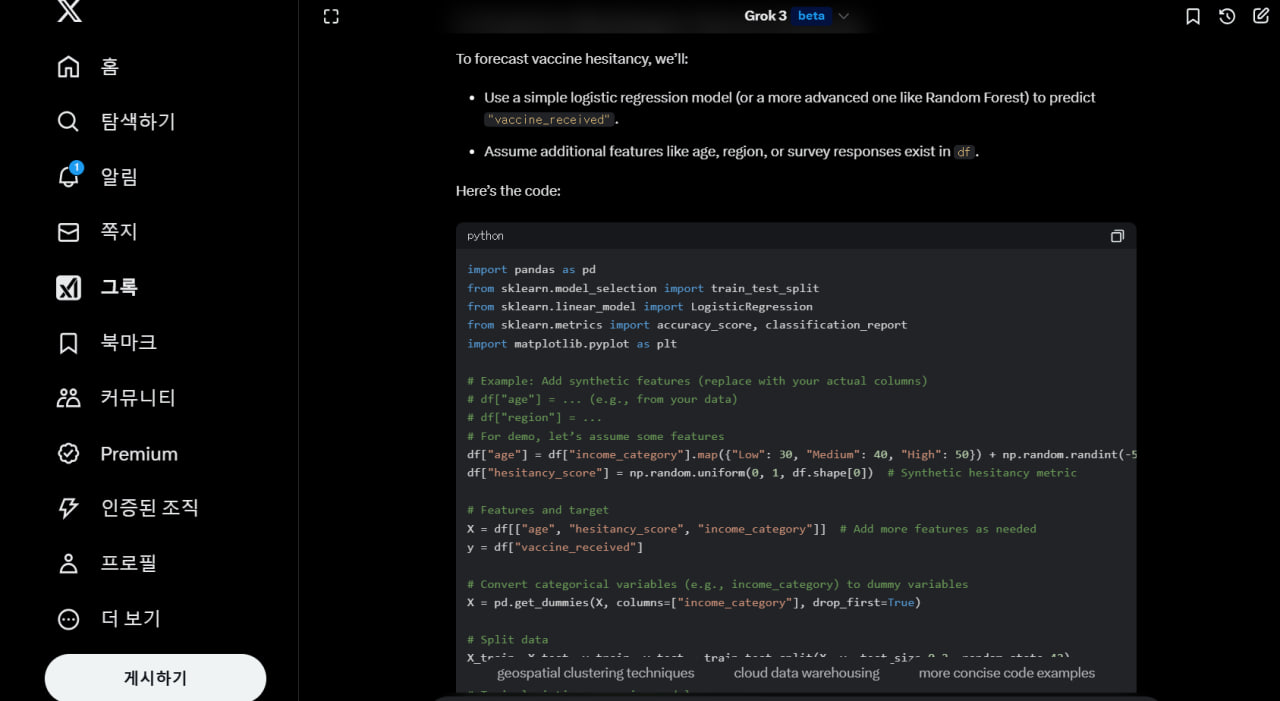
To forecast vaccine hesitancy, we’ll:
Use a simple logistic regression model (or a more advanced one like Random Forest) to predict "vaccine_received".
Assume additional features like age, region, or survey responses exist in df.
Here’s the code:
python
import pandas as pd
from sklearn.model_selection import train_test_split
from sklearn.linear_model import LogisticRegression
from sklearn.metrics import accuracy_score, classification_report
import matplotlib.pyplot as plt
Example: Add synthetic features (replace with your actual columns)
df["age"] = ... (e.g., from your data)
df["region"] = ...
For demo, let’s assume some features
df["age"] = df["income_category"].map({"Low": 30, "Medium": 40, "High": 50}) + np.random.randint(-5, 5, df.shape[0])
df["hesitancy_score"] = np.random.uniform(0, 1, df.shape[0]) # Synthetic hesitancy metric
Features and target
X = df[["age", "hesitancy_score", "income_category"]] # Add more features as needed
y = df["vaccine_received"]
Convert categorical variables (e.g., income_category) to dummy variables
X = pd.get_dummies(X, columns=["income_category"], drop_first=True)
Split data
X_train, X_test, y_train, y_test = train_test_split(X, y, test_size=0.2, random_state=42)
Train logistic regression model
model = LogisticRegression(max_iter=1000)
model.fit(X_train, y_train)
Predict and evaluate
y_pred = model.predict(X_test)
print("Accuracy:", accuracy_score(y_test, y_pred))
print(classification_report(y_test, y_pred))
Forecasting: Predict probability of vaccine hesitancy (1 - P(vaccine_received))
hesitancy_prob = 1 - model.predict_proba(X)[:, 1]
Add to DataFrame
df["hesitancy_forecast"] = hesitancy_prob
Visualize hesitancy by income level
hesitancy_summary = df.groupby("income_category")["hesitancy_forecast"].mean() * 100
plt.figure(figsize=(10, 5))
sns.barplot(x=hesitancy_summary.index, y=hesitancy_summary.values, palette="viridis")
plt.title("Forecasted Vaccine Hesitancy by Income Level")
plt.ylabel("Hesitancy Rate (%)")
plt.xlabel("Income Level")
plt.show()
Notes:
Features: Replace synthetic age and hesitancy_score with real data (e.g., survey responses, demographics).
Model Choice: Logistic regression is simple. For better accuracy, try RandomForestClassifier or XGBoost.
Output: hesitancy_forecast gives the probability of not receiving the vaccine (hesitancy). Adjust the threshold (e.g., >0.5) as needed.
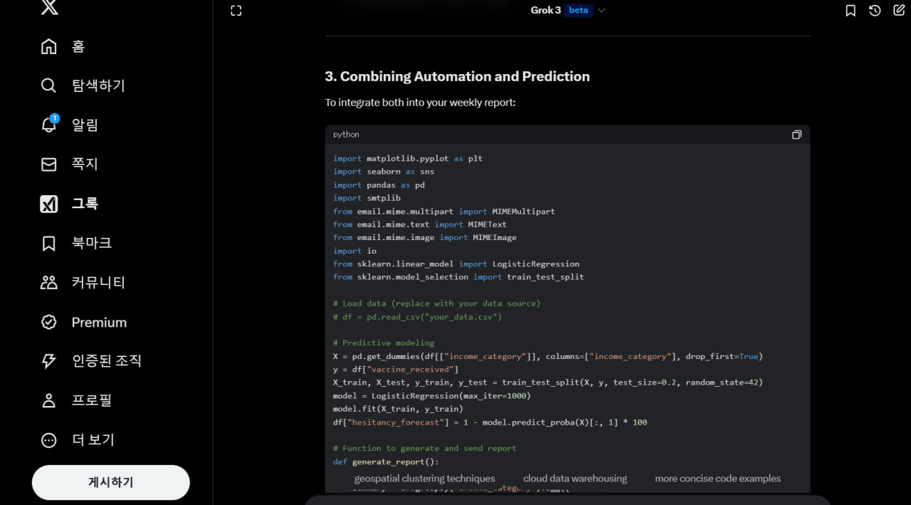
3. Combining Automation and Prediction
To integrate both into your weekly report:
python
import matplotlib.pyplot as plt
import seaborn as sns
import pandas as pd
import smtplib
from email.mime.multipart import MIMEMultipart
from email.mime.text import MIMEText
from email.mime.image import MIMEImage
import io
from sklearn.linear_model import LogisticRegression
from sklearn.model_selection import train_test_split
Load data (replace with your data source)
df = pd.read_csv("your_data.csv")
Predictive modeling
X = pd.get_dummies(df[["income_category"]], columns=["income_category"], drop_first=True)
y = df["vaccine_received"]
X_train, X_test, y_train, y_test = train_test_split(X, y, test_size=0.2, random_state=42)
model = LogisticRegression(max_iter=1000)
model.fit(X_train, y_train)
df["hesitancy_forecast"] = 1 - model.predict_proba(X)[:, 1] * 100
Function to generate and send report
def generate_report():
# Summary Table
summary = df.groupby("income_category").agg({
    "vaccine_received": ["count", "sum", "mean"],
    "hesitancy_forecast": "mean"
})
summary.columns = ["Total Population", "Vaccinated", "Vaccination Rate", "Hesitancy Forecast"]
summary["Vaccination Rate"] *= 100

# Plot 1: Vaccination Rate
plt.figure(figsize=(10, 5))
sns.barplot(x=summary.index, y=summary["Vaccination Rate"], palette="coolwarm")
plt.title("Vaccination Rate by Income Level")
plt.ylabel("Vaccination Rate (%)")
img_buffer1 = io.BytesIO()
plt.savefig(img_buffer1, format="png", bbox_inches="tight")
img_buffer1.seek(0)
plt.close()

# Plot 2: Hesitancy Forecast
plt.figure(figsize=(10, 5))
sns.barplot(x=summary.index, y=summary["Hesitancy Forecast"], palette="viridis")
plt.title("Forecasted Vaccine Hesitancy by Income Level")
plt.ylabel("Hesitancy Rate (%)")
img_buffer2 = io.BytesIO()
plt.savefig(img_buffer2, format="png", bbox_inches="tight")
img_buffer2.seek(0)
plt.close()

# Email content
html_content = f"""
<h2>Vaccination Report - Week of Feb 20, 2025</h2>
<p>Summary Table:</p>
{summary.to_html()}
<p>Vaccination Rate:</p>
<img src="cid:plot1">
<p>Forecasted Hesitancy:</p>
<img src="cid:plot2">
"""

# Email setup
sender_email = "your_email@gmail.com"
receiver_email = "recipient_email@example.com"
password = "your_app_specific_password"

msg = MIMEMultipart()
msg["From"] = sender_email
msg["To"] = receiver_email
msg["Subject"] = "Weekly Vaccination Report"

msg.attach(MIMEText(html_content, "html"))

# Attach images
img1 = MIMEImage(img_buffer1.read())
img1.add_header("Content-ID", "<plot1>")
msg.attach(img1)

img2 = MIMEImage(img_buffer2.read())
img2.add_header("Content-ID", "<plot2>")
msg.attach(img2)

# Send email
with smtplib.SMTP("smtp.gmail.com", 587) as server:
    server.starttls()
    server.login(sender_email, password)
    server.sendmail(sender_email, receiver_email, msg.as_string())
print("Report sent!")
Run once for testing
generate_report()
Uncomment to schedule
import schedule
schedule.every().monday.at("09:00").do(generate_report)
while True:
schedule.run_pending()
time.sleep(60)
Final Thoughts
Customization: Add more features to the predictive model and refine the email content as needed.
Error Handling: Add try-except blocks for robustness (e.g., email failures).
Deployment: Run this on a server with a scheduler (cron, Windows Task Scheduler) for true automation.
Let me know if you need help with specific parts or integrating your actual dataset!