Free Grok 3
https://grok.com/
Grok-3과 ChatGPT는 둘 다 대형 언어 모델(LLM)이지만, 서로 다른 설계 철학과 강점을 가지고 있어 비교해볼 가치가 있어.
공통점
1. LLM 기반: 둘 다 대규모 데이터로 학습된 AI 챗봇으로, 자연어 이해(NLU)와 생성(NLG) 능력이 뛰어남.
2. 대화형 AI: 사용자와의 대화를 이해하고 맥락을 유지하며, 복잡한 질문에도 응답 가능.
3. 멀티모달 지원: 최신 버전 기준으로 텍스트뿐만 아니라 이미지, 코드 등의 처리도 가능.
4. 응용 가능성: 코딩 지원, 창작(글쓰기, 시나리오 작성), 번역, 요약, 분석 등의 다양한 작업 수행 가능.
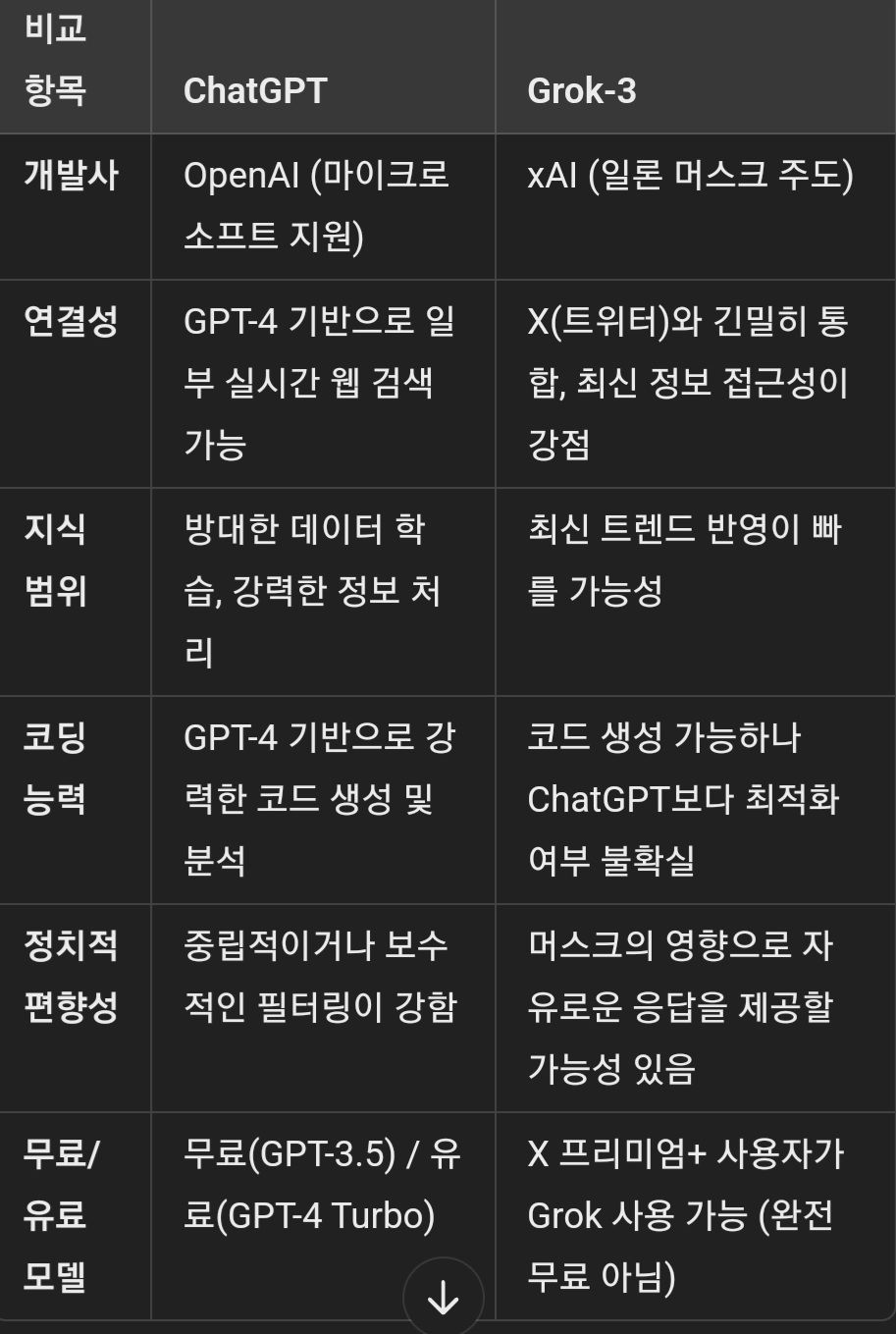
Grok-3가 ChatGPT보다 나은 점
1. X(트위터)와 통합 → 실시간 뉴스, 트렌드에 빠르게 접근할 가능성.
2. 자유로운 표현 → OpenAI보다 검열이 덜할 가능성이 있어 더 직설적인 답변 제공 가능.
3. 일론 머스크의 AI 비전 반영 → 전통적인 AI 필터링보다 더 개방적인 방향성을 가질 가능성.
ChatGPT가 Grok-3보다 나은 점
1. 코딩 지원 → AI 개발, 코드 생성 및 최적화에서 검증된 성능.
2. 문서 생성/분석 → 논문 요약, 보고서 작성, 복잡한 문서 처리 능력에서 강점.
3. AI 신뢰성 → 검증된 데이터와 학습을 통한 높은 일관성 제공.
결론
- 최신 트렌드/뉴스 분석: Grok-3가 유리할 가능성이 있음.
- 코딩, 논리적 문제 해결: ChatGPT가 강점.
- 자유로운 답변 스타일: Grok-3는 더 개방적, ChatGPT는 신뢰성과 검증된 정보를 중시.
어떤 용도로 AI를 활용하느냐에 따라 적합한 모델이 달라질 것 같아. 너는 어떤 용도로 AI를 쓰려는 거야?
I'll guide you through deploying your solution on Azure, refining the geospatial and predictive analysis, and adding interactive features like dropdown filters and dynamic Kaplan-Meier survival curves. I'll use Azure SQL for the database, Azure Functions for real-time updates, and a Streamlit app for interactivity. Since this is a complex setup, I’ll break it into steps and provide modular code you can deploy.
Step 1: Set Up Azure Cloud Services
1.1 Provision Azure SQL Database
Create Azure SQL Database:
Go to the Azure Portal > "Create a resource" > "SQL Database".
Set up a server, database name (e.g., VaccineDB), and admin credentials.
Enable "Allow Azure services to access" in the firewall settings.
Note the connection string (e.g., Server=tcp:yourserver.database.windows.net,1433;Database=VaccineDB;...).
Create Table:
Use the following SQL script in Azure Query Editor or connect via pyodbc:
sql
CREATE TABLE VaccineData (
id INT IDENTITY(1,1) PRIMARY KEY,
gender VARCHAR(10),
income_category VARCHAR(20),
urban_rural VARCHAR(10),
state VARCHAR(50),
ethnicity VARCHAR(50),
vaccine_brand VARCHAR(50),
vaccine_received BIT,
vaccination_date DATE,
latitude FLOAT,
longitude FLOAT,
location GEOGRAPHY
);
1.2 Set Up Azure Event Hubs for Real-Time Updates
Create Event Hub:
Azure Portal > "Create a resource" > "Event Hubs".
Create a namespace (e.g., VaccineHubNS) and an Event Hub (e.g., VaccineEvents).
Note the connection string (e.g., Endpoint=sb://your_namespace.servicebus.windows.net/;SharedAccessKeyName=...).
Azure Function to Process Events:
Create a Function App in Azure Portal > "Create a resource" > "Function App".
Set runtime to Python, deploy via VS Code or GitHub.
Add an Event Hub trigger function:
python
function.json
{
"scriptFile": "init.py",
"bindings": [
{
"type": "eventHubTrigger",
"name": "event",
"direction": "in",
"eventHubName": "VaccineEvents",
"connection": "EVENT_HUB_CONNECTION_STRING",
"cardinality": "one"
}
]
}
init.py
import json
import pyodbc
import logging
def main(event: str):
data = json.loads(event.get_body().decode('utf-8'))
conn = pyodbc.connect("DRIVER={ODBC Driver 17 for SQL Server};SERVER=yourserver.database.windows.net;DATABASE=VaccineDB;UID=youruser;PWD=yourpass")
cursor = conn.cursor()
point = f"POINT({data['longitude']} {data['latitude']})"
cursor.execute("""
INSERT INTO VaccineData (gender, income_category, urban_rural, state, ethnicity, vaccine_brand, vaccine_received, vaccination_date, latitude, longitude, location)
VALUES (?, ?, ?, ?, ?, ?, ?, ?, ?, ?, geography::STGeomFromText(?, 4326))
""", (data["gender"], data["income_category"], data["urban_rural"], data["state"], data["ethnicity"],
data["vaccine_brand"], data["vaccine_received"], data["vaccination_date"], data["latitude"], data["longitude"], point))
conn.commit()
conn.close()
logging.info(f"Inserted: {data}")
Set EVENT_HUB_CONNECTION_STRING in Application Settings.
Step 2: Refine Analysis and Add Interactivity
2.1 Enhanced Dataset
Assume your data now includes:
gender, income_category, urban_rural, state, ethnicity, vaccine_brand, vaccine_received, vaccination_date, latitude, longitude.
2.2 Streamlit App with Dropdown Filters and Kaplan-Meier Curve
Streamlit provides an interactive UI with real-time updates from Azure SQL.
python
import streamlit as st
import pandas as pd
import pyodbc
import matplotlib.pyplot as plt
import seaborn as sns
from lifelines import KaplanMeierFitter
import geopandas as gpd
from shapely.geometry import Point
from azure.eventhub import EventHubProducerClient, EventData
import json
Azure SQL connection
conn_str = "DRIVER={ODBC Driver 17 for SQL Server};SERVER=yourserver.database.windows.net;DATABASE=VaccineDB;UID=youruser;PWD=yourpass"
conn = pyodbc.connect(conn_str)
Load data
@st.cache_data(ttl=60) # Refresh every 60 seconds
def load_data():
query = """
SELECT gender, income_category, urban_rural, state, ethnicity, vaccine_brand, vaccine_received,
vaccination_date, latitude, longitude,
location.STDistance(geography::STGeomFromText('POINT(-122.3321 47.6062)', 4326)) / 1000 AS distance_km
FROM VaccineData
"""
return pd.read_sql(query, conn)
df = load_data()
Sidebar filters
st.sidebar.header("Filters")
gender = st.sidebar.multiselect("Gender", options=df["gender"].unique(), default=df["gender"].unique())
income = st.sidebar.multiselect("Income Level", options=df["income_category"].unique(), default=df["income_category"].unique())
urban_rural = st.sidebar.multiselect("Urban/Rural", options=df["urban_rural"].unique(), default=df["urban_rural"].unique())
state = st.sidebar.multiselect("State", options=df["state"].unique(), default=df["state"].unique())
ethnicity = st.sidebar.multiselect("Ethnicity", options=df["ethnicity"].unique(), default=df["ethnicity"].unique())
vaccine_brand = st.sidebar.multiselect("Vaccine Brand", options=df["vaccine_brand"].unique(), default=df["vaccine_brand"].unique())
Filter data
filtered_df = df[
(df["gender"].isin(gender)) &
(df["income_category"].isin(income)) &
(df["urban_rural"].isin(urban_rural)) &
(df["state"].isin(state)) &
(df["ethnicity"].isin(ethnicity)) &
(df["vaccine_brand"].isin(vaccine_brand))
]
Summary table
summary = filtered_df.groupby("income_category").agg({
"vaccine_received": ["count", "sum", "mean"],
"distance_km": "mean"
})
summary.columns = ["Total", "Vaccinated", "Vaccination Rate", "Avg Distance (km)"]
summary["Vaccination Rate"] *= 100
st.write("Summary Table", summary)
Vaccination Rate Bar Plot
fig, ax = plt.subplots(figsize=(10, 5))
sns.barplot(x=summary.index, y=summary["Vaccination Rate"], palette="coolwarm", ax=ax)
ax.set_title("Vaccination Rate by Income Level")
ax.set_ylabel("Vaccination Rate (%)")
st.pyplot(fig)
Geospatial Visualization
gdf = gpd.GeoDataFrame(filtered_df, geometry=gpd.points_from_xy(filtered_df["longitude"], filtered_df["latitude"]), crs="EPSG:4326")
fig, ax = plt.subplots(figsize=(10, 5))
gdf.plot(ax=ax, column="vaccine_received", categorical=True, legend=True, cmap="coolwarm")
ax.set_title("Vaccination Status by Location")
st.pyplot(fig)
Kaplan-Meier Survival Curve (Time to Vaccination)
st.subheader("Kaplan-Meier Curve: Time to Vaccination")
kmf = KaplanMeierFitter()
fig, ax = plt.subplots(figsize=(10, 5))
for brand in filtered_df["vaccine_brand"].unique():
mask = filtered_df["vaccine_brand"] == brand
time = (pd.to_datetime(filtered_df["vaccination_date"]) - pd.to_datetime("2020-01-01")).dt.days[mask]
event = filtered_df["vaccine_received"][mask]
kmf.fit(time, event_observed=event, label=brand)
kmf.plot_survival_function(ax=ax)
ax.set_title("Survival Curve by Vaccine Brand")
ax.set_ylabel("Probability of Not Being Vaccinated")
st.pyplot(fig)
Simulate real-time update
def send_update():
new_data = {
"gender": "Female", "income_category": "Medium", "urban_rural": "Urban", "state": "WA",
"ethnicity": "Asian", "vaccine_brand": "Pfizer", "vaccine_received": 1,
"vaccination_date": "2025-02-20", "latitude": 47.6350, "longitude": -122.3550
}
producer = EventHubProducerClient.from_connection_string("your_event_hub_connection_string")
with producer:
producer.send_batch([EventData(json.dumps(new_data))])
st.write("Simulated real-time update sent!")
if st.button("Simulate New Data"):
send_update()
conn.close()
Deployment on Azure
Azure App Service for Streamlit:
Install Streamlit locally: pip install streamlit.
Save the script as app.py.
Deploy to Azure App Service:
Azure Portal > "Create a resource" > "Web App".
Set runtime to Python, upload via GitHub or FTP.
Add startup command: streamlit run app.py --server.port 8000 --server.address 0.0.0.0.
Install dependencies in requirements.txt:
streamlit
pandas
pyodbc
matplotlib
seaborn
geopandas
lifelines
azure-eventhub
Environment Variables:
Add EVENT_HUB_CONNECTION_STRING, SQL_CONNECTION_STRING in App Service Configuration.
Step 3: Refine Analysis
3.1 Dynamic Kaplan-Meier Updates
The curve updates automatically via @st.cache_data(ttl=60) as new data arrives from Event Hubs.
lifelines calculates survival probability (time to vaccination) by vaccine brand.
3.2 Improved Interactivity
Dropdown Filters: Users can explore patterns by gender, income, urban/rural, state, ethnicity, and vaccine brand.
Geospatial Plot: Shows vaccination status on a map, filtered dynamically.
Simulation Button: Triggers a real-time update for testing.
3.3 Additional Refinements
Predictive Modeling: Add a logistic regression or Random Forest model to forecast hesitancy:
python
from sklearn.linear_model import LogisticRegression
X = pd.get_dummies(filtered_df[["gender", "income_category", "urban_rural", "state", "ethnicity", "vaccine_brand"]])
y = filtered_df["vaccine_received"]
model = LogisticRegression().fit(X, y)
hesitancy = 1 - model.predict_proba(X)[:, 1]
filtered_df["hesitancy_forecast"] = hesitancy
st.write("Hesitancy Forecast", filtered_df[["income_category", "hesitancy_forecast"]])
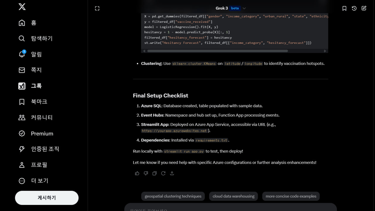
Clustering: Use sklearn.cluster.KMeans on latitude/longitude to identify vaccination hotspots.
Final Setup Checklist
Azure SQL: Database created, table populated with sample data.
Event Hubs: Namespace and hub set up, Function App processing events.
Streamlit App: Deployed on Azure App Service, accessible via URL (e.g., https://yourapp.azurewebsites.net).
Dependencies: Installed via requirements.txt.
Run locally with streamlit run app.py to test, then deploy!
Let me know if you need help with specific Azure configurations or further analysis enhancements!!
I’ll provide a detailed explanation of the regression techniques, mixed models, non-parametric approaches, and data reduction techniques you’ve requested, tailored to a general understanding with examples relevant to your vaccination analysis context. These methods are widely used in statistical modeling, including health-related research like PRO development or vaccination studies.
1. Regression Techniques
Ordinary Least Squares (OLS) Regression
Purpose: Models the relationship between a continuous dependent variable (e.g., vaccination rate) and one or more independent variables (e.g., age, income).
Core Concept: Minimizes the sum of squared differences between observed and predicted values:
\hat{y} = \beta_0 + \beta_1x_1 + \beta_2x_2 + \epsilon, \quad \text{where } \epsilon \sim N(0, \sigma^2)
\beta_0: Intercept,
\beta_i: Coefficients,
\epsilon : Error.
Assumptions: Linearity, independence, homoscedasticity, normality of residuals.
Example: Predict vaccination rate based on income and age.
sas
proc reg data=vaccine;
model vacc_rate = age income_category;
run;
Strengths: Simple, interpretable.
Limitations: Assumes linearity and continuous outcomes.
Logistic Regression
Purpose: Models a binary outcome (e.g., vaccine received: 0/1) as a function of predictors.
Core Concept: Uses the logit link to model probabilities:
\text{logit}(p) = \ln\left(\frac{p}{1-p}\right) = \beta_0 + \beta_1x_1 + \beta_2x_2
p: Probability of the event (e.g., vaccination).
Assumptions: Independence, linearity in the logit.
Example: Predict vaccine uptake based on gender and comorbidity.
sas
proc logistic data=vaccine descending;
class gender (ref='F');
model vaccine_received = age gender comorbidity_flag;
run;
Strengths: Handles binary outcomes, provides odds ratios.
Limitations: Doesn’t handle continuous or time-to-event data directly.
Generalized Linear Models (GLM)
Purpose: Extends OLS and logistic regression to various outcome types (e.g., counts, proportions) using different distributions and link functions.
Core Concept:
Distribution: Normal (OLS), Binomial (logistic), Poisson (counts), etc.
Link: g(\mu) = X\beta
, where \mu is the expected outcome.
Examples:
Poisson GLM for vaccination counts by region.
Gamma GLM for time-to-vaccination (if positive and skewed).
sas
proc genmod data=vaccine;
class state;
model vacc_count = age state / dist=poisson link=log;
run;
Strengths: Flexible for non-normal data.
Limitations: Requires correct distribution specification.
2. Mixed Models
Mixed models account for both fixed effects (e.g., age) and random effects (e.g., patient-specific variation), making them ideal for hierarchical or repeated measures data.
Survival Analysis (Mixed Effects)
Purpose: Models time-to-event data (e.g., time to vaccination) with censoring.
Core Concept: Incorporates random effects into survival models like Cox PH.
Cox with frailty: Adds a random effect (e.g., clinic-level variation).
h(t|X) = h_0(t) \exp(\beta X + u_i), \quad u_i \sim N(0, \sigma^2)
Example: Time to vaccination, adjusting for state-level clustering.
sas
proc phreg data=vaccine;
class gender;
model time_to_vacc * vaccine_received(0) = age gender / ties=efron;
random state / dist=normal;
run;
Strengths: Handles clustering, censoring.
Limitations: Complex to fit, requires large samples.
Longitudinal Analysis (Mixed Effects)
Purpose: Models repeated measures over time (e.g., vaccine hesitancy scores across months).
Core Concept:
Fixed effects: Population-level trends.
Random effects: Individual or group variation (e.g., random intercept per patient).
y{ij} = \beta_0 + \beta_1 \text{time}{ij} + b{0i} + b{1i} \text{time}{ij} + \epsilon{ij}
Example: Hesitancy scores over time by income.
sas
proc mixed data=vaccine_long;
class patient_id income_category;
model hesitancy = time income_category time*income_category / solution;
random intercept time / subject=patient_id type=un;
run;
Strengths: Accounts for correlation in repeated measures.
Limitations: Assumes missing data are ignorable (MAR).
3. Non-Parametric Approaches
Non-parametric methods don’t assume a specific distribution, making them robust for data with unknown or violated assumptions.
Examples:
Wilcoxon Rank-Sum Test: Compare vaccination rates between two groups (e.g., urban vs. rural).
sas
proc npar1way data=vaccine wilcoxon;
class urban_rural;
var vacc_rate;
run;
Kruskal-Wallis Test: Compare across multiple groups (e.g., income levels).
sas
proc npar1way data=vaccine wilcoxon;
class income_category;
var vacc_rate;
run;
Kaplan-Meier (Non-Parametric Survival): Estimates survival curves without assuming a distribution.
sas
proc lifetest data=vaccine plots=survival;
time time_to_vacc * vaccine_received(0);
strata income_category;
run;
Strengths: Flexible, fewer assumptions.
Limitations: Less powerful, no parameter estimates.
4. Data Reduction Techniques
These methods reduce complex datasets into simpler structures for analysis or interpretation.
Factor Analysis
Purpose: Identifies latent constructs (e.g., vaccine attitudes) from multiple observed variables (e.g., survey items).
Core Concept:
X = \Lambda F + \epsilon
X : Observed variables,
\Lambda : Factor loadings,
F : Latent factors.
Example: Reduce 10 vaccine attitude items into 2 factors (e.g., trust, fear).
sas
proc factor data=vaccine_pro method=principal rotate=varimax nfactors=2;
var item1-item10;
run;
Strengths: Simplifies data, identifies underlying dimensions.
Limitations: Assumes linearity, requires interpretation.
Structural Equation Modeling (SEM)
Purpose: Models relationships between latent variables and observed variables, including direct and indirect effects.
Core Concept: Combines factor analysis and path analysis:
Measurement model: Links items to latent factors.
Structural model: Links factors to outcomes (e.g., hesitancy -> vaccination).
Example: Model how trust and fear influence vaccination uptake.
sas
proc calis data=vaccine_pro;
/ Measurement model /
factor Trust => item1-item5, Fear => item6-item10;
/ Structural model /
path Trust -> vaccine_received, Fear -> vaccine_received;
run;
Strengths: Tests complex hypotheses, handles latent variables.
Limitations: Requires large samples, model specification.
Application to Vaccination Analysis
OLS: Predict continuous vaccination rates by region.
Logistic: Model likelihood of vaccine uptake.
GLM: Analyze count of vaccine doses with Poisson.
Mixed Models: Fixed and random effects ideal for hierarchical or repeated measures data
Survival: Time to vaccination with clinic-level random effects.
Longitudinal: Hesitancy trends over time per patient.
Non-Parametric: Compare uptake across income levels without normality assumptions.
Factor Analysis: Reduce PRO items into hesitancy factors.
SEM: Link latent attitudes (trust) to vaccination behavior.
Let me know if you’d like a specific technique applied to your dataset in SAS or further elaboration!