📌 구별 데이터로 정리
crime_anal_station = pd.read_csv(
    "../data/02. crime_in_Seoul_raw.csv",
    index_col=0,   # index_col: "구분" 을 인덱스 컬럼으로 설정
encoding='utf-8') - 컬럼을 다른 컬럼으로 나누기
# 검거율 생성
# 하나의 컬럼을 다른 컬럼으로 나누기

crime_anal_gu['강도검거'] / crime_anal_gu['강도발생']
# 다수의 컬럼을 다른 컬럼으로 나누기
crime_anal_gu[["강도검거", "살인검거"]].div(crime_anal_gu["강도발생"], axis=0).head(3)# 다수의 컬럼을 다수의 컬럼으로 각각 나누기
num = ['강간검거', '강도검거', '살인검거', '절도검거', '폭력검거']
den = ['강간발생', '강도발생', '살인발생', '절도발생', '폭력발생']
crime_anal_gu[num].div(crime_anal_gu[den].values).head()- 100보다 큰 숫자 찾아서 바꾸기
# 100보다 큰 숫자 찾아서 바꾸기

crime_anal_gu[crime_anal_gu[target] > 100] = 100
📌 범죄 데이터 정렬을 위한 데이터 정리
정규화-> max 값으로 나누기- 최고값을 1로 두고, 최소값을 0으로
# 정규화: 최고값은 1, 최소값은 0
crime_anal_gu["강도"] / crime_anal_gu["강도"].max()
# 정규화된 범죄발생 건수 전체의 평균을 구해서 범죄 컬럼 대표값으로 사용
col = ['강간', '강도', '살인', '절도', '폭력']
crime_anal_norm['범죄'] = np.mean(crime_anal_norm[col], axis=1)
crime_anal_norm.head()np.mean()
np.mean(np.array([0.307692, 0.358974, 0.310078, 0.488988, 0.632184]))

>>>
0.41958320000000005np.mean(np.array(
[[0.307692, 0.358974, 0.310078, 0.488988, 0.632184],
[0.538462, 0.128205, 0.420543, 0.340675, 0.694153]]
), axis=1) # axis=1: 행, axis=0: 열 기준으로 연산 (numpy)
>>>
array([0.4195832, 0.4244076])numpy: axis=1(행), axis=0(열)pandas: axis=0(행), axis=1(열)
📌 seaborn
- matplotlib과 함께 실행
import numpy as np
import pandas as pd
import matplotlib.pyplot as plt
import seaborn as sns
from matplotlib import rc

plt.rcParams['axes.unicode_minus'] = False # - 부호 깨지는 것 방지
rc('font', family='Arial Unicode MS')  # Windows: Malgun Gothic
# %matplotlib inline
get_ipython().run_line_magic("matplotlib", 'inline')np.linspace(0, 14, 100) # 0부터 14까지 데이터 100개seaborn 예제1
x = np.linspace(0, 14, 100)
y1 = np.sin(x)
y2 = 2 * np.sin(x + 0.5)
y3 = 3 * np.sin(x + 1.0)
y4 = 4 * np.sin(x + 1.5)plt.figure(figsize=(10, 6))
plt.plot(x, y1, x, y2, x, y3, x, y4)
plt.show()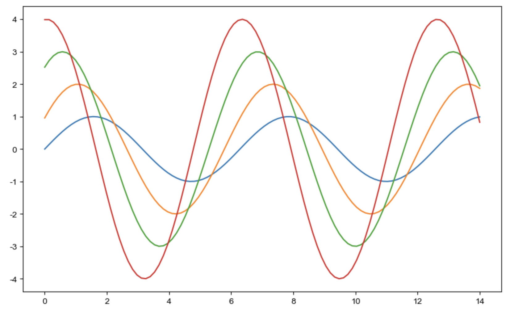
- set_style(): 그래프 배경
sns.set_style('white')
sns.set_style('dark')
sns.set_style('whitegrid')
sns.set_style('darkgrid')
seaborn 예제2
boxplot, swarmplot, lmplot
tips = sns.load_dataset('tips')boxplot
# boxplot
plt.figure(figsize=(8, 6))
sns.boxplot(x=tips['total_bill'])
plt.show()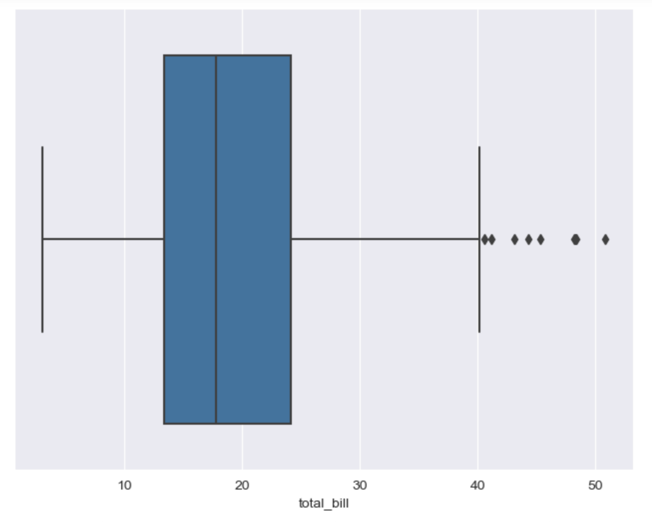
# boxplot
plt.figure(figsize=(8, 6))
sns.boxplot(x='day', y='total_bill', data=tips)
plt.show()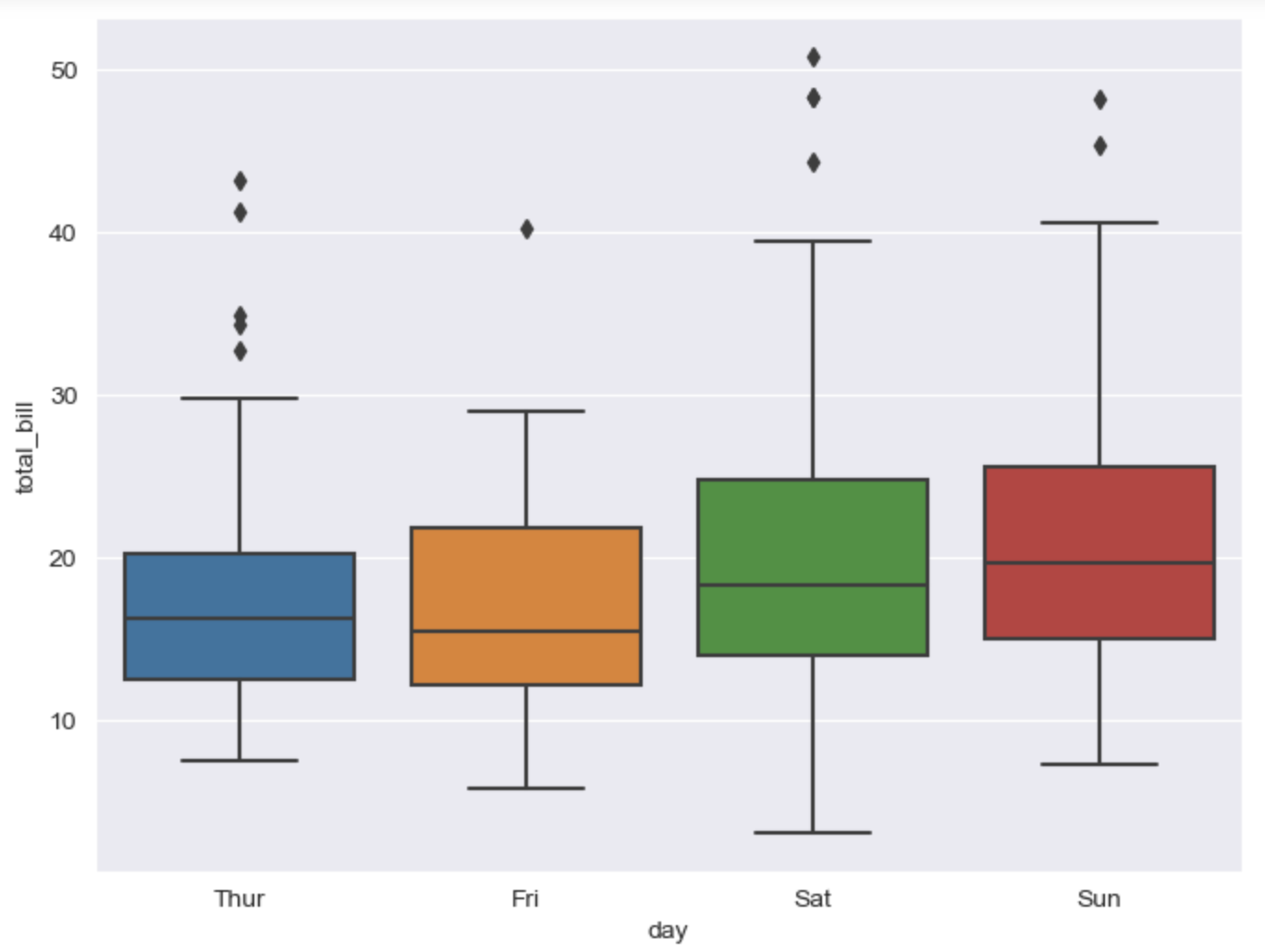
- hue, palette
# boxplot hue, palette option
# hue: 카테고리 데이터  (matplotlib legand)

plt.figure(figsize=(8, 6))
sns.boxplot(x='day', y='total_bill', data=tips, hue="smoker")
plt.show() 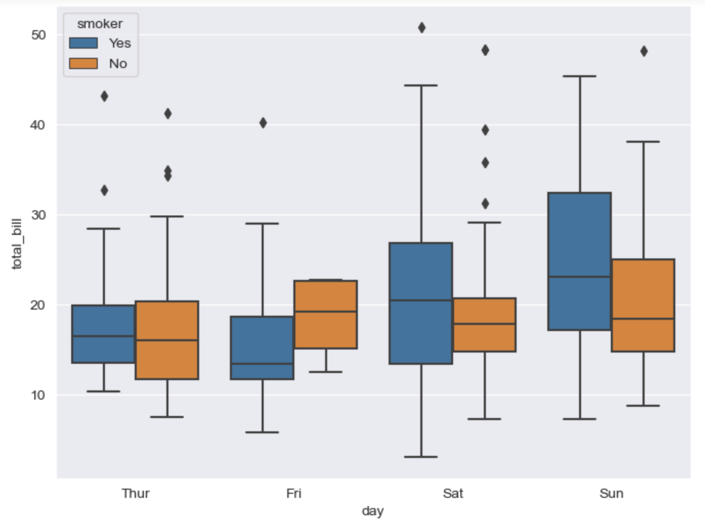
# palette: 색 바꾸기
sns.boxplot(x='day', y='total_bill', data=tips, hue="smoker", palette='Set1')  # Set 1 - 3
swarmplot
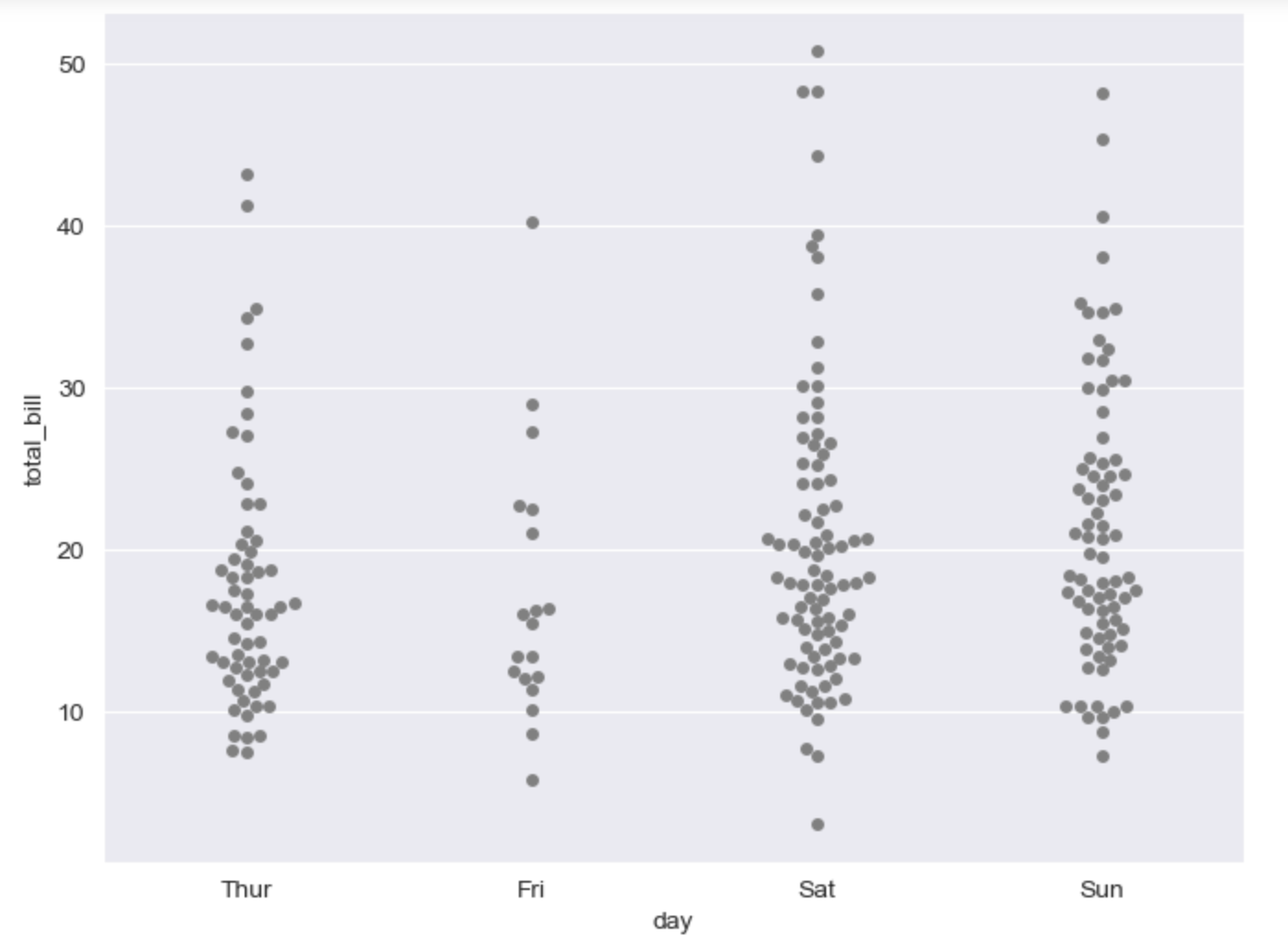
# swarmplot
# color: 0-1 사이 검은색부터 흰색 사이 값을 조절

plt.figure(figsize=(8, 6))
sns.swarmplot(x='day', y='total_bill', data=tips, color='0.5')
plt.show()