※블로그 내용은 저 '개인'의 기준으로 더 필요하다고 생각되는, 또는 한번 더 짚어보는 의미로 대부분 직접 필기한 것입니다. 수희 혼자 볼라고 쓴 블로그
디자인 파악 Scss 폴더 구조 변경 >
scss파일 찾기 쉽게 폴더 생성해서 정리
- 메뉴 상세 이미지 영역>
이미지 넣는 셋팅 + 아래 그림자 넣는거. 비포 애프터 선택자로 위아래 그라디언트.menu-img {
position: relative;
height: 300px;
background-color: #f8fafb;
background-repeat: no-repeat;
background-position: center;
background-size: cover;
box-shadow: 0 2px 4px 0 rgba(0,0,0,0.03);
&::before {
content: ''; ★가상요소 선택 필수
position: absolute;
top: 0;
left: 0;
right: 0;
height: 130px;
background-image: linear-gradient(to bottom, #000, rgba(0,0,0,0));
z-index: 1;
opacity: 0.2;
}
&::after {
content: '';
position: absolute;
bottom: 0;
left: 0;
right: 0;
height:65px;
background-image: linear-gradient(to top, #000, rgba(0,0,0,0));
z-index: 1;
opacity: 0.15;
2-2. 메뉴 주문 영역
<button> 태그의 disabled 속성은 해당 버튼이 비활성화됨을 명시.
-
align-items는 수직축의 라인을 기준으로 아이템들이 정렬이 되고
-
align-content는 수직축의 라인을 기준으로 (두 줄 이상 일 때만) 라인 자체가 정렬.
-
align-self는 부모 요소의 자식 아이템들을 각각 다른 방식으로 정렬할때(=정렬을 개별로 설정하고 싶다면)
-
letter-spacing는 글자 사이의 간격
-
word-spacing는 단어 사이의 간격(단어 뭉탱이)
값이 커지면 간격이 커집니다. 값에는 음수를 넣을 수 있습니다(글자 겹치기 가능) -
line-height는 줄 높이를 정하는 속성
-
line-height: normal | length | number | percentage | initial | inherit
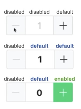
2-3. 공통 컴포넌트(.amount-select) > 플러스 마이너스 btn
4.주문자 리뷰 영역 > 별점 부분.
<span class="ico-star-group-fill" style="width: 80%;"></span>
대표적인 display: inline-block; 엘리먼트로 <button>이나 <input>, <select> 태그
5-1. 옵션 선택 영역 - 전체 레이아웃 =★볼려면 hidden 꺼
body.scroll-off {
overflow: hidden;
-ms-touch-action: none;
touch-action: none; }
팝업창 밖에 스크롤 못 움직이게 하는거
▲▲▲▲▲ 뜯어진 종이 패턴 fill
.content-top-pattern {
position: absolute;
top: -11px;
width: 100%;
height: 11px;
fill: white; }
★14분 부분 옵션 선택 페이지
overflow-y: auto; 즉 위와 아래의 내용이 더 길때 (세로) 어떻게 보일지 선택하는 속성
webkit-overflow-scrolling: touch;
스크롤 동작을 마치고 터치스크린에서 손가락을 뗀 후에도 콘텐츠가 잠시 동안 계속 스크롤되는 모멘텀 기반 스크롤을 사용. 계속되는 스크롤의 속도와 지속 시간은 스크롤 제스처의 강도에 비례합니다. 또한 새로운 쌓임 맥락을 생성
5-2. 옵션 선택 영역 - 상단,하단 > 어렵다
scss에서 @mixin을 사용하면 그룹단위의 스타일을 변수처럼 적용할 수 있습니다.
즉 여러개의 스타일을 설정해두었다가 한번에 적용하는 것이 가능
mixin(믹스인)은 함수와 비슷한 동작을 하는 문법이며 CSS 스타일 시트에서 반복적으로 재사용할 CSS 스타일 그룹 선언을 정의하는 기능
믹스인에 @include 적용해서 믹스인 사용.
text-overflow:ellipsis; 글자 수 제한
@include common-inner 는 넓어졌을때 영역안에 들어오게 함.
@mixin ellipsis {
text-overflow: ellipsis;
white-space: nowrap;
overflow: hidden;
}
@mixin multi-ellipsis($font-size, $line-height, $lines) {
font-size: $font-size;
line-height: $line-height;
max-height: $line-height $lines;
overflow: hidden;
display: -webkit-box;
-webkit-line-clamp: $lines;
-webkit-box-orient: vertical; / autoprefixer: off */
}
@mixin common-inner {
margin-left: auto;
margin-right: auto;
max-width: 720px;
}
5-3. 옵션 선택 영역 - 중앙>
<input type="radio" id="rd2" class="input-radio" name="base">
<label for="rd2" class="label">
<span class="label-txt">채소볼</span>
<span class="label-icon"></span>
라디오 선택창 외 라벨인 채소볼 눌러도 선택되는 효과.
<label> 요소는 브라우저에 의해 일반적인 텍스트로 랜더링되지만, 사용자가 마우스로 해당 텍스트를 클릭할 경우 <label> 요소와 연결된 요소를 곧바로 선택할 수 있음.
5-4. 옵션 선택 영역 - radio, checkbox
체크박스 클래스 이름 { { &:checked : 글씨 굵어지고~
체크 박스 클릭 하고 나서 글씨 굵어진다는것
& + .label .label-icon 라벨, 아이콘까지 같이 써주기. 옆에있는 거 체크라서 플러스!
.input-radio {
& + .label .label-icon {
border-radius: 100%;
}
&:checked + .label .label-icon {
border: 8px solid $green;
}
}
클릭시 체크박스 아이콘에 체크표시 넣기.
css로 체크 모양 그리려면
.label-icon {
position: relative;
border-color: $green;
background-color: $green;
★ &::before {
content: '';
position: absolute;
top: 6px;
right: 6px;
width: 14px;
height: 9px;
border: 2px solid #fff;
border-width: 0 0 2px 2px;
transform: rotate(-45deg);
}