1. position
내가 만든 영역을 2차원 평면의 공간으로 할지, 3차원 공간의 영역으로 할지를 결정짓는 요소입니다.
1-1. 2차원과 3차원의 차이
| 2차원 | 3차원 | |
|---|---|---|
| 부모 자식 지간에 발생하는 마진 병합 현상 | O | X |
| top, left, right, bottom | X | O |
| 자식의 높이값이 부모의 높이값에 영향을 줌 | O | X |
1-2. 속성별 분류
| 속성값 | n차원 |
|---|---|
| static | 2차원 |
| fixed | 3차원 |
| relative | 2차원&3차원 |
| absolute | 3차원 |
position: relative는 2차원과 3차원의 속성을 모두 가지고 있어 1-1에서 언급한 3개의 상황에서 모두 영향을 받습니다.
position: absolute의 경우, 기준이 될 부모는 position: relative를 가지고 있어야 합니다. 만약 position: relative인 부모가 없다면 해당 요소는 body 태그를 기준으로 위치를 설정하게 됩니다.
따라서, poisition: absolute를 사용해야하는 상황이라면, 기준이 될 부모 요소에 position: relative를 주면 됩니다. 앞서 이야기한 것처럼 position: relative는 2차원과 3차원의 속성을 모두 가지고 있어서 position: relative를 추가하는 것이 결과에 아주 큰 영향을 주지는 않습니다. :)
1-3. left/right로 width 효과 주기
position이 3차원이 지정된 상황에서 left, right: 0을 주는 것과 width: 100%는 같은 효과를 낼 수도 있습니다. 상황에 따라 적절하게 사용할 수 있습니다.
div {
	position: absolute;
	left: 0;
	right: 0;
}

div {
	width: 100%;
}
1-4. :before 가상선택자와 함께 활용
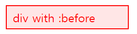
div {
  border: 0.1rem solid #f00;
  padding: 0.3rem 0.5rem;
  color: #f00;
  position: relative;
}

div:before {
   content: '';
   position: absolute;
   top: 0;
   right: 0;
   bottom: 0;
   left: 0;
   opacity: 0.1;
   background-color: #f00;
}
2. z-index
position의 속성이 3차원(static X)인 경우에 사용가능합니다.
가령, 다음과 같은 코드가 있다고 가정해봅니다.
<head>
  <style>
    .box1 {
    	position: static;
    	width: 100px;
    	height: 100px;
		background-color: yellow;
    }

    .box2 {
    	position: static;
    	width: 100px;
    	height: 100px;
    	background-color: blue;
    }
  </style>
</head>
<body>
  <div class="box1"></div>
  <div class="box2"></div>
</body>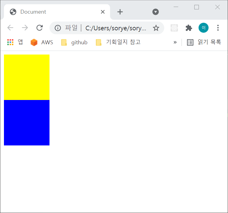
position 값이 static(또는 relative) 즉 2차원인 상태에서는 노란박스 아래 파란 박스가 나란히 위치합니다.
이때 position이 3차원 공간을 의미하는 fixed, absolute에서는 아래와 같이 두 박스가 겹쳐보입니다.
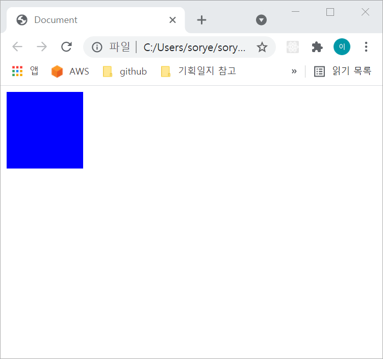
상대적으로 나중에 생성된 파란박스가 위에 올라온 형태입니다. 노란 박스를 위로 올리고 싶을 때 z-index를 사용합니다.
가장 위로 올리고 싶은 도형의 z-index를 아래와 같이 더 높은 수로 설정하면 됩니다.
<head>
  <style>
    .box1 {
    	position: absolute;
    	width: 100px;
    	height: 100px;
		background-color: yellow;
    	z-index: 2;
    }

    .box2 {
    	position: absolute;
    	width: 100px;
    	height: 100px;
    	background-color: blue;
    	z-index: 1;
    }
  </style>
</head>
<body>
  <div class="box1"></div>
  <div class="box2"></div>
</body>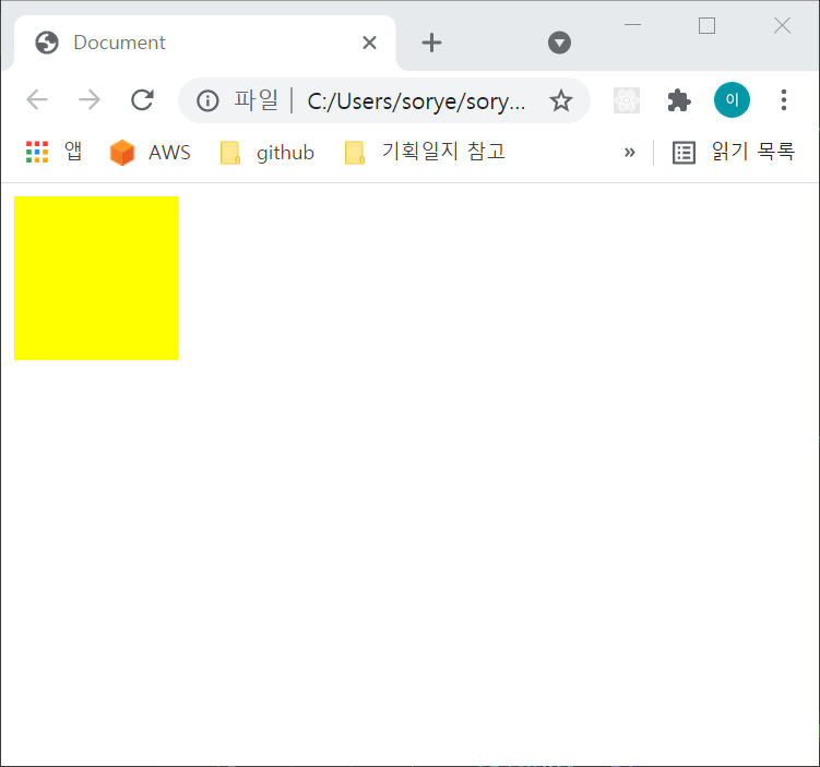
노란박스의 z-index를 0, 파란박스의 z-index를 -1로 설정할 수도 있습니다.
3. html 태그와 웹 표준
-
main 태그는 익스플로어에서는 지원하지 않기 때문에
role="main"이라는 속성값을 꼭 명시해야 합니다. -
article 태그는 명시적 태그이지만, article 안에 h1~h6 중 하나의 태그는 필수적으로 포함하는 것이 웹 표준에 맞습니다.
4. parallax 구현 방법 - css만으로
parallax(시차)?
parallax scrolling은 웹사이트 내에서 스크롤할 때, 배경 이미지가 다른 속도로 이동하는 효과를 주는 것을 말합니다.
<head>
  <style>
    .parallax {
    	background-image: url('blah.png');
    	min-height: 500px;
    	background-attachment: fixed;
    	background-position: center;
    	background-repeat: no-repeat;
    	background-size: cover;
    }

    .text_box {
    	height: 1000px;
    	background-color: black;
    	color: white;
    	font-size: 18px;
    }

  </style>
</head>
<body>
  <div class="parallax"></div>
  <div class="text_box">
    Lorem ipsum dolor sit, amet consectetur adipisicing elit. Possimus eaque saepe illo odit porro ipsam corrupti natus, non suscipit rerum mollitia, labore minima fugiat, unde excepturi ea itaque consequatur harum!
  </div>
</body>
사진이 들어갈 영역(.parallax)과 텍스트가 들어갈 영역(.text_box)을 나란히 위치하게 합니다.
그리고 사진의 영역에서 background-attachment: fixed로 스크롤이 되더라도 사진은 함께 움직이지 않도록 합니다.
이때 min-height를 설정해야 사진이 보여집니다. 그렇지 않으면 사진이 영역 배분을 받지 못합니다 :)
이렇게 작성하면 텍스트영역이 스크롤에 의해 올라갈 때도 사진은 움직임이 없기 때문에 스크롤 시차 효과를 보여줄 수 있습니다.