HTML & CSS
Weegle 검색바 만들기
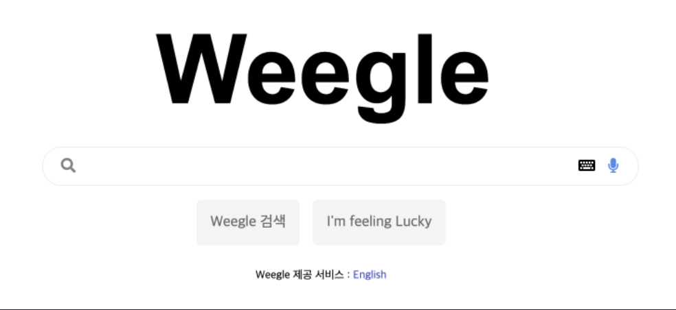
위와 같은 웹페이지를 만드는 실습을 진행하였습니다.
HTML
CSS
* {
  box-sizing: border-box;
}

.wrap {
  height: 400px;
  display: flex;
  flex-direction: column;
  align-items: center;
  justify-content: center;
}

.logo {
  width: 300px;
}

.textbox {
  position: relative;
  width: 500px;
}

input {
  width: 100%;
  border: 1px solid #e0e0e0;
  border-radius: 15px;
  font-size: 24px;
}

.glass {
  position: absolute;
  left: 12px;
  margin: 10px 0 10px 0;
  color: grey;
  font-size: 12px;
}

.keyboard {
  position: absolute;
  right: 32px;
  margin: 10px 0 10px 0;
  font-size: 12px;
}

.mic {
  position: absolute;
  right: 12px;
  margin: 10px 0 10px 0;
  color: #4f87ec;
  font-size: 12px;
}

.box {
  background-color: #e0e0e0;
  color: grey;
  border: 1px solid white;
  padding: 10px;
  border-radius: 5px;
  text-align: center;
  margin: 10px 4px;
}

.text {
  display: flex;
}

.bottom {
  font-size: 12px;
  font-weight: bold;
  margin-top: 10px;
}
코드는 다음과 같이 작성하였고
문제를 풀면서 어려웠던 점과 짚고 넘어가면 좋을 것 같은 개념들을 정리해보겠습니다.
저는 구조 자체를 wrap 클래스로 logo 클래스, textbox 클래스, text 클래스, bottom 클래스를 묶어주었고
그 안에 요소들을 display: flex;를 사용하여 수평, 수직에 대해 가운데 정렬을 했습니다.
그 과정에서 wrap 클래스에 height를 주는 것에서 막혔었습니다.
처음에는 생각으로는 직접적으로 height 값을 주지 않고 height: 100%로 설정했었습니다.
하지만 width나 height에 대해서 % 값을 사용하는 것은 width와 height를 상대적인 길이로 정하는 것이며, 그러기 위해서는 부모 요소에 길이가 설정이 되어있어야 한다는 것을 알게 되었습니다.
직접적인 값을 주지 않고 뷰포트나 전체 창 비율에 맞게 길이를 설정하는 것에 대해 찾아보고 개념을 익혀야겠다는 생각을 하게 되었습니다.
Wecolor Picker 컴포넌트
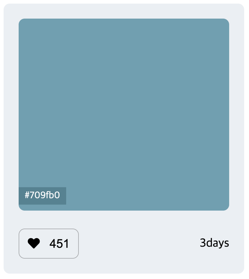 위와 같은 웹 페이지를 만드는 실습을 진행하였습니다.
HTML
CSS
* {
  box-sizing: border-box;
}

.biggerColorBox {
  display: flex;
  flex-flow: column;
  align-items: center;
  background-color: #ebeff3;
  width: 400px;
  height: 450px;
  border-radius: 10px;
  border: 1px solid black;
}

.colorBox {
  position: relative;
  background-color: #709fb0;
  width: 360px;
  height: 300px;
  border-radius: 10px;
  margin-top: 20px;
}

.colorNum {
  position: absolute;
  background: #568390;
  color: white;
  width: 60px;
  height: 20px;
  font-size: 14px;
  text-align: center;
  padding: 3px 0 6px 0;
  bottom: 10px;
  opacity: 0;
}

.colorBox:hover .colorNum{
  opacity: 1;
}

.items {
  display: flex;
  justify-content: space-between;
  width: 360px;
  margin-top: 20px;
}

.heartBox {
  width: 80px;
  height: 40px;
  border: 1px solid #888;
  border-radius: 10px;
  text-align: center;
  padding: 12px 0 12px 0;
}

.day {
  padding: 12px 0 12px 0;
}
코드는 다음과 같이 작성하였고
문제를 풀면서 어려웠던 점과 짚고 넘어가면 좋을 것 같은 개념들을 정리해보겠습니다.
처음에 구상했을 때는 biggerColorBox와 colorBox의 배치를
relative와 absolute를 이용해서 짜려고 했습니다.
그렇게 구상을 하고 나니 biggerColorBox와 colorbox의 배치를 끝내고
colorNum의 배치도 relative와 absolute를 이용해서 해야하는데
어떻게 해야되나라는 고민에 빠지게 되었습니다.
한 클래스에 relative와 absolute 두가지의 값을 줄 수는 없었기에 구조를 다시 바꾸게 되었습니다.
biggerColorBox와 colorbox의 배치를 flex를 이용해야겠구나 라는 결과에 도달하였습니다.
그렇게 해서 biggerColorBox와 colorbox를 flex로 배치하고
colorBox에 relative를, colorNum에 absolute를 줘서 colorNum의 배치를 했습니다.이 과제를 수행하면서 flex의 효율성을 직접적으로 느낄 수 있었습니다.