라디오버튼과 체크박스를 커스텀 체크박스로 스타일링2
폰트어썸 아이콘을 사용하여 라디오버튼과 체크박스를 커스텀 체크박스로 스타일링
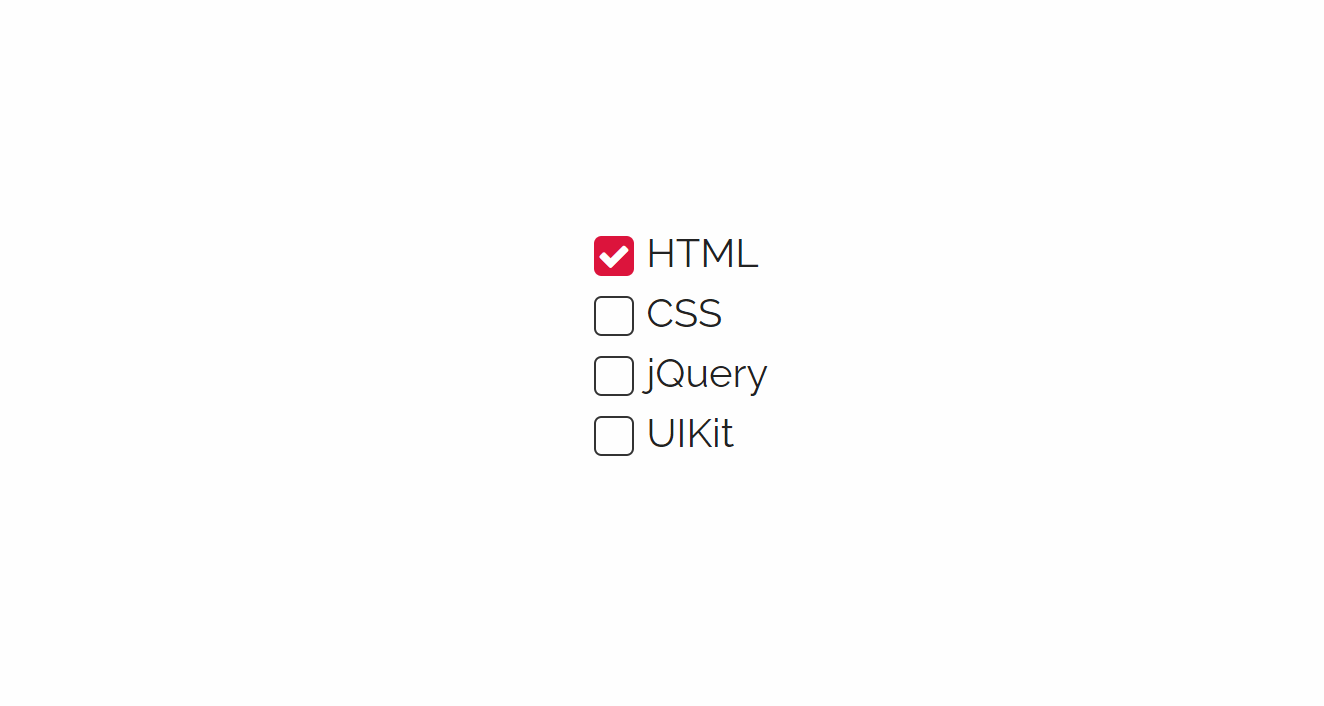
예제보기
가상클래스 :active
선택자를 마우스로 클릭하는 순간을 뜻함
HTML
  <form>
    <input type="checkbox" id="chk1">
    <label for="chk1">HTML</label>
    <input type="checkbox" id="chk2">
    <label for="chk2">CSS</label>
    <input type="checkbox" id="chk3">
    <label for="chk3">jQuery</label>
    <input type="checkbox" id="chk4">
    <label for="chk4">UIKit</label>
  </form>
CSS
/* Google Web Font */
@import url('https://fonts.googleapis.com/css?family=Raleway&display=swap');

/* Fontawesome 4.7 */
@import url('https://stackpath.bootstrapcdn.com/font-awesome/4.7.0/css/font-awesome.min.css');

body {
  font-family: 'Raleway', sans-serif;
  line-height: 1.5em;
  margin: 0;
  font-weight: 300;
  color: #222;
  display: flex;
  justify-content: center;
  align-items: center;
  height: 100vh;
}
a {
  text-decoration: none;
  color: #222;
}
form input[type=checkbox] {
  display: none;
}
form label {
  display: block;
}
form label::before{
  content: '\f00c';
  font-family: Fontawesome;
  border: 1px solid #333;
  width: 14px;
  height: 14px;
  border-radius: 3px;
  margin-right: 5px;
  font-size: 13px;
  vertical-align: middle;
  display: inline-block;
  text-align: center;
  line-height: 14px;
  color: transparent;
  transition: 0.2s;
}
form input[type=checkbox]:checked + label::before {
  background-color: crimson;
  color: #fff;
  border-color: transparent;
}
form input[type=checkbox] + label:active::before {
  transform: scale(0);
}
프론트엔드 4년차