이 글은 boostcourse의 '웹 UI 개발'을 수강하고 적는 글입니다.
📌 9. 레이어팝업
1) 팝업 소개
- POPUP : 특정 영역의 위치에, 특정 사이즤 레이어(창)를, 특정 시점에 노출
- Popup = 새창
- Modal = 레이어 팝업
- Alert = 알림/ 시스템 팝업
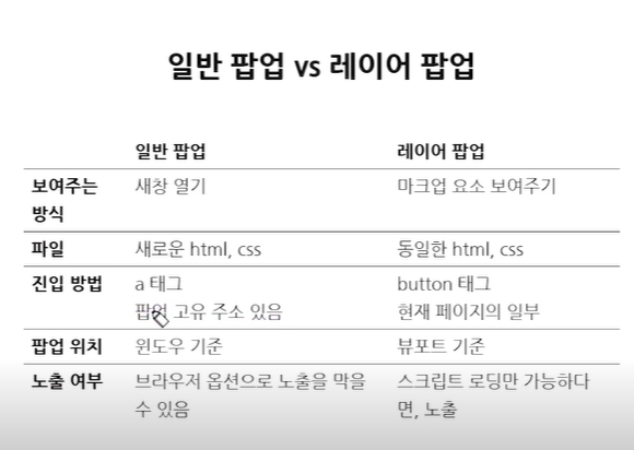
레이어 팝업
- 웹 페이지와의 디자인 통일
- 사용자에게 노출이 될 확률이 좀 더 높음
- 특히 모바일에서 유용
- 반투명한 배경을 깔아서 레이어 팝업 외 화면 인터렉션 막음
- 뷰포트 내, 중앙 정렬
중앙 정렬 방법
- text-align: center;
- vertical-align: midde;
- margin: auto;
- display: table | table-cell;
2) 레이어팝업 제작
<!DOCTYPE html>
<html lang="kr">
<head>
<meta charset="UTF-8">
<title>레이어 팝업</title>
<link rel="stylesheet" type="text/css" href="layer_popup.css">
</head>
<body>
<div class="content">
<!-- 콘텐츠 -->
</div>
<div class="popup">
	<div class="popup_layer">
		<div class="text_area">
			<strong class="title">팝업 타이틀</strong>
			<p class="text">팝업 텍스트 영역</p>
		</div>
		<div class="btn_area">
			<button type="button" name="button" class="btn">예</button>
			<button type="button" name="button" class="btn no">아니오</button>
		</div>
	</div>
	<div class="popup_dimmed"></div>
</div>
</body>
</html>
.content {
height: 5000px;
}
.popup {
position: fixed;
top: 0;
right: 0;
bottom: 0;
left: 0;
}
.popup_layer {
position: relative;
width: 300px;
min-height: 150px;
padding-bottom: 50px;
background: #fff;
z-index: 10;
}
.text_area {
padding: 50px 30px 30px;
text-align: center
}
.btn_area {
position: absolute;
left: 0;
right: 0;
bottom: 0;
height: 50px;
overflow: hidden;
}
.btn {
float: left;
width: 50%;
height: 100%;
font-size: 15px;
font-weight: bold;
border: 0;
background: pink;
}
.btn.no {
background: lightblue;
}
.popup_dimmed {
position: absolute;
top: 0;
right: 0;
bottom: 0;
left: 0;
background: #000;
opacity: 0.3;
}3) 요약 정리
사이즈 고정일 경우
- position:absoulte; | margin 마이너스 값
-> margin 값에 대한 추가적인 연산 필요- position:absoulte; | margin: auto;
-> margin 값에 대한 추가적 연산이 필요 없음
사이즈 가변일 경우
- display: inline-block | vertical-align:midde; | text-align:center;
-> 빈 태그 혹은 가상 요소(:after)가 하나 더 필요- display: table | table-cell
-> 많은 코드 중첩
📌 10. 폼
1) 폼 소개
2) 폼 커스텀 - 텍스트 박스
<p><input type="text" placeholder="이름을 입력해주세요."></p>

<p><input type="password" placeholder="비밀번호를 입력해주세요."></p>

<p><textarea name="" id="" cols="30" rows="10" placeholder="문구를 입력해주세요."></textarea></p>
input[type="text"],
input[type="password"] {
width: 198px;
height: 38px;
line-height: 38px;
border: 1px solid #ddd;
font-size: 15px;
text-indent: 10px;
color: #000;
}
textarea {
width: 280px;
height: 130px;
padding: 9px;
border: 1px solid #ddd;
font-size: 15px;
resize: none;
color: #000;
}
input[type="text"],
input[type="password"] {
width: 198px;
height: 38px;
line-height: 38px;
border: 1px solid #ddd;
font-size: 15px;
text-indent: 10px;
color: #000;
}
textarea {
width: 280px;
height: 130px;
padding: 9px;
border: 1px solid #ddd;
font-size: 15px;
resize: none;
color: #000;
}
::-webkit-input-placeholder { /* Chrome/Opera/Safari */
color: red;
}
::-moz-placeholder { /* Firefox 19+ */
color: red;
}
:-ms-input-placeholder { /* IE 10+ */
color: red;
}
:-moz-placeholder { /* Firefox 18- */
color: red;
}
textarea::-webkit-input-placeholder { /* Chrome/Opera/Safari */
color: blue;
}
textarea::-moz-placeholder { /* Firefox 19+ */
color: blue;
}
textarea:-ms-input-placeholder { /* IE 10+ */
color: blue;
}
textarea:-moz-placeholder { /* Firefox 18- */
color: blue;
}3) 폼 커스텀 - 체크박스, 라디오
- CSS만을 이용한 checkbox 커스텀
<div>
    <input type="checkbox" id="check_button1" name="">
    <label for="check_button1">선택1</label>
</div>

<div>
    <input type="checkbox" id="check_button2" name="">
    <label for="check_button2">선택2</label>
</div>
input[type='checkbox'] + label {
display: inline-block;
overflow: hidden;
position: relative;
width: 36px;
height: 21px;
border-radius: 10px;
background: #666;
vertical-align: top;
color: transparent;
}
input[type='checkbox'] + label:after {
content: '';
position: absolute;
top: 1px;
left: 1px;
width: 19px;
height: 19px;
background: #fff;
border-
}
input[type='checkbox'] + label {
display: inline-block;
overflow: hidden;
position: relative;
width: 36px;
height: 21px;
border-radius: 10px;
background: #666;
vertical-align: top;
color: transparent;
}
input[type='checkbox'] + label:after {
content: '';
position: absolute;
top: 1px;
left: 1px;
width: 19px;
height: 19px;
background: #fff;
border-radius: 50%;
}
input[type='checkbox']:checked + label {
background-color: #62a7ee; /* 배경색 변경 */
}
input[type='checkbox']:checked + label:after { /* 버튼 위치 변경 */
left: auto;
right: 1px;
}
input[type='checkbox'] { /* input 감추기 */
position: absolute;
overflow:hidden;
width: 1px;
height: 1px;
margin: -1px;
opacity: 0;
}
input[type='checkbox'] + label {
display: inline-block;
overflow: hidden;
position: relative;
width: 36px;
height: 21px;
border-radius: 10px;
background: #666;
vertical-align: top;
color: transparent;
}
input[type='checkbox'] + label:after {
content: '';
position: absolute;
top: 1px;
left: 1px;
width: 19px;
height: 19px;
background: #fff;
border-radius: 50%;
}
input[type='checkbox']:checked + label {
background-color: #62a7ee;
}
input[type='checkbox']:checked + label:after {
left: auto;
right: 1px;
}- 이미지를 이용한 checkbox 커스텀
<div>
    <input type="checkbox" id="check_button1" name="">
    <label for="check_button1">선택1</label>
</div>

<div>
    <input type="checkbox" id="check_button2" name="">
    <label for="check_button2">선택2</label>
</div>
input[type='checkbox'] + label {
display: inline-block;
font-size: 16px;
}
input[type='checkbox'] + label:before {
display: inline-block;
width: 20px;
height: 20px;
margin:-4px 5px 0 0;
background: url(checkbox.png) no-repeat 0 0;
background-size: 20px;
vertical-align: top;
content:'';
}
input[type='checkbox'] + label {
display: inline-block;
font-size: 16px;
}
input[type='checkbox'] + label:before {
display: inline-block;
width: 20px;
height: 20px;
margin:-4px 5px 0 0;
background: url(checkbox.png) no-repeat 0 0;
background-size: 20px;
vertical-align: top;
content:'';
}
input[type='checkbox']:checked + label:before {
background-image: url(checkbox_on.png); /* checked 이미지 적용 */
}
input[type='checkbox'] { /* input 감추기 */
position: absolute;
overflow:hidden;
width: 1px;
height: 1px;
margin: -1px;
opacity: 0;
}
input[type='checkbox'] + label {
display: inline-block;
font-size: 16px;
}
input[type='checkbox'] + label:before {
display: inline-block;
width: 20px;
height: 20px;
margin:-4px 5px 0 0;
background: url(checkbox.png) no-repeat 0 0;
background-size: 20px;
vertical-align: top;
content:'';
}
input[type='checkbox']:checked + label:before {
background-image: url(checkbox_on.png);
}- 이미지를 이용한 radio 버튼 커스텀
<div>
    <input type="radio" id="radio_button1" name="radio_form">
    <label for="radio_button1">라디오1</label>
</div>

<div>
    <input type="radio" id="radio_button2" name="radio_form">
    <label for="radio_button2">라디오2</label>
</div>

<div>
    <input type="radio" id="radio_button3" name="radio_form">
    <label for="radio_button3">라디오3</label>
</div>
input[type='radio'] + label {
display: inline-block;
font-size: 16px;
}
input[type='radio'] + label:before {
display: inline-block;
width: 20px;
height: 20px;
margin:-4px 5px 0 0;
background: url(radio.png) no-repeat 0 0;
background-size: 20px;
vertical-align: top;
content:'';
}
input[type='radio'] + label {
display: inline-block;
font-size: 16px;
}
input[type='radio'] + label:before {
display: inline-block;
width: 20px;
height: 20px;
margin:-4px 5px 0 0;
background: url(radio.png) no-repeat 0 0;
background-size: 20px;
vertical-align: top;
content:'';
}
input[type='radio']:checked + label:before {
background-image: url(radio_on.png); /* checked 이미지 적용 */
}
input[type='radio'] { /* input 감추기 */
position: absolute;
overflow:hidden;
width: 1px;
height: 1px;
margin: -1px;
opacity: 0;
}
input[type='radio'] + label {
display: inline-block;
font-size: 16px;
}
input[type='radio'] + label:before {
display: inline-block;
width: 20px;
height: 20px;
margin:-4px 5px 0 0;
background: url(radio.png) no-repeat 0 0;
background-size: 20px;
vertical-align: top;
content:'';
}
input[type='radio']:checked + label:before {
background-image: url(radio_on.png);
}4) 폼 커스텀 - 파일 찾기
- CSS만을 이용한 파일 선택 버튼 커스텀
<div class="file_form">
  <input type="file">
  <span class="text">filename..</span>
</div>
input[type='file'] {
display: none;
}
input[type='file']{
display: none;
}
.file_form { /* 기본 틀 구현 */
display: inline-block;
width: 198px;
height: 38px;
line-height: 38px;
border: 1px solid cornflowerblue;
font-size: 12px;
}
.file_form .text { /* 텍스트영역 말줄임 처리 */
overflow: hidden;
text-overflow: ellipsis;
display: block;
padding: 0 50px 0 10px;
white-space: nowrap;
}
input[type='file']{
display: none;
}
.file_form {
position: relative; /* position 기준 */
display: inline-block;
width: 198px;
height: 38px;
line-height: 38px;
border: 1px solid cornflowerblue;
font-size: 12px;
}
.file_form .text {
overflow: hidden;
text-overflow: ellipsis;
display: block;
padding: 0 50px 0 10px;
white-space: nowrap;
}
.file_form .text:after { /* 버튼형태 구현 */
position: absolute;
top:0;right:0;
width: 50px;
background-color: cornflowerblue;
text-align: center;
color: #fff;
content:'파일찾기';
}
.file_form input[type='file'] {
background-color: rgba(0, 0, 0, 0.5);
}
.file_form {
position: relative; /* position 기준 */
display: inline-block;
width: 198px;
height: 38px;
line-height: 38px;
border: 1px solid cornflowerblue;
font-size: 12px;
}
.file_form .text {
overflow: hidden;
text-overflow: ellipsis;
display: block;
padding: 0 50px 0 10px;
white-space: nowrap;
}
.file_form .text:after { /* 버튼형태 구현 */
position: absolute;
top:0;right:0;
width: 50px;
background-color: cornflowerblue;
text-align: center;
color: #fff;
content:'파일찾기';
}
.file_form input[type='file'] {
position: absolute;
top: 0; right: 0; bottom: 0; left: 0;
z-index: 10;
width: 100%;
opacity: 0;
}2.이미지 버튼을 이용한 프로필 등록 만들기
<div class="file_form_img">
  <span class="img"><img src="default.png" alt="프로필 이미지"></span>
  <label class="file"><input type="file"></label>
</div>
.file_form_img .img {
overflow: hidden;
position: relative;
display: block;
width: 100px;
height: 100px;
border:1px solid rgba(0, 0, 0, 0.2);
border-radius: 50%;
}
.file_form_img .img img {
width: 100%;
height: auto;
border-radius: 50%;
}
.file_form_img .img {
overflow: hidden;
position: relative;
display: block;
width: 100px;
height: 100px;
border:1px solid rgba(0, 0, 0, 0.2);
border-radius: 50%;
}
.file_form_img .img img {
width: 100%;
height: auto;
border-radius: 50%;
}
.file_form_img .file {
position: relative;
display: block;
margin: 10px 0 0;
background:url(btn_file.jpg) no-repeat;
width: 82px;
height: 24px;
}
.file_form_img .file input[type=file] {
position: absolute;
z-index: 10;
top: 0; right: 0; bottom: 0; left: 0;
width: 100%;
opacity: 0;
}
.file_form_img {
width: 100px; /* 프로필 등록 사이즈 지정 */
}
.file_form_img .img {
overflow: hidden;
position: relative;
display: block;
width: 100px;
height: 100px;
border:1px solid rgba(0, 0, 0, 0.2);
border-radius: 50%;
}
.file_form_img .img img {
width: 100%;
height: auto;
border-radius: 50%;
}
.file_form_img .file {
position: relative;
display: block;
margin: 10px auto 0; /* 버튼 가운데 정렬 */
background:url(btn_file.jpg) no-repeat;
width: 82px;
height: 24px;
}
.file_form_img .file input[type=file] {
position: absolute;
z-index: 10;
top: 0; right: 0; bottom: 0; left: 0;
width: 100%;
opacity: 0;
}5) 폼 커스텀 - SELECT 메뉴
<div class="select_form">
    <select name="" id="">
        <option value="">선택1</option>
        <option value="">선택2</option>
        <option value="">선택3</option>
    </select>
</div>
.select_form {
display: block;
position: relative;
width: 198px;
height: 38px;
line-height: 40px;
border: 1px solid #ddd;
text-align: left;
}
.select_form {
display: block;
position: relative;
width: 198px;
height: 38px;
line-height: 40px;
border: 1px solid #ddd;
text-align: left;
}
.select_form select {
width: 100%;
height: 100%;
padding: 0 30px 0 10px;
background-color: transparent;
border: 0 none;
font-size: 16px;
appearance: none;
-moz-appearance: none;
-webkit-appearance: none;
}
.select_form:after {
position: absolute;
top: 16px;
right: 10px;
background:url(select.png) no-repeat 0 0;
width: 13px;
height: 7px;
display: block;
content:'';
}📌 11. 반응형 웹
1) 반응형 웹 소개
반응형 웹 : 디스플레이 종류에 따라 화면의 크기가 자동으로 최적화되도록 조절되는 웹페이지
2) 반응형 웹 제작
3) 반응형 웹 제작 - PC용
<!DOCTYPE html>
<html lang="ko">
	<head>
		<meta charset="utf-8">
		<meta name="viewport" content="width==device-width, initial-scale=1.0">
		<title>반응형 웹</title>
		<link rel="stylesheet" href="./reset.css">
		<link rel="stylesheet" href="./responsive.css">
	</head>
	<body>
		<div class="wrap">
			<header>
				<a href="#" class="logo"><h1>LOGO</h1></a>
				<a href="#" class="gnb_menu">gnb menu</a>
				<nav>
					<a href="#">MENU1</a>
					<a href="#">MENU2</a>
					<a href="#">MENU3</a>
					<a href="#">MENU4</a>
					<a href="#">MENU5</a>
					<a href="#">MENU6</a>
					<a href="#">MENU7</a>
					<a href="#">MENU8</a>
				</nav>
			</header>
			<section>
				<ul class="list">
					<li>
						<a href="#" class="inner">
							<div class="thumb">
								<img src="thumb.png" alt="썸네일이미지">
							</div>
							<div class="title">
								타이틀을 길게 써보도록 하겠습니다. 썸네일보다 길게
							</div>
						</a>
					</li>
					<li>
						<a href="#" class="inner">
							<div class="thumb">
								<img src="thumb.png" alt="썸네일이미지">
							</div>
							<div class="title">
								타이틀입니다.
							</div>
						</a>
					</li>
					<li>
						<a href="#" class="inner">
							<div class="thumb">
								<img src="thumb.png" alt="썸네일이미지">
							</div>
							<div class="title">
								타이틀입니다.
							</div>
						</a>
					</li>
					<li>
						<a href="#" class="inner">
							<div class="thumb">
								<img src="thumb.png" alt="썸네일이미지">
							</div>
							<div class="title">
								타이틀입니다.
							</div>
						</a>
					</li>
					<li>
						<a href="#" class="inner">
							<div class="thumb">
								<img src="thumb.png" alt="썸네일이미지">
							</div>
							<div class="title">
								타이틀입니다.
							</div>
						</a>
					</li>
					<li>
						<a href="#" class="inner">
							<div class="thumb">
								<img src="thumb.png" alt="썸네일이미지">
							</div>
							<div class="title">
								타이틀입니다.
							</div>
						</a>
					</li>
					<li>
						<a href="#" class="inner">
							<div class="thumb">
								<img src="thumb.png" alt="썸네일이미지">
							</div>
							<div class="title">
								타이틀입니다.
							</div>
						</a>
					</li>
					<li>
						<a href="#" class="inner">
							<div class="thumb">
								<img src="thumb.png" alt="썸네일이미지">
							</div>
							<div class="title">
								타이틀입니다.
							</div>
						</a>
					</li>
					<li>
						<a href="#" class="inner">
							<div class="thumb">
								<img src="thumb.png" alt="썸네일이미지">
							</div>
							<div class="title">
								타이틀입니다.
							</div>
						</a>
					</li>
				</ul>
			</section>
			<footer>
				Copyright © NAVER Corp. All Rights Reserved.
			</footer>
		</div>
	</body>
</html>
@charset "UTF-8";
a{
text-decoration: none;
}
header{
overflow:hidden;
background-color: pink;
padding: 20px;
}
.logo{
float:left;
font-size: 20px;
color:#fff;
}
nav{
float:right;
}
nav a{
padding: 0 5px;
font-size: 20px;
color:#fff;
}
footer{
height: 50px;
line-height: 50px;
text-align:center;
background-color:#ccc;
font-size: 14px;
color:#000;
}
section{
overflow: hidden;
max-width: 900px;
margin: 50px auto;
}
.list{
margin: -5px;
overflow:hidden;
}
.list li{
float:left;
width: 20%;
}
.inner{
display:block;
margin: 5px;
border:1px solid #000;
}
.thumb img{
width: 100%;
height: auto;
vertical-align: top;
}
.title{
overflow:hidden;
padding: 5px 0;
text-align:center;
font-size: 14px;
color:#555;
white-space: nowrap;
text-overflow: ellipsis;
}4) 반응형 웹 제작 - TABLET
@media screen and (max-width: 768px), screen and (max-height: 768px) and (orientation: landscape)  {
	header{
		background-color: lightseagreen;:
	}
	.logo{
		width: 100px;
		float: none;
		display: block;
		margin: 0 auto;
		font-size: 40px;
		text-align: center;
	}
	nav{
		overflow-x: auto;
		overflow-y: hidden;
		margin-top: 20px;
		float: none;
		white-space: nowrap;
	}
	nav a{
		font-size: 25px;
	}
	footer{
		background-color: lightcoral;
		color: #fff;
	}
	.list {
		margin: -4px;
	}
	.list li{
		width: 25%;
	}
	.inner{
		position: relative;
		margin: 4px
	}
	.title{
		position: absolute;
		left:0; right:0; bottom:0;
		padding: 10px 0;
		background-color: rgba(0,0,0,0.2);
		color:#fff;
	}
}
5) 반응형 웹 제작 - MOBILE
<!DOCTYPE html>
<html lang="ko">
	<head>
		<meta charset="utf-8">
		<meta name="viewport" content="width==device-width, initial-scale=1.0">
		<title>반응형 웹</title>
		<link rel="stylesheet" href="./reset.css">
	</head>
	<body>
		<div class="wrap">
			<header>
				<a href="#" class="logo"><h1>LOGO</h1></a>
				<a href="#" class="gnb_menu">gnb menu</a>
				<nav>
					<a href="#">MENU1</a>
					<a href="#">MENU2</a>
					<a href="#">MENU3</a>
					<a href="#">MENU4</a>
					<a href="#">MENU5</a>
					<a href="#">MENU6</a>
					<a href="#">MENU7</a>
					<a href="#">MENU8</a>
				</nav>
			</header>
			<section>
				<ul class="list">
					<li>
						<a href="#" class="inner">
							<div class="thumb">
								<img src="thumb.png" alt="썸네일이미지">
							</div>
							<div class="title">
								타이틀을 길게 써보도록 하겠습니다. 썸네일보다 길게
							</div>
						</a>
					</li>
					<li>
						<a href="#" class="inner">
							<div class="thumb">
								<img src="thumb.png" alt="썸네일이미지">
							</div>
							<div class="title">
								타이틀입니다.
							</div>
						</a>
					</li>
					<li>
						<a href="#" class="inner">
							<div class="thumb">
								<img src="thumb.png" alt="썸네일이미지">
							</div>
							<div class="title">
								타이틀입니다.
							</div>
						</a>
					</li>
					<li>
						<a href="#" class="inner">
							<div class="thumb">
								<img src="thumb.png" alt="썸네일이미지">
							</div>
							<div class="title">
								타이틀입니다.
							</div>
						</a>
					</li>
					<li>
						<a href="#" class="inner">
							<div class="thumb">
								<img src="thumb.png" alt="썸네일이미지">
							</div>
							<div class="title">
								타이틀입니다.
							</div>
						</a>
					</li>
					<li>
						<a href="#" class="inner">
							<div class="thumb">
								<img src="thumb.png" alt="썸네일이미지">
							</div>
							<div class="title">
								타이틀입니다.
							</div>
						</a>
					</li>
					<li>
						<a href="#" class="inner">
							<div class="thumb">
								<img src="thumb.png" alt="썸네일이미지">
							</div>
							<div class="title">
								타이틀입니다.
							</div>
						</a>
					</li>
					<li>
						<a href="#" class="inner">
							<div class="thumb">
								<img src="thumb.png" alt="썸네일이미지">
							</div>
							<div class="title">
								타이틀입니다.
							</div>
						</a>
					</li>
					<li>
						<a href="#" class="inner">
							<div class="thumb">
								<img src="thumb.png" alt="썸네일이미지">
							</div>
							<div class="title">
								타이틀입니다.
							</div>
						</a>
					</li>
				</ul>
			</section>
			<footer>
				Copyright © NAVER Corp. All Rights Reserved.
			</footer>
		</div>
	</body>
</html>
@media screen and (max-width: 375px), screen and (max-height: 375px) and (orientation: landscape) {
header{
padding: 10px 0;
}
nav{
display: none;
position: absolute;
top: 60px;
left:0;
bottom: 0;
z-index: 10;
width: 200px;
margin:0;
background-color: lightslategray;
}
nav a{
display: block;
padding: 20px 10px;
font-size: 20px;
border-bottom: 1px solid #fff;
}
.gnb_menu{
position: absolute;
top: 12px;
left:12px;
display: block;
width: 40px;
height: 35px;
font-size: 1px;
color: transparent;
background: linear-gradient(#fff 50%, transparent 50%);
background-size: 100% 10px;
}
section{
margin: 0;
}
.list li {
width: 100%;
}
.inner{
display: table;
table-layout: fixed;
width: 100%;
margin: 0;
border: none;
border-top: 1px solid #000;
}
.thumb{
display: table-cell;
width: 100px;
}
.title{
display: table-cell;
position: relative;
right:auto;
left: auto;
bottom: auto;
vertical-align: middle;
background-color:#fff;
padding: 8px;
color:#000;
text-overflow: inherit;
white-space: inherit;
text-align: left;
}
}