🚩 선택자 응용
지금까지 배웠던 선택자들 응용해보기
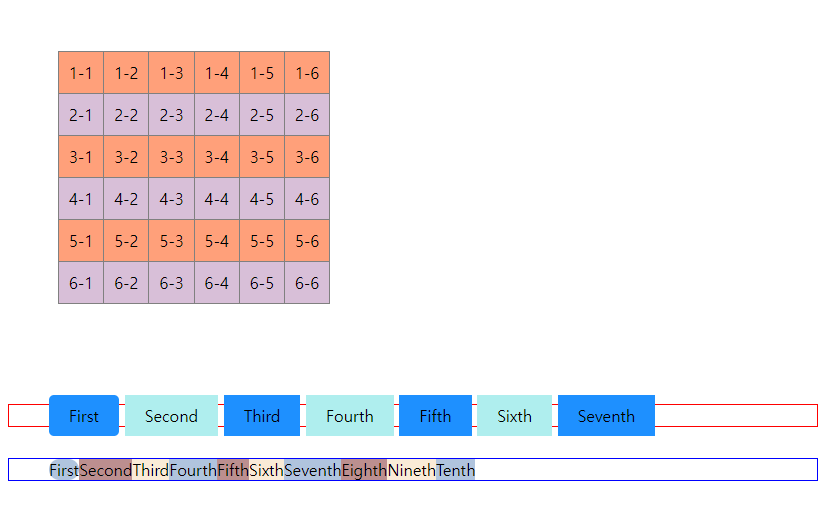
✒️ 작성한 코드
입력
<style>
/* border-collapse: collapse; - 테두리끼리 겹치게 만든다(그래서 두께가 2px이 아니라 1px이 됨) */
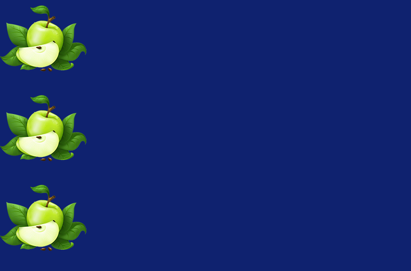
table { border-collapse: collapse; margin: 100px; }
table td { border: 1px solid gray; padding: 10px; }
tr:nth-child(even) { background-color: thistle; } /* 짝수에만 적용 */
tr:nth-child(odd) { background-color: lightsalmon; } /* 홀수에만 적용 */
ul { margin: 0 0 10px 50px; }
li { list-style: none; }
/*
19 ~ 22 라인 전부 같은 ul을 가리킴.
nth-child는 같은 자식을 가리키기 때문에 tabel도 포함되어 2번째로 작성한다.
ul:nth-child(2) { border: 2px solid red; }
ul:first-of-type { border: 2px solid red; }
*/
ul:nth-of-type(1) { border: 1px solid red; }
ul:first-of-type li { display: inline; padding: 10px 20px;} /* inline은 float와 달리 자체적으로 자간 여백이 생기고, 레이아웃 영역보다 커지면 내용물이 밖으로 튀어나간다 */
ul:first-of-type li:nth-child(2n) { background: paleturquoise; } /* 짝수 */
ul:first-of-type li:nth-child(2n-1) { background: dodgerblue; } /* 홀수 */
ul:last-of-type { border: 1px solid blue; overflow: hidden; }
ul:last-of-type li { float: left; } /* block방식 유지 */
ul:last-of-type li:nth-child(3n) { background: antiquewhite; } /* 3 6 9 12 ... */
ul:last-of-type li:nth-child(3n-2) { background: lightsteelblue; } /* 1 4 7 10 ... */
ul:last-of-type li:nth-child(3n-1) { background: rosybrown; } /* 2 5 8 ... */
ul:first-of-type li:first-of-type { border-radius: 5px; }
ul:last-of-type li:nth-child(1) { border-radius: 30px; }
</style>
<body>
<table>
<tr>
<td>1-1</td>
<td>1-2</td>
<td>1-3</td>
<td>1-4</td>
<td>1-5</td>
<td>1-6</td>
</tr>
<tr>
<td>2-1</td>
<td>2-2</td>
<td>2-3</td>
<td>2-4</td>
<td>2-5</td>
<td>2-6</td>
</tr>
<tr>
<td>3-1</td>
<td>3-2</td>
<td>3-3</td>
<td>3-4</td>
<td>3-5</td>
<td>3-6</td>
</tr>
<tr>
<td>4-1</td>
<td>4-2</td>
<td>4-3</td>
<td>4-4</td>
<td>4-5</td>
<td>4-6</td>
</tr>
<tr>
<td>5-1</td>
<td>5-2</td>
<td>5-3</td>
<td>5-4</td>
<td>5-5</td>
<td>5-6</td>
</tr>
<tr>
<td>6-1</td>
<td>6-2</td>
<td>6-3</td>
<td>6-4</td>
<td>6-5</td>
<td>6-6</td>
</tr>
</table>
<ul>
<li>First</li>
<li>Second</li>
<li>Third</li>
<li>Fourth</li>
<li>Fifth</li>
<li>Sixth</li>
<li>Seventh</li>
</ul>
<br>
<ul>
<li>First</li>
<li>Second</li>
<li>Third</li>
<li>Fourth</li>
<li>Fifth</li>
<li>Sixth</li>
<li>Seventh</li>
<li>Eighth</li>
<li>Nineth</li>
<li>Tenth</li>
</ul>
</body>
출력(이미지)
- 글 작성시 미리보기에선 작동되지만 본문에서는 되지 않으므로 이미지로 대체
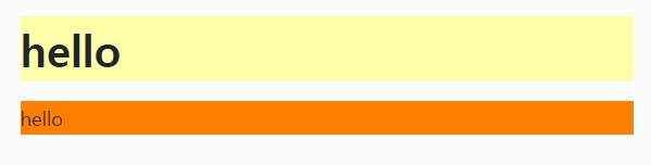
🚩 백그라운드(배경) 속성
background-color
📝 설명
- 해당 HTML 요소의 배경색을 설정한다.
✒️ 사용법
입력
body { background-color: lightblue; }
h1 { background-color: #ffffee; }
p { background-color: rgb(255, 128, 0); }
출력(이미지)
- 글 작성시 미리보기에선 작동되지만 본문에서는 되지 않으므로 이미지로 대체
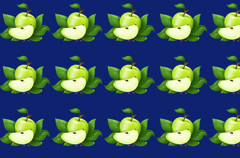
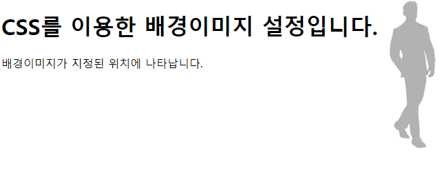
background-image
📝 설명
- 해당 HTML 요소의 배경으로 나타날 배경 이미지를 설정한다.
- 설정된 이미지는 반복되어 설정한 HTML 요소 전체에 나타난다.
✒️ 사용법
입력
선택자 { background-image: url('경로'); }출력(이미지)
- 글 작성시 미리보기에선 작동되지만 본문에서는 되지 않으므로 이미지로 대체
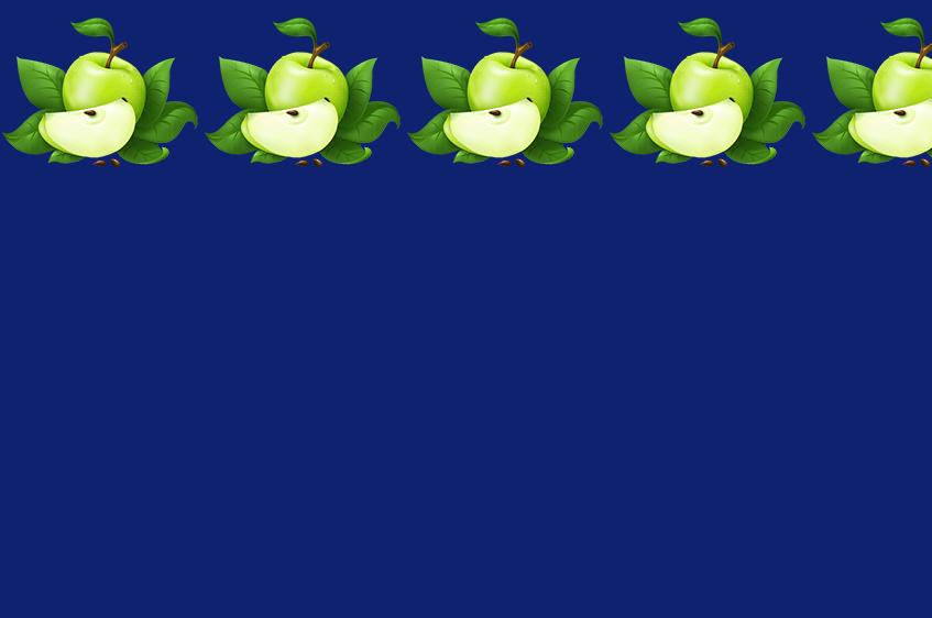
background-repeat
📝 설명
- 배경 이미지를 수평이나 수직 방향 or 반복하지 않게 설정할 수 있다.
✒️ 사용법
입력
선택자 {
	background-image: url('경로');

    /* 수평(x축)방향으로 반복 */
    background-repeat: repeat-x;

    /* 수직(y축)방향으로 반복 */
    background-repeat: repeat-y;

    /* 반복하지 않음 */
    background-repeat: no-repeat;
}
출력(이미지)
- 글 작성시 미리보기에선 작동되지만 본문에서는 되지 않으므로 이미지로 대체
repeat-x
repeat-y
no-repeat
background-size
📝 설명
- 배경 이미지의 크기를 조절할 수 있다.
✒️ 사용법
입력
선택자 {
	background-image: url('경로');

	background-size: x y;
    * x, y 순서로 지정 가능.
    20px 한 개만 쓰면 x축 기준 또는 20px auto로 작성 가능함
}
background-position
📝 설명
- 반복되지 않는 배경 이미지의 상대 위치(relative position)를 설정한다.
- x축과 y축 모두 지정해 주어야 함
- left top right bottm center을 사용하여 지정하거나, %나 px을 사용하여 직접 지정할 수 있다.
- 상대 위치를 결정하는 기준은 무조건 left top이다.
✒️ 사용법
입력
선택자 {
	background-image: url('경로');
    background-repeat: no-repeat;

    background-position: top right;
}
출력(이미지)
- 글 작성시 미리보기에선 작동되지만 본문에서는 되지 않으므로 이미지로 대체
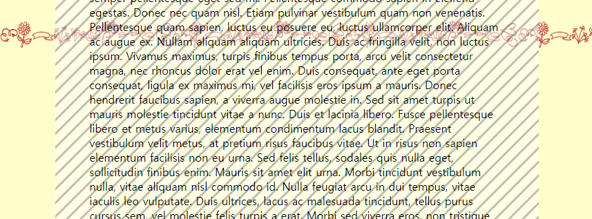
background-attatchment
📝 설명
- 위치가 설정된 배경 이미지를 해당 위치에 고정시킨다.
- 스크롤 해도 그 자리에서 움직이지 않고 고정되어있다.
✒️ 사용법
입력
선택자 {
	background-image: url('경로');
    background-repeat: no-repeat;
    background-position: top right;

    background-attatchment: fixed;
}
출력(이미지)
- 글 작성시 미리보기에선 작동되지만 본문에서는 되지 않으므로 이미지로 대체
스크롤 해도 빨간색 무늬가 해당 위치에 고정되어 있음
background 속성 축약하기
📝 설명
- 위에서 사용한 background 속성들을 한 줄로 축약하여 사용 가능하다.
✒️ 사용법
background: #ffffcc url('img/bg3.png') repeat-x 0 50px / 250px auto fixed;

*축약형 사용 시 크기(size), 위치값(position)을 동시에 사용할때는,
위치값 / 크기 (0 50px / 250px auto처럼) 숫자가 1번 나오면 무조건 위치값으로 인식

}
background 이미지 여러장 넣기
📝 설명
background-image: url('')코드 url부분을 콤마(,)로 구분하여 사용.
✒️ 사용법
background-image: url('img/BackgroundFront.png'), url('./img/BackgroundBack.png');

/* 이미지 여러장 넣었을 때 코드 축약하는법은 첫번째 나열 후 콤마로 구분한 후 두번째 나열 */
background: url('img/BackgroundFront.png') 0 200px / 100% no-repeat fixed, lemonchiffon url('./img/BackgroundBack.png') center 400px / 50% no-repeat

}
🚩 상대적 길이
%
📝 설명
- 부모 엘리먼트의 크기에 따라 상대적으로 %가 차지하는 영역이 변한다.
✒️ 사용법
입력
부모선택자 { width: 700px; height: 1000px; }

자식선택자 { width: 100%; height: 50%; }
출력
- width는 같고, height는 부모의 절반으로 출력된다.
vw & vh
📝 설명
- 창 사이즈(viewport)에 반응하여 상대적으로 크기가 변하기 때문에 반응형 웹에서 주로 사용한다.
- 뷰포트의 1%를 크기로 갖는다.
✒️ 사용법
입력
 /* 절대적 단위 */
선택자 { width: 1000px; height: 800px; }

/* 상대적 단위 */
선택자 { width: 1vw; } /* 10px */
선택자 { height: 1vh; } /* 8px */
출력
- 창 사이즈를 변경할 때마다 그에 맞게 변경됨.
🔗 참고 링크 & 도움이 되는 링크

공부하는 벨로그