
CSS Position
HTML마크업을 하고 난뒤 CSS를 이용하여 스타일을 입혀준다.
스타일을 붙이기전에 어디에 배치할 것인지 CSS에서 위치를 잡는것은 기본중에 기본이다.
CSS position은 레이아웃을 배치하거나 객체를 위치시킬 때 사용하는 속성이다.
Position 속성
위치를 담당하는 position에는 여러가지 속성들이 존재한다.
- position : static
- position : relative
- position : absolute
- position : fixed
그럼 우선 간단하게 첫번째 기본값인 static을 알아보자.
첫번째 position : static
static속성은 position의 기본값이며, 속성이 아무런 영향을 주지 않는다.
HTML과 CSS에 넣어보고 알아보자.
※ 쉽게 알아보기 위해 배경색을 넣었습니다.
HTML
    <div></div>
    <div class="box"></div>
    <div></div>
    <div></div>
    <div></div>
    <div></div>
    <div></div>
CSS
div{
width: 100px;
height: 100px;
background:red;
margin-bottom: 5px;
}
.box{
width: 100px;
height: 100px;
background:yellow;
margin-bottom: 5px;
top: 30px;
left: 30px;
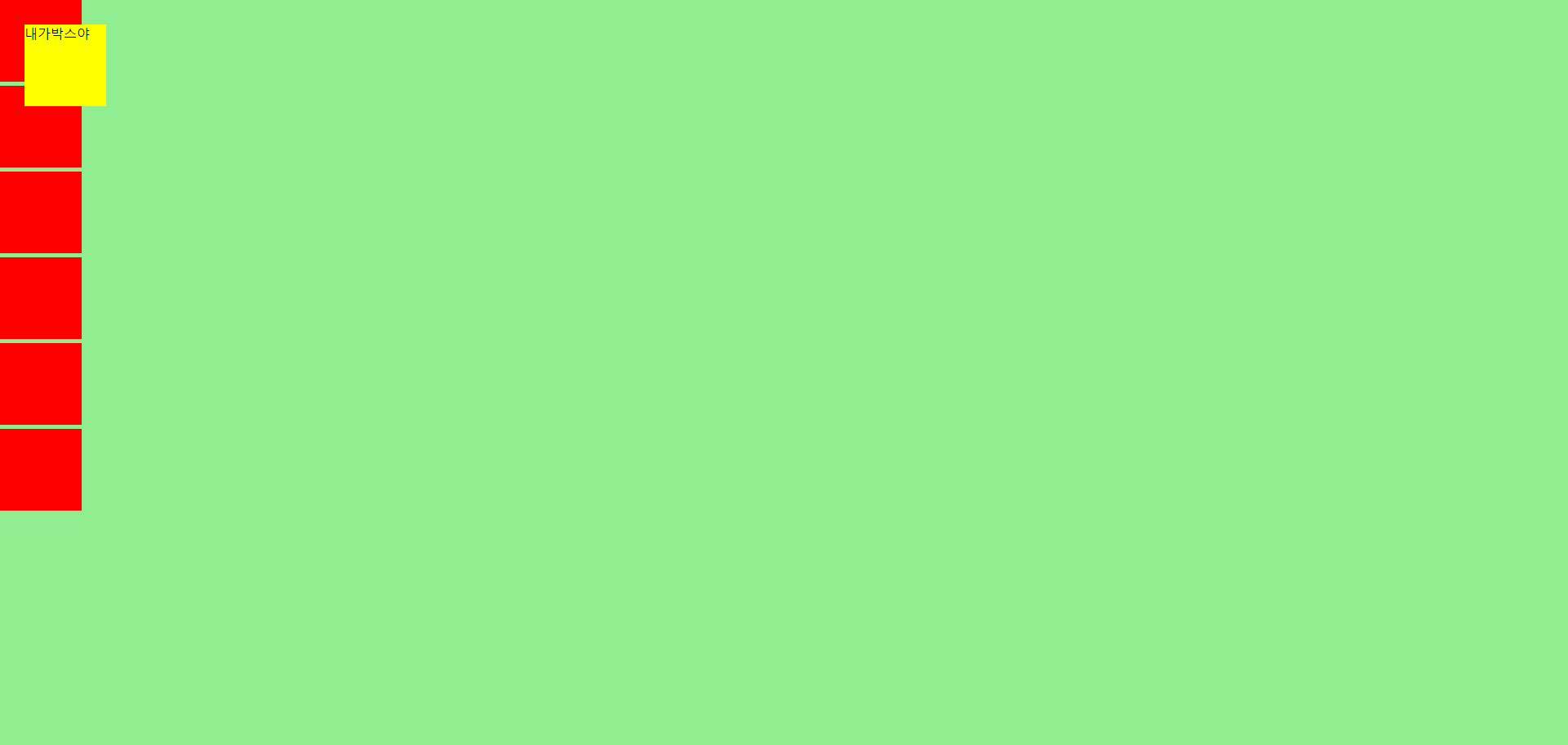
} 결과
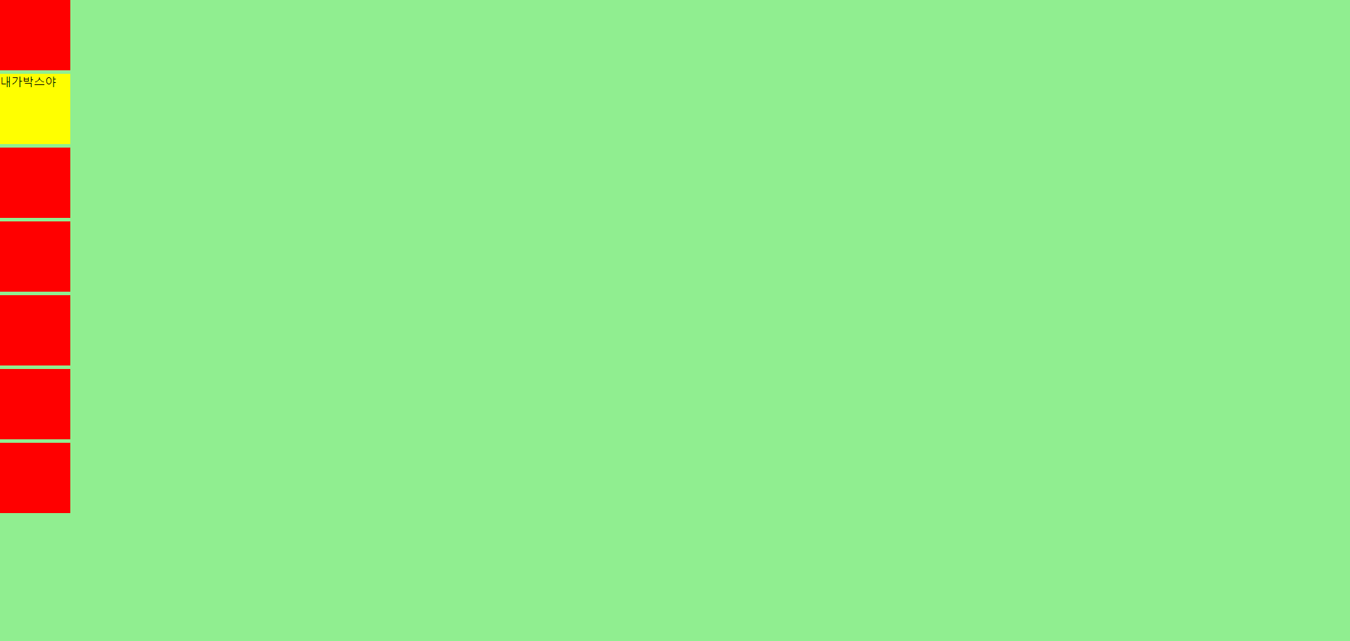
귀여운 네모들이 잘찍혀있다. 우리는 노란색 박스를 이동시켜주려고한다.
이동을 하기 위해서 top,bottom,right,left 의값을 넣어주자.
CSS
.box{
    width: 100px;
    height: 100px;
    background:yellow;
    margin-bottom: 5px;
    top: 30px;
    left: 30px;
}
top: 30px;, left: 30px;를 넣어줬다. 결과값을 볼까?
박스를 이동하기 위해 수정했지만 노란색 네모는 이동하지 않았다.
static 속성은
top,bottom,right,left... 등등 넣어도 위치는 변하지 않는다.
가만히 있어하고 싶은 나같은 게으른 속성이라고 할 수 있다.
기본값이기 때문에 자주 쓰지 않는 속성이다.
두번째 position : relative
원래 있어야하는 자리를 기준으로 이동하는 속성이다.
아까 이동해주고싶은 박스에 position : relative; 을 넣어주자.
CSS
.box{
    width: 100px;
    height: 100px;
    background:yellow;
    margin-bottom: 5px;
    position : relative;
    top: 30px;
    left: 30px;
}
결과
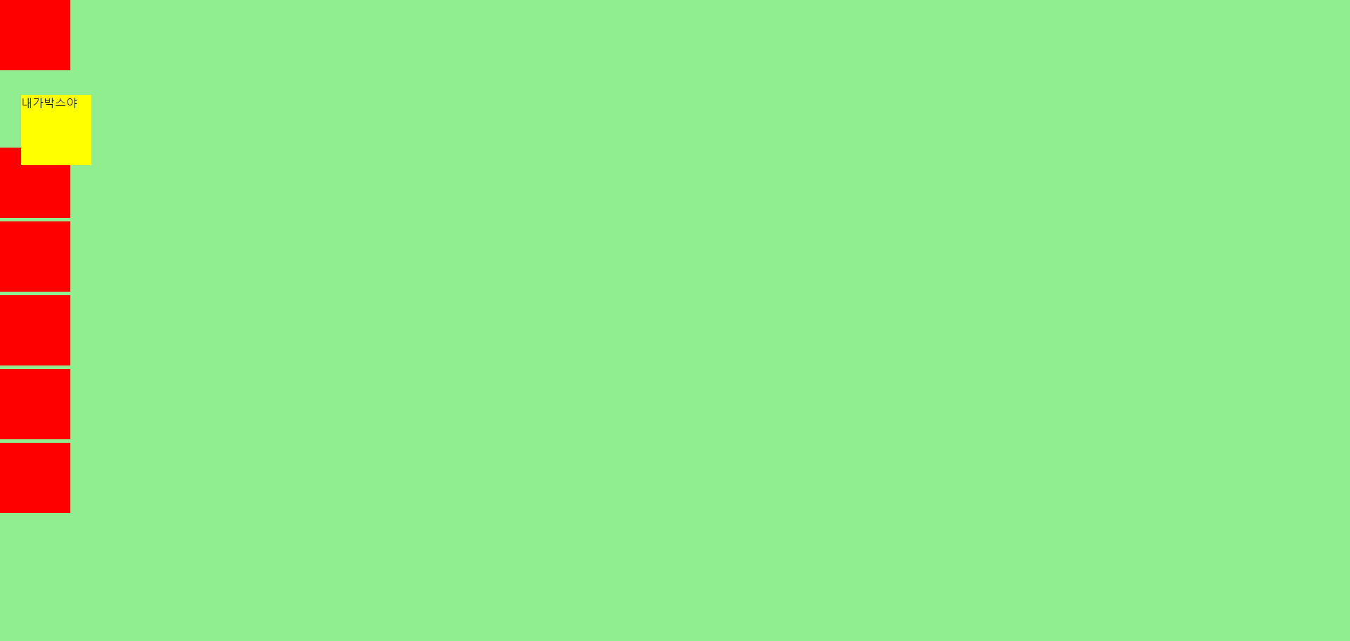
position : relative; 기존에 있었던 곳에서 오른쪽 하단으로 이동했다.
왜 이렇게 이동했을까?
자기자신의 기준점으로 top30px; , left: 30px;만큼 이동한다고 보면된다.
따라서 자기 자신을 기준으로 top, right, bottom, left의 값에 따라 오프셋을 적용한다.
세번째 position : absolute
상위에 있는 요소의 자리를 기준으로 위치를 이동하는 속성이다.
이번엔 position : relative; 대신 position : absolute;을 넣어주자.
CSS
.box{
width: 100px;
height: 100px;
background:yellow;
margin-bottom: 5px;
position : absolute;
top: 30px;
left: 30px;
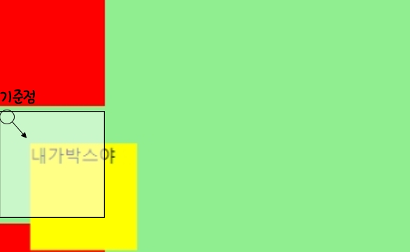
} 결과

여기서 relative 와 무엇이 바꼇을까?
absolute는 상위 태그를 상대적으로 배치한다.absolute는 위치 지정 요소가 없다면 초기 컨데이너 블록을 기준으로 잡는다.absolute자기 위치를 없애고 이동한다.
현재 예제는 상위 태그 중 position: relative 가 없기 때문에 body태그 의 기준으로 잡고 이동한것을 볼 수 있다.
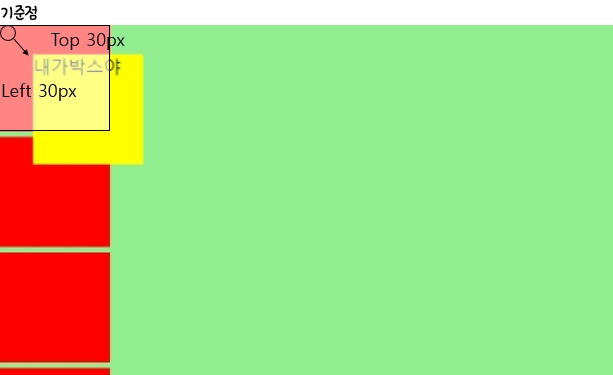
그리고 또 다른점은 absolute는 relative와 다르게 자기 위치를 없애고 이동한 것을 볼 수 있다.
네번째 position : fixed
상위에 있는 요소의 자리의 영향받지 않으며 위치를 이동하고 그자리에 꼭 붙어있는 속성이다.
CSS
.box{
    width: 100px;
    height: 100px;
    background:yellow;
    margin-bottom: 5px;
    position : fixed;
    top: 30px;
    left: 30px;
} 
뭐가 다른걸까?
사진만 보면 absolute 와는 다를게 없어보인다.
쉽게 이해 하기위해 div태그를 왕창 추가해서 스크롤을 만들고,
위치를 보기 위해 상위태그인 parent을 추가하여 확인해보자.
HTML
    <div class="parent">
        <div></div>
        <div class="box">내가박스야</div>
        <div class="center"></div>
        <div></div>
        <div></div>
        <div></div>
        <div></div>
        <div></div>
        <div></div>
        <div></div>
        <div></div>
        <div></div>
        <div></div>
        <div></div>
        <div></div>
    </div>
CSS
.parent{
    width: 500px;
    height: 500px;
    background:yellowgreen;
    position: relative;
    top: 100px;
    left: 100px;
}

.box{
    width: 100px;
    height: 100px;
    background:yellow;
    position: fixed;
    margin-bottom: 5px;
    top: 30px;
    left: 30px;
}
상위태그인 parent에게 위치를 이동하고 연두색의 색을 입히고 확인을 해보자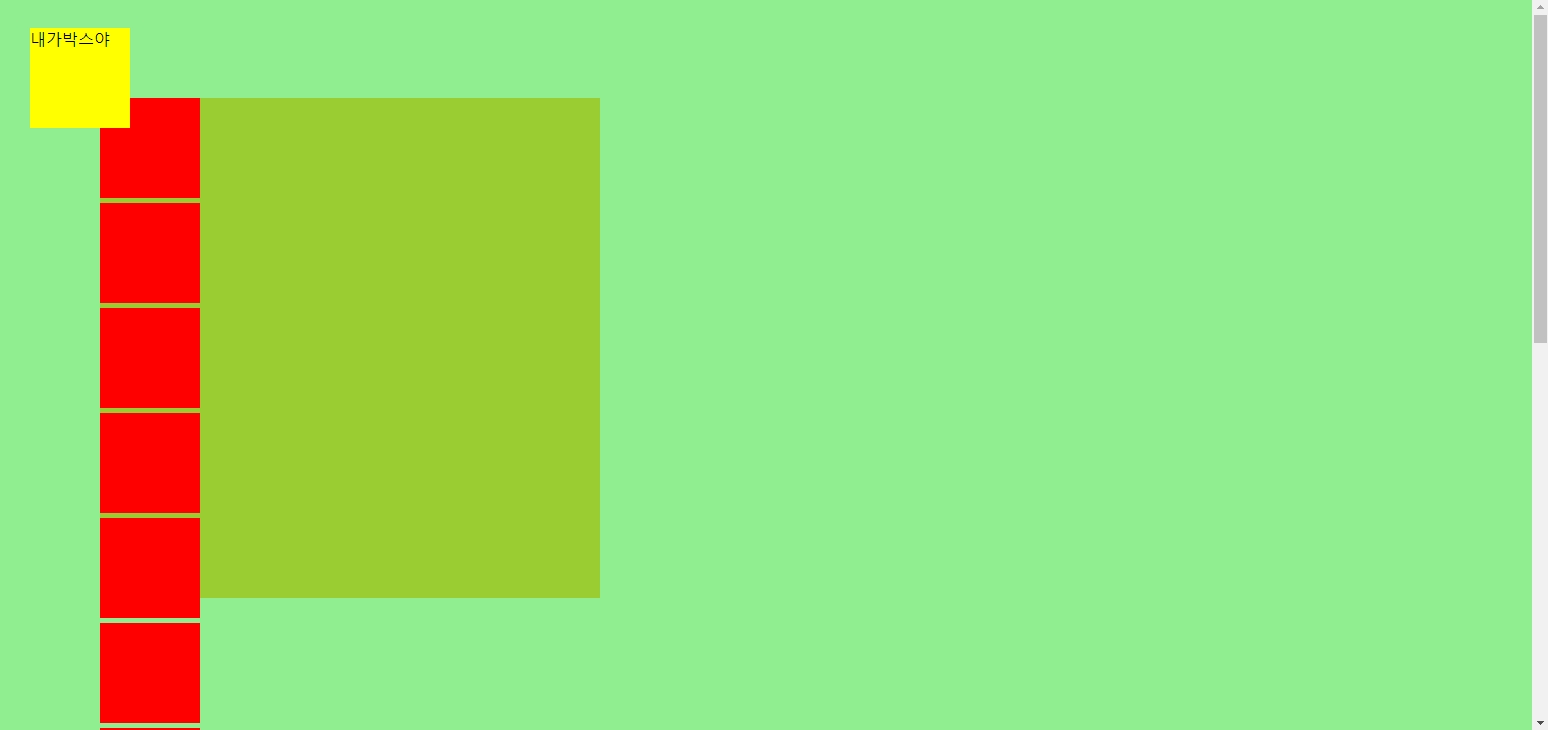
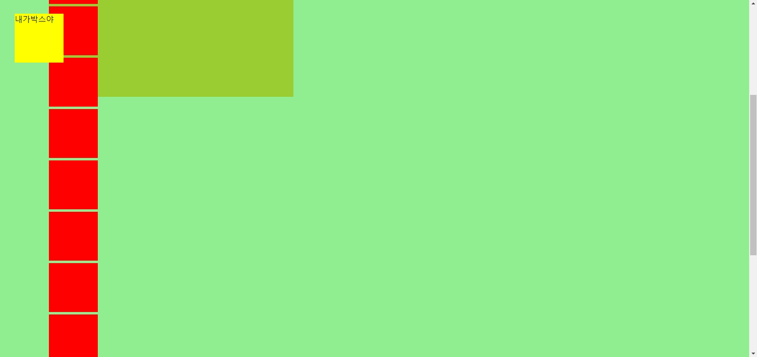
스크롤을 이동해도 노란색 박스가 붙어있는걸 볼 수 있다.
Position으로 가운데 정렬하기
이제 응용을 해서 position을 원하는 위치에 넣어보자.
HTML
<div class="parent">
        <div></div>
        <div class="box">내가박스야</div>
        <div class="center">내가 가운데</div>
        <div></div>
        <div></div>
        <div></div>
        <div></div>
        <div></div>
        <div></div>
        <div></div>
        <div></div>
        <div></div>
        <div></div>
        <div></div>
        <div></div>
    </div>
우리가 사용하던 코드 중 center의 친구를 생성하고 상위 태그인 parent 가운데정렬 해보자.
CSS
div{
    width: 100px;
    height: 100px;
    background:red;
    margin-bottom: 5px;
}

.parent{
    width: 500px;
    height: 500px;
    background:yellowgreen;
    position: relative;
    top: 100px;
    left: 100px;
}


.center{
    width: 100px;
    height: 100px;
    background: darkblue;
    position: absolute;
    top: 0;
    left: 0;
    color: #fff;
}
이렇게 실행하면
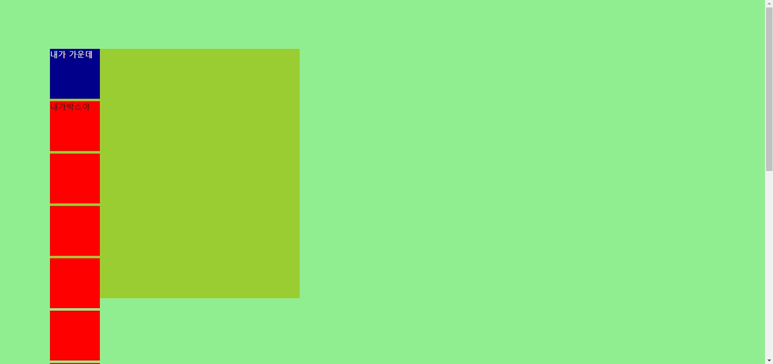
파란색 박스의 위치기준은 상위태그인 parent의 상단 왼쪽 끝이 된다.
여기서 .center에게
top: 50%; left50%; 를 absolute가 적용된 박스에게 주면
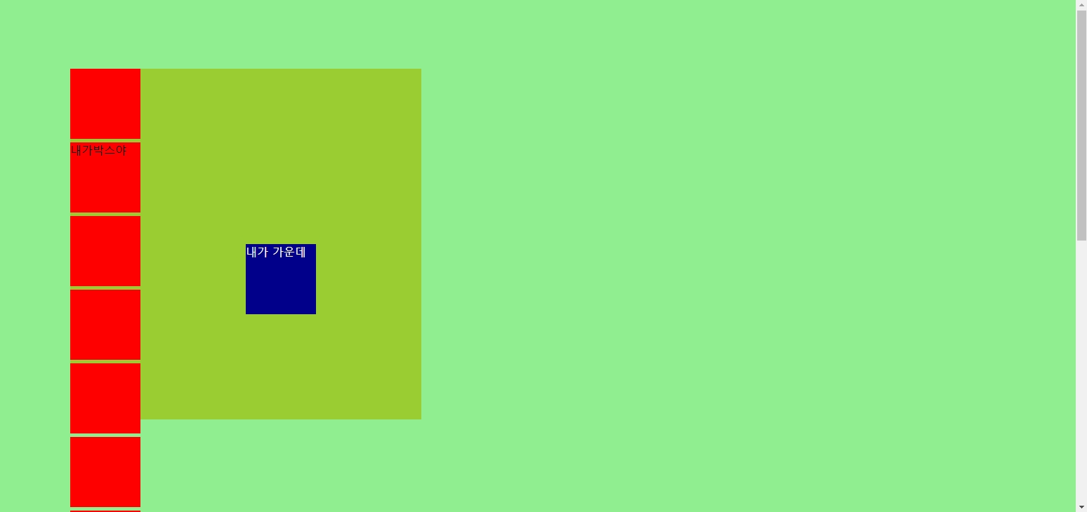
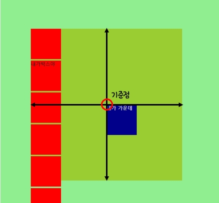
가운데로 오긴 했는데 정가운데가 아닌 거슬리는 가운데로 이동했다.
아래 그림처럼 기준점이 왼쪽 상단이라서 왼쪽 상단의 기준으로 가운데 정렬을 한것이다.
여기서 transform의 속성을 이용하여 위치를 이동시켜주자.
transform은 엘리먼트의 크기,위치,모양을 변경해주는 속성이다.
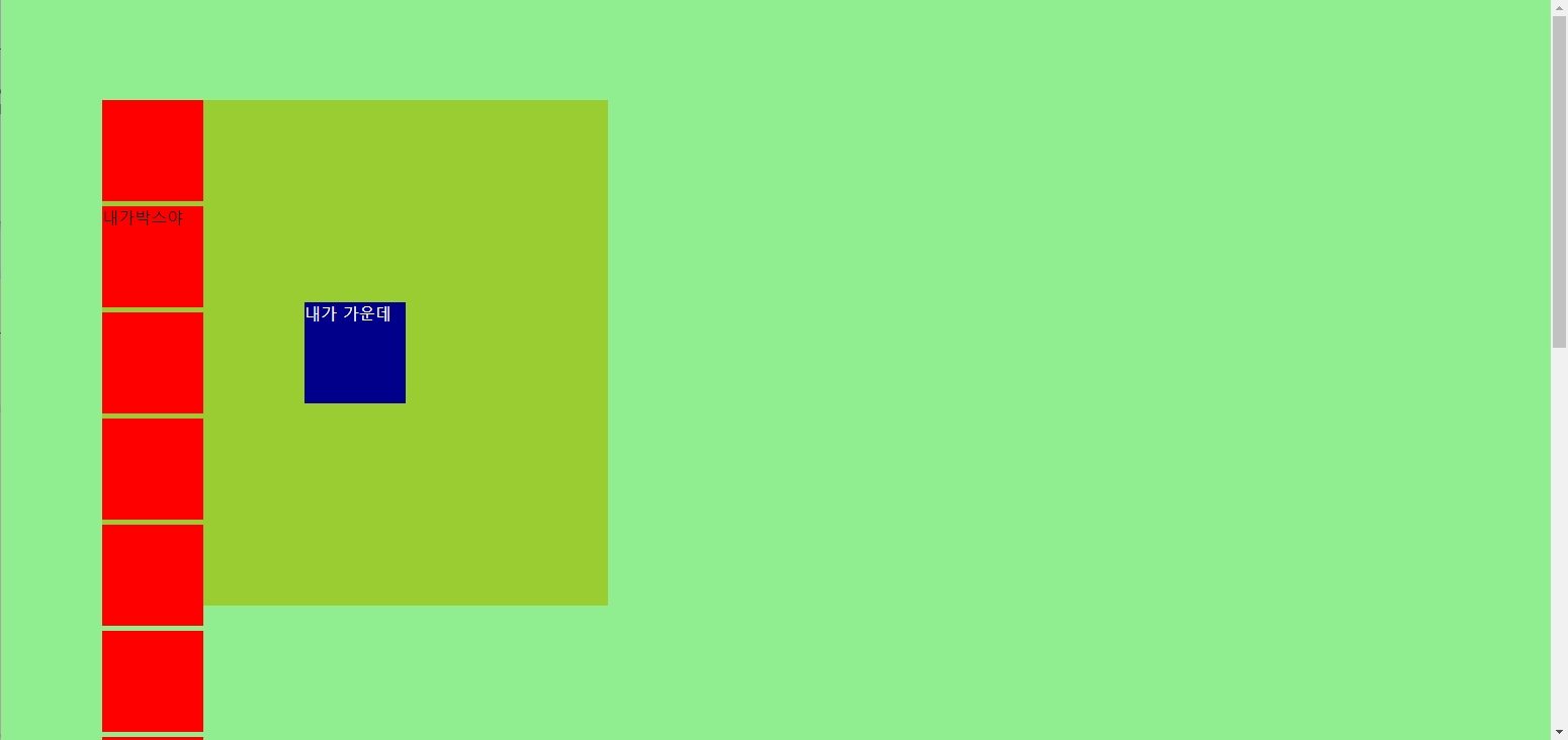
transform : translate(-50%,-50%);를 추가해주자.
.center{
    width: 100px;
    height: 100px;
    background: darkblue;
    position: absolute;
    top: 50%;
    left: 50%;
    color: #fff;
    transform : translate(-50%,-50%);
}
.jpg)
안정적으로 가운데로 들어간 모습이다.
정리
위치를 담당하는 position에는 여러가지 속성들이 존재한다.
- static : 기본값이며, 속성이 아무런 영향을 주지 않는다.
- relative : 원래 있어야하는 자리를 기준으로 이동하는 속성이다.
- absolute : 상위에 있는 (위치 속성이 들어간) 요소의 자리를 기준으로 위치를 이동하는 속성이다.
- fixed : 상위에 있는 요소의 자리의 영향받지 않으며 위치를 이동하고 그자리에 꼭 붙어있는 속성이다.