계속 figma로 UI/UX 디자인만 해왔다가
엘리스 부트캠프 통해서 html/css/javascript배운것 기초로
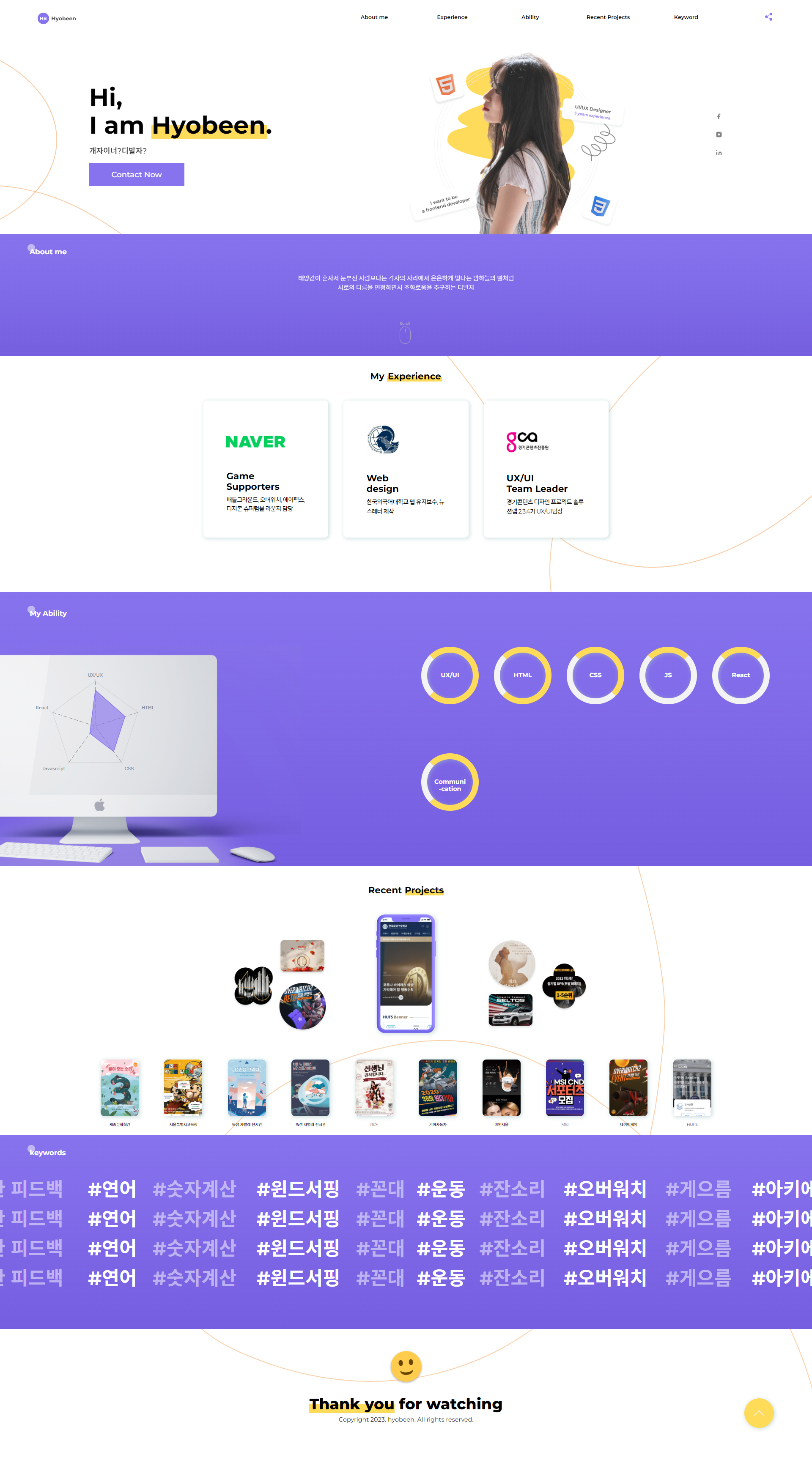
2주간의 개인 프로젝트로 진행하게 된 포폴 사이트 만들기

(⬆이미지 클릭하면 사이트로 이동합니다.)
프로젝트 가이드
목표
- 지금까지 학습한 웹 프로그래밍 지식을 서비스로 실현하며 해당 지식을 자신의 것으로 만들고, 2주 동안 웹 서비스를 성공적으로 완성하여 자신의 포트폴리오를 제작합니다.
- 요구사항에 따라 첫 날부터 개발을 진행하고, 나만의 자유롭게 기능을 추가 개발 혹은 개선함으로써 개발 역량을 향상시킵니다.
##1주차 가이드
➡️ 제공되는 개발 프로세스 및 기본 코드 구조를 기반으로, 자기소개 페이지를 완성합니다.
- 자기소개 페이지에는 다음 항목을 필수로 포함해야 합니다.
- Header : 표현된 정보로 이동할 수 있는 기능을 제공합니다.
- Main : 프로필 사진, 이름, 성별, 개발 능력, 주요 경험, 장단점, 좋아하는 것과 싫어하는 것 등 나를 표현할 수 있는 정보를 자유롭게 선정하여 표현합니다.
- Footer : 해당 사이트를 제작한 사람의 정보를 표현합니다.
- 그래픽 차트 라이브러리를 사용하여 정보를 1개 이상 표현합니다.
- CSS 애니메이션을 1개 이상 적용합니다.
- 데이터 동적 처리 : 반복되는 UI 구조에서는 데이터를 JS 혹은 JSON으로 저장한 뒤 불러와서 반복문을 통해 데이터를 표현합니다.
2주차: 자기소개 페이지 고도화
➡️ 완성한 자기소개 페이지에 기능을 추가 혹은 개선하며 확장 및 고도화합니다.
- 프로젝트 Advenced
필수 항목을 모두 채운 경우 다음 항목(예시)를 추가할 때마다 가산점을 포함합니다.
- 로컬 스토리지 혹은 IndexedDB 기술을 이용한 방명록 기능 만들기 (서버 이용 X)
- 내가 좋아하는 영화를 The Movie Database API를 통해 가져와서 표현하기
- 이미지 슬라이더 추가하기
- 이외의 추가하고 싶은 것
1주간은 엘리스에서 요구한 가이드라인에 최대한 맞춰서 PC버전으로 구현하는 것을 중점으로 두었다.
2주차때부터 고도화와 반응형 작업에 들어갔다.
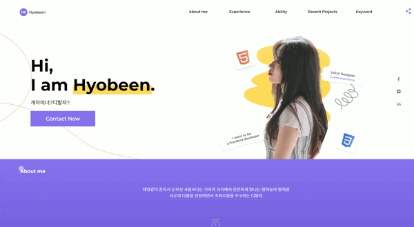
주변사람들이 폰에서는 잘 안보인다는 피드백을 줘서
모바일화면에서도 잘 보일 수 있도록 Media Query 작업을 처음해봤는데
디자인만해서 화면만 만드는것과 다르게 직접 구현하는 재미가 있었다.
새롭게 배운점
json데이터 연결, 구현
Json데이터와 연결해서 화면에 구현하는것도 프로젝트 과제중에 하나였는데
내가 좋아하는것, 싫어하는 keyword를 랜덤하게 뽑아서 흘러가도록 구현했다.
(싫어하는것 흐리게, 좋아하는것 선명하게 번갈아서 출력)
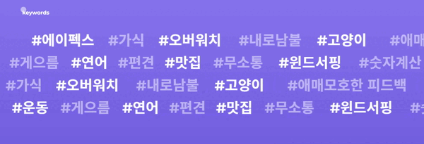
json
    { "favorite" : ["#에이펙스","#고양이","#운동","#연어","#맛집","#떡볶이","#사진촬영","#바텐더","#오버워치","#칵테일","#아키에이지","#매운음식","#게임","#윈드서핑"],
    "hate" : ["#꼰대","#편견","#내로남불","#무소통","#잔소리","#느끼한 음식","#애매모호한 피드백","#가식","#멍게","#숫자계산","#게으름"]
    }
javascript
//keywords json연결
const moveText1 = document.querySelector(".move_text1>.text1")
const moveText2 = document.querySelector(".move_text2>.text2")
const moveText3 = document.querySelector(".move_text3>.text3")
const moveText4 = document.querySelector(".move_text4>.text4")

const data = await fetch("./keywords.json").then((res) => res.json());

async function displayKeywords() {

    const favoriteData = data.favorite;
    const hateData = data.hate;

    const favoriteArray = favoriteData.sort(() => Math.random() - 0.5)
    const hateArray = hateData.sort(() => Math.random() - 0.5)
    const array = (a, b) => {
        let answer = '';
        for (let i = 0; i < 11; i++) {
            answer += `<td> ${a[i]}</td>`;
            answer += `<td> ${b[i]}</td>`;

        }
        answer += answer + answer + answer;
        return answer;
    }

    moveText1.innerHTML = array(favoriteArray, hateArray);
    moveText2.innerHTML = array(favoriteArray, hateArray);
    moveText3.innerHTML = array(favoriteArray, hateArray);
    moveText4.innerHTML = array(favoriteArray, hateArray);
}
어려웠던점
반응형-gnb 구현
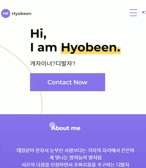
모바일화면에서 적합한 gnb화면을 출력하기가 어려웠다.
그리고 작은 창에서 큰 창으로 늘려도 gnb 출력부분에 에러가 생겨서
그부분 해결하는데 구글링으로 검색을 많이 하면서 시도끝에 원하는 화면이 나왔다.
gnb 코드
// PC버전

.header>nav {
    width: 60%;
    margin: auto 0;

}

.header>nav>.gnb {
    display: flex;
    justify-content: flex-end;
}

.header>nav>.gnb>li {
    width: calc(80%/5);
    font-size: 14px;
    font-weight: 600;
    list-style: none;
    cursor: pointer;
    text-align: center;

}

.header>nav>.gnb>li>a {
    color: black;
}

.header>nav>.gnb>li>a:hover {
    color: #8873EE;
} 입력하세요
//Mobile 버전
.header>nav>.gnb {
display: none;
}
.header>nav>.gnb.on {
position: fixed;
z-index: 9999;
display: block;
background: linear-gradient(49deg, rgba(117, 94, 224) 50%, rgba(117, 94, 224) 50%);
padding: 95px 0;
height: 100%;
width: 100%;
left: 0;
top: 0;
}
.header>nav>.gnb.on>li a {
display: block;
padding: 20px 0 20px 10px;
font-size: 14px;
color: #fff;
}
.header>nav>.gnb.on>li {
text-align: center;
width: auto;
}
.header .menu_toggle_btn {
cursor: pointer;
display: block;
position: relative;
width: 30px;
height: 2.1rem;
margin: auto 0;
z-index: 10000;
}
.header .menu_toggle_btn::before {
content: '';
position: absolute;
top: 6px;
left: 3px;
width: 80%;
height: 2px;
background-color: #8873EE;
transition: all ease 1s;
}
.header .menu_toggle_btn span {
position: absolute;
top: 50%;
left: 50%;
transform: translate(-50%, -50%);
width: 80%;
height: 2px;
background-color: #8873EE;
transition: all ease 1s;
}
.header .menu_toggle_btn::after {
content: '';
position: absolute;
bottom: 6px;
left: 3px;
width: 80%;
height: 2px;
background-color: #8873EE;
transition: all ease 1s;
}
.header .menu_toggle_btn.on {
position: fixed;
right: 8% top: 30px;
}
.header .menu_toggle_btn.on::before {
content: '';
position: absolute;
top: 6px;
left: 3px;
width: 100%;
height: 2px;
background-color: white;
transform: rotate(-45deg) translateY(9px) translateX(-6px);
}
.header .menu_toggle_btn.on span {
position: absolute;
top: 50%;
left: 50%;
transform: translate(-50%, -50%);
width: 100%;
height: 2px;
background-color: white;
transform: rotate(45deg) translateX(-8px) translateY(6px);
}
.header .menu_toggle_btn.on::after {
content: '';
position: absolute;
bottom: 6px;
left: 3px;
width: 80%;
height: 2px;
background-color: white;
display: none;
}앞으로 개선할 점
진짜 남에게 pr할 수 있는 포트폴리오 홈페이지를 만들자고 생각하고 진행했던 것이기 때문에
앞으로 진행하는 프로젝트를 추가하고 디벨롭할 예정이다.
- ability 내용 수정 (실무에서 개인능력 수치화하는것은 안좋다고 피드백 받음)
- 애니메이션 고도화
- 프로젝트 자세히 보기 기능 구현
- React로 구현

코딩하는 디자이너