
import pandas as pd
import numpy as np
import plotly.express as px
import matplotlib.pyplot as plt
import seaborn as sns
import koreanize_matplotlib
import warnings

warnings.filterwarnings('ignore')
%matplotlib inline
pd.set_option('display.max_columns', 100)
train = pd.read_csv('./cell2celltrain.csv')
# CustomerID, ServiceArea 컬럼 삭제
train = train.drop(["CustomerID", "ServiceArea"], axis=1)
# family 컬럼 생성
family_type = train.apply(lambda row : 'Nuclear Families' if (row['ChildrenInHH'] == 'Yes') & (row['MaritalStatus'] == 'Yes') else 'Childless' if (row['ChildrenInHH'] == 'No') & (row['MaritalStatus'] == 'Yes') else 'Single-parent' if (row['ChildrenInHH'] == 'Yes') & (row['MaritalStatus'] == 'No') else 'Unknown', axis=1)
train['Family'] = family_type
train[['AgeHH1','AgeHH2','MaritalStatus', 'ChildrenInHH', 'Family']]
# age 컬럼 생성
train['Age'] = (train['AgeHH1'] + train['AgeHH2'])/2
train.drop(['AgeHH1', 'AgeHH2'], axis=1, inplace=True)
# 항목 개수를 확인하기 위해 'count' 컬럼 생성
train['count'] = 1
# 이탈 고객과 미이탈 고객의 dataframe 각각 생성
churn_y = train[train['Churn']=='Yes']
churn_y = churn_y.reset_index(drop=True)
churn_n = train[train['Churn']=='No']
churn_n = churn_n.reset_index(drop=True)
# dataframe 이름과 컬럼명을 넣으면 항목별 비율 반환하는 함수
def get_percent(df_name, column_name):
return round(df_name[column_name].value_counts() / len(df_name) * 100, 1)
# 범주형, 수치형 구분하여 dataframe 생성
# HandsetPrice는 수치형인데 Unknown값이 들어가 있어서 제외
numeric_features = train[['MonthlyRevenue', 'MonthlyMinutes', 'TotalRecurringCharge', 'DirectorAssistedCalls', 'OverageMinutes', 'RoamingCalls', 'PercChangeMinutes',
'PercChangeRevenues', 'DroppedCalls', 'BlockedCalls', 'UnansweredCalls', 'CustomerCareCalls', 'ThreewayCalls', 'ReceivedCalls', 'OutboundCalls',
'InboundCalls', 'PeakCallsInOut', 'OffPeakCallsInOut', 'DroppedBlockedCalls', 'CallForwardingCalls', 'CallWaitingCalls', 'MonthsInService',
'UniqueSubs', 'ActiveSubs', 'Handsets', 'HandsetModels', 'CurrentEquipmentDays', 'RetentionCalls', 'RetentionOffersAccepted', 'ReferralsMadeBySubscriber',
'AdjustmentsToCreditRating', 'Age']]
categoric_features = train[['ChildrenInHH', 'HandsetRefurbished', 'HandsetWebCapable', 'TruckOwner', 'RVOwner', 'Homeownership', 'BuysViaMailOrder', 'RespondsToMailOffers',
'OptOutMailings', 'NonUSTravel', 'OwnsComputer', 'HasCreditCard', 'NewCellphoneUser', 'NotNewCellphoneUser', 'IncomeGroup', 'OwnsMotorcycle',
'MadeCallToRetentionTeam', 'CreditRating', 'PrizmCode', 'Occupation', 'MaritalStatus', 'Family', 'Churn']] HandsetPrice 컬럼
colors = sns.color_palette('RdYlGn', 16)
ax = train.HandsetPrice.value_counts().plot(kind="bar", figsize=(10, 6), width=0.9, color=colors)

for c in ax.containers:
    labels = [ x.get_height() for x in c ]
    ax.bar_label(c, labels= np.round(labels, 1), label_type='edge')

plt.rcParams['font.size'] = 12
plt.title('HandsetPrice(Count)')
plt.xticks(rotation=0)
plt.show()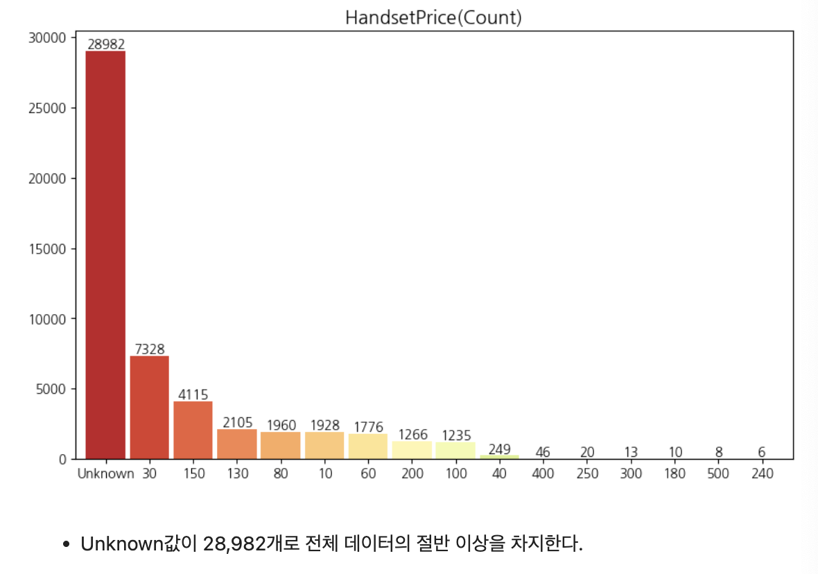
고객 이탈 비율
f, ax = plt.subplots(1, 2, figsize = (10, 8))
plt.subplots_adjust(wspace=0.3)

train['Churn'].value_counts().plot.pie(explode = [0, 0.05], # 각 조각 사이 거리
                                       autopct='%1.1f%%', # 퍼센트 표시
                                       ax=ax[0], # 첫번째 위치에 그리기
                                       colors=['#CED7EA', '#ff0f4f'],
                                       shadow=True)

ax[0].set_title('Customer Churn')
ax[0].set_ylabel('')

sns.countplot(data=train, x='Churn', ax=ax[1], palette=['#ff0f4f','#CED7EA'])
for p in ax[1].patches: # 데이터 텍스트 표시
    ax[1].annotate(format(p.get_height(), '.0f'), (p.get_x() + p.get_width() / 2., p.get_height()), ha='center', va='center', xytext=(0, 10), textcoords='offset points')
ax[1].set_title('Customer Churn (Count)')

plt.rcParams['font.size'] = 12

plt.show()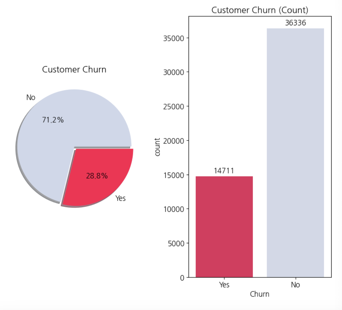
자녀 유무
f, ax = plt.subplots(1,2, figsize=(12,8))
plt.subplots_adjust(wspace=0.3)

ax[0].set_title('Customer with children Distribution')
sns.countplot(x='ChildrenInHH', data=train, ax=ax[0], palette=['#ffecab', '#89aae3'])
for p in ax[0].patches: # 데이터 텍스트 표시
    ax[0].annotate(format(p.get_height(), '.0f'), (p.get_x() + p.get_width() / 2., p.get_height()), ha='center', va='center', xytext=(0, 10), textcoords='offset points')

ax[1].set_title('Children : Churn and Non-churned')
sns.countplot(x='ChildrenInHH', data=train, hue='Churn', ax=ax[1], palette=['#ff0f4f', '#CED7EA'])
for p in ax[1].patches: # 데이터 텍스트 표시
    ax[1].annotate(format(p.get_height(), '.0f'), (p.get_x() + p.get_width() / 2., p.get_height()), ha='center', va='center', xytext=(0, 10), textcoords='offset points')

plt.rcParams['font.size'] = 12
plt.show()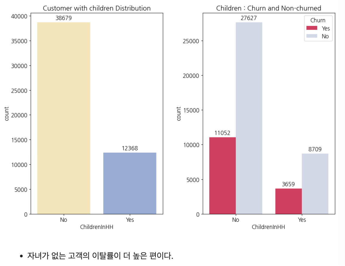
신용카드 보유
f, ax = plt.subplots(1,2, figsize=(12,8))
plt.subplots_adjust(wspace=0.3)

ax[0].set_title('Customer with Credit card Distribution')
sns.countplot(x='HasCreditCard', data=train, ax=ax[0], palette=['#ffecab', '#89aae3'])
for p in ax[0].patches: # 데이터 텍스트 표시
    ax[0].annotate(format(p.get_height(), '.0f'), (p.get_x() + p.get_width() / 2., p.get_height()), ha='center', va='center', xytext=(0, 10), textcoords='offset points')

ax[1].set_title('Credit card : Churn and Non-churned')
sns.countplot(x='HasCreditCard', data=train, hue='Churn', ax=ax[1], palette=['#ff0f4f', '#CED7EA'])
for p in ax[1].patches: # 데이터 텍스트 표시
    ax[1].annotate(format(p.get_height(), '.0f'), (p.get_x() + p.get_width() / 2., p.get_height()), ha='center', va='center', xytext=(0, 10), textcoords='offset points')

plt.rcParams['font.size'] = 12
plt.show()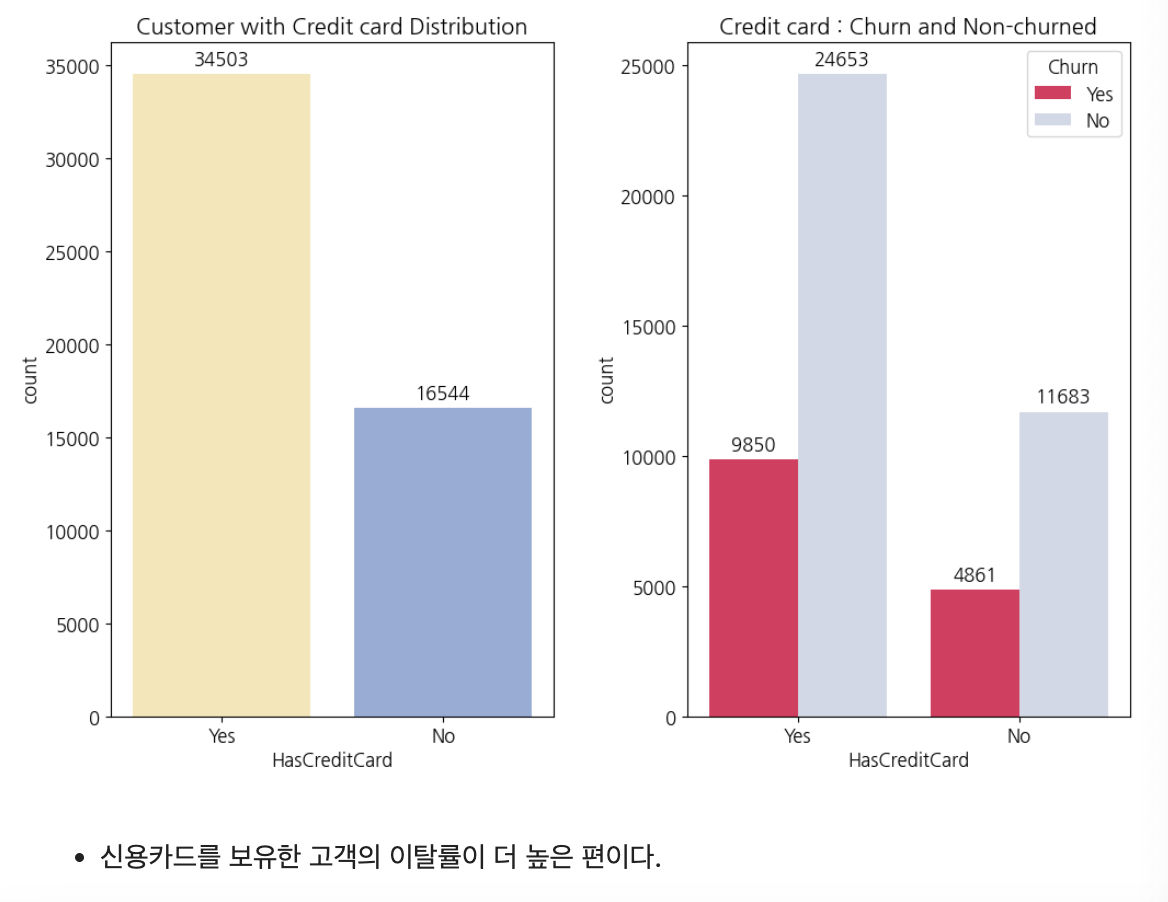
신용 등급
credit_percent = get_percent(train, 'CreditRating').sort_values(ascending=False)

f,ax = plt.subplots(1,2, figsize=(13,6))
sns.set_palette("pastel")

sns.countplot(x='CreditRating', data=train, order = train['CreditRating'].value_counts().index, ax=ax[0])
ax[0].set_title('전체 고객의 신용 등급')
ax[0].set_xticklabels(['High', 'Highest', 'Good', 'Low', 'Medium', 'Lowest', 'Very Low'])

(get_percent(churn_y, 'CreditRating').sort_values(ascending=False)).plot.pie(
    autopct='%1.1f%%',
    labels=['High', 'Highest', 'Good', 'Low', 'Medium', 'Lowest', 'VeryLow'],
    startangle=30,
    ax=ax[1],
    wedgeprops={'width': 0.7, 'edgecolor': 'w', 'linewidth': 4},
    shadow=False
)
ax[1].set_title('이탈 고객의 신용 등급')

plt.show()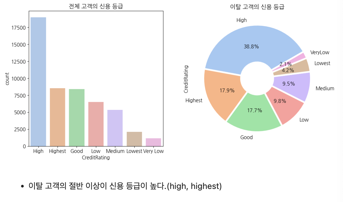
나이
# age_category 생성
train['age_category'] = np.nan

def fill_age_category(num1, num2, groupName):
    train.loc[(train['Age'] >= num1) & (train['Age'] <= num2), "age_category"] = groupName

fill_age_category(0, 0, 'zero')
fill_age_category(9, 19, 'student')
fill_age_category(20, 29, 'twenties')
fill_age_category(30, 39, 'thirties')
fill_age_category(40, 49, 'forties')
fill_age_category(50, 59, 'fifties')
fill_age_category(60, 92, 'senior')

# 나이가 0으로 표시된 고객 제외
age_except_zero = train[train['age_category'] != 'zero']

plt.pie(get_percent(age_except_zero, 'age_category'),
        autopct='%.1f%%',
        labels=['40대', '30대', '학생(9~19세)', '20대', '50대', '60세 이상'],
        explode=[0.05, 0.05, 0.05, 0.05, 0.05, 0.05],
        wedgeprops={'width': 0.7, 'edgecolor': 'w', 'linewidth': 4},
        colors=sns.set_palette("pastel"),
        shadow=False)

plt.show()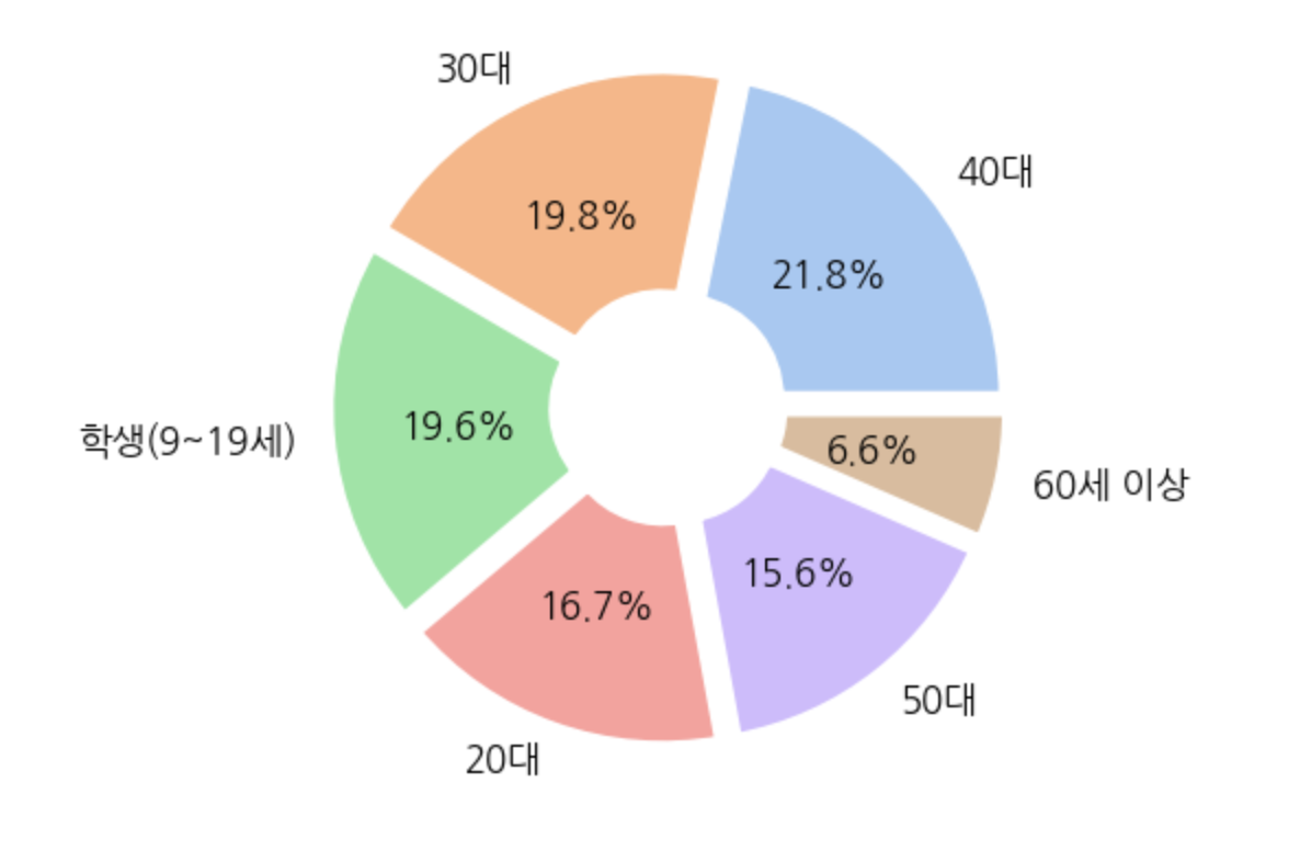
서비스 이용 기간
plt.hist((churn_y['MonthsInService'], churn_n['MonthsInService']),
         bins=50, histtype='stepfilled', color=['#ffe37d','#94959c'])
plt.xlabel('months in service')
plt.ylabel('count')
plt.legend(['이탈N', '이탈Y'])
plt.title('서비스 이용 기간')
plt.show()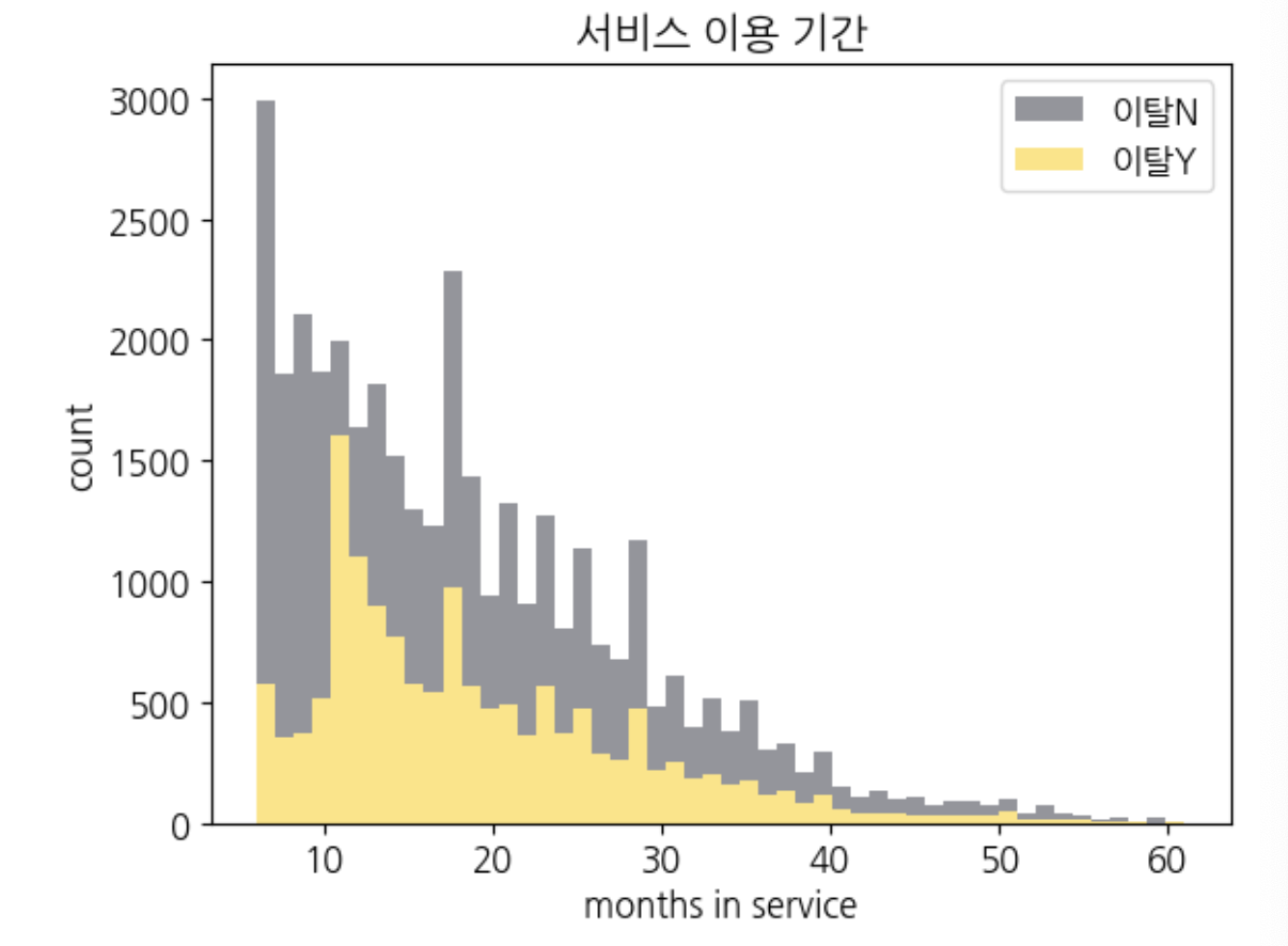
현재 기기 사용 기간
plt.hist((churn_y['CurrentEquipmentDays'], churn_n['CurrentEquipmentDays']),
         bins=50, histtype='stepfilled', color=['#ffe37d','#94959c'])
plt.xlabel('current euipment days')
plt.ylabel('count')
plt.legend(['이탈N', '이탈Y'])
plt.title('현재 기기 사용 기간')
plt.show()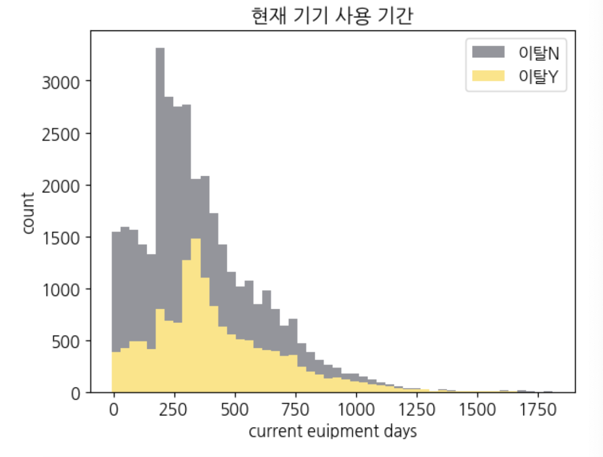
RetentionCalls(고객 → 서비스센터 전화 수)
f, ax = plt.subplots(1,2, figsize=(12,8))
plt.subplots_adjust(wspace=0.3)

ax[0].set_title('Made call to retention team (Count)')
order = ['No', 'Yes']
sns.countplot(x='MadeCallToRetentionTeam', hue='Churn', data=train, ax=ax[0], order=order, palette=['#ffecab', '#89aae3'])

for p in ax[0].patches: # 데이터 텍스트 표시
    ax[0].annotate(format(p.get_height(), '.0f'), (p.get_x() + p.get_width() / 2., p.get_height()), ha='center', va='center', xytext=(0, 10), textcoords='offset points')

ax[1].set_title('Retention Calls (Count)')
sns.countplot(x='RetentionCalls', data=train[train['RetentionCalls']>0], hue='Churn', ax=ax[1], palette=['#ff0f4f', '#CED7EA'])

for p in ax[1].patches: # 데이터 텍스트 표시
    ax[1].annotate(format(p.get_height(), '.0f'), (p.get_x() + p.get_width() / 2., p.get_height()), ha='center', va='center', xytext=(0, 10), textcoords='offset points')

plt.rcParams['font.size'] = 12
plt.show()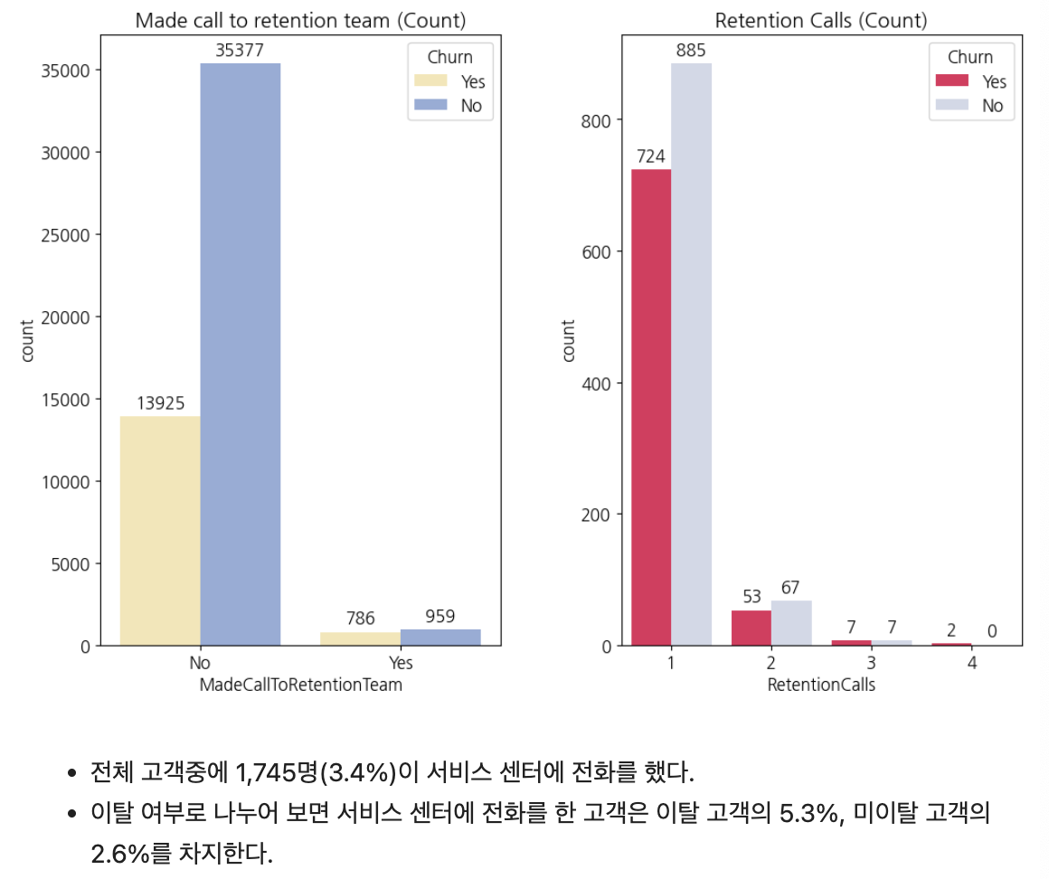

21세기 주인공