05_Fashion MNIST 의류 예측하기.ipynb
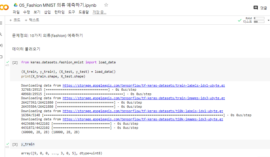
^ 데이터 불러오기
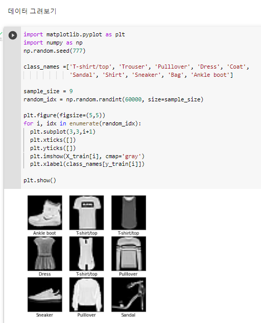
^ 데이터 그려보기
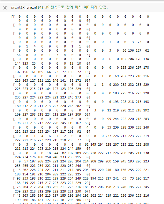
^ 픽셀값에 따라 이미지가 담김
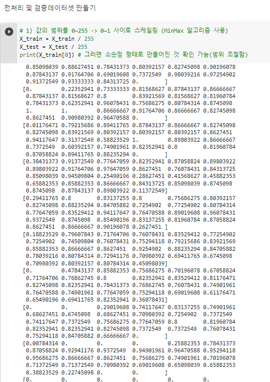
^ 스케일링하여 0~1사이로 범위 조절해줌
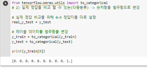
^ 어떤 아이템이 들어있는지 알 수 있다. 여기에서는 앵클부츠가 들어있음.
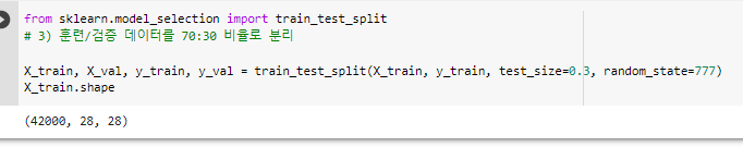
^ X_train 42000개 사용
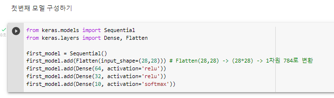
^ 첫번째 층은 3개의 레이어로 만듦.
^ 첫번째 모델 설정하기
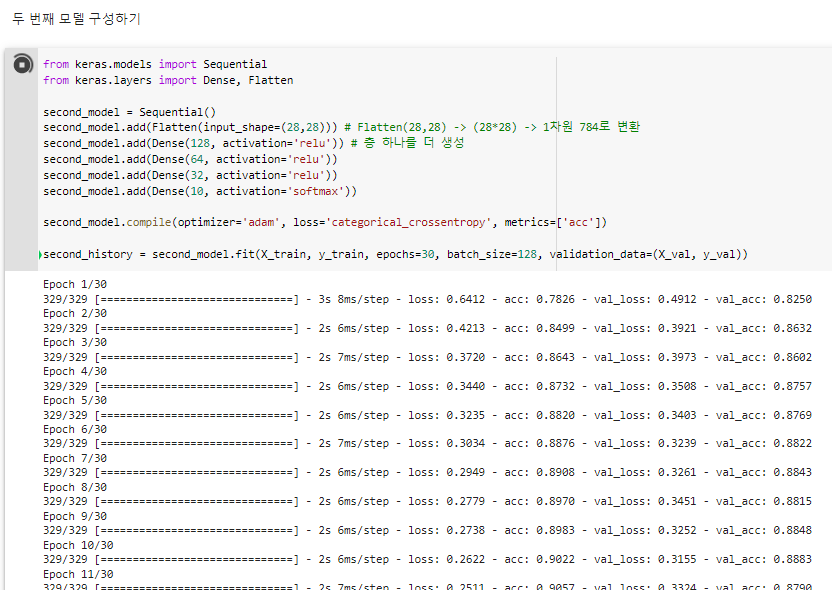
^ 두 번째 모델 구성하기
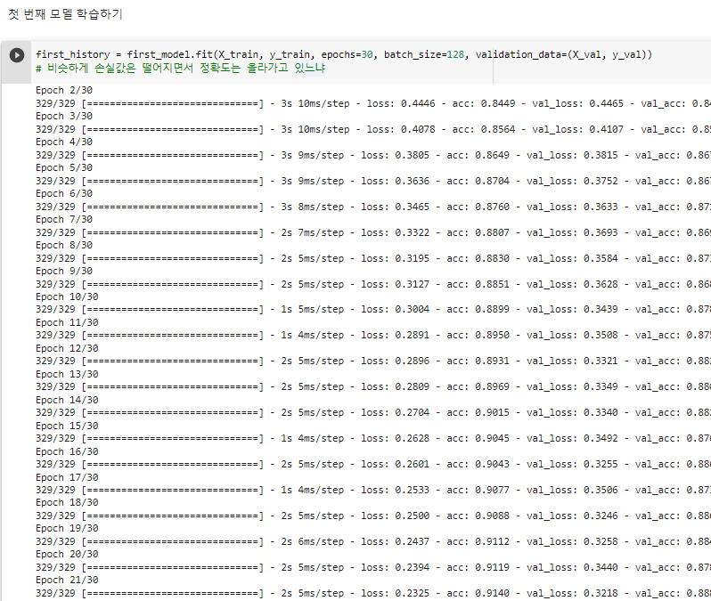
# 그래프를 보면 너무 많이 공부(over-fitting) 하다보니 다시 설정을 해보자. epochs 5 부터 해볼까.
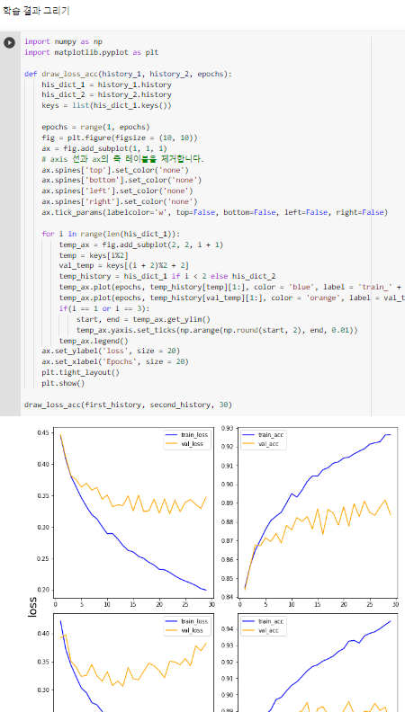
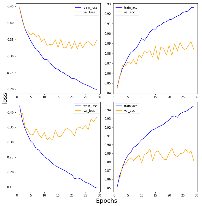
겹치는 부분을 보면 5번 정도 학습하면 되겠다. 많은 layer 가 필요없었다. 신경망이 깊다고 무조건 좋은건 아니다.import numpy as np
import matplotlib.pyplot as plt
def draw_loss_acc(history_1, history_2, epochs):
his_dict_1 = history_1.history
his_dict_2 = history_2.history
keys = list(his_dict_1.keys())
epochs = range(1, epochs)
fig = plt.figure(figsize = (10, 10))
ax = fig.add_subplot(1, 1, 1)
# axis 선과 ax의 축 레이블을 제거합니다.
ax.spines['top'].set_color('none')
ax.spines['bottom'].set_color('none')
ax.spines['left'].set_color('none')
ax.spines['right'].set_color('none')
ax.tick_params(labelcolor='w', top=False, bottom=False, left=False, right=False)
for i in range(len(his_dict_1)):
temp_ax = fig.add_subplot(2, 2, i + 1)
temp = keys[i%2]
val_temp = keys[(i + 2)%2 + 2]
temp_history = his_dict_1 if i < 2 else his_dict_2
temp_ax.plot(epochs, temp_history[temp][1:], color = 'blue', label = 'train_' + temp)
temp_ax.plot(epochs, temp_history[val_temp][1:], color = 'orange', label = val_temp)
if(i == 1 or i == 3):
start, end = temp_ax.get_ylim()
temp_ax.yaxis.set_ticks(np.arange(np.round(start, 2), end, 0.01))
temp_ax.legend()
ax.set_ylabel('loss', size = 20)
ax.set_xlabel('Epochs', size = 20)
plt.tight_layout()
plt.show()
draw_loss_acc(first_history, second_history, 30)^ 학습결과 그리기
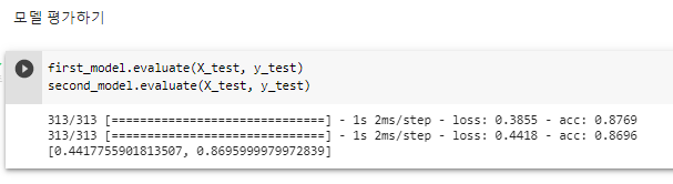
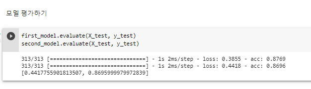
second_model 에 층(레이어)을 하나 더 깊게 팠더라도 first_model과 별로 차이가 없다. ^ 모델 평가하기
05Fashion MNIST 의류 예측하기 학습횟수조정.ipynb의 사본
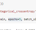
변경1: 기존 코드에서 첫번째 모델과 두번째 모델의 epochs 를 5 로 변경해줌
변경2: 학습결과 그릴때도 아래에 5로 바꿔줌
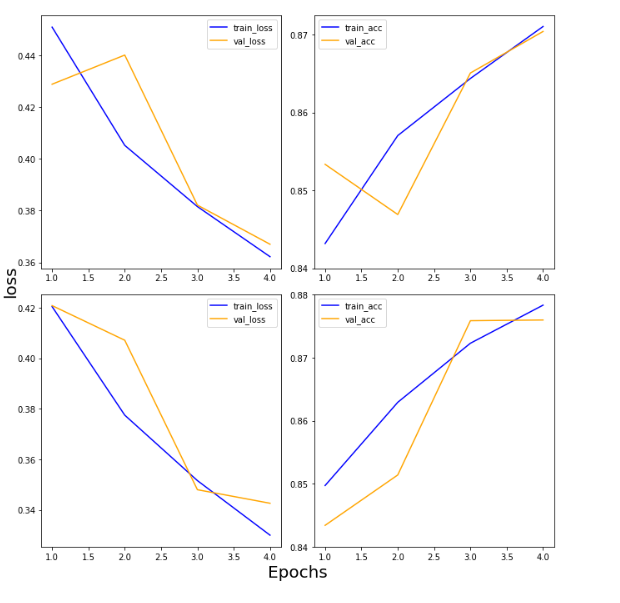
^ epochs = 5로 변경해주면 다음과 같은 결과가 나온다.
import numpy as np
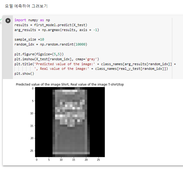
results = first_model.predict(X_test)
arg_results = np.argmax(results, axis = -1)
sample_size =10
random_idx = np.random.randint(10000)
plt.figure(figsize=(5,5))
plt.imshow(X_test[random_idx], cmap='gray')
plt.title('Predicted value of the image:' + class_names[arg_results[random_idx]] +
', Real value of the image:' + class_names[real_y_test[random_idx]])
plt.show()^ 모델 예측하여 그려보기
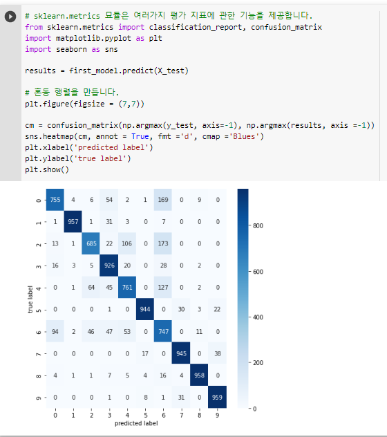
# sklearn.metrics 묘듈은 여러가지 평가 지표에 관한 기능을 제공합니다.
from sklearn.metrics import classification_report, confusion_matrix
import matplotlib.pyplot as plt
import seaborn as sns

results = first_model.predict(X_test)

# 혼동 행렬을 만듭니다.
plt.figure(figsize = (7,7))

cm = confusion_matrix(np.argmax(y_test, axis=-1), np.argmax(results, axis =-1))
sns.heatmap(cm, annot = True, fmt ='d', cmap ='Blues')
plt.xlabel('predicted label')
plt.ylabel('true label')
plt.show()
^ 모델 평가 방법 혼동행렬

Best ECommerce Website for Cloth manufacturing companies like Fabric and SportsWear
https://xsportswears.com
https://xathleticwear.com