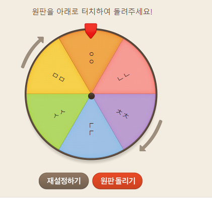
룰렛 선택
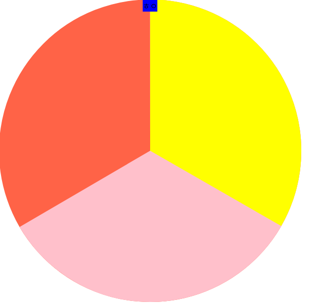
원 위에 떠있는 파란색 사각형이 룰렛이 멈춘 구역을 선택할 것이다.
이때 파란색 사각형이 가리키고있는 멈춘 구역(노드)을 어떻게 가져올까?
getBoundingClientRect()
뷰포트기준으로 얼마나 떨어져있는지 반환하는 함수이다.
콘솔로 찍어보면 다음과 같이 나온다.
이 좌표를 활용하면 좋을 것 같다.
elementsFromPoint(x,y)
좌표를 기준으로 엘리먼트를 반환하는 메서드다. 처음보는데 신기하네?
아무튼 이 친구를 사용하면 될 것 같다.
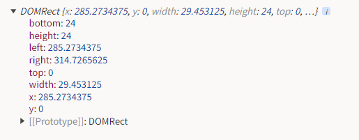
const { x: targetX, y: targetY } = $arrow.getBoundingClientRect();
$button2.addEventListener("click", () => {
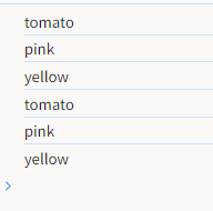
console.log(document.elementsFromPoint(targetX, targetY));
});
콘솔로 한번 찍어보니..흠. circle태그의 부모인 svg만 나온다.
아마 y값이 0이라서 circle은 찍히지 않는 것 같다. y축 기준 값을 조금이나마 더해 찾아내본다.
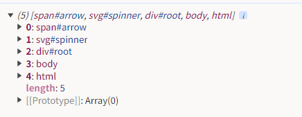
$button2.addEventListener("click", () => {
  console.log(document.elementsFromPoint(targetX, targetY + 1));
});
원이 바로 나왔다!
회전하고 있을때도 정상적으로 작동할까?
음 정상적으로 작동한다!
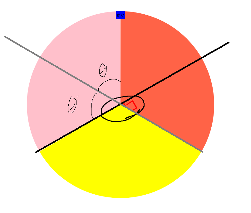
transform-origin
원 내부 부채꼴을 회전시킬때, rotate로 회전 후 translate로 위치를 잡아주었다.
왜냐면, 회전축이 좌상단인 (0,0)이었기 때문이다.
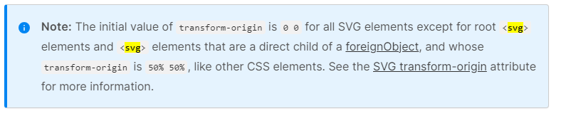
때문에 수식으로 위치를 옮겨주는 귀찮은 작업을 해야했다. svg도 통상노드처럼 중앙을 회전축으로 삼을 수 없을까?
circle{
  transform-origin:center
}
이 한방으로 해결됐다!
<!-- 이전코드 -->

          <svg width="600px" height="600px" id="spinner" viewBox="0 0 600 600">
            <circle r="150" cx="50%" cy="50%" stroke="tomato" fill="transparent" stroke-width="300"
              stroke-dasharray="calc(100 * calc(2*3.14*150) / 100) calc(2*3.14*150)"
              transform="rotate(-90) translate(-600)" />
            <circle r="150" cx="50%" cy="50%" stroke="pink" fill="transparent" stroke-width="300"
              stroke-dasharray="calc(66.6 * calc(2*3.14*150) / 100) calc(2*3.14*150)"
              transform="rotate(-90) translate(-600)" />
            <circle r="150" cx="50%" cy="50%" stroke="yellow" fill="transparent" stroke-width="300"
              stroke-dasharray="calc(33.3 * calc(2*3.14*150) / 100) calc(2*3.14*150)"
              transform="rotate(-90) translate(-600)" />
          </svg>

<!-- 수정 후 코드 -->

          <svg transform="rotate(-90)" width="600px" height="600px" id="spinner" viewBox="0 0 600 600">
            <circle r="150" cx="50%" cy="50%" stroke="tomato" fill="transparent" stroke-width="300"
              stroke-dasharray="calc(33.3 * calc(2*3.14*150) / 100) calc(2*3.14*150)" transform="rotate(-120)" />
            <circle r="150" cx="50%" cy="50%" stroke="pink" fill="transparent" stroke-width="300"
              stroke-dasharray="calc(33.3 * calc(2*3.14*150) / 100) calc(2*3.14*150)" transform="rotate(-240)" />
            <circle r="150" cx="50%" cy="50%" stroke="yellow" fill="transparent" stroke-width="300"
              stroke-dasharray="calc(33.3 * calc(2*3.14*150) / 100) calc(2*3.14*150)" transform="rotate(0)" />
          </svg>
transform-origin 변경 전에는 회전축이 0,0이어서 차트의 각 비율을 조절할때도 애를 먹었다.
이제는 점유율만큼 각도를 나눠주면 된다!
circle 내부 텍스트 넣어주기
svg에 text라는 요소를 이용해보겠다.
기존 span태그등과 다른점은 text요소 역시 svg처럼 벡터로 그려진다.

이 텍스트 요소를 원 안에 어떻게 넣을까?
먼저 각도 부터 해결해보자.
text의 각도(svg의 쌓임맥락)
내가 만들 돌림판은text요소의 회전값과 circle태그와 동일해야한다.
이때 g태그를 활용하여 하나의 그룹으로 묶어보겠다.
            <g transform="rotate(-120)">
              <circle r="150" cx="50%" cy="50%" stroke="pink" fill="transparent" stroke-width="300"
                stroke-dasharray="calc(33.3 * calc(2*3.14*150) / 100) calc(2*3.14*150)" />
              <text text-anchor="middle" x="50%" y="50%" font-size="50"
                fill="red">다라</text>
            </g>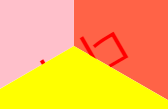
잘 안보이지만 중앙에 있다. text-anchor속성을 활용하여 중점기준에 두었다.
참고로 svg에서 z-index는 먹히지 않는다. svg의 쌓임맥락은 나중에 선언한 요소 우선이다
아무튼 글자를 얼만큼 회전시켜야 할까?
출처는 네이버!
글자를 위 사진처럼 배치하려면, 중앙각을 절반으로 나눠주면 될 것 같다.
참고로 분홍 부채꼴과 글자는 그룹화하였기 때문에 같은 회전값을 가졌다.
따라서 글자에만 회전을 주면 될 것 같다.
각 부채꼴의 중심각은 360/3 (120도)씩 분배되어있다.
따라서 각 부채꼴의 중심각 크기인 120도의 절반(60도) 만큼 글자를 회전 시키면 될 것 같다.
            <g transform="rotate(-120)">
              <circle r="150" cx="50%" cy="50%" stroke="pink" fill="transparent" stroke-width="300"
                stroke-dasharray="calc(33.3 * calc(2*3.14*150) / 100) calc(2*3.14*150)" />
              <text transform="rotate(60)" text-anchor="middle" x="50%" y="50%" font-size="50" fill="red">다라</text>
            </g>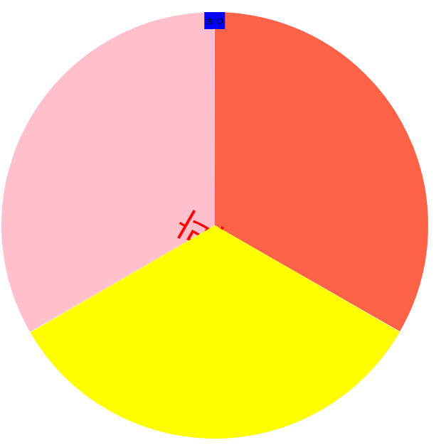
잘 안보이지만 각도가 분명히 돌아갔다 이제 위치를 조정해주어야 한다. 반지름의 절반만큼 이동하면 되지 않을까?
하지만 이 svg요소는 실제 원이 아니라 stroek-width를 이용한 기만임에 유의하자.
즉, 실제 반지름만큼 이동해주어야 한다.(기억 안나겠지만, 전편에서 두께 원의 반지름은 300으로 설정함)
            <g transform="rotate(-120)">
              <circle r="150" cx="50%" cy="50%" stroke="pink" fill="transparent" stroke-width="300"
                stroke-dasharray="calc(33.3 * calc(2*3.14*150) / 100) calc(2*3.14*150)" />
              <text transform="rotate(60) translate(150)" text-anchor="middle" x="50%" y="50%" font-size="50"
                fill="red">다라</text>
            </g>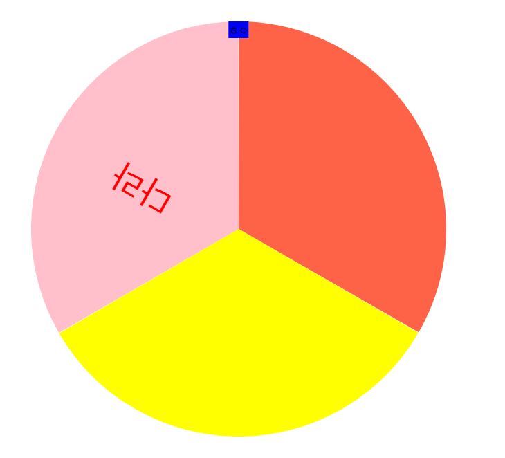
y축이 살짝 마음에 안드는데...이 부분은 다음편에 해결해보자!