1. props이 존재할 경우만 스타일 적용
ex) width, height 값이 존재할 경우만 스타일 적용
방법 1. AND 연산 활용
export const Button = styled.button<{width? : number, height? : number}>`
${({width})=> width && `width: ${width}px`};
${({height})=> height && `height: ${height}px`};
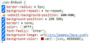
border : none;
color : #FFF;
font-family : 'Inter';
방법 2. if문 활용
  export const Button = styled.button<{width? : number, height? : number}>`

    ${({width})=> {
        if(width)
            return css`
            width : ${width}px;
        `
    }};

    ${({height})=> {
        if(height)
            return css`
            height : ${height}px;
        `
    }};

    border : none;
    color : #FFF;
    font-family : 'Inter';
cf) 만일 다음과 같이 width, height 값을 0으로 주면
<Button width={0} height={0}>확인</Button>
false로 평가되어
width, height 값이 적용되지 않습니다.
잘못 사용한 예
  export const Button = styled.button<{width? : number, height? : number}>`

  width : ${({width})=> `${width}px`};
  height : ${({height})=> `${height}px`};

  border : none;
  color : #FFF;
  font-family : 'Inter';
width, height값을 지정할 경우 정상적으로 스타일이 적용되지만
<Button width={136} height={48}>확인</Button>
다음과 같이 지정하지 않았을 경우
<Button>확인</Button>
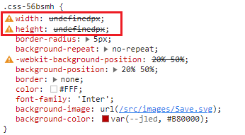
undefined로 값이 들어가 Invalid property value라는 warning이 표시되므로 위처럼 사용하지 않도록 합니다.
2. props값 없을 경우 디폴트 값 적용
ex) borderRadius 값을 다음과 같이 12로 줄경우 12px, 값이 없을 시 5px 적용
<Input width={456} placeholder="12345678" backgroundColor="#EAF2FF" borderRadius={20}/>
export const Input = styled.input<{borderRadius? : number}>`


    border: 1px solid var(--neutral-light-darkest, #C5C6CC);
    box-sizing : border-box;
    font-family : 'Inter';

    background-color : #000;
    border-radius : ${({borderRadius})=> borderRadius ? `${borderRadius}px` : '5px'};


    &[type=checkbox]{
        accent-color: #B80000;
    }

프론트엔드 개발자