230726 React-datepicker 커스터마이징
react-datepicker 커스터마이징
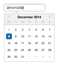
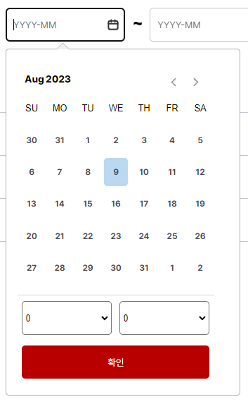
위와 같은 기본 스타일에서 아래와 같은 스타일로 변경하고자 합니다.
https://reactdatepicker.com/#example-custom-headerd 을 참고하여 만들었습니다.
npm install react-datepicker
npm install date-fns
npm install react-lodash
스타일 적용은 react-datepicker 컴포넌트 기본형을 화면에 표시한 후 개발자 도구에서 요소를 선택하여 스타일을 변경할 부분에 클래스 이름을 확인한 후, 변경하고자 하는 스타일을 적용하였습니다.(아래 DatePickerWrapper 컴포넌트에 (.react-datepicker__month-container, .react-datepicker__day-name 등))
import DatePicker from "react-datepicker"

// DatePicker 기본 css 스타일, import 하지 않을시 달력이 정상적으로 표시되지 않음
import 'react-datepicker/dist/react-datepicker.css';
import { ArrowLeft, Button, Wrapper } from "./Style"
import { ArrowRight } from "./Style"
import { getMonth, getYear } from "date-fns"
import { styled } from "styled-components";
import { Dispatch, SetStateAction} from "react"

const months = [
    'Jan', 'Feb', 'Mar', 'Apr','May', 'Jun', 'Jul', 'Aug', 'Sep', 'Oct', 'Nov', 'Dec'
 ];

const _ = require('lodash')
const hourArr = Array(25).fill(undefined).map((v,i)=> i);
const minuteArr = Array(61).fill(undefined).map((v,i)=> i);

const years = _.range(1980, getYear(new Date()) + 1, 1);


//타입 관련 오류 밣생하여 일단 any로 지정 후 타입 잡을 예정입니다.

interface IProps {
    date: any ;
    setDate: Dispatch<SetStateAction<any>>;
  }


// DatePicker css 스타일 적용합니다.


/*

const DatepickerWrapper = styled(DatePicker)`

	.react-datepicker{

    padding : 16px;
    width : 300px;

    .react-datepicker__header {
        background-color: #fff;
        color: #fff;
        border-bottom: none;
        border-radius: 0;
    }

	...

}

`
=> 위에 처럼 DatePicker에 직접 스타일을 적용하면 스타일이 변경되지 않는다.
DatePicker 컴포넌트의 Warpper 컴포넌트를 만들고 해당 컴포넌트에서 스타일을 적용하면 원하는 스타일대로 커스터마이징 할 수 있다.

*/


// Wrapper 컴포넌트
const DatepickerWrapper = styled.div`

.react-datepicker{

    padding : 16px;
    width : 300px;

    .react-datepicker__header {
        background-color: #fff;
        color: #fff;
        border-bottom: none;
        border-radius: 0;
    }

    .react-datepicker__month-container {

        padding-bottom : 16px;
        margin-bottom : 8px;
        border-bottom : 1px solid #D4D6DD;

        .react-datepicker__day-names{

            width : 280px;
            display : flex;
            justify-content : center;
            align-items : center;
            box-sizing : border-box;

            .react-datepicker__day-name{
                display : flex;
                width : 40px;
                height : 40px;
                justify-content : center;
                align-items : center;
            }
        }

        .react-datepicker__current-month{
            float : left;
        }

        .react-datepicker__month{
            margin : 0px;
        }

        .react-datepicker__week{

            width : 280px;
            display : flex;
            justify-content : space-around;

            > * {
                display : flex;
                width : 40px;
                height : 40px;
                justify-content : center;
                align-items : center;
                color: var(--neutral-dark-medium, #494A50);
                text-align: center;

                font-family: Inter;
                font-size: 12px;
                font-style: normal;
                font-weight: 700;
                line-height: normal;
            }

            .react-datepicker__day--selected{
                border-radius: 20px;
                background: var(--highlight-darkest, #006FFD);
                display: flex;
                width: 40px;
                height: 40px;
                justify-content: center;
                align-items: center;
                color : #fff;
            }
        }
}

.react-datepicker__children-container{
    width : 300px;
    }
}
`

//연월 선택 셀렉트 박스

const YearMonthSelect = styled.select<{width? : number}>`
    width : ${(props)=> props.width ? `${props.width}px` : ''};
    -Webkit-appearance : none;
    -moz-appearance : none;
    appearance: none;
    border : none;
    font-size : 14px;
    font-weight : 800;
    font-family : Inter;
`


//시간,분 선택 셀렉트 박스

const HourMonthSelect = styled.select<{width? : number}>`

    width : 128px;
    height : 48px;
    display : inline-block;

    border-radius : 5px;

    &:first-child{
        margin-right : 11px;
    }
`


// YYYY-MM-DD 형태로 변경하는 함수입니다.

export function getDate(date : Date | null) {

    if(date !== null){

    return date.getFullYear() +
		'-' + ( (date.getMonth()+1) < 9 ? "0" + (date.getMonth()+1) : (date.getMonth()+1) )+
		'-' + ( (date.getDate()) < 9 ? "0" + (date.getDate()) : (date.getDate()) );
    }
}

export default function CustomerDatePicker({date, setDate} : IProps){

    return(

        <DatepickerWrapper>
            <DatePicker formatWeekDay = {(nameOfday) => nameOfday.toUpperCase().slice(0,2)} selected={new Date(date)} onChange={(date) => setDate(getDate(date))
            } renderCustomHeader={({
                date,
                changeYear,
                changeMonth,
                decreaseMonth,
                increaseMonth,
                prevMonthButtonDisabled,
                nextMonthButtonDisabled
            }) => (
            <div
                style={{
                margin: 10,
                }}
            >
                <Wrapper float="left">
                    <YearMonthSelect width={30}
                        value={months[getMonth(date)]}
                        onChange={({ target: { value }} : any) =>
                        changeMonth(months.indexOf(value))
                        }
                    >
                        {months.map(option => (
                        <option key={option} value={option}>
                            {option}
                        </option>
                        ))}
                    </YearMonthSelect>

                    <YearMonthSelect
                        value={getYear(date)}
                        onChange={({ target: { value }} : any) => changeYear(Number(value))}
                    >
                        {years.map((option : any) => (
                        <option key={option} value={option}>
                            {option}
                        </option>
                        ))}
                    </YearMonthSelect>
                </Wrapper>
                <Wrapper float="right">
                    <Button width={12} height={12} style={{backgroundColor : "transparent"}} position="relative" onClick={decreaseMonth} disabled={prevMonthButtonDisabled}>
                        <ArrowLeft onClick={decreaseMonth}/>
                    </Button>
                    <Button width={12} height={12} style={{backgroundColor : "transparent"}}position="relative" onClick={increaseMonth} disabled={nextMonthButtonDisabled}>
                        <ArrowRight/>
                    </Button>
                </Wrapper>
            </div>
        )}>
            <Wrapper marginBottom={15}>
            <HourMonthSelect name ="hour">
                {hourArr.map((hour)=>(
                    <option value={hour}>{hour}</option>))
                }
            </HourMonthSelect>
            <HourMonthSelect name ="minute">
                {minuteArr.map((minute)=>(
                    <option value={minute}>{minute}</option>))
                }
            </HourMonthSelect>
            </Wrapper>
            <Button width={267} height={47}>확인</Button>
            </DatePicker>
        </DatepickerWrapper>
    )
}
부모 컴포넌트에서 사용
import CustomerDatePicker from "./common/DatePicker"
import { getDate } from "./common/DatePicker"


export default function Main(){

...

    const [date, setDate] = useState<any>(getDate(new Date()));

....

return(

  ...

  	<CustomerDatePicker date = {date} setDate={setDate} />

  ...

  )

}
프론트엔드 개발자