TIL DAY 198

오늘 배운 일
✔️ CSS Layout
🎲 IIII) Flexbox
오늘은 flex-grow, flex-shrink 에 대해 배워볼건데...
이 두개의 property 들을 자식 요소에게 줄 수 있다.
예를 보면...
index.html
<body>
  <div class="box">1</div>
  <div class="box">2</div>
  <div class="box">3</div>
</body>
style.css
body {
  display : flex;
  justify-content:space-around;
  width: 100%;
}

.box {
  width: 300px;
  height: 200px;
  background : peru;
  color : white;
  font-size: 50px;
  display: flex;
  justify-content: center;
  align-items: center;
}

.box:nth-child(2) {
  background: #000;
}
결과는...
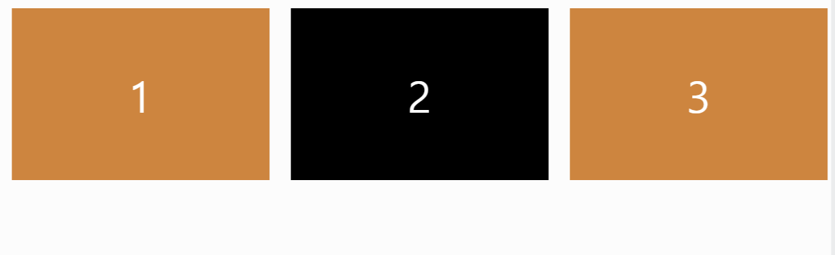
2 번째 box 를 검은색으로 만들어주었다.
그러면 flex-shrink 에 대해 먼저 알아보자!
✂ flex-shrink (property)
flex-shrink 는 기본적으로 element 의 행동을 정의한다. 그 때가 바로 flexbox 가 쥐어짜질 때 말인 것이다.
전에 배웠듯이, flex-wrap 의 기본값은 nowrap 이다.
그 말은 즉 가로 길이를 설정해두었다 해도, flexbox 는 최대한 요소들을 한 줄에 있게끔 만들거라 길이가 줄어둘 수도 있다.
그러면 이제 flex-shrink 를 적용해보자!
flex-shrink 의 기본값은 1 이다. 그 뜻은 두 번째 박스를 flex-shrink : 1 로 만들어도, 해당 박스들을 줄어들게 만들면 다 똑같은 사이즈로 줄어든다.
그럼 이제 진짜로 적용해보면...
style.css
body {
  display : flex;
  justify-content:space-around;
  width: 100%;
}

.box {
  width: 300px;
  height: 200px;
  background : peru;
  color : white;
  font-size: 50px;
  display: flex;
  justify-content: center;
  align-items: center;
}

.box:nth-child(2) {
  background: #000;
  flex-shrink: 2;
}
flex-shrink 을 2로 지정해두고 화면을 줄어보면...
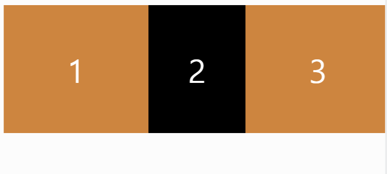
2 번째 검정색 박스는 1번과 3번 박스보다 2배가 더 줄어든다.
이 프로퍼티는 유용하게 쓰일 수 있는게 가끔 유저들은 모든 box 들을 같은 크기로 찌그러지는 걸 원하지 않을수 있기 때문이다.
그리고 다른 박스한테 flex-shrink 를 적용해보면...
style.css
body {
  display : flex;
  justify-content:space-around;
  width: 100%;
}

.box {
  width: 300px;
  height: 200px;
  background : peru;
  color : white;
  font-size: 50px;
  display: flex;
  justify-content: center;
  align-items: center;
}

.box:nth-child(2) {
  background: #000;
  flex-shrink: 3;
}

.box:nth-child(3) {
  flex-shrink: 2;
}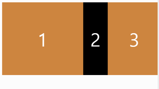
2 번째 박스한테 flex-shrink 3을 하고, 3 번째한테는 2를 주니 위의 결과물처럼 화면을 줄이니까, 확실히 차이가 명확하다.
그럼 이제 flex-grow 에 대해 알아보자!
📝 flex-grow (property)
이름에서 부터 추측할 수 있듯이, flex-grow 는 flex-shrink 와 반대로 작용한다.
그러니까 얼마나 박스들이 커질까?
예 )
style.css
body {
  display : flex;
  justify-content:space-around;
  width: 100%;
}

.box {
  width: 300px;
  height: 200px;
  background : peru;
  color : white;
  font-size: 50px;
  display: flex;
  justify-content: center;
  align-items: center;
}

.box:nth-child(2) {
  background: #000;
  flex-grow: 1;
}
결과는...
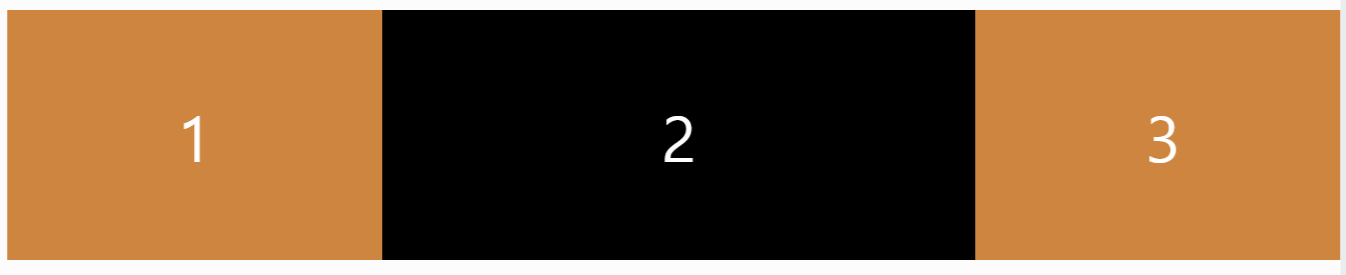
flex-grow : 1 를 설정해두니, 2번째 박스가 화면을 늘릴때마다 다른 박스들보다 커진다.
그리고 기본값은 0이다.
3 번재 박스를 2로 설정해두면...
style.css
body {
  display : flex;
  justify-content:space-around;
  width: 100%;
}

.box {
  width: 300px;
  height: 200px;
  background : peru;
  color : white;
  font-size: 50px;
  display: flex;
  justify-content: center;
  align-items: center;
}

.box:nth-child(2) {
  background: #000;
  flex-grow: 1;
}

.box:nth-child(3) {
  flex-grow: 2;
}
flex-shrink 와 flex-grow 는 반응형 디자인을 할 때 유용하다.
마지막으로 flex-basis 에 대해 알아볼 것 이다.
🎯 flex-basis (property)
flex-basis 는 자식 요소에게 적용되는 flex 의 property 이다.
예 )
style.css
body {
  display : flex;
  justify-content:space-around;
  width: 100%;
}

.box {
  flex-basis: 300px;
  background : peru;
  color : white;
  font-size: 50px;
  display: flex;
  justify-content: center;
  align-items: center;
}

.box:nth-child(2) {
  background: #000;
}
결과는...

flex-basis 를 300px 로 지정해두었는데, 결과물을 보면 width 와 비슷하다고 볼 수 있다고 할 수 있다.
flex-basis 는 element 에게 처음 크기를 주는 것이다.
정확히는 모든게 찌그러지거나 늘어나기 전에 말이다.
하지만 flex-basis 는 width 에만 해당되는게 아니다.
현재 위의 코드에서는 flex-direction 은 row 이여서, main-axis 는 가로축이다.
그 말은, 위 같은 경우에는 flex-basis 는 수평으로 그러니까 width 인 셈인것 이다.
그러면 flex-direction 은 column 으로 바꾸면...

column 으로 바꾸니, flex-basis 는 height 이 되었다.
이번엔는 main axis 는 vertical 그러니까 세로축이다.
결론적으로는 flex-direction 에 따라 width 가 될 수 있고, height 이 될 수 있다.
끝으로 :
- 오늘은 마지막 flexbox 에 대해 알아보았다.
- 확실히 다시 공부해보니 정확히 이해하된다.
