TIL DAY 199
오늘 배운 일
✔️ CSS Layout
👑 Grid [part I]
Grid 는 flex 와 동일하게 부모 요소한테 써주면 된다.
예 )
.father {
	display: grid;
}
grid 는 flexbox 와 거의 비슷한 규칙을 가지고 있다.
대부분의 시간을 부모 요소에 대해 얘기할 것 이다.
flexbox 처럼 자식 요소에 대해 얘기할 것이지만, grid design 은 father 에서 진행한다.
index.html
  <div class="father">
    <div class="child">1</div>
    <div class="child">2</div>
    <div class="child">3</div>
  </div>
style.css
html, body {
  height: 100%;
  width: 100%;
}

.father {
  display: grid;
}

.child {
  background-color: peru;
  color: white;
  font-size: 50px;
  display: flex;
  justify-content: center;
}
결과는...

요소를 자세히보면...
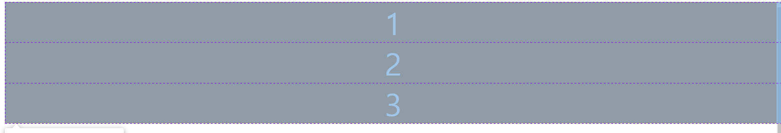
부모 요소인 father 라는 클래스를 가지고 있는 div 한테 display: grid 를 적용하니 3개의 줄(row)이 생겼다.
그럼 이제 grid 한테 행(row)과 열(column)에 대해 알아보자!
먼저 column 이 몇 개인지 보자면...
.father {
  display: grid;
  grid-template-columns: ;
}
grid-template-columns 프로퍼티는 원하는 만큼 columns 의 개수와 크기를 작성할 수 있다.
한 번 쓰자면...
index.html
  <div class="father">
    <div class="child">1</div>
    <div class="child">2</div>
    <div class="child">3</div>
    <div class="child">4</div>
  </div>
style.css
html, body {
  height: 100%;
  width: 100%;
}

.father {
  display: grid;
  grid-template-columns: 25px 55px 85px 100px;
}

.child {
  background-color: peru;
  color: white;
  font-size: 50px;
  display: flex;
  justify-content: center;
}
첫 번째 column 은 25px, 두 번째는 55px, 세 번째는 85px 그리고 마지막 column 은 100px 인것이다.
이렇게 각 요소의 개수에 따라 크기를 지정해줄 수 있다.
만약 우리가 3 column grid 를 원한다면?
style.css
html, body {
  height: 100%;
  width: 100%;
}

.father {
  display: grid;
  grid-template-columns: 250px 250px 250px;
}

.child {
  background-color: peru;
  color: white;
  font-size: 50px;
  display: flex;
  justify-content: center;
}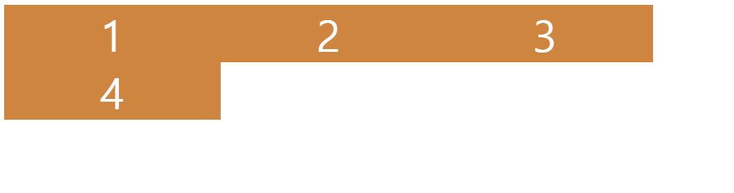
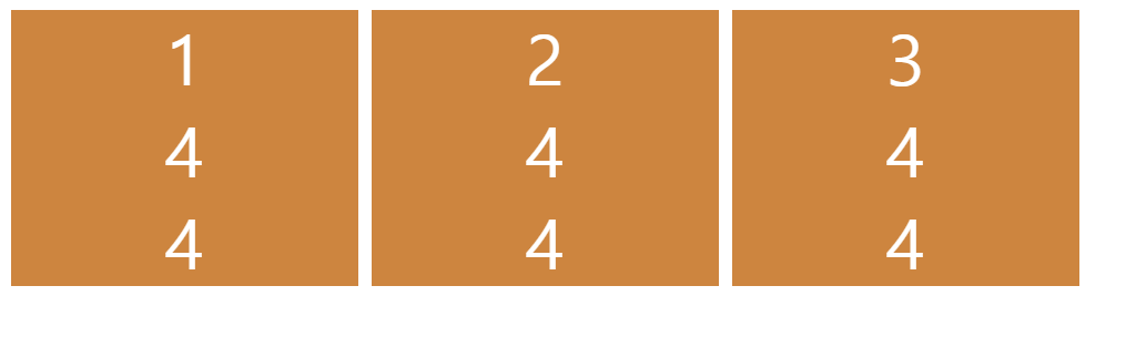
요소를 자세히보면...
grid-template-columns 프로퍼티에 3개만 작성하니 나머지 하나는 밑으로 내려가버렸다.
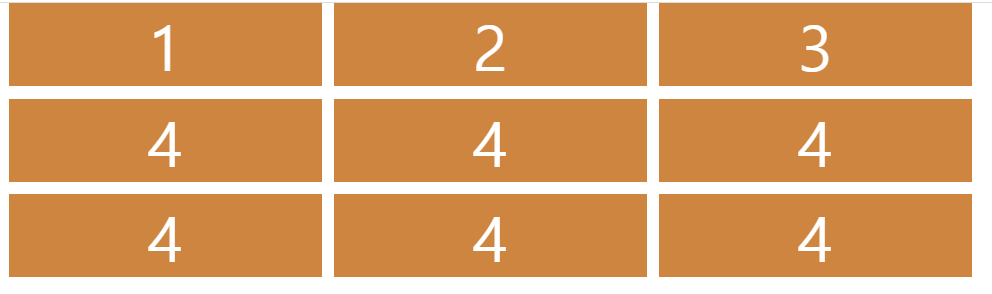
그러면 이제 요소들을 추가해보면...
3개의 열이 생겨버렸다.
그럼 이번엔 grid 에 공간을 넣으면 어떻게 되는지 알아보자!
style.css
html, body {
  height: 100%;
  width: 100%;
}

.father {
  display: grid;
  grid-template-columns: 250px 250px 250px;
  column-gap: 10px;
}

.child {
  background-color: peru;
  color: white;
  font-size: 50px;
  display: flex;
  justify-content: center;
}
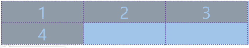
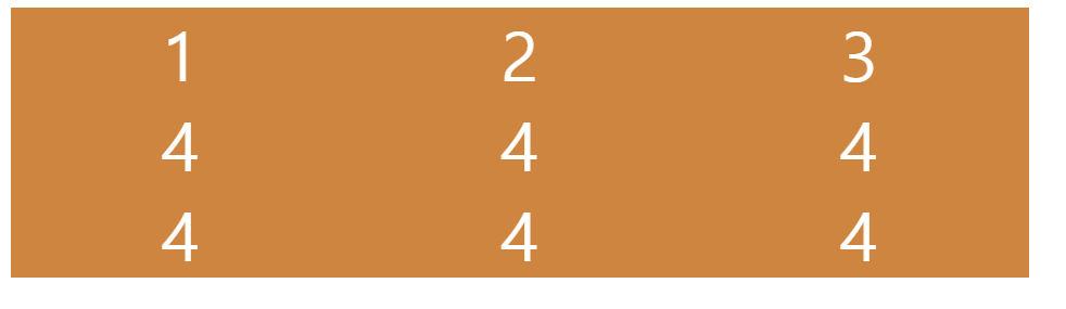
이제 모든 column 들을 10px 빈 공간이 생겼다.
row 또한 gap 을 줄 수 있다.
style.css
html, body {
  height: 100%;
  width: 100%;
}

.father {
  display: grid;
  grid-template-columns: 250px 250px 250px;
  column-gap: 10px;
  row-gap: 10px;
}

.child {
  background-color: peru;
  color: white;
  font-size: 50px;
  display: flex;
  justify-content: center;
}
이제 각 요소끼리 10px 공간이 생겼다.
아주 멋진 대칭 형태가 생긴것이다.
만약 이렇게 row, column 을 쓰기 싫으면...
style.css
html, body {
  height: 100%;
  width: 100%;
}

.father {
  display: grid;
  grid-template-columns: 250px 250px 250px;
  gap: 10px;
}

.child {
  background-color: peru;
  color: white;
  font-size: 50px;
  display: flex;
  justify-content: center;
}
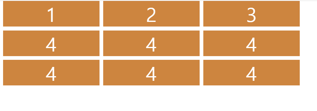
이게 바로 grid 의 기본 이론이다.
그리고 해당 요소의 높이를 확인해보면...

60px 넘게 생겼는데 이것은 child 요소에 폰트 사이즈가 50px 이기 때문이다.
만약 폰트를 줄인다면...
style.css
html, body {
  height: 100%;
  width: 100%;
}

.father {
  display: grid;
  grid-template-columns: 250px 250px 250px;
  gap: 10px;
}

.child {
  background-color: peru;
  color: white;
  font-size: 5px;
  display: flex;
  justify-content: center;
}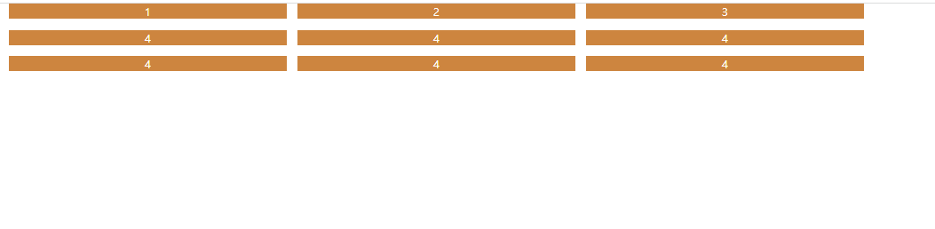
그럼 이제 row 크기를 조절하는 방법에 대해 보자면...
grid-template-columns 처럼 grid-template-rows 가 존재한다.
이것은 원하는 row 의 크기를 지정할 수 있다.
style.css
html, body {
  height: 100%;
  width: 100%;
}

.father {
  display: grid;
  grid-template-columns: 250px 250px 250px;
  grid-template-rows: 100px 50px 300px;
  gap: 10px;
}

.child {
  background-color: peru;
  color: white;
  font-size: 5px;
  display: flex;
  justify-content: center;
}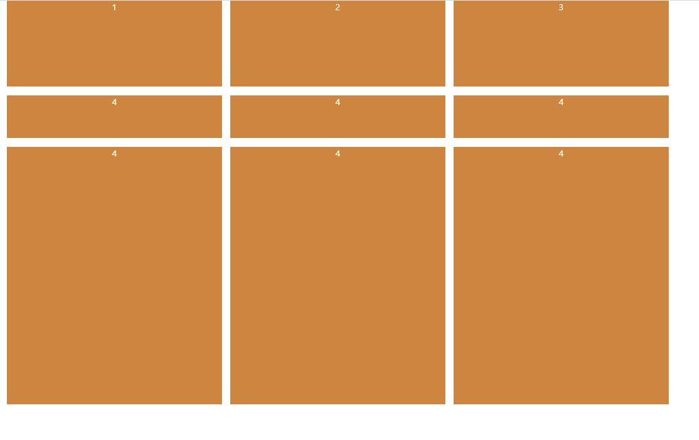
이제 우리는 행과 열을 조절할 수 있게 되었다.
끝으로 :
- 이렇게 grid 분야에 첫 걸음을 내딛어봤는데, 천천히 알아보자!
- 아직 배울게 많으니 시간을 두고 알아가보자!
